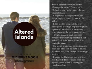
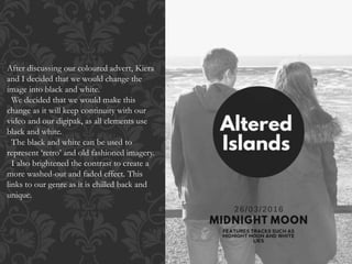
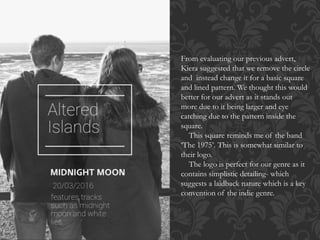
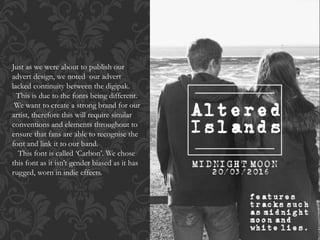
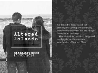
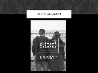
HOW I CREATED THE ADVERT
Here is the first advert we created.
Through the use of ‘Fotor.com’ &
‘BeFunky.com’ we began to edit our
original image.
I brightened the highlights of the
image to give a heavenly look to the
video.
I also tried to bring out the blue
throughout the image to place emphasis
upon their location as it has strong
correlations to the genre conventions.
We also added a black eclipse to
replicate the what we presented in our
video. This links to the album title-
midnight moon.
The use of white font contrasts against
the black circle to help our band name
stand out and catch the eye of our target
audience.
I placed the black font over the light
trail I added. This contrasts the black
against colour which is helping the
details stand out.
After discussing our coloured advert, Kiera
and I decided that we would change the
image into black and white.
We decided that we would make this
change as it will keep continuity with our
video and our digipak, as all elements use
black and white.
The black and white can be used to
represent ‘retro’ and old fashioned imagery.
I also brightened the contrast to create a
more washed-out and faded effect. This
links to our genre as it is chilled back and
unique.
From evaluating our previous advert,
Kiera suggested that we remove the circle
and instead change it for a basic square
and lined pattern. We thought this would
better for our advert as it stands out
more due to it being larger and eye
catching due to the pattern inside the
square.
This square reminds me of the band
‘The 1975’. This is somewhat similar to
their logo.
The logo is perfect for our genre as it
contains simplistic detailing- which
suggests a laidback nature which is a key
convention of the indie genre.
Just as we were about to publish our
advert design, we noted our advert
lacked continuity between the digipak.
This is due to the fonts being different.
We want to create a strong brand for our
artist, therefore this will require similar
conventions and elements throughout to
ensure that fans are able to recognise the
font and link it to our band.
This font is called ‘Carbon’. We chose
this font as it isn’t gender biased as it has
rugged, worn in indie effects.
We decided to really extend our
branding and develop our continuity,
therefore we decided to add the vintage
‘scratches’ to the image.
This allowed for the advert image and
the digipaks to all features the
same/similar effects and filters.
OUR FINAL ADVERT

our advert production

  • 1.
    HOW I CREATEDTHE ADVERT
  • 3.
    Here is thefirst advert we created. Through the use of ‘Fotor.com’ & ‘BeFunky.com’ we began to edit our original image. I brightened the highlights of the image to give a heavenly look to the video. I also tried to bring out the blue throughout the image to place emphasis upon their location as it has strong correlations to the genre conventions. We also added a black eclipse to replicate the what we presented in our video. This links to the album title- midnight moon. The use of white font contrasts against the black circle to help our band name stand out and catch the eye of our target audience. I placed the black font over the light trail I added. This contrasts the black against colour which is helping the details stand out.
  • 4.
    After discussing ourcoloured advert, Kiera and I decided that we would change the image into black and white. We decided that we would make this change as it will keep continuity with our video and our digipak, as all elements use black and white. The black and white can be used to represent ‘retro’ and old fashioned imagery. I also brightened the contrast to create a more washed-out and faded effect. This links to our genre as it is chilled back and unique.
  • 5.
    From evaluating ourprevious advert, Kiera suggested that we remove the circle and instead change it for a basic square and lined pattern. We thought this would better for our advert as it stands out more due to it being larger and eye catching due to the pattern inside the square. This square reminds me of the band ‘The 1975’. This is somewhat similar to their logo. The logo is perfect for our genre as it contains simplistic detailing- which suggests a laidback nature which is a key convention of the indie genre.
  • 6.
    Just as wewere about to publish our advert design, we noted our advert lacked continuity between the digipak. This is due to the fonts being different. We want to create a strong brand for our artist, therefore this will require similar conventions and elements throughout to ensure that fans are able to recognise the font and link it to our band. This font is called ‘Carbon’. We chose this font as it isn’t gender biased as it has rugged, worn in indie effects.
  • 7.
    We decided toreally extend our branding and develop our continuity, therefore we decided to add the vintage ‘scratches’ to the image. This allowed for the advert image and the digipaks to all features the same/similar effects and filters.
  • 8.