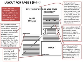
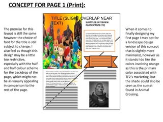
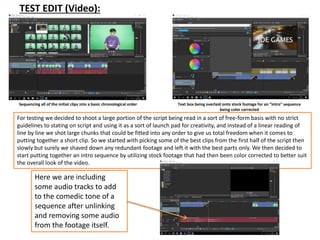
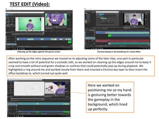
Pre-Production
Pre-productionThe Project:
For my project I’m making a project combining both short proof of concept clips of a video essay as well
as transforming the full video’s script into a print graphic akin to an article found in a gaming related
magazine. The video portion will be short snippets of a would be full video, such as the introduction to
the video, one of the key talking points of the discussion comparing the two games spoken about in my
essay and one of the ending, perhaps more. The print portion will include graphics and repurposed
storyboarding etc.
The Purpose:
The purpose of the project being split into 2 sections allows me to better display the full concept of the
video as well as the script and most importantly the discussion/comparison between both games
themselves. Truthfully, I wanted to make the essay in a video format in full, however due to time
constraints and lack of prior experience that would speed up the process, I’ve had to compromise.
Despite this, I’m still happy with this approach as it gets across what I’m really aiming for, which is the
conversation I hope to spark because of the comparison between both games researched.
Audience:
My target demographic is a mixed bag. My age range is definitely from 16-21, and it’s more inclined
towards men who like to play video games in a more “competitive” sense. This doesn’t strictly tie my
demographic down to hard-core people who spend hours upon hours in very strenuous gaming
environments where they are constantly competing against others, it more-so means that my piece is
for the hard-core who are knowledgeable and think semi-critically of the games they play, where they
give active thought to why they enjoy it and have some form of emotional resonance with the game
they’re playing, or at least enough to be opinionated about it beyond “it’s good” or “it’s bad” with no
further elaboration.
Availability of work:
My video clips based on the video essay concept will be uploaded to YouTube with the intention of
being made for YouTube. The print section however could be uploaded to a number of places, but will
definitely have to be exported as a PDF file that is available for viewing. I am considering uploading the
finished page(s) as a slideshow that can be viewed as a presentation.
Reflection
SCRIPT DRAFT (Video/Print): Here is the first draft of my script. My idea was to
create a quick little introduction with background on
me and my relation to both games, with it then
followed by a summary of TF2’s history for the
uneducated, then transitioning into Animal Crossing
and a history of that game also. My aim when
redrafting this will be to make sure that the pacing is
consistent and tight enough that it doesn’t feel as
though I’m just rambling, this can be amended when
it comes to doing the script phonetically as well by
making it more choppy and comedic.
Even here after just adding a few more
bits of information and removing some
of the redundancy I noticed after
rereading it makes a huge difference.
STYLE SHEETS (Print):
Here I’ve collected some design template ideas
that I’ll use as inspiration for the print portion of
the project, I think the minimal images with lots
of text surrounding it is something I want to
apply to my piece as the print portion is more
so about the rest of the script not shown in the
video clips, meaning the text holds a lot more
importance, but the images can also be a frame
of reference to certain points in the video
I used a website to help identify a
colour scheme in some
artwork/screenshots from both games
as well. I hope to apply these color
schemes to my print piece. What is
interesting however is that both of the
color schemes are quite tame in that
they’re not as bright and colorful that I
anticipated them to be, which could
pose a challenge when it comes to
making the colors pop out, it all
depends on what is used predominantly
and the contrasts between each color.
LAYOUT FOR PAGE 1 (Print):
Image source
Here’s the basic
outline for what the
layout could look like
without any of the
font choices or color
schemes applied.
The layout for this first
page is very much inspired
by the layouts present in
Empire magazine, where
the images are stills from
whatever is being
discussed, however I want
to use a collection of
images for the first photo
to show that this article is
about two very different
things being compared.
I’ve included image
source lines at the
bottom of all images as
they could be in-game
captures from myself or
sourced from different
places online
The image collage I’ve
planned for here is one that I
myself will put together in
photo shop, a combination of
different images from both
games put together in a nice
edited group picture that can
tie both games in nicely. My
initial idea for this would be
to use some gradients that
utilize colors present from
both games that I discovered
in my style sheet.
IMAGE
COLLAGE
TITLE (SLIGHT OVERLAP NEAR TEXT)
SUBTITLES (INTERVIEW
PARTICIPANTS ETC)
SCRIPT TEXT
IMAGE
Image source
I’ve segmented the middle of
the article page as an idea for
the final piece to use a
dissolve into the opposite
color scheme. I want to create
a visual contrast that
represents both games that
are being discussed in some
subtle background visuals
The first paragraph will be
some context behind the
article itself being a typed up
version of the phonetic script,
followed by the elevated text
over the color segment that
gives a brief introduction to
the discussion itself
Image source
CONCEPT FOR PAGE 1 (Print):
TITLE (SLIGHT OVERLAP NEAR
TEXT) SUBTITLES (INTERVIEW
PARTICIPANTS ETC)
SCRIPT TEXT
Image source
I’ve played video games for a pretty long time.
Most of my teenage life has been spent playing
video games, and I’m still not even that good at
most of the ones I play. I’ve sunk almost 2000
hours into TF2 and there are still days where I sit
at the bottom of the scoreboard in a public game
against randoms, and I’ve still yet to even try play
competitively even once. Like, seriously I haven’t
even queued up for a match in my entire near
2000 hour long play time.
The premise for this
layout is still the same
however the choice of
font for the title is still
subject to change. I
also feel as though this
design may be a little
too restrictive,
especially with the half
and half colour scheme
for the backdrop of the
page, which might not
be as visually appealing
in comparison to the
rest of the page.
Team Fortress 2 holds a very special place in my heart. It’s
been in my life since I first started secondary school
seemingly a millennia ago and is still with me now (even
after a long period of saying I had quit and left for it’s
seemingly more modernised attractive cousin Overwatch,
of which I quickly realised that’s not the case and I can
never escape Valve’s hold on me). Now here I am, talking
about TF2 and gushing over it’s splendid stupidity for
aproximately 6 pages. I hope you get something out of
these ramblings!
When it comes to
finally designing my
first page I may opt for
a landscape design
version of this concept
that is slightly more
minimalist, however as
it stands I do like the
colors involving orange
as this is the primary
color associated with
TF2's marketing, but
the shade could also be
seen as the sunset
found in Animal
Crossing.
TEST EDIT (Video):
Sequencing all of the initial clips into a basic chronological order Text box being overlaid onto stock footage for an “intro” sequence
being color corrected
For testing we decided to shoot a large portion of the script being read in a sort of free-form basis with no strict
guidelines to stating on script and using it as a sort of launch pad for creativity, and instead of a linear reading of
line by line we shot large chunks that could be fitted into any order to give us total freedom when it comes to
putting together a short clip. So we started with picking some of the best clips from the first half of the script then
slowly but surely we shaved down any redundant footage and left it with the best parts only. We then decided to
start putting together an intro sequence by utilizing stock footage that had then been color corrected to better suit
the overall look of the video.
Here we are including
some audio tracks to add
to the comedic tone of a
sequence after unlinking
and removing some audio
from the footage itself.
TEST EDIT (Video):
Cleaning up the edges against the green screen Chroma keying in the backdrop of a stock office
After working on the intro sequence we moved on to adjusting some of the later clips, one part in particular
seemed to have a lot of potential for a comedic edit, so we worked on cleaning up the edges around me to keep it
crisp and smooth without and green shadows or outlines that could potentially pop up during playback. We
highlighted a ring around me and worked closely from there and inserted a Chroma key layer to then insert the
office backdrop to, which turned out quite well.
Here we worked on
positioning me so my hand
is gesturing better towards
the gameplay in the
background, which lined
up perfectly.
Resources
Equipment/ Props needed Necessary Footage
Mac/PC Bedroom (redressed)
Internet connection Footage of Upward in TF2
Photoshop Footage of a King of the Hill match in TF2
Premiere Animal Crossing game intro footage
Camera (iPhone) Animal Crossing house set up footage
In-game recording Planting flowers in Animal Crossing footage
Nintendo 3DS
Contingency Planning
PROBLEM
(Video)
SOLUTION
(Video)
PROBLEM
(Print)
SOLUTION
(Print)
Work is corrupted Create save date backup
prior to starting work on
external hard drive
Unsure of how to use a
tool in photo shop
Use tutorials online to
learn how to effectively
use each tool
Footage is blurry Reshoot the footage and
make sure to adjust lens
before shooting
Not saved the work
properly
Backup the .psd file on
OneDrive as well as saving to
an external storage format
(USB)
Audio is muffled Use a microphone when
filming, or dub the audio
over in editing
Not enough time to
create all assets
necessary for project
Source images online
and edit them in photo
shop
Lighting is poor Compensate for natural
light by covering light
sources
Image with an
unwanted background
Use the polygonal lasso tool and
the quick selection tool to clear
out the background, layer via
copy the area you want to edit
afterwards
Not enough
footage
Plan accordingly and devise a
storyboard with timestamps,
then go out and shoot all of
the footage, reshoot just to
be safe, try different angles
Cluttered layers that
are unorganized
Rename each layer
accordingly, hide layers to
make sure you’re on the
correct layer that you’re
organizing
Loose cables in
filming area
Redress the set
appropriately and make
sure to not leave anything
that could be potentially
hazardous around
Health and Safety
DSE PROBLEMS DSE SOLUTIONS
STUDIO
PROBLEMS
STUDIO
SOLUTIONS
• How should the
chair be
positioned?
• The chair should be firmly
upright to support your
back
• Make sure the chair is at a
height that puts your
elbow above the desk
• Make sure wrists are
relaxed
• Preparations
before using the
space?
• Make sure all the relevant
equipment has been
checked by a tutor and
they are aware of what
will be used when you're
using the studio
• Where should
the keyboard and
mouse be placed
in relation to the
user?
• Keyboard should be
directly in front of you
• Shoulders should be in a
position that resembles a
right angle
• Wrists should be
neutral/relaxed
• Use keyboard shortcuts as
often as possible
• Hand away from mouse
when not in use
• How do I
operate/interact
with the lights?
• The lights should already be
arranged for easy access, if this
is not the case do not come
into contact with them and
notify a tutor immediately
• If you need to move the lights,
ask a technician to do so for
you, they shouldn't be moved
under any other circumstance
• When finished with the lights,
switch the plugs off and
unplug the cables, and hang
them onto the orange handle
on the light
• How far should
the screen be
from the users
face?
• Screen should be
approximately arm's
length away
• Tilt the screen so that
it is comfortable for
viewing, shouldn't look
up at the screen.
• How do I use the
greenscreen?
• The background is made
primarly of paper,
therefore do not pull or
stamp on it as it will rip
and tear.
• Don't stand too close to
the curve of the sheet of
green paper as you could
rip and pull the whole set
down.
• Don't use any incredibly
heavy props that could
damage the paper, check
with your tutor if you're
Day/Lesson Tasks
First second & third • First page initial layout
• Collage image for first page
• Text formatting
First second & third • Final layout for first page
• Revist image collage for first page
• Second page image collage
First second & third • Finalise second page image collage
• Include formatted text
• 3rd page image collage
• Devise phonetic version of script/print section written work
• Record first half of script (just audio)
First second & third • 3rd page text and image inserted
• Gradient adjustments for all 3 pages (check for consistency
between all 3)
• Page numbers (aligned properly)
• Record live-action footage in front of green screen
First second & third • Import clips from green screen recording
• Source gameplay footage online and import (trailers and
actual in-game footage)
• Arrange clips in a suitable sequence for intro clip (max 30
seconds)
• Edit sequence (music, sfx, on-screen animations,
transitions etc)
First second & third • Record second half of script (just audio)
• Midway clip sequence arrangement
• Edit sequence (music, sfx, on-screen
animations, transitions etc)
• End of video clip sequence arrangement
• Edit sequence (music, sfx, on-
screen animations, transitions etc)
Production Schedule

FMP Pre-Production

  • 1.
  • 2.
    Pre-productionThe Project: For myproject I’m making a project combining both short proof of concept clips of a video essay as well as transforming the full video’s script into a print graphic akin to an article found in a gaming related magazine. The video portion will be short snippets of a would be full video, such as the introduction to the video, one of the key talking points of the discussion comparing the two games spoken about in my essay and one of the ending, perhaps more. The print portion will include graphics and repurposed storyboarding etc. The Purpose: The purpose of the project being split into 2 sections allows me to better display the full concept of the video as well as the script and most importantly the discussion/comparison between both games themselves. Truthfully, I wanted to make the essay in a video format in full, however due to time constraints and lack of prior experience that would speed up the process, I’ve had to compromise. Despite this, I’m still happy with this approach as it gets across what I’m really aiming for, which is the conversation I hope to spark because of the comparison between both games researched. Audience: My target demographic is a mixed bag. My age range is definitely from 16-21, and it’s more inclined towards men who like to play video games in a more “competitive” sense. This doesn’t strictly tie my demographic down to hard-core people who spend hours upon hours in very strenuous gaming environments where they are constantly competing against others, it more-so means that my piece is for the hard-core who are knowledgeable and think semi-critically of the games they play, where they give active thought to why they enjoy it and have some form of emotional resonance with the game they’re playing, or at least enough to be opinionated about it beyond “it’s good” or “it’s bad” with no further elaboration. Availability of work: My video clips based on the video essay concept will be uploaded to YouTube with the intention of being made for YouTube. The print section however could be uploaded to a number of places, but will definitely have to be exported as a PDF file that is available for viewing. I am considering uploading the finished page(s) as a slideshow that can be viewed as a presentation. Reflection
  • 3.
    SCRIPT DRAFT (Video/Print):Here is the first draft of my script. My idea was to create a quick little introduction with background on me and my relation to both games, with it then followed by a summary of TF2’s history for the uneducated, then transitioning into Animal Crossing and a history of that game also. My aim when redrafting this will be to make sure that the pacing is consistent and tight enough that it doesn’t feel as though I’m just rambling, this can be amended when it comes to doing the script phonetically as well by making it more choppy and comedic. Even here after just adding a few more bits of information and removing some of the redundancy I noticed after rereading it makes a huge difference.
  • 4.
    STYLE SHEETS (Print): HereI’ve collected some design template ideas that I’ll use as inspiration for the print portion of the project, I think the minimal images with lots of text surrounding it is something I want to apply to my piece as the print portion is more so about the rest of the script not shown in the video clips, meaning the text holds a lot more importance, but the images can also be a frame of reference to certain points in the video I used a website to help identify a colour scheme in some artwork/screenshots from both games as well. I hope to apply these color schemes to my print piece. What is interesting however is that both of the color schemes are quite tame in that they’re not as bright and colorful that I anticipated them to be, which could pose a challenge when it comes to making the colors pop out, it all depends on what is used predominantly and the contrasts between each color.
  • 5.
    LAYOUT FOR PAGE1 (Print): Image source Here’s the basic outline for what the layout could look like without any of the font choices or color schemes applied. The layout for this first page is very much inspired by the layouts present in Empire magazine, where the images are stills from whatever is being discussed, however I want to use a collection of images for the first photo to show that this article is about two very different things being compared. I’ve included image source lines at the bottom of all images as they could be in-game captures from myself or sourced from different places online The image collage I’ve planned for here is one that I myself will put together in photo shop, a combination of different images from both games put together in a nice edited group picture that can tie both games in nicely. My initial idea for this would be to use some gradients that utilize colors present from both games that I discovered in my style sheet. IMAGE COLLAGE TITLE (SLIGHT OVERLAP NEAR TEXT) SUBTITLES (INTERVIEW PARTICIPANTS ETC) SCRIPT TEXT IMAGE Image source I’ve segmented the middle of the article page as an idea for the final piece to use a dissolve into the opposite color scheme. I want to create a visual contrast that represents both games that are being discussed in some subtle background visuals The first paragraph will be some context behind the article itself being a typed up version of the phonetic script, followed by the elevated text over the color segment that gives a brief introduction to the discussion itself Image source
  • 6.
    CONCEPT FOR PAGE1 (Print): TITLE (SLIGHT OVERLAP NEAR TEXT) SUBTITLES (INTERVIEW PARTICIPANTS ETC) SCRIPT TEXT Image source I’ve played video games for a pretty long time. Most of my teenage life has been spent playing video games, and I’m still not even that good at most of the ones I play. I’ve sunk almost 2000 hours into TF2 and there are still days where I sit at the bottom of the scoreboard in a public game against randoms, and I’ve still yet to even try play competitively even once. Like, seriously I haven’t even queued up for a match in my entire near 2000 hour long play time. The premise for this layout is still the same however the choice of font for the title is still subject to change. I also feel as though this design may be a little too restrictive, especially with the half and half colour scheme for the backdrop of the page, which might not be as visually appealing in comparison to the rest of the page. Team Fortress 2 holds a very special place in my heart. It’s been in my life since I first started secondary school seemingly a millennia ago and is still with me now (even after a long period of saying I had quit and left for it’s seemingly more modernised attractive cousin Overwatch, of which I quickly realised that’s not the case and I can never escape Valve’s hold on me). Now here I am, talking about TF2 and gushing over it’s splendid stupidity for aproximately 6 pages. I hope you get something out of these ramblings! When it comes to finally designing my first page I may opt for a landscape design version of this concept that is slightly more minimalist, however as it stands I do like the colors involving orange as this is the primary color associated with TF2's marketing, but the shade could also be seen as the sunset found in Animal Crossing.
  • 7.
    TEST EDIT (Video): Sequencingall of the initial clips into a basic chronological order Text box being overlaid onto stock footage for an “intro” sequence being color corrected For testing we decided to shoot a large portion of the script being read in a sort of free-form basis with no strict guidelines to stating on script and using it as a sort of launch pad for creativity, and instead of a linear reading of line by line we shot large chunks that could be fitted into any order to give us total freedom when it comes to putting together a short clip. So we started with picking some of the best clips from the first half of the script then slowly but surely we shaved down any redundant footage and left it with the best parts only. We then decided to start putting together an intro sequence by utilizing stock footage that had then been color corrected to better suit the overall look of the video. Here we are including some audio tracks to add to the comedic tone of a sequence after unlinking and removing some audio from the footage itself.
  • 8.
    TEST EDIT (Video): Cleaningup the edges against the green screen Chroma keying in the backdrop of a stock office After working on the intro sequence we moved on to adjusting some of the later clips, one part in particular seemed to have a lot of potential for a comedic edit, so we worked on cleaning up the edges around me to keep it crisp and smooth without and green shadows or outlines that could potentially pop up during playback. We highlighted a ring around me and worked closely from there and inserted a Chroma key layer to then insert the office backdrop to, which turned out quite well. Here we worked on positioning me so my hand is gesturing better towards the gameplay in the background, which lined up perfectly.
  • 9.
    Resources Equipment/ Props neededNecessary Footage Mac/PC Bedroom (redressed) Internet connection Footage of Upward in TF2 Photoshop Footage of a King of the Hill match in TF2 Premiere Animal Crossing game intro footage Camera (iPhone) Animal Crossing house set up footage In-game recording Planting flowers in Animal Crossing footage Nintendo 3DS
  • 10.
    Contingency Planning PROBLEM (Video) SOLUTION (Video) PROBLEM (Print) SOLUTION (Print) Work iscorrupted Create save date backup prior to starting work on external hard drive Unsure of how to use a tool in photo shop Use tutorials online to learn how to effectively use each tool Footage is blurry Reshoot the footage and make sure to adjust lens before shooting Not saved the work properly Backup the .psd file on OneDrive as well as saving to an external storage format (USB) Audio is muffled Use a microphone when filming, or dub the audio over in editing Not enough time to create all assets necessary for project Source images online and edit them in photo shop Lighting is poor Compensate for natural light by covering light sources Image with an unwanted background Use the polygonal lasso tool and the quick selection tool to clear out the background, layer via copy the area you want to edit afterwards Not enough footage Plan accordingly and devise a storyboard with timestamps, then go out and shoot all of the footage, reshoot just to be safe, try different angles Cluttered layers that are unorganized Rename each layer accordingly, hide layers to make sure you’re on the correct layer that you’re organizing Loose cables in filming area Redress the set appropriately and make sure to not leave anything that could be potentially hazardous around
  • 11.
    Health and Safety DSEPROBLEMS DSE SOLUTIONS STUDIO PROBLEMS STUDIO SOLUTIONS • How should the chair be positioned? • The chair should be firmly upright to support your back • Make sure the chair is at a height that puts your elbow above the desk • Make sure wrists are relaxed • Preparations before using the space? • Make sure all the relevant equipment has been checked by a tutor and they are aware of what will be used when you're using the studio • Where should the keyboard and mouse be placed in relation to the user? • Keyboard should be directly in front of you • Shoulders should be in a position that resembles a right angle • Wrists should be neutral/relaxed • Use keyboard shortcuts as often as possible • Hand away from mouse when not in use • How do I operate/interact with the lights? • The lights should already be arranged for easy access, if this is not the case do not come into contact with them and notify a tutor immediately • If you need to move the lights, ask a technician to do so for you, they shouldn't be moved under any other circumstance • When finished with the lights, switch the plugs off and unplug the cables, and hang them onto the orange handle on the light • How far should the screen be from the users face? • Screen should be approximately arm's length away • Tilt the screen so that it is comfortable for viewing, shouldn't look up at the screen. • How do I use the greenscreen? • The background is made primarly of paper, therefore do not pull or stamp on it as it will rip and tear. • Don't stand too close to the curve of the sheet of green paper as you could rip and pull the whole set down. • Don't use any incredibly heavy props that could damage the paper, check with your tutor if you're
  • 12.
    Day/Lesson Tasks First second& third • First page initial layout • Collage image for first page • Text formatting First second & third • Final layout for first page • Revist image collage for first page • Second page image collage First second & third • Finalise second page image collage • Include formatted text • 3rd page image collage • Devise phonetic version of script/print section written work • Record first half of script (just audio) First second & third • 3rd page text and image inserted • Gradient adjustments for all 3 pages (check for consistency between all 3) • Page numbers (aligned properly) • Record live-action footage in front of green screen First second & third • Import clips from green screen recording • Source gameplay footage online and import (trailers and actual in-game footage) • Arrange clips in a suitable sequence for intro clip (max 30 seconds) • Edit sequence (music, sfx, on-screen animations, transitions etc) First second & third • Record second half of script (just audio) • Midway clip sequence arrangement • Edit sequence (music, sfx, on-screen animations, transitions etc) • End of video clip sequence arrangement • Edit sequence (music, sfx, on- screen animations, transitions etc) Production Schedule

Editor's Notes

  • #4 Use this space to document whatever pre-production work you did for your project. It will vary from person to person and project to project.
  • #5 Use this space to document whatever pre-production work you did for your project. It will vary from person to person and project to project.
  • #6 Use this space to document whatever pre-production work you did for your project. It will vary from person to person and project to project.
  • #7 Use this space to document whatever pre-production work you did for your project. It will vary from person to person and project to project.
  • #8 Use this space to document whatever pre-production work you did for your project. It will vary from person to person and project to project.
  • #9 Use this space to document whatever pre-production work you did for your project. It will vary from person to person and project to project.