Evaluation
Question One
IN WHAT WAYS DOES YOUR MEDIA PRODUCT USE, DEVELOP OR
CHALLENGE FORMS AND CONVENTIONS OF REAL MEDIA PRODUCTS?
Screenshots
(Sadly, the gifs didn’t work when I uploaded my PowerPoint  I have put them all below and will reference to
certain ones when I am using them as examples, not as classy but there we go.)
Conventions of a teaser trailer
 Teaser trailers are usually quite short, ranging from 30-
60 seconds. Although some can be longer and last
over one minute.
 Teasers mainly consist of one or a few clips (that are
meant to ‘tease’ the audience) and are usually
edited into a montage sequence.
 As with theatrical trailers, the pace normally starts of
slow before picking up speed.
 The teaser gives the audience an idea of the genre
of the film and a rough synopsis of what its about.
 Sometimes clips may be used in the teaser that are
not included in the film, but will link to it in some way.
This could be due to filming, as they might not have
actually finished filming the movie and had to use the
only footage they had for the teaser then realised
that they didn’t need those clips in the film.
 The teaser trailer is also released a lot earlier than the
theatrical trailer and doesn’t usually have a release
date so it is marked as ‘coming soon’.
This is the teaser trailer for warm bodies.
It uses some of the conventions that
have been listed. For instance it is just
over 60 seconds (the right length for a
teaser) the pace of it speeds up as it
goes along and it includes clips that
were not put in to the actual film, for
instace the zoom in of the city right at
the beginning of the teaser trailer.
Conventions of a film poster
 Film title
 Main image
 Tagline
 Billing block
 Main cast name
 Film quotes
 Release dates
 Production company logos
Conventions of a magazine cover
 Magazine title
 Film title
 Film tagline
 Main image
 Quotes/reviews
 Main actors
 Magazine info
 Price/Website/Barcode/
What’s included in the
magazine
 Information on other films
Idents
 Dawn to Dusk: This ident was based of the BBC One moon ident that was aired
a few years ago. The ident was of a mood that had the BBC text in the middle
whilst circles moved around it. We liked the idea of the moon and thought it fit
in to our genre quite nicely. Our ident is different however as we used a clip of
a moon reflecting on water as it disappears which is then replaces by the title
of the company. For this ident we used dark colours like black, whites and greys
to correspond with not only the theme of out film but with the zombie genre in
general. We edited this clip so all the saturation was down and there was no
background left. The font we used for the title is dark and shadowing creating
a ‘horror’ vibe for the audience.
 Iris: We chose the name Iris before we actual decided on what the ident
should look like but it seemed fitting that it should be an eye. We used a close
up of a girl blinking and changed it so it match the theme of our trailer e.g.
black and white, scary. By using a human eye we also link into the genre of our
film, zombie, as nearly all the characters are zombies with human eyes. The font
we used for this ident was a luminous white which shone against the backdrop
of the eye.
 We made our idents fairly short not only to keep a good time with the teasers
length but to make sure it fit with the pace of our trailer. If the idents were too
long it would seem strange to suddenly change to a slower paced clip. Also
our background music stays over the top of our idents so there is sound whilst
the idents play creating a sense of eeriness. The ‘Warm Bodies’ trailer also does
this at the beginning with their ident.
Camera work
 We used the camera style of panning in our shots at the beginning of
our teaser, we did this because we wanted to show fluidity in the
scanning of the body without making it jarred by using jump cuts. We
also took parts of the these clips and sped up the pace to create a
faster time frame in the audiences eyes. This has been done before in
the film ‘Zombieland’ where there is a very subtle pace change within
the panning of the main character. What this clip also shows is the pan
carries on to show said characters from both angles, we have also don’t
this in our teaser.
 From the beginning we envisioned our trailer to be very sparsely lit and
fairly dark throughout with maybe the effect of one spotlight on in a
dark room. This is also shown from another clip from the film ‘Saw V’
where a man is sprawled on a table in a badly lit room. We have taken
ideas from this and created what we have in out teaser trailer.
Titles
 Titles are another main feature of a teaser trailer as they provide the
information that may not be conveyed from the shots. Our titles provide
brief answers to what our film is about and who the characters are. The
style of the titles was inspired by the ‘28 days later’ trailer who also had
white writing pan across a black screen.
 We added in the colour change on ‘millions of zombies’ as it stuck to
our colour theme and also conveyed that the title was important and
was a key to what the film was about. The colour red also parallels to
danger and blood, both of which relate to our genre.
 We used around 8 titles altogether which is generally more than a
teaser trailer would use and is more similar to a theatrical trailer but it
was the right amount for us to get our films point across. Not all teasers
stick to the convention of only a few titles. ‘Shaun of the Dead’s’ teaser
was mostly made of titles and had around 11 of them in total.
Effects and Pace
 We used effects of some of our clips to make them look different and
present a more montage looking teaser trailer. We got inspiration to do this
from the warm bodies trailer as it also used effects in the beginning when the
zombies are on screen. We put on the effect of black and white and
‘broken T.V’ which gives the shot a jagged and faulty look to it. Because of
these effects the clips look like they are being taken from a hand held
camera. These filters and overlays also make the teaser look more appealing
and will give the audience a larger desire to see it.
 Also during the editing process we added in jump cuts so the zombies
appeared to be getting closer and closer. This challenges some zombie film
conventions as zombies are known as slow and brain-dead while we have
shown them as fast and more threatening. Another film that does this is
‘Zombieland’. They have their zombies run after the humans at a much faster
pace in comparison to older zombie films.
 The pace of our film, much like our zombies, is faster than some zombie
trailers. The shots fit in with out music as it reaches a crescendo towards the
end. We start off with slow and flowing shots which quickly turn it fast snappy
shots, which is when the zombies start to appear.
Close ups
 We used close up to show off our main character and portray a
main element of our teaser trailer. We got influence for our ‘opening
the eyes shot’, not from a film trailer but, from a book trailer. The
book is called ‘As Dead As It Gets’ by Katie Alender. During this
trailer there is a close up of a girl who’s eyes are closed, as if to say
she was dead, but then they open. This inspired us to use a shot like
that too as we thought it was very effective. We added in the eyes
fluttering part to our trailer as we thought it would look good from
different camera angles to capture a point of view shot.
Main title
 During a teaser trailer you will usually find the films title will be shown at the end. This is
because it is the most important part of the trailer and should be the most
memorable bit of it. For us we wanted to use the name of our ‘zombie disease’
(Traumiac Omosis Disease) as the title but found that it would be too long so we
shortened it down to T.O.D. We also put our film title at the end alike most other real
teaser trailers.
 The main title we used in our teaser trailer stuck to main conventions that revolve
around the zombie/horror genre and theme. For instance the typeface we used is
highly relatable to the genre of our film as it uses a font that is recognises by an
audience that it links to our chosen theme. It is a bold font with lettering that has a +
symbol in the letters O and D. This symbol is often related to the ambulance/first aid
logo creating a link to our film T.O.D which is about a disease that spreads
throughout the world. It could also symbolize death which is another hint to our films
plot.
 The colours we chose were very important as we wanted a clear colour theme
running through all three of our products. We ended up deciding on red, black and
purple as we thought it resembled blood as the title ran over the background. The
blood was also a key feature for us as that is one of, if not the most important,
conventions of a zombie film. So by portraying a bloody liquid flow across the screen
we captured another element of our films genre.
Release dates
 The release dates are what the audience see, usually, at the end
of the teaser trailer. The titles will either consist of a date or some
form of the words ‘coming soon’. We typically did what most
other teaser trailers do and put our release date shot at the end
of the trailer so it is the last thing the audience see’s. We also
included on this screen the films website, the company names
that helped fund the film, the copyright details, ‘In Theatres
Soon’ along with the age rating. As we were taking influences
from other teaser trailers we decided to go for ‘not yet rated’
which is what ‘World War Z’s’ teaser trailer had. The other
information we included like the website was put in so the
audience could look up more information about the film, thus
helping the film and franchise gain publicity.
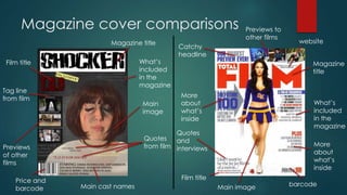
Magazine cover comparisons
Magazine
title
What’s
included
in the
magazine
More
about
what’s
inside
barcodeMain image
Quotes
and
interviews
Film title
More
about
what’s
inside
Catchy
headline
Previews to
other films
website
Film title
Magazine title
What’s
included
in the
magazine
Main
image
Quotes
from filmPreviews
of other
films
Tag line
from film
Price and
barcode Main cast names
Film poster comparison
Main cast
name
Film title
Main imageTag line
background
Star
rating/review
and quotes
Age
rating
Billing block Release date
Production
companies
names/logos
Secondary
image
Main cast
names
Film title
Background
Billing block
Release date
Company
name/logo
Main
image
Use of
props
Tag line

Evaluation question one

  • 1.
    Evaluation Question One IN WHATWAYS DOES YOUR MEDIA PRODUCT USE, DEVELOP OR CHALLENGE FORMS AND CONVENTIONS OF REAL MEDIA PRODUCTS?
  • 2.
    Screenshots (Sadly, the gifsdidn’t work when I uploaded my PowerPoint  I have put them all below and will reference to certain ones when I am using them as examples, not as classy but there we go.)
  • 3.
    Conventions of ateaser trailer  Teaser trailers are usually quite short, ranging from 30- 60 seconds. Although some can be longer and last over one minute.  Teasers mainly consist of one or a few clips (that are meant to ‘tease’ the audience) and are usually edited into a montage sequence.  As with theatrical trailers, the pace normally starts of slow before picking up speed.  The teaser gives the audience an idea of the genre of the film and a rough synopsis of what its about.  Sometimes clips may be used in the teaser that are not included in the film, but will link to it in some way. This could be due to filming, as they might not have actually finished filming the movie and had to use the only footage they had for the teaser then realised that they didn’t need those clips in the film.  The teaser trailer is also released a lot earlier than the theatrical trailer and doesn’t usually have a release date so it is marked as ‘coming soon’. This is the teaser trailer for warm bodies. It uses some of the conventions that have been listed. For instance it is just over 60 seconds (the right length for a teaser) the pace of it speeds up as it goes along and it includes clips that were not put in to the actual film, for instace the zoom in of the city right at the beginning of the teaser trailer.
  • 4.
    Conventions of afilm poster  Film title  Main image  Tagline  Billing block  Main cast name  Film quotes  Release dates  Production company logos
  • 5.
    Conventions of amagazine cover  Magazine title  Film title  Film tagline  Main image  Quotes/reviews  Main actors  Magazine info  Price/Website/Barcode/ What’s included in the magazine  Information on other films
  • 6.
    Idents  Dawn toDusk: This ident was based of the BBC One moon ident that was aired a few years ago. The ident was of a mood that had the BBC text in the middle whilst circles moved around it. We liked the idea of the moon and thought it fit in to our genre quite nicely. Our ident is different however as we used a clip of a moon reflecting on water as it disappears which is then replaces by the title of the company. For this ident we used dark colours like black, whites and greys to correspond with not only the theme of out film but with the zombie genre in general. We edited this clip so all the saturation was down and there was no background left. The font we used for the title is dark and shadowing creating a ‘horror’ vibe for the audience.  Iris: We chose the name Iris before we actual decided on what the ident should look like but it seemed fitting that it should be an eye. We used a close up of a girl blinking and changed it so it match the theme of our trailer e.g. black and white, scary. By using a human eye we also link into the genre of our film, zombie, as nearly all the characters are zombies with human eyes. The font we used for this ident was a luminous white which shone against the backdrop of the eye.  We made our idents fairly short not only to keep a good time with the teasers length but to make sure it fit with the pace of our trailer. If the idents were too long it would seem strange to suddenly change to a slower paced clip. Also our background music stays over the top of our idents so there is sound whilst the idents play creating a sense of eeriness. The ‘Warm Bodies’ trailer also does this at the beginning with their ident.
  • 7.
    Camera work  Weused the camera style of panning in our shots at the beginning of our teaser, we did this because we wanted to show fluidity in the scanning of the body without making it jarred by using jump cuts. We also took parts of the these clips and sped up the pace to create a faster time frame in the audiences eyes. This has been done before in the film ‘Zombieland’ where there is a very subtle pace change within the panning of the main character. What this clip also shows is the pan carries on to show said characters from both angles, we have also don’t this in our teaser.  From the beginning we envisioned our trailer to be very sparsely lit and fairly dark throughout with maybe the effect of one spotlight on in a dark room. This is also shown from another clip from the film ‘Saw V’ where a man is sprawled on a table in a badly lit room. We have taken ideas from this and created what we have in out teaser trailer.
  • 8.
    Titles  Titles areanother main feature of a teaser trailer as they provide the information that may not be conveyed from the shots. Our titles provide brief answers to what our film is about and who the characters are. The style of the titles was inspired by the ‘28 days later’ trailer who also had white writing pan across a black screen.  We added in the colour change on ‘millions of zombies’ as it stuck to our colour theme and also conveyed that the title was important and was a key to what the film was about. The colour red also parallels to danger and blood, both of which relate to our genre.  We used around 8 titles altogether which is generally more than a teaser trailer would use and is more similar to a theatrical trailer but it was the right amount for us to get our films point across. Not all teasers stick to the convention of only a few titles. ‘Shaun of the Dead’s’ teaser was mostly made of titles and had around 11 of them in total.
  • 9.
    Effects and Pace We used effects of some of our clips to make them look different and present a more montage looking teaser trailer. We got inspiration to do this from the warm bodies trailer as it also used effects in the beginning when the zombies are on screen. We put on the effect of black and white and ‘broken T.V’ which gives the shot a jagged and faulty look to it. Because of these effects the clips look like they are being taken from a hand held camera. These filters and overlays also make the teaser look more appealing and will give the audience a larger desire to see it.  Also during the editing process we added in jump cuts so the zombies appeared to be getting closer and closer. This challenges some zombie film conventions as zombies are known as slow and brain-dead while we have shown them as fast and more threatening. Another film that does this is ‘Zombieland’. They have their zombies run after the humans at a much faster pace in comparison to older zombie films.  The pace of our film, much like our zombies, is faster than some zombie trailers. The shots fit in with out music as it reaches a crescendo towards the end. We start off with slow and flowing shots which quickly turn it fast snappy shots, which is when the zombies start to appear.
  • 10.
    Close ups  Weused close up to show off our main character and portray a main element of our teaser trailer. We got influence for our ‘opening the eyes shot’, not from a film trailer but, from a book trailer. The book is called ‘As Dead As It Gets’ by Katie Alender. During this trailer there is a close up of a girl who’s eyes are closed, as if to say she was dead, but then they open. This inspired us to use a shot like that too as we thought it was very effective. We added in the eyes fluttering part to our trailer as we thought it would look good from different camera angles to capture a point of view shot.
  • 11.
    Main title  Duringa teaser trailer you will usually find the films title will be shown at the end. This is because it is the most important part of the trailer and should be the most memorable bit of it. For us we wanted to use the name of our ‘zombie disease’ (Traumiac Omosis Disease) as the title but found that it would be too long so we shortened it down to T.O.D. We also put our film title at the end alike most other real teaser trailers.  The main title we used in our teaser trailer stuck to main conventions that revolve around the zombie/horror genre and theme. For instance the typeface we used is highly relatable to the genre of our film as it uses a font that is recognises by an audience that it links to our chosen theme. It is a bold font with lettering that has a + symbol in the letters O and D. This symbol is often related to the ambulance/first aid logo creating a link to our film T.O.D which is about a disease that spreads throughout the world. It could also symbolize death which is another hint to our films plot.  The colours we chose were very important as we wanted a clear colour theme running through all three of our products. We ended up deciding on red, black and purple as we thought it resembled blood as the title ran over the background. The blood was also a key feature for us as that is one of, if not the most important, conventions of a zombie film. So by portraying a bloody liquid flow across the screen we captured another element of our films genre.
  • 12.
    Release dates  Therelease dates are what the audience see, usually, at the end of the teaser trailer. The titles will either consist of a date or some form of the words ‘coming soon’. We typically did what most other teaser trailers do and put our release date shot at the end of the trailer so it is the last thing the audience see’s. We also included on this screen the films website, the company names that helped fund the film, the copyright details, ‘In Theatres Soon’ along with the age rating. As we were taking influences from other teaser trailers we decided to go for ‘not yet rated’ which is what ‘World War Z’s’ teaser trailer had. The other information we included like the website was put in so the audience could look up more information about the film, thus helping the film and franchise gain publicity.
  • 13.
    Magazine cover comparisons Magazine title What’s included inthe magazine More about what’s inside barcodeMain image Quotes and interviews Film title More about what’s inside Catchy headline Previews to other films website Film title Magazine title What’s included in the magazine Main image Quotes from filmPreviews of other films Tag line from film Price and barcode Main cast names
  • 14.
    Film poster comparison Maincast name Film title Main imageTag line background Star rating/review and quotes Age rating Billing block Release date Production companies names/logos Secondary image Main cast names Film title Background Billing block Release date Company name/logo Main image Use of props Tag line