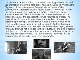
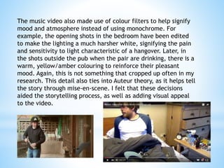
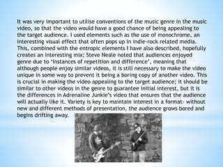
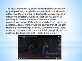
The document discusses how the student's media products for a music video, print advert, and digipak for the song "Adrenaline Junkie" both utilize conventions of real media products in the indie rock genre as well as introduce some original, entropic elements.
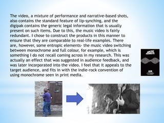
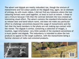
The music video uses conventional techniques like close-up shots of musicians performing and lip syncing, but also employs unconventional color filters to signify mood and monochrome/color switching for visual interest. Audience feedback helped shape some unique elements. While following standard formats, the print materials also feature monochrome/color mixing not found in the student's research. The goal was to balance familiarity and novelty to engage the target audience.