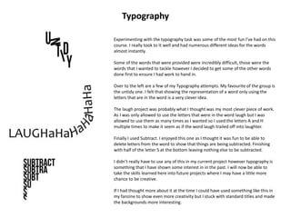
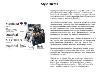
New Skills and How I Used Them
Grids
This was the first time that I had ever used grids as a guideline for a
project. In the past I have really just relied on freehand placement of
things and making sure that everything is sitting relatively neatly.
InDesign allowed me to create grids. It allowed me to edit the
amount of horizontal and vertical lines that I wanted allowing me to
experiment with the amount of lines to see how I wanted my page
setting out.
The program also gave me the option to edit the size of the margins
that were available to me, this meant that I could have larger or
smaller boxes tailored to the needs of my design.
As you can see from the example work on the left I was able to use
InDesign to add grids before starting my work. I could then use the
large boxes provided by the layout to ensure that all my columns of
text were evenly spaced and aligned correctly.
Its also a great way to ensure that your images are placed correctly.
Using the Rectangle frame tool you can drag a frame for an image
that you will place later. The preset grid allows you to size the frame
correctly and will leave the spacing correct between the columns.
This was a new feature that I enjoyed using and has encourage me
to use InDesign for more layout based work in the future. It is easier
to use than the ruler system that Photoshop which is why I would
rather use this.
Typographical Hierarchy
Another new skill that I learnt whilst doing this project was about
typographical hierarchy and how it works.
We were set a task of creating a gig poster for 4 bands, the only things
we could use were text and we were not allowed to add any words.
The great thing about this was learning about how and where to place
larger words to ensure that they are seen easily by everything else.
By using this method I feel that I successfully created a poster that
shows everything in order of importance. The headline band are in a
larger sized font and spreads the span of the page with the rest of the
bands being in smaller fonts. The date was important as was the venue
name so I ensure that both of those were large too.
I decided to add a little bit of colour with the blues as it helped to
accentuate the aspects of my Picture that were not quite as important
as others but still was a piece of information that was helpful to be
seen.
The social media links I felt were the least important parts of the poster
so I left them at the bottom.
I was able to put some of these newly obtained skills into practice when
creating my newspapers articles ensuring that headlines were the
largest stand point with other things such as sub heading and Masthead
being slightly smaller.
Experimenting with the typography task was some of the most fun I’ve had on this
course. I really took to It well and had numerous different ideas for the words
almost instantly.
Some of the words that were provided were incredibly difficult, those were the
words that I wanted to tackle however I decided to get some of the other words
done first to ensure I had work to hand in.
Over to the left are a few of my Typography attempts. My favourite of the group is
the untidy one. I felt that showing the representation of a word only using the
letters that are in the word is a very clever idea.
The laugh project was probably what I thought was my most clever piece of work.
As I was only allowed to use the letters that were in the word laugh but I was
allowed to use them as many times as I wanted so I used the letters A and H
multiple times to make it seem as if the word laugh trailed off into laughter.
Finally I used Subtract. I enjoyed this one as I thought it was fun to be able to
delete letters from the word to show that things are being subtracted. Finishing
with half of the letter S at the bottom leaving nothing else to be subtracted.
I didn’t really have to use any of this in my current project however typography is
something that I have shown some interest in in the past. I will now be able to
take the skills learned here into future projects where I may have a little more
chance to be creative.
If I had thought more about it at the time I could have used something like this in
my fanzine to show even more creativity but I stuck with standard titles and made
the backgrounds more interesting.
Typography
Style Sheets
In past projects before starting the main body of the work we have
planned what we will do using mood boards. For some reason
mood boards are something that I have always struggled with, not
so much the concept of them but getting them to a standard which
is deemed worthy of the work that I produce.
This time we were told to create a style sheet, this I felt much more
comfortable with. I looked up some fonts and came up with 6 ideas
for the possible text for the masthead of the newspaper. I looked
for some conventional fonts such as Trajan Pro and Imprint MT
Shadow and also some fonts that I thought were perhaps a little
more risky such as Lucida Black letter. I wanted to ensure I had the
option to chop and change and see which ones I preferred.
I also searched for three body texts. I wanted the body texts to be a
serif font much like most other newspapers use, this is due to how
easily the font type can be read at a small size. I went for three
fairly traditional fonts all of which I felt would be easy to read.
I also sourced three images from the internet of possible pictures
that I could use for my project. Many of the pictures I found were
unsuitable and the ones which may have been more suitable were
incredibly hard to find.
The final part of the style sheet was to add in any colours that I
might use. I opted for Red and Blue but actually decided against
both of those colours on my final project and went for green
instead. This was just a scenario where I didn’t really know what
colours would work up until the point of actually doing it.
Terminology
Whilst before this project I had heard of some terminology to do
with writing there was a lot of things that were new to me, or
that I just didn’t know the name for. I never realised what a
complex process putting together an article could be and
learning the terminology and the ideas behind it was a massive
eye opener to me.
One of the first things I decided on was where I was going to use
images and which orientation they would have, portrait or
landscape. I didn’t realise how important this was to the final
piece, it gives you a starting point as to where you can put text
and whether or not you have space for more images. In this
instance a large image took up an entire page leaving the
majority of the left page for text.
The headlines and straplines I already knew about and had used in
the past. I knew what a pull quote was but had never really
experimented with one which is why I enjoyed using one in my
final pieces. Drop capitals are a great way of making the first word
of your paragraph stand out. Sometimes they are used at the
beginning of every paragraph other times they are simply used
once to indicate the beginning of the story. It looks very
professional and I had drafts that used them and drafts that did
not.
Reverse was another new piece of terminology for me. After
finding out what It meant it was something that I had already
used but didn’t know it had a name. Reverse is using a lighter text
on a darker background as opposed to the generic darker text on
a lighter background.
I used the majority of the terminology that I discovered in my
work and will be able to take my new knowledge of said
terminology away with me and will be able to use it in future
projects.
I have also tried to use the terminology where it fits in my
evaluation to show the knowledge that I had of it I now
understand the importance of all the little bits that go into
releasing a full scale publication which is something that I never
imagined would be so intricate.

Finalevaluation

  • 1.
    New Skills andHow I Used Them
  • 2.
    Grids This was thefirst time that I had ever used grids as a guideline for a project. In the past I have really just relied on freehand placement of things and making sure that everything is sitting relatively neatly. InDesign allowed me to create grids. It allowed me to edit the amount of horizontal and vertical lines that I wanted allowing me to experiment with the amount of lines to see how I wanted my page setting out. The program also gave me the option to edit the size of the margins that were available to me, this meant that I could have larger or smaller boxes tailored to the needs of my design. As you can see from the example work on the left I was able to use InDesign to add grids before starting my work. I could then use the large boxes provided by the layout to ensure that all my columns of text were evenly spaced and aligned correctly. Its also a great way to ensure that your images are placed correctly. Using the Rectangle frame tool you can drag a frame for an image that you will place later. The preset grid allows you to size the frame correctly and will leave the spacing correct between the columns. This was a new feature that I enjoyed using and has encourage me to use InDesign for more layout based work in the future. It is easier to use than the ruler system that Photoshop which is why I would rather use this.
  • 3.
    Typographical Hierarchy Another newskill that I learnt whilst doing this project was about typographical hierarchy and how it works. We were set a task of creating a gig poster for 4 bands, the only things we could use were text and we were not allowed to add any words. The great thing about this was learning about how and where to place larger words to ensure that they are seen easily by everything else. By using this method I feel that I successfully created a poster that shows everything in order of importance. The headline band are in a larger sized font and spreads the span of the page with the rest of the bands being in smaller fonts. The date was important as was the venue name so I ensure that both of those were large too. I decided to add a little bit of colour with the blues as it helped to accentuate the aspects of my Picture that were not quite as important as others but still was a piece of information that was helpful to be seen. The social media links I felt were the least important parts of the poster so I left them at the bottom. I was able to put some of these newly obtained skills into practice when creating my newspapers articles ensuring that headlines were the largest stand point with other things such as sub heading and Masthead being slightly smaller.
  • 4.
    Experimenting with thetypography task was some of the most fun I’ve had on this course. I really took to It well and had numerous different ideas for the words almost instantly. Some of the words that were provided were incredibly difficult, those were the words that I wanted to tackle however I decided to get some of the other words done first to ensure I had work to hand in. Over to the left are a few of my Typography attempts. My favourite of the group is the untidy one. I felt that showing the representation of a word only using the letters that are in the word is a very clever idea. The laugh project was probably what I thought was my most clever piece of work. As I was only allowed to use the letters that were in the word laugh but I was allowed to use them as many times as I wanted so I used the letters A and H multiple times to make it seem as if the word laugh trailed off into laughter. Finally I used Subtract. I enjoyed this one as I thought it was fun to be able to delete letters from the word to show that things are being subtracted. Finishing with half of the letter S at the bottom leaving nothing else to be subtracted. I didn’t really have to use any of this in my current project however typography is something that I have shown some interest in in the past. I will now be able to take the skills learned here into future projects where I may have a little more chance to be creative. If I had thought more about it at the time I could have used something like this in my fanzine to show even more creativity but I stuck with standard titles and made the backgrounds more interesting. Typography
  • 5.
    Style Sheets In pastprojects before starting the main body of the work we have planned what we will do using mood boards. For some reason mood boards are something that I have always struggled with, not so much the concept of them but getting them to a standard which is deemed worthy of the work that I produce. This time we were told to create a style sheet, this I felt much more comfortable with. I looked up some fonts and came up with 6 ideas for the possible text for the masthead of the newspaper. I looked for some conventional fonts such as Trajan Pro and Imprint MT Shadow and also some fonts that I thought were perhaps a little more risky such as Lucida Black letter. I wanted to ensure I had the option to chop and change and see which ones I preferred. I also searched for three body texts. I wanted the body texts to be a serif font much like most other newspapers use, this is due to how easily the font type can be read at a small size. I went for three fairly traditional fonts all of which I felt would be easy to read. I also sourced three images from the internet of possible pictures that I could use for my project. Many of the pictures I found were unsuitable and the ones which may have been more suitable were incredibly hard to find. The final part of the style sheet was to add in any colours that I might use. I opted for Red and Blue but actually decided against both of those colours on my final project and went for green instead. This was just a scenario where I didn’t really know what colours would work up until the point of actually doing it.
  • 6.
    Terminology Whilst before thisproject I had heard of some terminology to do with writing there was a lot of things that were new to me, or that I just didn’t know the name for. I never realised what a complex process putting together an article could be and learning the terminology and the ideas behind it was a massive eye opener to me. One of the first things I decided on was where I was going to use images and which orientation they would have, portrait or landscape. I didn’t realise how important this was to the final piece, it gives you a starting point as to where you can put text and whether or not you have space for more images. In this instance a large image took up an entire page leaving the majority of the left page for text. The headlines and straplines I already knew about and had used in the past. I knew what a pull quote was but had never really experimented with one which is why I enjoyed using one in my final pieces. Drop capitals are a great way of making the first word of your paragraph stand out. Sometimes they are used at the beginning of every paragraph other times they are simply used once to indicate the beginning of the story. It looks very professional and I had drafts that used them and drafts that did not. Reverse was another new piece of terminology for me. After finding out what It meant it was something that I had already used but didn’t know it had a name. Reverse is using a lighter text on a darker background as opposed to the generic darker text on a lighter background. I used the majority of the terminology that I discovered in my work and will be able to take my new knowledge of said terminology away with me and will be able to use it in future projects. I have also tried to use the terminology where it fits in my evaluation to show the knowledge that I had of it I now understand the importance of all the little bits that go into releasing a full scale publication which is something that I never imagined would be so intricate.