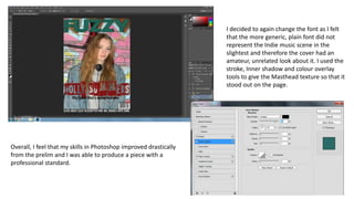
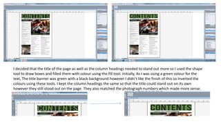
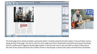
What have you learnt about
technologies from the process
of constructing this product?
From the onset of my project, I developed my skills in several different
areas of technology in order to create the most successful end product
that I could. Through trial and error, from the prelim activity onwards, I
worked hard to improve my skills which meant that my end product
was finished to a professional standard. Using Blogger, PowerPoint, An
SLR Camera, Photoshop and Quark, and online resources such as Prezi
and PowToon, I moved through the project gradually building up to the
production of my Front Cover, Contents Page and Double Page Spread-
which I am happy with the outcome of. Throughout the project, I
worked to improve my skills in all areas, particularly Photoshop and
Quark as I had never used these programmes before, so that my work
could progress and I feel I was successful in doing so.
My Initial task, before anything else, was to set up a blog so that I had one place to keep all my coursework
together. Having a blogger page meant that my work was secure and also in a organised, chronological order,
easy to find certain pieces of work if necessary. Blogger, as a tool, was extremely easy to use and meant that I
had a sufficient storage method as well as an attractive way to present my work.
BLOGGER
Firstly, I Logged into my google account so that I could
access Blogger.
Once I had logged in I came to this page, where you can
access your own blog as well as others similar or your
favourites. To create an new blog I selected the ‘new blog’
option in the left hand corner, which offered me multiple
options to set up my blog page.
After opening a new blog, I got many options. Firstly, I chose
the template for my blog. I chose quite a simple template so
that I could modify it further on, changing colours,
positioning of features and fonts of the page title, column
headings etc.
I then had to make a title and blog address. It is important
that these are relevant as these are the first things that will
be seen on your blog. I choose the blog address
‘asmediarubymcgann@blogspot.co.uk’ and the title ‘AS
Media Studies’.
After this, I am taken to the post list, which features all of the
content on the blogger page. Each blog post has a name
which will also appear on the blog and also a date and time of
publishing which you can amend to change the order of the
posts if necessary.
To create a blog post I selected the ‘new post’ option. Here
I could insert text and edit this text with standard text
options, Insert Images, Videos, links and documents. As
well as this, It is possible to embed items such as YouTube
videos, Prezi and Powtoon documents, an essential
throughout my project. This was done using an embedding
link on the HTML option of the page.
After publishing the page, the post is present on the blog. I
feel that I was successful in using blogger due to the
simplicity of it. The work from the prelim, up to the final
outcome is present and the clear progression is evident
due to the chronological order of the posts.
I used the internet as a tool for research throughout the entire process. I was able to find information about
magazines- the typical codes and conventions at the start of the project up to more detailed analysis further
on in the project. When researching the competitor market, I was able to find information such as Price,
Frequency of Publication and Number of pages etc, which allowed me to create a general idea for how my
magazine should be. The internet was a useful tool to get pictures which illustrated my points in many areas of
the work. Without the Internet I would have struggled to present my work in different ways meaning it would
be boring and lack variety.
INTERNET
Both Prezi and Powtoon are free online programmes which allow
you to present your work in different ways. I used both
programmes multiple times throughout my project and they
allowed me to be creative with what would just be written text.
Prezi allowed me to create interactive presentations- I was able
to choose from hundreds of themes and edit the work so that it
suited my needs. Powtoon allowed me to create animated videos
again a great way to present a piece of written text differently.
Although it is harder to use, I like the outcome of a Powtoon
video as it is has a very professional appearance. I enjoyed using
both programmes as they allowed me to vary my work.
I developed my skills using a professional camera throughout the project. I learnt about camera angles, types
of photographs, lighting, framing and zooming and gradually improved my skills so that I could have the best
results possible in my final outcomes. I learnt that retaking photographs multiple times helped ensure that
they were at the best quality possible meaning that my piece had a professional finish. I did struggle slightly
with the photography side of the project however I feel that I improved as time went on.
CAMERA
As you can see the photography has drastically improved
as I have considered aspects such as positioning- A
medium close up image should be used, Back ground- It is
important that the setting of the image relates to theme
or complies to house style, and the styling of the cover
star- The clothing worn should compliment the genre as
well as the house style. The progression with the
photography means the work I produced also progresses.
I had had no experience with Photoshop before starting this project meaning that I struggled at first to adapt
my skills so that I could use it in a productive way. Photoshop allowed me to manipulate my work in order to
mimic the professionalism of real media products however it took me a while to get used to using the
programme well.
PHOTOSHOP
I learnt that Photoshop consists of layers and
each layer is a separate part of the work.
Firstly, I opened an ‘International Paper’ A4
size- This would be the base for my final
outcome Front Cover. It is important that
these settings are used so that the page is
functional. By using the transform tools I
played around with the sizing and positioning
of the photograph after dragging into the
page, until I found the perfect place for it.
The image has a medium close up quality and
I achieved this through my photography as
well as the transform tools. I downloaded a
font of ‘Dafont.com’ which I thought suited
my magazine page the most and used this
from the font list and also changed the colour
of to a turquoise colour.
I continued to experiment with the sizing of the mast
head and its location, using the tool bar to do so. By using
the text box I inserted another layer which was the
positioning statement. Again, using the font list, I chose a
more generic font differing from the mast head font and
placed in beneath the mast head in the top left hand
corner. Again, I experimented with the size of the
positioning statement using the transform tool. I decided
to do it much smaller than originally planned so that it did
not take attention away from the mast head. Using the
‘Layer style’ pop up tab I lightened the colour of the
Masthead slightly, using the colour overlay option to do
so. I was still unhappy with the appearance of the mast
head on the page however I found it difficult to work out
why and did not know what I could do to improve it.
I ended up changing the font to a more simple font, adjusting the font size
where I needed to. I kept the colour and stroke of the text that I had earlier
changed and decided to use more generic font. Using the import setting in the
file menu I inserted a bar code which I has found online. I struggled with this
process as I was unaware of the drag and drop feature at this point and did not
know how to get the Barcode onto the photo as a layer. I decided to minimise
the size of the Barcode to a smaller size in the corner so that It was see able but
didn’t take over the page. Using the shape tool in the tool bar I drew a box
which would be a strap banner and filled it using the fill tool so that it was black
the white text would stand out.
I experimented with fonts until I found the
perfect font for the main cover line. I
made sure it was not bigger than the mast
head by the font size listing in the top bar
and changed the colour to an exclusive
colour using the colour maker.
The cover lines were inserted one by one using the text
tool and shared the same font and size meaning that
they were uniform. Initially, there was no editing on the
cover lines however they did not stand out and blended
with the background, taking away from the authentic
look intended. Because of this, I utilised the ‘Layer Style’
pop up tab once again and outlined the cover lines in
white as well as gave them a small shadow so that they
stood out and did not merge with the multiple colours
in the background of the photograph.
I also moved the
cover lines around
multiple times using
the navigating tool
and made sure that
they lined up- This
was possible through
the margin feature.
I decided to again change the font as I felt
that the more generic, plain font did not
represent the Indie music scene in the
slightest and therefore the cover had an
amateur, unrelated look about it. I used the
stroke, Inner shadow and colour overlay
tools to give the Masthead texture so that it
stood out on the page.
Overall, I feel that my skills in Photoshop improved drastically
from the prelim and I was able to produce a piece with a
professional standard.
Again, I had had no experience with Quark before starting this project meaning that I struggled at first to
adapt my skills so that I could use it in a productive way. I used quark to create both my Contents page and
Double page spread and used knowledge from tutorials to attempt to create retail worthy pieces in this
programme. I worked on the programme extensively in order to achieve this.
QUARK
My Initial step on both the contents page and double page spread document was to open a new page rather than working
on the A Page, which is present when you open a new document- It is important to ignore this as it does not function and
therefore the work would be lost. I Inserted my image immediately on the Double page spread, making it the background of
the page and Inserted column guides so that I was aware of where my text would go on the page. I also did this on the
contents page- The title was my first concern, and using the text tool I inserted this also, so I had a brief idea of its location.
I imported my text using the import tool In the
file menu- It is important to do so as copied
and pasted text is not formatted correctly and
will therefore appear in the wrong order and
form on the page. I moved the positioning of
the text downwards using the select tool which
meant that my text carried over onto another
page, become the third page of my article- I
did this through the text link option, meaning
that the article continued in a chronological
order onto this page.
I changed the text of the title
using the font drop down
menu and decided this font
would be the main font used
on the page as well as the
colour so it complied to house
style, matching colours in the
photographs. I inserted the
images using the image box
and import feature and
positioned them in relation to
my draft.
I Imported my content and then organised it into categories
which I had inserted using the text box feature. I changed
the colour of them to green so that they matched the tile
of the page. As well as this, I made the size of the page
numbers bigger and also changed these to the green colour
using the colour pipette tool so that readers Identified
these conventions as key feature. Using the text options I
bolded the Content names using the B Button so that they
were easily distinguishable from the sublines/descriptions-
as they are the title of the pages. Using the shape tool I
drew black boxes on the images which I would then put the
page number into, anchoring the picture to a page.
I inserted the stand first and by-line using the text box tool
and referred to my publication plan to choose a font from
the font list that was suitable. Again using the colour
pipette tool I took colours from the clothing of the artists
included and their instruments and used it for these
features so that the page linked and complimented itself
well. This font is bolder than the article so readers know it
is of importance.
Initially, the idea was to have a black title so that It stood
out and was bold against the white sky however I did not
like the black text as it clashed with the colourful aspects
on the page and didn’t look attractive atall. Utilising the
colour I had made for the By-line, I changed the colour of
the masthead to blue and although I was unsure about
the font now, I preferred the colour. I searched
Dafont.com to find a font I preferred. One thing I liked
about Quark was how easy it was to download a font into
the programme that I could therefore use on my work.
This meant that I could specialise the page to my liking
and have the best result I possible finish with the best
result I could achieve. I changed the font to a block font
using the font tool and using the transform tools I
changed the size so it was apt to the space provided.
I decided that the title of the page as well as the column headings needed to stand out more so I used the shape
tool to draw boxes and filled them with colour using the fill tool. Initially, As I was using a green colour for the
text, The title banner was green with a black background however I didn’t like the finish of this so Inverted the
colours using these tools. I kept the column headings the same so that the title could stand out on its own
however they still stood out on the page. They also matched the photograph numbers which made more sense.
The third page of my article included a pull quote which I inserted using the formats option in the pull down menus
along the top of the page. The text In columns and I made sure that it moved well around the pull quote mimicking
that of a professional magazine double page spread. In this formats menu I was also able to create a Drop Cap at
the start of my article and chose the number of lines it should span as well as the colour and font that it should be.

What have you learnt about technologies from the

  • 1.
    What have youlearnt about technologies from the process of constructing this product?
  • 2.
    From the onsetof my project, I developed my skills in several different areas of technology in order to create the most successful end product that I could. Through trial and error, from the prelim activity onwards, I worked hard to improve my skills which meant that my end product was finished to a professional standard. Using Blogger, PowerPoint, An SLR Camera, Photoshop and Quark, and online resources such as Prezi and PowToon, I moved through the project gradually building up to the production of my Front Cover, Contents Page and Double Page Spread- which I am happy with the outcome of. Throughout the project, I worked to improve my skills in all areas, particularly Photoshop and Quark as I had never used these programmes before, so that my work could progress and I feel I was successful in doing so.
  • 3.
    My Initial task,before anything else, was to set up a blog so that I had one place to keep all my coursework together. Having a blogger page meant that my work was secure and also in a organised, chronological order, easy to find certain pieces of work if necessary. Blogger, as a tool, was extremely easy to use and meant that I had a sufficient storage method as well as an attractive way to present my work. BLOGGER Firstly, I Logged into my google account so that I could access Blogger. Once I had logged in I came to this page, where you can access your own blog as well as others similar or your favourites. To create an new blog I selected the ‘new blog’ option in the left hand corner, which offered me multiple options to set up my blog page.
  • 4.
    After opening anew blog, I got many options. Firstly, I chose the template for my blog. I chose quite a simple template so that I could modify it further on, changing colours, positioning of features and fonts of the page title, column headings etc. I then had to make a title and blog address. It is important that these are relevant as these are the first things that will be seen on your blog. I choose the blog address ‘asmediarubymcgann@blogspot.co.uk’ and the title ‘AS Media Studies’. After this, I am taken to the post list, which features all of the content on the blogger page. Each blog post has a name which will also appear on the blog and also a date and time of publishing which you can amend to change the order of the posts if necessary.
  • 5.
    To create ablog post I selected the ‘new post’ option. Here I could insert text and edit this text with standard text options, Insert Images, Videos, links and documents. As well as this, It is possible to embed items such as YouTube videos, Prezi and Powtoon documents, an essential throughout my project. This was done using an embedding link on the HTML option of the page. After publishing the page, the post is present on the blog. I feel that I was successful in using blogger due to the simplicity of it. The work from the prelim, up to the final outcome is present and the clear progression is evident due to the chronological order of the posts.
  • 6.
    I used theinternet as a tool for research throughout the entire process. I was able to find information about magazines- the typical codes and conventions at the start of the project up to more detailed analysis further on in the project. When researching the competitor market, I was able to find information such as Price, Frequency of Publication and Number of pages etc, which allowed me to create a general idea for how my magazine should be. The internet was a useful tool to get pictures which illustrated my points in many areas of the work. Without the Internet I would have struggled to present my work in different ways meaning it would be boring and lack variety. INTERNET Both Prezi and Powtoon are free online programmes which allow you to present your work in different ways. I used both programmes multiple times throughout my project and they allowed me to be creative with what would just be written text. Prezi allowed me to create interactive presentations- I was able to choose from hundreds of themes and edit the work so that it suited my needs. Powtoon allowed me to create animated videos again a great way to present a piece of written text differently. Although it is harder to use, I like the outcome of a Powtoon video as it is has a very professional appearance. I enjoyed using both programmes as they allowed me to vary my work.
  • 7.
    I developed myskills using a professional camera throughout the project. I learnt about camera angles, types of photographs, lighting, framing and zooming and gradually improved my skills so that I could have the best results possible in my final outcomes. I learnt that retaking photographs multiple times helped ensure that they were at the best quality possible meaning that my piece had a professional finish. I did struggle slightly with the photography side of the project however I feel that I improved as time went on. CAMERA As you can see the photography has drastically improved as I have considered aspects such as positioning- A medium close up image should be used, Back ground- It is important that the setting of the image relates to theme or complies to house style, and the styling of the cover star- The clothing worn should compliment the genre as well as the house style. The progression with the photography means the work I produced also progresses.
  • 8.
    I had hadno experience with Photoshop before starting this project meaning that I struggled at first to adapt my skills so that I could use it in a productive way. Photoshop allowed me to manipulate my work in order to mimic the professionalism of real media products however it took me a while to get used to using the programme well. PHOTOSHOP I learnt that Photoshop consists of layers and each layer is a separate part of the work. Firstly, I opened an ‘International Paper’ A4 size- This would be the base for my final outcome Front Cover. It is important that these settings are used so that the page is functional. By using the transform tools I played around with the sizing and positioning of the photograph after dragging into the page, until I found the perfect place for it. The image has a medium close up quality and I achieved this through my photography as well as the transform tools. I downloaded a font of ‘Dafont.com’ which I thought suited my magazine page the most and used this from the font list and also changed the colour of to a turquoise colour.
  • 9.
    I continued toexperiment with the sizing of the mast head and its location, using the tool bar to do so. By using the text box I inserted another layer which was the positioning statement. Again, using the font list, I chose a more generic font differing from the mast head font and placed in beneath the mast head in the top left hand corner. Again, I experimented with the size of the positioning statement using the transform tool. I decided to do it much smaller than originally planned so that it did not take attention away from the mast head. Using the ‘Layer style’ pop up tab I lightened the colour of the Masthead slightly, using the colour overlay option to do so. I was still unhappy with the appearance of the mast head on the page however I found it difficult to work out why and did not know what I could do to improve it.
  • 10.
    I ended upchanging the font to a more simple font, adjusting the font size where I needed to. I kept the colour and stroke of the text that I had earlier changed and decided to use more generic font. Using the import setting in the file menu I inserted a bar code which I has found online. I struggled with this process as I was unaware of the drag and drop feature at this point and did not know how to get the Barcode onto the photo as a layer. I decided to minimise the size of the Barcode to a smaller size in the corner so that It was see able but didn’t take over the page. Using the shape tool in the tool bar I drew a box which would be a strap banner and filled it using the fill tool so that it was black the white text would stand out. I experimented with fonts until I found the perfect font for the main cover line. I made sure it was not bigger than the mast head by the font size listing in the top bar and changed the colour to an exclusive colour using the colour maker.
  • 11.
    The cover lineswere inserted one by one using the text tool and shared the same font and size meaning that they were uniform. Initially, there was no editing on the cover lines however they did not stand out and blended with the background, taking away from the authentic look intended. Because of this, I utilised the ‘Layer Style’ pop up tab once again and outlined the cover lines in white as well as gave them a small shadow so that they stood out and did not merge with the multiple colours in the background of the photograph. I also moved the cover lines around multiple times using the navigating tool and made sure that they lined up- This was possible through the margin feature.
  • 12.
    I decided toagain change the font as I felt that the more generic, plain font did not represent the Indie music scene in the slightest and therefore the cover had an amateur, unrelated look about it. I used the stroke, Inner shadow and colour overlay tools to give the Masthead texture so that it stood out on the page. Overall, I feel that my skills in Photoshop improved drastically from the prelim and I was able to produce a piece with a professional standard.
  • 13.
    Again, I hadhad no experience with Quark before starting this project meaning that I struggled at first to adapt my skills so that I could use it in a productive way. I used quark to create both my Contents page and Double page spread and used knowledge from tutorials to attempt to create retail worthy pieces in this programme. I worked on the programme extensively in order to achieve this. QUARK My Initial step on both the contents page and double page spread document was to open a new page rather than working on the A Page, which is present when you open a new document- It is important to ignore this as it does not function and therefore the work would be lost. I Inserted my image immediately on the Double page spread, making it the background of the page and Inserted column guides so that I was aware of where my text would go on the page. I also did this on the contents page- The title was my first concern, and using the text tool I inserted this also, so I had a brief idea of its location.
  • 14.
    I imported mytext using the import tool In the file menu- It is important to do so as copied and pasted text is not formatted correctly and will therefore appear in the wrong order and form on the page. I moved the positioning of the text downwards using the select tool which meant that my text carried over onto another page, become the third page of my article- I did this through the text link option, meaning that the article continued in a chronological order onto this page. I changed the text of the title using the font drop down menu and decided this font would be the main font used on the page as well as the colour so it complied to house style, matching colours in the photographs. I inserted the images using the image box and import feature and positioned them in relation to my draft.
  • 15.
    I Imported mycontent and then organised it into categories which I had inserted using the text box feature. I changed the colour of them to green so that they matched the tile of the page. As well as this, I made the size of the page numbers bigger and also changed these to the green colour using the colour pipette tool so that readers Identified these conventions as key feature. Using the text options I bolded the Content names using the B Button so that they were easily distinguishable from the sublines/descriptions- as they are the title of the pages. Using the shape tool I drew black boxes on the images which I would then put the page number into, anchoring the picture to a page. I inserted the stand first and by-line using the text box tool and referred to my publication plan to choose a font from the font list that was suitable. Again using the colour pipette tool I took colours from the clothing of the artists included and their instruments and used it for these features so that the page linked and complimented itself well. This font is bolder than the article so readers know it is of importance.
  • 16.
    Initially, the ideawas to have a black title so that It stood out and was bold against the white sky however I did not like the black text as it clashed with the colourful aspects on the page and didn’t look attractive atall. Utilising the colour I had made for the By-line, I changed the colour of the masthead to blue and although I was unsure about the font now, I preferred the colour. I searched Dafont.com to find a font I preferred. One thing I liked about Quark was how easy it was to download a font into the programme that I could therefore use on my work. This meant that I could specialise the page to my liking and have the best result I possible finish with the best result I could achieve. I changed the font to a block font using the font tool and using the transform tools I changed the size so it was apt to the space provided.
  • 17.
    I decided thatthe title of the page as well as the column headings needed to stand out more so I used the shape tool to draw boxes and filled them with colour using the fill tool. Initially, As I was using a green colour for the text, The title banner was green with a black background however I didn’t like the finish of this so Inverted the colours using these tools. I kept the column headings the same so that the title could stand out on its own however they still stood out on the page. They also matched the photograph numbers which made more sense.
  • 18.
    The third pageof my article included a pull quote which I inserted using the formats option in the pull down menus along the top of the page. The text In columns and I made sure that it moved well around the pull quote mimicking that of a professional magazine double page spread. In this formats menu I was also able to create a Drop Cap at the start of my article and chose the number of lines it should span as well as the colour and font that it should be.