
Recommended
More Related Content
What's hot
What's hot (20)
Similar to My layouts eval
Similar to My layouts eval (20)
More from katiesteph5
More from katiesteph5 (20)
My layouts eval
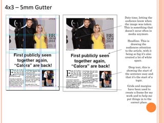
- 1. 4x3 – 5mm Gutter Date time, letting the audience know when the image was taken. This is something that doesn’t occur often in media anymore. Headline. This is drawing the audiences attention to the article, with it being so big it’s also created a lot of white space. Drop text, this is showing the start of the sentence easy and that it’s the start of a topic. Grids and margins have been used to create a frame for my work and to help me put things in to the correct place.
- 2. 3x3 – 5mm Gutter Headline, this will attract the audiences attention. Strap line, this is telling the audience a little more about what the article is going to be about before they go on to reading it. Medium sized baseline has been used, doing this has made my text look as if there is more too it. Grids and margins have been used again to set frames for my work and un-able me to put things in to the correct places. Drop text has been used to draw the audiences attention to a new subject.
- 3. 6x6 – 5mm gutter Header, this is informing the audience again what the article is about, it is also leaving quite a lot of white space on the article. Drop text has been used again in this to try and gain the audiences attention to the beginning of the article. The baseline for this text is the same size as the other text, again making it look as if there is quite a lot of text, though this may put some people off. A boarder has been used around the edge of the image to create more of a professional look.
- 4. To do my layouts I used InDesign, I found this software quite hard to use as it is different to other things that I have used, like Photoshop, I found that it was more complicated when doing my work, and it took longer to do than it would on Photoshop, overall though I think that it was quite interesting to use as it was something different. I used grids and margins in my work to create a frame for my work so that it looked neater, it also helped me to put things in the correct placement. This enabled me to gain more of a professional look when making my mock layouts, this is something that I will do in my last piece, as it helps to make it look more formal as well. For the text I used two columns, this gave my article more of a structured look too It, it’s also kept my work portrait as well. This is what standard double page spreads will be like. I also used quite a block-y font, which was serif, this means that the text I used didn’t have any flicks and it was quite a masculine text, this may put the female audience off, so this is something that I would need to consider when creating my final piece, depending on what the subject is I will have to take in to consideration whether the font will be serif, quite a square font, or sans serif, which is a font with flicks on the end of the lettering, which Is seen as quite a feminine font. The headline that I have created is big and bold, this will get the audiences attention. The baseline for my text is quick little, this makes the text look more dense as well. I think that overall my work looks quite dull and boring because there isn’t really much going on because they are only mock versions, in my final pieces I will make it so that there is more colour too it rather than it mostly being just black and white, this would put me off reading the article as a customer. Technically I don’t think that my work is very aesthetic either because all I had to do was copy and paste text and drop images in to where the margins/grids where, I thin k that it could have been more interesting if I had more time and also if this where a final piece.
- 6. 6x4
- 7. 8x2
- 8. I liked doing this version of layouts more because to me it looks more aesthetically pleasing and it also looks more technical, I liked the way that everything wasn’t really neat though it is at the same time, the idea of things being cut in half and being in different directions is more interesting to me because It gives you more to look at, even though there is a lot of negative space, the overlapping parts make up for it giving you a lot to look at. The best parts of both pieces is how the text overlaps the images because it looks as if the text has actually been written on to the subjects skin, I think that it makes it look more interesting and more in depth.