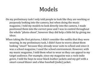
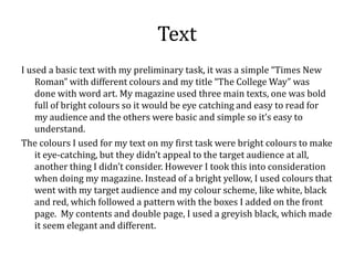
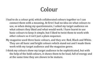
Looking back to your preliminary task,
what do you feel that you have learnt in the
progression from it to the full product?
Looking Back
This is my preliminary task for school students and the parents of the
   students, as you can see it’s not good.
                                             There’s multiple text, different
                                             colours which make it hard to
                                             understand. The photo’s are
                                             badly re-arranged and
                                             widespread all over the page,
                                             which makes the image seem
                                             bigger than it originally is.
                                             My contents page is appalling, no
                                             organisation and it just looks like
                                             someone chucked things
                                             together to make “work.”
Photoshop
At the beginning of this project, and whilst doing the preliminary task, I
    didn’t use Photoshop. Instead I used Microsoft publisher to quickly put
    everything together. So I can’t say a lot on the Photoshop side, but
    when I started my first draft I found Photoshop amazingly difficult.
    When I wanted to rub out things, it decided to wipe out someone's face
    or leg, but from time to time I found out that you can control the rubber
    with different settings. Layers were a difficulty to deal with, I kept
    making a layer, but it wouldn’t let me change something with my work
    and then I realised that it was the wrong layer, also getting them in
    order was one of my difficulties.
However throughout this course I have developed a knowledge of
    Photoshop which allowed me to make my magazine pages better than
    what I previously started with.
Images
The one thing I found most difficult when dealing with images is when I
   was taking the photos and didn’t consider peoples posture, body
   movement, camera “shake” and disappearing limbs. Which is not a
   good thing when editing a photo, and then realising that you can’t make
   it do what you intended to do because of missing body parts like an
   arm or a leg. Since I didn’t take all of that into consideration at the
   beginning. So half way through on making my magazine, I had to re-
   take my photo’s, which set me back a weeks worth of editing.
When re-taking my photo’s, I used a guide which told me the camera shots
   and camera angles, so that helped me make my photo’s better than
   before.
So I have learnt whilst taking photo’s, I have to consider whether or not
   there whole body is in the shot, so when editing I won’t have any
   complications. And I have also considered the lighting and my
   backgrounds, and if they work with what I am trying to produce.
Models
On my preliminary task I only told people to look like they are working or
   purposely looking into the camera, but when doing the music
   magazine, I told my models to look directly into the camera, I made
   positioned them into the correct pose and I was in control throughout
   the whole “photo-shoot”, however they did help a little bit by giving me
   ideas.
When taking the first pictures, I didn’t consider the outfits that they were
   wearing. In my preliminary task, I didn’t have to worry about them
   looking “smart” because they already wear suits to school and since it
   was a school magazine, I used the school environment. However, with
   my music magazine, I told them what to wear so they can appeal to my
   target audience. For example, since my magazine was a rock-indie
   genre, I told the boys to wear black leather jackets and my girl with a
   smart-casual blazer and a blue baseball (indie) jacket.
Text
I used a basic text with my preliminary task, it was a simple “Times New
    Roman” with different colours and my title “The College Way” was
    done with word art. My magazine used three main texts, one was bold
    full of bright colours so it would be eye catching and easy to read for
    my audience and the others were basic and simple so it’s easy to
    understand.
The colours I used for my text on my first task were bright colours to make
    it eye-catching, but they didn’t appeal to the target audience at all,
    another thing I didn’t consider. However I took this into consideration
    when doing my magazine. Instead of a bright yellow, I used colours that
    went with my target audience and my colour scheme, like white, black
    and red, which followed a pattern with the boxes I added on the front
    page. My contents and double page, I used a greyish black, which made
    it seem elegant and different.
Colour
I had to do a colour grid, which collaborated colours together so I can
    connect them with a meaning. At first I had no idea on what colours to
    use, so when doing my questionnaire, I asked my target audience on
    what colours they liked and what would work. I have learnt to use
    basic colours to keep it simple, but I liked to twist them to work with
    other colours so it isn’t just a plain sequence.
My magazine used three basic colours, and they are: Red, Black and White.
    They are all basic and bright colours which stand out and I made them
    work with my target audience and the magazine genre.
I think my colours show my target audience to be sophisticated, but with
    the help of the bold colours, it shows them to be loud, full of energy and
    at the same time they are shown to be mature.
Overall
Overall, I have learnt to take the little things into consideration mainly so I
  don’t mess up like I did at the start. At the beginning I had little skills
  for Photoshop, and now I know how to edit photo’s, make layers and
  backdrops and many more. When picking a target audience, I have
  learnt to keep it simple, my magazine is aimed at unisex teenagers from
  the ages of 13-17, when at the beginning I wanted it to be for ages of
  16-24, but that changed when I realised that what I was making didn’t
  suit that age range.

I have also learnt to make:
- Questionnaires
- A proper blog
- Prezi (presentation device)
And many more, during this process.

Evaluation question 7

  • 1.
    Looking back toyour preliminary task, what do you feel that you have learnt in the progression from it to the full product?
  • 2.
    Looking Back This ismy preliminary task for school students and the parents of the students, as you can see it’s not good. There’s multiple text, different colours which make it hard to understand. The photo’s are badly re-arranged and widespread all over the page, which makes the image seem bigger than it originally is. My contents page is appalling, no organisation and it just looks like someone chucked things together to make “work.”
  • 3.
    Photoshop At the beginningof this project, and whilst doing the preliminary task, I didn’t use Photoshop. Instead I used Microsoft publisher to quickly put everything together. So I can’t say a lot on the Photoshop side, but when I started my first draft I found Photoshop amazingly difficult. When I wanted to rub out things, it decided to wipe out someone's face or leg, but from time to time I found out that you can control the rubber with different settings. Layers were a difficulty to deal with, I kept making a layer, but it wouldn’t let me change something with my work and then I realised that it was the wrong layer, also getting them in order was one of my difficulties. However throughout this course I have developed a knowledge of Photoshop which allowed me to make my magazine pages better than what I previously started with.
  • 4.
    Images The one thingI found most difficult when dealing with images is when I was taking the photos and didn’t consider peoples posture, body movement, camera “shake” and disappearing limbs. Which is not a good thing when editing a photo, and then realising that you can’t make it do what you intended to do because of missing body parts like an arm or a leg. Since I didn’t take all of that into consideration at the beginning. So half way through on making my magazine, I had to re- take my photo’s, which set me back a weeks worth of editing. When re-taking my photo’s, I used a guide which told me the camera shots and camera angles, so that helped me make my photo’s better than before. So I have learnt whilst taking photo’s, I have to consider whether or not there whole body is in the shot, so when editing I won’t have any complications. And I have also considered the lighting and my backgrounds, and if they work with what I am trying to produce.
  • 5.
    Models On my preliminarytask I only told people to look like they are working or purposely looking into the camera, but when doing the music magazine, I told my models to look directly into the camera, I made positioned them into the correct pose and I was in control throughout the whole “photo-shoot”, however they did help a little bit by giving me ideas. When taking the first pictures, I didn’t consider the outfits that they were wearing. In my preliminary task, I didn’t have to worry about them looking “smart” because they already wear suits to school and since it was a school magazine, I used the school environment. However, with my music magazine, I told them what to wear so they can appeal to my target audience. For example, since my magazine was a rock-indie genre, I told the boys to wear black leather jackets and my girl with a smart-casual blazer and a blue baseball (indie) jacket.
  • 6.
    Text I used abasic text with my preliminary task, it was a simple “Times New Roman” with different colours and my title “The College Way” was done with word art. My magazine used three main texts, one was bold full of bright colours so it would be eye catching and easy to read for my audience and the others were basic and simple so it’s easy to understand. The colours I used for my text on my first task were bright colours to make it eye-catching, but they didn’t appeal to the target audience at all, another thing I didn’t consider. However I took this into consideration when doing my magazine. Instead of a bright yellow, I used colours that went with my target audience and my colour scheme, like white, black and red, which followed a pattern with the boxes I added on the front page. My contents and double page, I used a greyish black, which made it seem elegant and different.
  • 7.
    Colour I had todo a colour grid, which collaborated colours together so I can connect them with a meaning. At first I had no idea on what colours to use, so when doing my questionnaire, I asked my target audience on what colours they liked and what would work. I have learnt to use basic colours to keep it simple, but I liked to twist them to work with other colours so it isn’t just a plain sequence. My magazine used three basic colours, and they are: Red, Black and White. They are all basic and bright colours which stand out and I made them work with my target audience and the magazine genre. I think my colours show my target audience to be sophisticated, but with the help of the bold colours, it shows them to be loud, full of energy and at the same time they are shown to be mature.
  • 8.
    Overall Overall, I havelearnt to take the little things into consideration mainly so I don’t mess up like I did at the start. At the beginning I had little skills for Photoshop, and now I know how to edit photo’s, make layers and backdrops and many more. When picking a target audience, I have learnt to keep it simple, my magazine is aimed at unisex teenagers from the ages of 13-17, when at the beginning I wanted it to be for ages of 16-24, but that changed when I realised that what I was making didn’t suit that age range. I have also learnt to make: - Questionnaires - A proper blog - Prezi (presentation device) And many more, during this process.