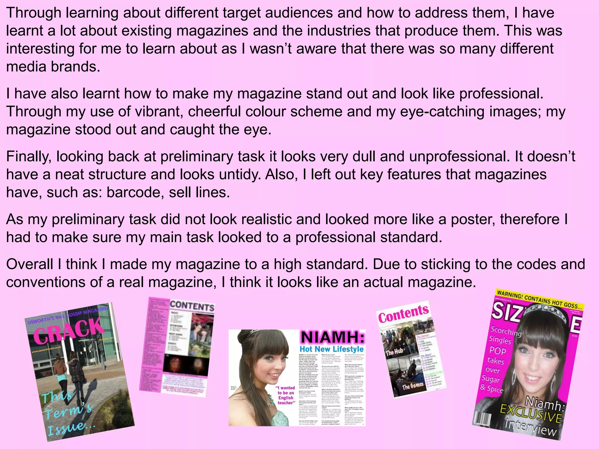
The document discusses what the author learned from their preliminary magazine cover task to their full magazine product. They realized the importance of structuring the magazine professionally for their target audience. This included using coordinated colors that conveyed the right message, taking better photos, and addressing the audience more directly. They also learned key elements magazines include like barcodes and sell lines. Overall, the preliminary task looked dull while the final product looked like a realistic, high quality magazine through applying these lessons.
As presented on February 9, 2015 at Interaction 15 in San Francisco.
Video of talk: https://vimeo.com/122052064
A mission is that which gives us purpose. In movies and books, the entire plot generally centers around the protagonist's mission. In real life, however, we often limit our understanding of "mission-driven" work to charities and non-profits. In reality, every designer can seize the opportunity to do work with greater meaning.
This talk is a practical guide to defining and understanding the mission that your work serves, whether you design for a tiny non-profit or the largest technology company. We'll look at successful examples of mission-driven design from both the non-profit and commercial sectors, and discuss methods for infusing this perspective into your own work. Ultimately, this session will give you the tools to become more purposeful
in everything that you design.
Designing The Listening Experience: The Making of NPR OneDaniel Newman
As presented on October 6, 2015 at HOW Interactive Design Conference in Chicago.
NPR One is a personalized audio experience designed to be heard. If we are doing our job well, then you likely aren’t even looking at your device. But being out-of-sight creates a unique set of constraints for building a mobile app. How do we craft an experience for that is audio-first? How do we design interfaces that are simple, content-first, and easy-to-understand, even if they're only used once in awhile? And how does the team work to evolve the experience and add new features while avoiding bloat and retaining the focus that is the hallmark of the app?
In this session, l'll discuss the evolution of NPR’s new digital radio platform, from inception to obstacles to examples of interactions built for listening. I'll talk about team dynamics and process, user research and A/B test findings, and delve into the paths not taken. Ultimately, you'll be able to learn from our successes and missteps as we continue to build the ultimate audio news and storytelling experience.
absorspi minyak jelantah dengan serat ampas tebuYoga Firmansyah
Absorpsi, Absorpsi Absorpsi Absorpsi Absorpsi Absorpsi Absorpsi Absorpsi Absorpsi Absorpsi Absorpsi Absorpsi Absorpsi Absorpsi minyak minyak minyak minyak minyak minyak minyak minyak minyak minyak minyak minyak minyak minyak minyak Jelantah Jelantah Jelantah Jelantah Jelantah Jelantah Jelantah Jelantah Jelantah Jelantah Serat Ampas tebu Ampas tebu Ampas tebu Ampas tebu Ampas tebu Ampas tebu Ampas tebu Ampas tebu Ampas tebu Ampas tebu Ampas tebu Ampas tebu Ampas tebu Ampas tebu
1. 7) Looking back at your preliminary
task, what do you feel you have learnt in
the progression from it to the full
product?
Preliminary Task –
Front Cover
Full Product – Front
Cover
2. I took my own images when creating my preliminary task, as did
I when I created my product. However, in my preliminary task I
used a long shot of two students walking in to college. With using
a long shot of two pupils with there backs turned, this doesn't’t
make the cover eye-catching. Therefore it doesn't’t connect with
a reader.
Also, I used very feminine colours when creating my preliminary
task. Although I also used feminine colours when producing my
product, my target audiences were
both different. For my preliminary task, I should have used neutral colours to attract both
a male and female audience.
I think by having a lot of background colours in my preliminary tasks causes your eye to
wander. On my main task I used a simple, clean and effective image that stands out and
attracts a readers attention. This is a massive improvement from my preliminary task
because by having a dominant eye-catching image it will attract my audience. By having
a close up image of only one person, helps my front cover look to a more professional
standard.
Also for my preliminary task, I did not make the text stand out. In my opinion look dull
and would not catch anyone’s eye. With this, I also used a variety of different fonts. By
doing this it make the cover look unprofessional and unorganised. Therefore with this in
mind, for my main product I used the same font throughout and put it in bold so it was
eye-catching.
3. I made my front cover very
vibrant, colourful and fun. I catered the
style of my magazine so that all the
features would pull in my target This is my masthead
audience. I also stuck to a house style on my preliminary task.
colour scheme, this making it look It is in a big font
structured and neat. The colours work however it would have
very well together and put forward looked better if I had
positive connotations. They all added an outline – this
complement each other and work well is because it would
as a whole. stand out more.
This is the my main sell line that I
created for my preliminary task. It is
I did make a skyline when I created this dull and boring. It wouldn’t attract any
task. However it was hard to read and didn’t readers. The font
stand out. doesn’t stand out
Here I have a lot of empty and isn’t very
space. It implies that the interesting. The
magazine is going to be dull colour also blends
and not going to hold much into the
‘crack’. I could have filled in background and
this space with sell lines. looks out of place.
4. This is my skyline that I used in my
final product. This is a play on words
with the police warning tape:
‘WARNING! WARNING! WARNING!’
and ‘POLICE LINE DO NOT CROSS’. I made it so that my masthead was beneath
my main image. This gives the illusion that the
magazine is popular and well known.
My main sell line on my final product it very eye-
catching. It has the name of the artist ‘Niamh’ – this
is very similar to other well known magazine brands.
Also, with the word ‘EXCLUSIVE’ being in a slightly
bigger size, it makes it stand out to the reader and
I also included 3 sell lines – all of automatically implies that it is exclusive
which are catchy and fun. Also, by news. The word is also being coloured in
adding in these sell line, it fills in yellow, which is part of my colour scheme
some space on the front cover. and matches my skyline. The sell line
Therefore making the magazine stands out and appears interesting to the
look more detailed and tells the audience as it is in a big font and is linked
reader that it contains a lot of to the main image.
good articles.
5. This is my contents page that I created for my
preliminary task. I took the images by myself and
catered them towards my audience. This is because
all of the images were taken around Usworth
College, which is what the magazine is about.
Also, with the images being taken of people in there
break it implies that there is ‘crack’ (gossip) contained
in the magazine.
Along the right hand side of the page is the contents
page. This does contain a lot of articles which are
linked to the magazine. However I do not like how I
structured the page numbers. Also, I don’t like how I
changed the colour of each heading. I think it would
have looked a lot neater if I would have kept the
headings the same.
Another thing that I don’t like is how there is text over
the images that I have used. I think this ruins the
images and the text looks out of place.
The images that I used in both pieces are very different. In my preliminary task the
lighting on my photos is wrong – this makes it look dull and unprofessional.
Also I have missed out the essential information that most magazines contain on their
contents pages.
6. By having top singles and
albums across the left hand
side gives more detail to
the page. It fills in a lot of
On my final product, this is my title.
gaps and makes the page
It is the exact same font and style
appear more interesting.
as my masthead. The colours
stand out and are will defiantly
catch the eye. By being eye-
catching it implies that the contents I have included the issue
is defiantly a page to read. number and date – this
is what other top brand
magazines do.
I added a competition for
my readers to get involved
with. Again this is similar to
other magazines, but it
also takes up more space
on the contents page and
makes it look interesting.
7. I made it so that all of The images on my contents were all
my headings were taken by myself. For each image, I
exactly the same. This have found a good catchy article name.
making it look neat
and professional. The images are structured neatly along
the side of the contents page – all of
Also, I made it so that which are the same size.
there was only one
page number next to
an article. I personally
think this looks more
organised.
Instead of writing on my images, I added small page
numbers at the corner of the images. Depending on the
colour of the images, I altered the colour between black
and white. I the choose which one stood out better.
By doing this tells the reader what to expect to
see in certain articles.
8. I had no experience in making a DPS due to the I have stuck to a colour scheme
fact that I did not make one in my preliminary that all go well with each other.
task. I think with this in mind, my double page They are all very light, feminine
spread has came out to a high, professional colours.
standard. The title of the
DPS is in the
A large image has same font as
been used to take up my masthead
one side of the page. and contents.
Whilst the other side This adds to
is all text. the magazines
The image relates to structure.
the text and her body
language tells the
reader to read the
article. By featuring a
caption, pull-
It has correct lighting quote and
and carries off a having a 3
professional look. With having no experience in creating DPS’, column article.
I turned to other magazines for guidance. I This adds to
was influenced by Billboard and Heat creating a
Magazine. professional
look.
9. Looking back at your preliminary task, what do
you feel you have learnt in the progression from
it to the full product?
During this project I have learnt how to structure a magazine and how to make it look
professional and catered towards a certain target audience. Also, I have learnt how to
make certain colours work together. Through this I have realised that due to the colours
that you choose, can give on a variety of different attitudes.
By doing this project, I have learnt a variety of new skills – i.e. using Photoshop and
Blogger. Creating my magazine has allowed me to experiment more with different tools
on Photoshop that I wouldn’t have used before. Also, I would never have considered
ever using the programme Blogger. My editing and camera skills have also improved in
this task. It has shown me how to edit good image and also how to take good photos – it
informed me that depending on an angle of a photo, it can portray different meanings.
I also learnt that I needed to address my target audience more. When looking at my
preliminary task I looked at how I could have addressed my audience – therefore when I
was making my final product, I thought hard about how to attract my chosen audience.
10. Through learning about different target audiences and how to address them, I have
learnt a lot about existing magazines and the industries that produce them. This was
interesting for me to learn about as I wasn’t aware that there was so many different
media brands.
I have also learnt how to make my magazine stand out and look like professional.
Through my use of vibrant, cheerful colour scheme and my eye-catching images; my
magazine stood out and caught the eye.
Finally, looking back at preliminary task it looks very dull and unprofessional. It doesn’t
have a neat structure and looks untidy. Also, I left out key features that magazines
have, such as: barcode, sell lines.
As my preliminary task did not look realistic and looked more like a poster, therefore I
had to make sure my main task looked to a professional standard.
Overall I think I made my magazine to a high standard. Due to sticking to the codes and
conventions of a real magazine, I think it looks like an actual magazine.