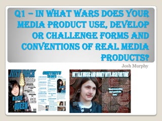
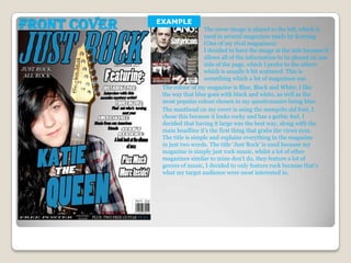
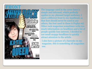
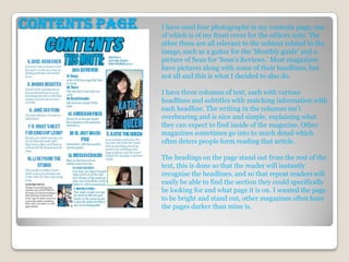
Q1 – In what wars does your
media product use, develop
    or challenge forms and
 conventions of real media
                  products?
                     Josh Murphy
Front Cover   EXAMPLE
                               The cover image is placed to the left, which is
                               used in several magazines made by Kerrang
                               (One of my rival magazines)
                               I decided to have the image at the side because it
                               allows all of the information to be placed on one
                               side of the page, which I prefer to the others
                               which is usually b bit scattered. This is
                               something which a lot of magazines use.
               The colour of my magazine is Blue, Black and White. I like
               the way that blue goes with black and white, as well as the
               most popular colour chosen in my questionnaire being blue.
               The masthead on my cover is using the mesquite std font, I
               chose this because it looks rocky and has a gothic feel. I
               decided that having it large was the best way, along with the
               main headline it’s the first thing that grabs the views eyes.
               The title is simple and explains everything in the magazine
               in just two words. The title ‘Just Rock’ is used because my
               magazine is simply just rock music, whilst a lot of other
               magazines similar to mine don’t do, they feature a lot of
               genres of music, I decided to only feature rock because that’s
               what my target audience were most interested in.
Front   The language used in the cover lines is
Cover   simple and informal, which perfectly
        applies to my planned target audience. I
        used a different front to my masthead, as
        that font should never be used in any
        others, the font used in these is Poplar std.
        Other rock magazines sometimes write too
        much information on headlines and a lot of
        people quickly lose interest, I decided to
        use small snappy headlines to quickly
        attract attention to the article.
        I also have a picture of a barcode on my
        magazine, this is something all magazines
        use.
Contents page   I have used four photographs in my contents page, one
                of which is of my front cover for the editors note. The
                other three are all relevant to the subtext related to the
                image, such as a guitar for the ‘Monthly guide’ and a
                picture of Sean for ‘Sean's Reviews.’ Most magazines
                have pictures along with some of their headlines, but
                not all and this is what I decided to also do.

                I have three columns of text, each with various
                headlines and subtitles with matching information with
                each headline. The writing in the columns isn’t
                overbearing and is nice and simple, explaining what
                they can expect to find inside of the magazine. Other
                magazines sometimes go into to much detail which
                often deters people form reading that article.

                The headings on the page stand out from the rest of the
                text, this is done so that the reader will instantly
                recognise the headlines, and so that repeat readers will
                easily be able to find the section they could specifically
                be looking for and what page it is on. I wanted the page
                to be bright and stand out, other magazines often have
                the pages darker than mine is.
The colour scheme used on the contents
Contents page   page follows that off the front cover, I did
                this because it is instantly recognisable
                which magazine the page belongs to, and
                so that views would get used to the colour
                and would associate the colours with my
                magazine. Other magazines tend to use
                different colour styles and fonts, but I
                decided for the contents page alone it
                would be best to keep it similar to the front
                cover, so the readers can familiarise them
                self with the magazines style.

                Once again I decided to use simple,
                informal language for the contents page
                (Just as I did for the front cover.) I chose to
                do this because it welcomes people to the
                magazine, and so it doesn't feel like a
                lecture book, more of a fun interesting
                read.
For the double pages spread I
took pictures of Josh Fortune
and placed it on the left side of
the page, for the coins in the
background I took a picture of
several coins and copied several
of these on top of each other to
give the effect of lots of money. I
used the coins because of Josh’s
second name, Fortune. A lot of
magazines do the same as this.

Once again I have three
columns, these are spread across
a single page as the image is
used on the other.

The heading is bring and
standout, it will be the first thing
the reader sees when looking at
the page, it mentions money
with links with Josh’s second
name and the background
image.
                                       Unlike my contents page and front cover, the double
                                       page spread uses slightly informal language, I did
                                       this because the interview is informative, but at the
                                       same time it is not to serious, so some aspects of it
                                       are informal, so it’s still enjoyable and not a chunk of
                                       text from a school book


Double Page Spread
Again I used a similar
colour scheme, but I
did not implement the
colour black onto the
page because with the
coins in the
background it would
not stand out, I use
standout colours and
images in my
magazine, so it would
not be keeping with
the tone of my
magazine.

 Unlike my contents page and front cover, the double page spread uses
 slightly informal language, I did this because the interview is
 informative, but at the same time it is not to serious, so some aspects of it
 are informal, so it’s still enjoyable and not a chunk of text from a school
 book
Double Page Spread

Q1

  • 1.
    Q1 – Inwhat wars does your media product use, develop or challenge forms and conventions of real media products? Josh Murphy
  • 2.
    Front Cover EXAMPLE The cover image is placed to the left, which is used in several magazines made by Kerrang (One of my rival magazines) I decided to have the image at the side because it allows all of the information to be placed on one side of the page, which I prefer to the others which is usually b bit scattered. This is something which a lot of magazines use. The colour of my magazine is Blue, Black and White. I like the way that blue goes with black and white, as well as the most popular colour chosen in my questionnaire being blue. The masthead on my cover is using the mesquite std font, I chose this because it looks rocky and has a gothic feel. I decided that having it large was the best way, along with the main headline it’s the first thing that grabs the views eyes. The title is simple and explains everything in the magazine in just two words. The title ‘Just Rock’ is used because my magazine is simply just rock music, whilst a lot of other magazines similar to mine don’t do, they feature a lot of genres of music, I decided to only feature rock because that’s what my target audience were most interested in.
  • 3.
    Front The language used in the cover lines is Cover simple and informal, which perfectly applies to my planned target audience. I used a different front to my masthead, as that font should never be used in any others, the font used in these is Poplar std. Other rock magazines sometimes write too much information on headlines and a lot of people quickly lose interest, I decided to use small snappy headlines to quickly attract attention to the article. I also have a picture of a barcode on my magazine, this is something all magazines use.
  • 4.
    Contents page I have used four photographs in my contents page, one of which is of my front cover for the editors note. The other three are all relevant to the subtext related to the image, such as a guitar for the ‘Monthly guide’ and a picture of Sean for ‘Sean's Reviews.’ Most magazines have pictures along with some of their headlines, but not all and this is what I decided to also do. I have three columns of text, each with various headlines and subtitles with matching information with each headline. The writing in the columns isn’t overbearing and is nice and simple, explaining what they can expect to find inside of the magazine. Other magazines sometimes go into to much detail which often deters people form reading that article. The headings on the page stand out from the rest of the text, this is done so that the reader will instantly recognise the headlines, and so that repeat readers will easily be able to find the section they could specifically be looking for and what page it is on. I wanted the page to be bright and stand out, other magazines often have the pages darker than mine is.
  • 5.
    The colour schemeused on the contents Contents page page follows that off the front cover, I did this because it is instantly recognisable which magazine the page belongs to, and so that views would get used to the colour and would associate the colours with my magazine. Other magazines tend to use different colour styles and fonts, but I decided for the contents page alone it would be best to keep it similar to the front cover, so the readers can familiarise them self with the magazines style. Once again I decided to use simple, informal language for the contents page (Just as I did for the front cover.) I chose to do this because it welcomes people to the magazine, and so it doesn't feel like a lecture book, more of a fun interesting read.
  • 6.
    For the doublepages spread I took pictures of Josh Fortune and placed it on the left side of the page, for the coins in the background I took a picture of several coins and copied several of these on top of each other to give the effect of lots of money. I used the coins because of Josh’s second name, Fortune. A lot of magazines do the same as this. Once again I have three columns, these are spread across a single page as the image is used on the other. The heading is bring and standout, it will be the first thing the reader sees when looking at the page, it mentions money with links with Josh’s second name and the background image. Unlike my contents page and front cover, the double page spread uses slightly informal language, I did this because the interview is informative, but at the same time it is not to serious, so some aspects of it are informal, so it’s still enjoyable and not a chunk of text from a school book Double Page Spread
  • 7.
    Again I useda similar colour scheme, but I did not implement the colour black onto the page because with the coins in the background it would not stand out, I use standout colours and images in my magazine, so it would not be keeping with the tone of my magazine. Unlike my contents page and front cover, the double page spread uses slightly informal language, I did this because the interview is informative, but at the same time it is not to serious, so some aspects of it are informal, so it’s still enjoyable and not a chunk of text from a school book Double Page Spread