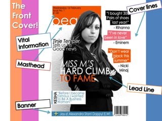
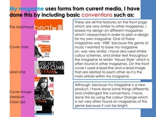
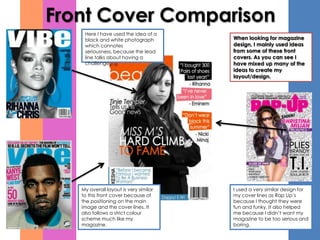
How does ‘ Beat ’
Magazine conform
and/or challenge the
conventions of
magazine design?
The
Front
Cover!
The
Contents!
The Double Page Spread!
My magazine uses forms from current media, I have
done this by including basic conventions such as:
                        These are all the features on the front page
The Masthead            which are very similar to other magazines, I
                        based my design on different magazines
                        which I researched in order to plan a design
                        for my own magazine. One of these
                        magazines was ‘VIBE’ because the genre of
Cover Lines             music I wanted to base my magazine
                        on, was very similar. I have also used similar
                        colour schemes, and similar text throughout
                        the magazine to retain ‘House Style’ which is
                        often found in other magazines. On the front
                        cover I used a lead line and a lead image
Lead Line               that are related to each other as it is the
                        main article within my magazine.

                        Although, because my magazine is a new
                        product, I have done some things differently
Cover Image             and challenged the conventions, I have
(Medium                 done this by using the colour Orange which
Close Up)               is not very often found on magazines of this
                        genre because it can be bright.
Front Cover Comparison
    Here I have used the idea of a
    black and white photograph         When looking for magazine
    which connotes                     design, I mainly used ideas
    seriousness, because the lead      from some of these front
    line talks about having a          covers. As you can see I
    challenge.                         have mixed up many of the
                                       ideas to create my
                                       layout/design.


   My overall layout is very similar   I used a very similar design for
   to this front cover because of      my cover lines as Rap Up’s
   the positioning on the main         because I thought they were
   image and the cover lines. It       fun and funky. It also helped
   also follows a strict colour        me because I didn’t want my
   scheme much like my                 magazine to be too serious and
   magazine.                           boring.
My magazine uses forms from current media, I have
done this by including basic conventions such as:

Title
                        These are all the features I believe are
                        conventional to a magazine. I have kept the
                        colour scheme of the magazine very well as
                        it has maintained the house style, I have also
                        used the same font as the front page and
Feature Stories         throughout the contents page. Although, for
                        the editors not I have used a ‘Script’ font
                        because this often seen in magazines
                        because it wants to feel like the editor has
                        handwritten their message. I have also
                        included the page numbers and a short
Regulars                introduction to the features, because these
                        are exclusive therefore their importance
                        needs to be emphasised. I have also placed
                        the regulars on the other side of the contents
                        page, but these have less emphasis because
                        people who often buy the magazine know
                        they are there anyway.
Editors Note

Evaluation

  • 1.
    How does ‘Beat ’ Magazine conform and/or challenge the conventions of magazine design?
  • 2.
  • 3.
  • 4.
  • 5.
    My magazine usesforms from current media, I have done this by including basic conventions such as: These are all the features on the front page The Masthead which are very similar to other magazines, I based my design on different magazines which I researched in order to plan a design for my own magazine. One of these magazines was ‘VIBE’ because the genre of Cover Lines music I wanted to base my magazine on, was very similar. I have also used similar colour schemes, and similar text throughout the magazine to retain ‘House Style’ which is often found in other magazines. On the front cover I used a lead line and a lead image Lead Line that are related to each other as it is the main article within my magazine. Although, because my magazine is a new product, I have done some things differently Cover Image and challenged the conventions, I have (Medium done this by using the colour Orange which Close Up) is not very often found on magazines of this genre because it can be bright.
  • 6.
    Front Cover Comparison Here I have used the idea of a black and white photograph When looking for magazine which connotes design, I mainly used ideas seriousness, because the lead from some of these front line talks about having a covers. As you can see I challenge. have mixed up many of the ideas to create my layout/design. My overall layout is very similar I used a very similar design for to this front cover because of my cover lines as Rap Up’s the positioning on the main because I thought they were image and the cover lines. It fun and funky. It also helped also follows a strict colour me because I didn’t want my scheme much like my magazine to be too serious and magazine. boring.
  • 7.
    My magazine usesforms from current media, I have done this by including basic conventions such as: Title These are all the features I believe are conventional to a magazine. I have kept the colour scheme of the magazine very well as it has maintained the house style, I have also used the same font as the front page and Feature Stories throughout the contents page. Although, for the editors not I have used a ‘Script’ font because this often seen in magazines because it wants to feel like the editor has handwritten their message. I have also included the page numbers and a short Regulars introduction to the features, because these are exclusive therefore their importance needs to be emphasised. I have also placed the regulars on the other side of the contents page, but these have less emphasis because people who often buy the magazine know they are there anyway. Editors Note