The document provides an evaluation of the contents and design of a magazine cover and first few pages. Key points include:
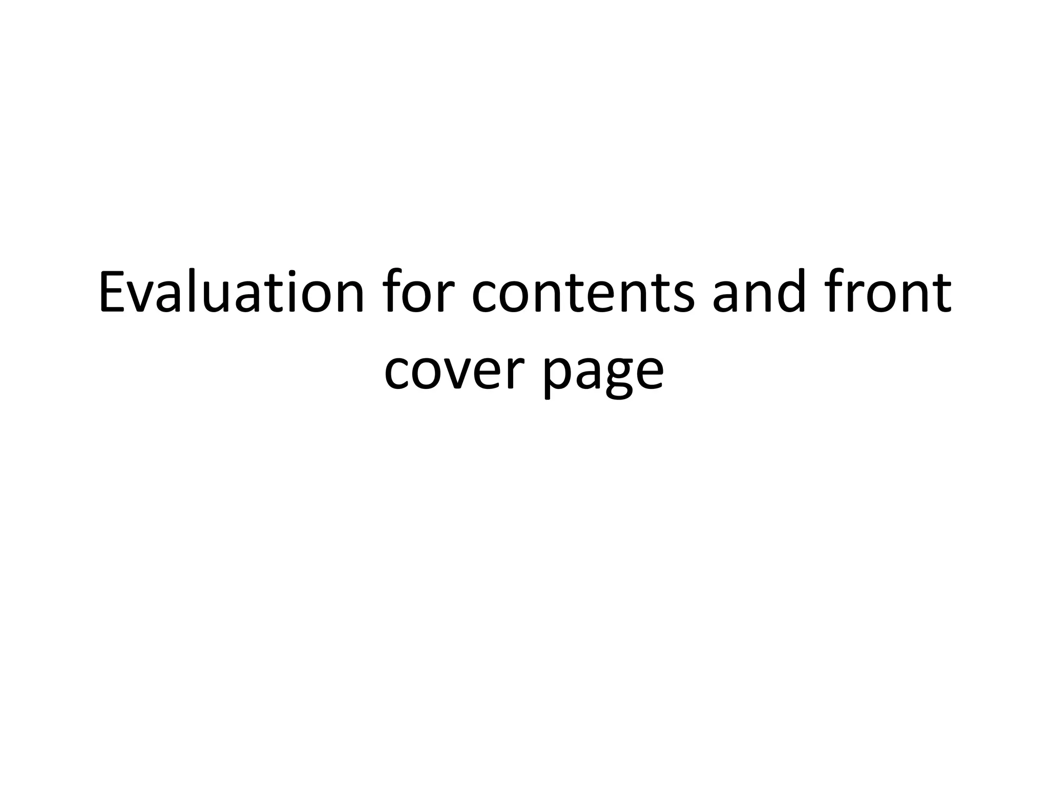
- The masthead uses a serif font to look formal but the letters are thin and bold for modern look. A subhead is also included.
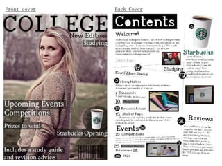
- The lead image could be improved with a lighter background to make the cover less dull.
- Cover lines use transparent black boxes to stand out against dark colors while maintaining a modern look.
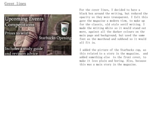
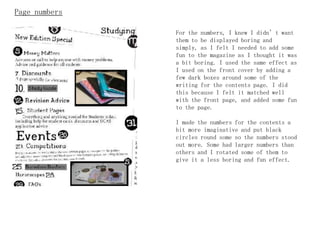
- The contents page mimics the cover design but could have better pictures. Page numbers have creative treatments like circles.
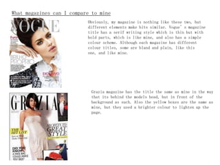
- Comparable magazines like Vogue and Grazia inspired some design elements but with brighter colors. Overall, brighter