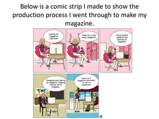
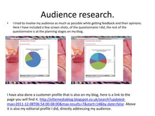
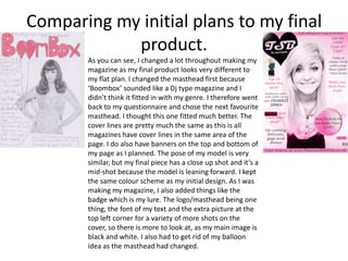
The document evaluates the conventions used in the author's magazine compared to a real magazine. Some key points made:
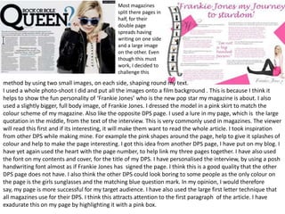
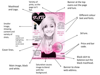
- The author's masthead is clearer than the one being compared, which has its image covered up.
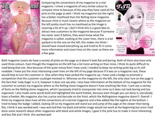
- Both magazines use a variety of pinks and only three colors, though the compared magazine has more dense cover lines.
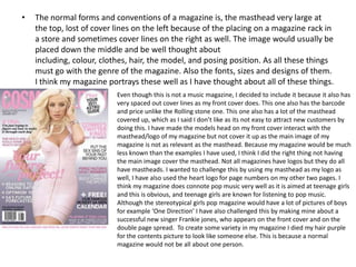
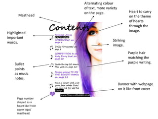
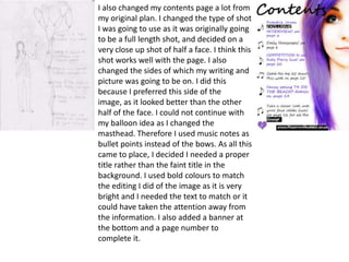
- The author's contents page could fit more information and smaller text when printed, and its image is less interesting.
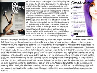
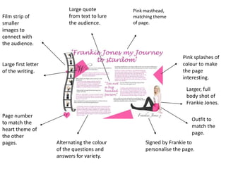
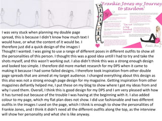
- The author's double-page spread uses two small images rather than one large image, with a film strip design and colors.
- The author believes their magazine represents conventions well while also adding personal touches.