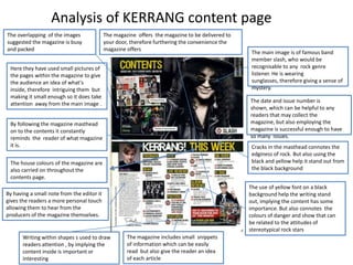
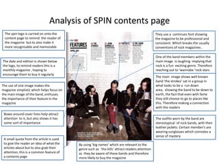
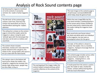
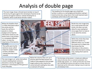
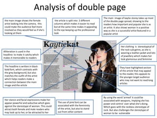
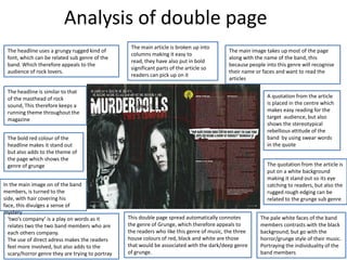
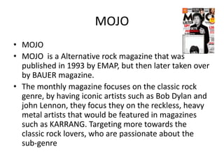
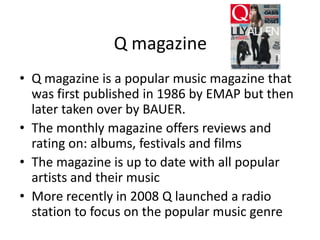
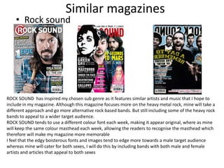
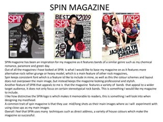
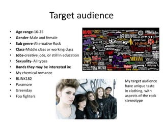
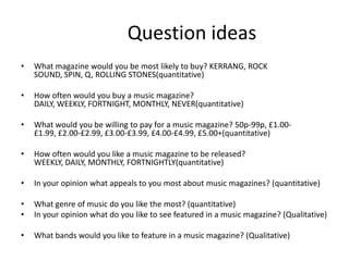
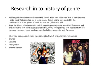
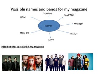
The document analyzes the covers and content pages of several rock music magazines, including Kerrang, Rock Sound, and Spin. Some key techniques used across magazines include iconic mastheads, bold fonts that convey energy, and imagery of recognizable rock artists to attract readers. Color schemes often incorporate darker tones like black, white and yellow. Cover lines use short, attention-grabbing phrases. Content pages provide a taste of articles through quotes and small images while maintaining the magazines' visual identities. Overall, the analyses show the magazines employ similar styles that align with perceptions of rock music to effectively target their audiences.