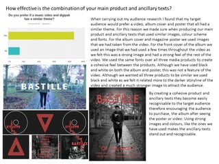
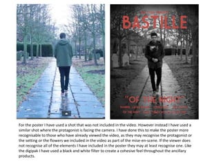
The document discusses the design choices made for the front cover of a digipak and poster for a music video. For the cover, an image was selected that was prominently featured in the video and encompassed its overall theme. The image brightness was increased and a black and white filter applied to create a strong background for the text. Black and white was chosen to represent the binary oppositions explored in the narrative. The text color was adjusted from red to a different shade that tied to elements in the video. The poster uses a similar shot to what was in the video to make it recognizable while still including familiar elements, and also applies a black and white filter for cohesion.