Evaluation Q1: In relation to ancillary tasks
•Download as PPT, PDF•
0 likes•279 views

The document discusses conventions used in psychological thriller media such as films and posters. It notes that psychological thrillers commonly use the colors red, black, and white to connote danger, violence, and mystery. Low-key lighting is also used on main subjects to create intrigue. For a poster, the author used close-ups of worried protagonists and dark colors in line with these conventions. The double page spread also followed conventions like a 12-point font size and large central image, while adapting the vertical image to a single page.
Report
Share
Report
Share

Recommended
Q1. film poster EVALUATION
This document evaluates how a media product uses, develops, and challenges conventions of real media products. It notes that the media product uses a gradient to make the edges darker, creating a mysterious feel. It features the killer as the main image and includes a blue tint. The film title is centered and close to the bottom in bold font to draw attention. It develops on conventions by depicting hands in a similar position and wearing dark clothing, but showing the killer from behind to appear more mysterious. The font used is white and bold. It challenges conventions by placing the slug line in a different location than other posters, mentioning people in the film at the top of the poster, and using a background that contains more thought than a comparable real
Analysis source code poster
The document analyzes and summarizes the key design elements of a source code movie poster. It notes that the dark background and colors create a sense of mystery, while contrasting red is used for the title to make it stand out. A pixelated effect on the main character creates the illusion of movement. The character holding a gun conveys the action and violence of the genre. The analysis concludes that these techniques intrigue audiences and effectively promote the movie.
Lighting ideas
Lighting is an important element in horror film trailers. Common lighting techniques used include ambient lighting to create realism, profile lighting to show two sides of a character, and backlighting or underlighting to generate suspense through silhouettes or ghostly effects. The document discusses how lighting in horror emphasizes darkness and the unknown to build fear and tension in viewers. It also notes that the film The Conjuring effectively uses dark and limited lighting in its basement scene to leave what may be lurking in shadows up to audience imagination.
Low key lighting
Low key lighting is a studio photography technique that uses high contrast between light and dark areas to create a dramatic, moody effect. It relies on accentuating shadows through strategic lighting placement. Images are often black and white but may include a single contrasting color. Several artists are discussed who have used low key lighting, including Quentin Arnaud, whose aim was to make faces "faceless" by shadowing models' features, and Yousuf Karsh, who ensured models could still be clearly seen despite shadowing for less dramatic results than other artists. The document also references an example of the author's own low key lighting photo experiment.
Inside slip presentation
1. The document describes 4 stages in designing the inside slip of a CD packaging to portray a subtle "good vs evil" theme related to war.
2. In Stage 2, the designers cropped an image from the poster to just show an angle of the face and added complimentary background color and lyrics.
3. Stage 3 manipulated the face on the right side to be darker to represent the "good vs evil" theme from their mind map.
Making magazine Cover
The document describes the process taken to design a magazine cover image based on a film. It involved finding a suitable base image, tracing it, and then coloring the tracing to emphasize certain features and create drama. Inspiration was taken from previous "Little White Lies" magazine covers, including using heavier shading on one side of the face to indicate a split personality, and burn-like markings on the neck to reference demons in the film. The goal was to capture the psychological thriller genre in a dramatic visual style inspired by past magazine covers.
The Colour Palette of Film
The document discusses how color palettes are used in films to convey moods, themes, and separate storylines. It provides examples of how specific films used color:
1) The Hours used different color filters and hues to separate the time periods and characters, giving Virginia Woolf's scenes a sepia tone, Julianne Moore's a pastel yellow, and Meryl Streep's a cold blue.
2) Munich defined each location with a specific color to orient viewers, with Beirut in blue-green, Rome warmer, Paris less saturated, and New York grainy.
3) Traffic used a blue/orange complementary scheme, with Mexico in orange and Ohio in blue.
Analysing Previous Students Work
This document analyzes and summarizes the strengths and weaknesses of previous students' films. For the film "The Edge", strengths included establishing tension through juxtaposition in the opening scene, using camera positioning to show who was being chased, incorporating non-diegetic music that built tension and changed to suit scenes, and using long shots and dim lighting to create an atmosphere of tension. Weaknesses were that the dark lighting sometimes made it hard to see, acting was weak at times due to a lack of dialogue, and the title font was confusing. For the film "Angel Dust", the analysis did not provide any details about its strengths or weaknesses.
Poster improvements
The document discusses design choices made in creating a movie poster. To maximize background space and add visual interest, the designer used a darkened image of character Stephen Adu. This emphasizes his anxious facial expression and eyes. The designer reduced the image's opacity to blend it in behind the knife, suggesting Stephen is one of the villain's victims. Awards were made more readable by applying a faded effect from black to white. The tagline was emphasized through font effects to highlight the secretive nature of the villain's deeds.
Mise en scene & lighting
This document discusses the elements of mise-en-scene in filmmaking, including costume, lighting and color, acting and proxemics, makeup and hair, props, and setting. It explains that mise-en-scene aims to establish the time, location, mood, and meaning through deliberate artistic choices. Key aspects covered include the use of lighting techniques like high key, low key, and backlighting to influence the audience's perceptions and create different atmospheres.
Lighting
Three point lighting refers to key lighting, fill lighting, and back lighting used in film production. Key lighting is the brightest light that aims at the main subject. Fill lighting reduces shadows created by the key light. Back lighting separates the subject from the background. There are different types of lighting like high key lighting which uses more fill light and creates brighter images, and low key lighting which uses less fill light and creates darker images with more shadows. Lighting techniques like backlighting, top lighting, and under lighting can be used to draw attention to certain objects or characters and create different moods like fear.
Making magazine cover part 2
This document describes the steps taken to design a magazine cover in the style of Little White Lies magazine. It involved scanning in an image and editing it for better contrast [1]. A Little White Lies badge was added by scanning and layering it [2]. The cover image was further edited to emphasize a split personality by making one eye red and the other perfect [3]. The title was manually positioned on the left shoulder [4]. A signature was added in the bottom corner following Little White Lies conventions [5].
Mise En Scene POWERPOINT
The document discusses various film techniques including mise-en-scene, setting, props, lighting, sound, costume/makeup, facial expressions, body language, positioning/space, and visual effects. It provides examples from horror movies like Jeepers Creepers analyzing how different techniques like isolated settings, crow sounds as props, dark lighting create atmosphere. Costuming in Grease and facial expressions in Confessions of a Shopaholic are also examined. Positioning uses examples from Karthik Calling Karthik and Avengers to demonstrate depth of space and frontality.
Mise en scene 14.10.14
Mise-en-scene refers to all the visual elements that a director can control within a scene, such as setting, costumes, lighting, staging of actors, and props. These elements are used to convey meaning and direct the audience's attention. Key aspects of mise-en-scene include setting, which establishes time and place; costumes and makeup, which provide clues about characters; lighting, which sets mood and guides vision; and staging of actors and their movements. Directors manipulate these various visual elements of mise-en-scene to achieve different artistic goals for their films.
Mise en scene
Mise en scene refers to everything presented within the frame of a film, including settings, costumes, lighting, and positioning of characters and objects. These elements are deliberately chosen by filmmakers to convey meaning and influence audience perception. For example, a tree can be made to look threatening through lighting, weather, and added elements, or non-threatening by showing children playing beneath it on a sunny day. Filmmakers also use mise en scene elements like settings, costumes, lighting, and character positioning to establish genre expectations and mood, provide clues about characters, and guide audience attention within a scene.
Ncf opresentation
The film is called "Misconception" and is a psychological thriller genre. It will be produced under the name "IceTex" and distributed by "Sunflower Productions". The film was influenced by "Black Swan" due to its dance elements and thriller genre. The unique selling point is that it is a rare dance thriller targeting 16-24 year old audiences, especially females, interested in psychological thrillers. The teaser trailer will use quick shots of dancers, studios, and mirrors with tense music to build suspense. The poster will feature dancers in a mirror where one reflection is different, and the magazine cover will use a double exposed image of a dancer in two poses.
Film poster analysis
This movie poster uses dark colors and a central image of a girl's face to attract the audience's attention. The girl's cute facial expression is meant to make the audience sympathize with her and want to know what happens in the film. Short text is used for optimal readability, with the title standing out in a distinctive font at the bottom to draw the eye down after viewing the key image.
Film Poster- Post-Production Diary
The document details the process of manipulating an image and composing a horror film poster. Key steps include:
1) Removing the background from the main image and adding a solid black background using Photoshop tools.
2) Blending the foreground character into the new background using smudge and blur tools to create unity.
3) Adjusting color, saturation and lighting to create a cold, eerie aesthetic reflective of the horror genre.
4) Composing all poster elements like text, logos and images in InDesign based on research of film poster conventions.
Double page spread analysis
This document provides an analysis of a double page spread from the magazine NME (New Musical Express). It summarizes the history and target audience of NME, which is 16-26 year olds interested in indie, rock, and alternative music. It analyzes the color scheme and use of black and white in the article, noting it gives the piece a tranquil and minimalist feel. Finally, it examines the image used, pointing out its black and white landscape format captures the artist's reflection and gives the article a mysterious tone through its lack of color.
Media Camera Shots
This document discusses different types of camera shots used in filmmaking and what each shot conveys. It describes extreme close-ups as focusing on facial expressions to show emotions. Close-ups show some background details while focusing on the subject. Medium shots provide more context of the surrounding environment and clues about the story's genre. Long shots reveal more of the background setting. Extreme long shots show only the distant location without character details. High angle shots can make characters seem less powerful while low angle shots imply more power and importance.
Mise en scene
This document discusses the concept of mise-en-scene in filmmaking, which refers to everything that appears in front of the camera. It identifies the six elements of mise-en-scene as settings and props, costumes, facial expressions, lighting and color, sound, and character positioning. Each of these elements conveys hidden meanings and influences how the audience feels in a scene. The document provides examples of different types of lighting and their effects, and asks the reader to analyze the mise-en-scene in several images.
Lighting plan
High-key lighting aims to reduce lighting ratios and shadows, creating an overall lighting design with low contrast between bright and dark areas. It is often used for comedies and action scenes. Low-key lighting creates a chiaroscuro effect using predominantly shadowy areas, and is commonly used for drama, horror and suspense genres. Lighting also helps set the mood and intensity of a scene. In the movie "The Third Man", the director used both high-key and low-key lighting - low-key in the bar scenes to create mystery, and natural lighting to depict an idealistic background as sunlight hits the character's eyes.
6163554 mise en-scene_powerpoint
This document discusses the concept of mise en scene in filmmaking. [1] It defines mise en scene as the visual elements within a scene, including settings, costumes, lighting, and character positioning. [2] It then explains the five main elements of mise en scene: settings and props, costumes and makeup, facial expressions and body language, lighting and color, and character positioning. [3] The document provides examples and tasks for understanding how mise en scene conveys meaning and emotion.
Shooting black-and-white
This document provides guidance on shooting black and white photographs using a D-SLR camera. It discusses camera settings for black and white like turning off in-camera sharpening. It also covers using optical filters like graduated neutral density filters to increase sky and cloud contrast. Post-processing techniques for conversion and enhancement in Photoshop and Lightroom are explained, including adjusting tones, levels, and curves as well as dodging and burning. Tips for seeing scenes in black and white and composing graphic images using shape, texture and lighting are also provided.
Micro Features Intro: Mise-en-scene
This document provides an introduction to analyzing film through the concept of mise-en-scene, which refers to everything visible within the frame of a shot. It defines the five elements of mise-en-scene: settings, props, costumes/makeup, facial expressions/body language, and lighting/color. Examples are given for each element and how they contribute meaning. Students are instructed to apply these concepts to analyze short film sequences for a homework assignment.
1.%20 initial%20plans
Luke Headland has created a mood board to influence his initial plans for a horror movie poster project. The mood board images emphasize darkness, shadows, masks and a calm yet unnerving tone to portray the unknown and highlight the horror genre. Luke analyzed that the repetition of these dark elements in the images will teach him lighting techniques and influence the stance and positioning of elements in his own poster. He proposed creating a teaser trailer, movie poster and DVD cover for a horror movie called "The Stonehearted" targeting 18-24 year old horror fans of both genders. Luke considered but rejected ideas like t-shirt designs and a graphic novel due to time constraints and lack of relevant experience.
Q1
The document discusses conventions used in thriller trailers and film posters and how the media producer applied them in their own thriller trailer and poster. Key points:
- The producer analyzed existing thriller and action trailers to identify conventions like ambiguous plots, dull lighting, ordinary costumes.
- In their trailer, they applied conventions like an ambiguous plot shown through a montage, mixture of lighting, and realistic characters/costumes.
- They also analyzed existing film posters to identify conventions like font sizes, image placement, and color schemes.
- The producer then applied conventions like sizing, placement of title/image/text, and using red/black/white in their own thriller poster.
Evaluation question 2
The document evaluates how effectively the main product and ancillary texts work together. It discusses using consistent color, font, and layout across materials to maintain brand identity. Red and black were chosen to convey horror, and a serif font like Times New Roman is typical of the genre. Images of the author in the central role were used on the poster and magazine cover to associate them with the movie. Consistency across materials effectively portrayed the intended horror brand identity.
Conventions of my chosen genre and the form
The document discusses various conventional techniques used in the filmmaker's horror production. It describes the use of close-up, mid, and wide shots to convey emotion and establish vulnerability. It also discusses techniques like low-angle and high-angle shots, rule of thirds framing, and fast-paced editing to build tension. Common horror genre elements like non-diegetic sounds, makeup, dark lighting, wooded locations, and dark costumes are also highlighted. Finally, it summarizes key conventions used in the film poster, magazine cover, and trailer to attract audiences, like prominent imagery, catchy text, and consistent color schemes and fonts.
More Related Content
What's hot
Poster improvements
The document discusses design choices made in creating a movie poster. To maximize background space and add visual interest, the designer used a darkened image of character Stephen Adu. This emphasizes his anxious facial expression and eyes. The designer reduced the image's opacity to blend it in behind the knife, suggesting Stephen is one of the villain's victims. Awards were made more readable by applying a faded effect from black to white. The tagline was emphasized through font effects to highlight the secretive nature of the villain's deeds.
Mise en scene & lighting
This document discusses the elements of mise-en-scene in filmmaking, including costume, lighting and color, acting and proxemics, makeup and hair, props, and setting. It explains that mise-en-scene aims to establish the time, location, mood, and meaning through deliberate artistic choices. Key aspects covered include the use of lighting techniques like high key, low key, and backlighting to influence the audience's perceptions and create different atmospheres.
Lighting
Three point lighting refers to key lighting, fill lighting, and back lighting used in film production. Key lighting is the brightest light that aims at the main subject. Fill lighting reduces shadows created by the key light. Back lighting separates the subject from the background. There are different types of lighting like high key lighting which uses more fill light and creates brighter images, and low key lighting which uses less fill light and creates darker images with more shadows. Lighting techniques like backlighting, top lighting, and under lighting can be used to draw attention to certain objects or characters and create different moods like fear.
Lighting
Three point lighting refers to key lighting, fill lighting, and back lighting used in film production. Key lighting is the brightest light that aims at the main subject. Fill lighting reduces shadows created by the key light. Back lighting separates the subject from the background. There are different types of lighting like high key lighting which uses more fill light and creates brighter images, and low key lighting which uses less fill light and creates darker images with more shadows. Lighting techniques like backlighting, top lighting, and under lighting can be used to draw attention to certain objects or characters and create different moods like fear.
Making magazine cover part 2
This document describes the steps taken to design a magazine cover in the style of Little White Lies magazine. It involved scanning in an image and editing it for better contrast [1]. A Little White Lies badge was added by scanning and layering it [2]. The cover image was further edited to emphasize a split personality by making one eye red and the other perfect [3]. The title was manually positioned on the left shoulder [4]. A signature was added in the bottom corner following Little White Lies conventions [5].
Mise En Scene POWERPOINT
The document discusses various film techniques including mise-en-scene, setting, props, lighting, sound, costume/makeup, facial expressions, body language, positioning/space, and visual effects. It provides examples from horror movies like Jeepers Creepers analyzing how different techniques like isolated settings, crow sounds as props, dark lighting create atmosphere. Costuming in Grease and facial expressions in Confessions of a Shopaholic are also examined. Positioning uses examples from Karthik Calling Karthik and Avengers to demonstrate depth of space and frontality.
Mise en scene 14.10.14
Mise-en-scene refers to all the visual elements that a director can control within a scene, such as setting, costumes, lighting, staging of actors, and props. These elements are used to convey meaning and direct the audience's attention. Key aspects of mise-en-scene include setting, which establishes time and place; costumes and makeup, which provide clues about characters; lighting, which sets mood and guides vision; and staging of actors and their movements. Directors manipulate these various visual elements of mise-en-scene to achieve different artistic goals for their films.
Mise en scene
Mise en scene refers to everything presented within the frame of a film, including settings, costumes, lighting, and positioning of characters and objects. These elements are deliberately chosen by filmmakers to convey meaning and influence audience perception. For example, a tree can be made to look threatening through lighting, weather, and added elements, or non-threatening by showing children playing beneath it on a sunny day. Filmmakers also use mise en scene elements like settings, costumes, lighting, and character positioning to establish genre expectations and mood, provide clues about characters, and guide audience attention within a scene.
Ncf opresentation
The film is called "Misconception" and is a psychological thriller genre. It will be produced under the name "IceTex" and distributed by "Sunflower Productions". The film was influenced by "Black Swan" due to its dance elements and thriller genre. The unique selling point is that it is a rare dance thriller targeting 16-24 year old audiences, especially females, interested in psychological thrillers. The teaser trailer will use quick shots of dancers, studios, and mirrors with tense music to build suspense. The poster will feature dancers in a mirror where one reflection is different, and the magazine cover will use a double exposed image of a dancer in two poses.
Film poster analysis
This movie poster uses dark colors and a central image of a girl's face to attract the audience's attention. The girl's cute facial expression is meant to make the audience sympathize with her and want to know what happens in the film. Short text is used for optimal readability, with the title standing out in a distinctive font at the bottom to draw the eye down after viewing the key image.
Film Poster- Post-Production Diary
The document details the process of manipulating an image and composing a horror film poster. Key steps include:
1) Removing the background from the main image and adding a solid black background using Photoshop tools.
2) Blending the foreground character into the new background using smudge and blur tools to create unity.
3) Adjusting color, saturation and lighting to create a cold, eerie aesthetic reflective of the horror genre.
4) Composing all poster elements like text, logos and images in InDesign based on research of film poster conventions.
Double page spread analysis
This document provides an analysis of a double page spread from the magazine NME (New Musical Express). It summarizes the history and target audience of NME, which is 16-26 year olds interested in indie, rock, and alternative music. It analyzes the color scheme and use of black and white in the article, noting it gives the piece a tranquil and minimalist feel. Finally, it examines the image used, pointing out its black and white landscape format captures the artist's reflection and gives the article a mysterious tone through its lack of color.
Media Camera Shots
This document discusses different types of camera shots used in filmmaking and what each shot conveys. It describes extreme close-ups as focusing on facial expressions to show emotions. Close-ups show some background details while focusing on the subject. Medium shots provide more context of the surrounding environment and clues about the story's genre. Long shots reveal more of the background setting. Extreme long shots show only the distant location without character details. High angle shots can make characters seem less powerful while low angle shots imply more power and importance.
Mise en scene
This document discusses the concept of mise-en-scene in filmmaking, which refers to everything that appears in front of the camera. It identifies the six elements of mise-en-scene as settings and props, costumes, facial expressions, lighting and color, sound, and character positioning. Each of these elements conveys hidden meanings and influences how the audience feels in a scene. The document provides examples of different types of lighting and their effects, and asks the reader to analyze the mise-en-scene in several images.
Lighting plan
High-key lighting aims to reduce lighting ratios and shadows, creating an overall lighting design with low contrast between bright and dark areas. It is often used for comedies and action scenes. Low-key lighting creates a chiaroscuro effect using predominantly shadowy areas, and is commonly used for drama, horror and suspense genres. Lighting also helps set the mood and intensity of a scene. In the movie "The Third Man", the director used both high-key and low-key lighting - low-key in the bar scenes to create mystery, and natural lighting to depict an idealistic background as sunlight hits the character's eyes.
6163554 mise en-scene_powerpoint
This document discusses the concept of mise en scene in filmmaking. [1] It defines mise en scene as the visual elements within a scene, including settings, costumes, lighting, and character positioning. [2] It then explains the five main elements of mise en scene: settings and props, costumes and makeup, facial expressions and body language, lighting and color, and character positioning. [3] The document provides examples and tasks for understanding how mise en scene conveys meaning and emotion.
Shooting black-and-white
This document provides guidance on shooting black and white photographs using a D-SLR camera. It discusses camera settings for black and white like turning off in-camera sharpening. It also covers using optical filters like graduated neutral density filters to increase sky and cloud contrast. Post-processing techniques for conversion and enhancement in Photoshop and Lightroom are explained, including adjusting tones, levels, and curves as well as dodging and burning. Tips for seeing scenes in black and white and composing graphic images using shape, texture and lighting are also provided.
Micro Features Intro: Mise-en-scene
This document provides an introduction to analyzing film through the concept of mise-en-scene, which refers to everything visible within the frame of a shot. It defines the five elements of mise-en-scene: settings, props, costumes/makeup, facial expressions/body language, and lighting/color. Examples are given for each element and how they contribute meaning. Students are instructed to apply these concepts to analyze short film sequences for a homework assignment.
What's hot (18)
Similar to Evaluation Q1: In relation to ancillary tasks
1.%20 initial%20plans
Luke Headland has created a mood board to influence his initial plans for a horror movie poster project. The mood board images emphasize darkness, shadows, masks and a calm yet unnerving tone to portray the unknown and highlight the horror genre. Luke analyzed that the repetition of these dark elements in the images will teach him lighting techniques and influence the stance and positioning of elements in his own poster. He proposed creating a teaser trailer, movie poster and DVD cover for a horror movie called "The Stonehearted" targeting 18-24 year old horror fans of both genders. Luke considered but rejected ideas like t-shirt designs and a graphic novel due to time constraints and lack of relevant experience.
Q1
The document discusses conventions used in thriller trailers and film posters and how the media producer applied them in their own thriller trailer and poster. Key points:
- The producer analyzed existing thriller and action trailers to identify conventions like ambiguous plots, dull lighting, ordinary costumes.
- In their trailer, they applied conventions like an ambiguous plot shown through a montage, mixture of lighting, and realistic characters/costumes.
- They also analyzed existing film posters to identify conventions like font sizes, image placement, and color schemes.
- The producer then applied conventions like sizing, placement of title/image/text, and using red/black/white in their own thriller poster.
Evaluation question 2
The document evaluates how effectively the main product and ancillary texts work together. It discusses using consistent color, font, and layout across materials to maintain brand identity. Red and black were chosen to convey horror, and a serif font like Times New Roman is typical of the genre. Images of the author in the central role were used on the poster and magazine cover to associate them with the movie. Consistency across materials effectively portrayed the intended horror brand identity.
Conventions of my chosen genre and the form
The document discusses various conventional techniques used in the filmmaker's horror production. It describes the use of close-up, mid, and wide shots to convey emotion and establish vulnerability. It also discusses techniques like low-angle and high-angle shots, rule of thirds framing, and fast-paced editing to build tension. Common horror genre elements like non-diegetic sounds, makeup, dark lighting, wooded locations, and dark costumes are also highlighted. Finally, it summarizes key conventions used in the film poster, magazine cover, and trailer to attract audiences, like prominent imagery, catchy text, and consistent color schemes and fonts.
Evaluation question 2
The student aimed to create continuity between their film trailer, poster, and magazine cover through consistent use of color, font, and mise-en-scene. A bright color palette of red and orange combined with darker tones of black and brown was used to convey a sense of action and comedy. The same bold font was used for the film title across all pieces. Character appearances, costumes, and lighting were kept consistent to clearly identify characters and combine the different promotional elements.
Media Question 2
The combination of marketing materials is effective if it represents the film consistently. The woman in black campaign used color, costume, and prestige to address the sinister tone and follow horror genre codes. Effective campaigns set the scene without revealing too much, linking key elements, stars, and shots to create an identity and brand for the film. The techniques target the intended 16-24 year old audience by using magazines, posters, trailers, and TV to reach them across different media.
Use develop challenge Film Poster
The document discusses the design of a film poster for "DISCONNECTED" and how it applies film poster conventions learned from the example poster for "The Descent". Key points:
- The title is the largest font to stand out, and credits/logos are also included per conventions.
- Similar colors of red, white, black are used, with red as the standout color signifying genre.
- Low key lighting and a single main image are used on both posters.
- The poster was further developed by adding an experimental inner silhouette image and adjusting font/layout while keeping conventions.
- The tagline is made bold around the image to incorporate horror and thriller genres. Actor names
Photoshop Construction Process
Michael Ekanem created a poster for a film called "Official Poster" using Photoshop. He selected a main image featuring a ghost to be the dominant element. Through adjusting brightness, contrast, and levels, he darkened the image and added more red and yellow tones. The burn tool was used to add shadows and give the poster a polished, Hollywood style. Yellow and burgundy text was added for the title using the eyedropper tool to match the ghost's color. Production credits and social media information were included at the bottom along with a film rating of R to follow conventions.
Group genre task
The group chose to research the crime thriller film Zodiac (2007) as their example. Zodiac is about a real serial killer who stalked victims in the 1960s-70s and taunted investigators with cryptic messages. They felt it followed genre conventions well to inspire their own teaser trailer and poster. Their analysis found the teaser trailer used fast editing, closeups, fades, and mysterious text and imagery typical of thrillers. The film poster also used common thriller elements like a night setting, low-key lighting, the characters' faces, and colors of black, red and blue that connote fear, blood and the police investigation.
Group genre task
The group chose to research the crime thriller film Zodiac (2007) as their example. Zodiac is about a real serial killer who stalked victims in the 1960s-70s and taunted investigators with cryptic messages. They felt it followed crime thriller conventions like having a storyline about an obsessed killer and investigators. They analyzed the teaser trailer and film poster for Zodiac, noting techniques like fast editing, low lighting, closeups of main characters, and cryptic text in the trailer. The poster uses similar techniques like low lighting, night setting, and colors of black, red and blue that symbolize fear, blood, and the police investigation.
Evalutaion 2
The document discusses the promotional package the author created for a horror film, consisting of a magazine cover, poster, and trailer. For both the magazine cover and poster, the author used the same cropped image of the villain's face to create recognition across the materials. The poster uses a dark color palette and fonts to indicate the horror genre, along with images suggesting someone is being watched. Both the poster and magazine cover follow this style. The trailer also uses musical and editing techniques typical of horror films to build tension. Overall, the author believes the main project and ancillary texts effectively convey the film is a horror genre piece through their shared visual elements and conventions.
Evaluation question 2.
The document discusses how the teaser trailer, poster, and magazine article work together to promote a horror film. It explains that they use consistent visual elements like colors, characters, logos, and taglines to create a recognizable brand. While each product has a different purpose and role, they complement each other by maintaining awareness of the film and familiarizing audiences with its genre, story, and characters. Visuals, narrative themes, and technical elements adhere to conventions of the horror genre across all promotional materials.
Evaluation question 2
The document discusses how the teaser trailer, poster, and magazine article work together to promote a horror film. It explains that they use consistent visual elements like colors, characters, logos, and taglines to create a recognizable brand. While each product has a different purpose and role, they complement each other by maintaining awareness of the film and familiarizing audiences with its genre, story, and characters. Visuals, narrative themes, and technical elements adhere to conventions of the horror genre across all promotional materials.
Question two
The document discusses how the creator developed ancillary products including a magazine cover and poster to promote their horror film titled "SNAPPED". These ancillary products were designed to have a consistent style and theme that tied them together with the film's trailer. Specifically, the images, fonts, mise-en-scene, and colors used were all designed to be low-key, dark, and focus on the film's victim to create a cohesive brand identity across the different promotional materials. The goal was to appeal to the target horror genre audience and effectively sell the film by linking all the promotional products together through their shared visual elements and themes.
Evaluation Question 1
The document summarizes how the media product uses and develops conventions of real media products. Specifically, it discusses how the trailer, poster, and magazine cover follow typical conventions in their respective genres, such as using tense music and lighting changes in the trailer, dominant images and taglines in the poster, and mastheads, coverlines, and puffs in the magazine cover. It also discusses some ways the media product challenges conventions, such as using high key lighting in the poster's dominant image rather than low key lighting.
1. initial plans
Josh Bailey has outlined initial plans for three potential creative projects: a film including a trailer, poster, and script; a magazine focusing on specific demographics and stories people care about; and a graphic novel balancing story, art, and dialogue. He considered but decided against the magazine and graphic novel ideas due to having done a magazine before and lacking drawing skills, and instead chose to pursue the film project making use of friends, locations, and equipment from college to appeal to teen and adult audiences.
1. initial plans
Josh Bailey has outlined initial plans for three potential creative projects - a film, magazine, or graphic novel. For the film, he would film a trailer, create a movie poster and script. The magazine would focus on stories people care about targeting a specific demographic. The graphic novel would balance story, characters, art and dialogue to create something readers want to read repeatedly.
Evalutaion 2
The document discusses the promotional package created for a horror film, including a trailer, magazine cover, and poster. For all elements, the creator used a close-up image of the villain with an unrecognizable face to generate intrigue. Dark colors like grey, black, and red were used across elements to signify the horror genre. Both the poster and magazine cover featured the same edited image but with different crops to be recognizable as part of the same package.
In what ways does your media product use, develop or challenge forms and conv...
The document discusses how the media product conforms to conventions of psychological horror films. It notes that the opening titles use red text, the plot involves murder and foreshadowing, costumes are all black, and lighting creates a scary atmosphere. Character exposition and roles like the final girl also follow horror conventions. The document analyzes how elements like sound, camera work, editing, typography, and color/visual techniques conform to typical techniques used in horror films to build suspense, tension, and engage audiences. However, it notes the representation of gender roles could be seen as conveying outdated ideologies.
AS Media Evaluation.
The student chose to create a film promotion package for their A2 coursework that included a teaser trailer, website homepage, and poster or magazine cover. They wanted to challenge themselves by learning new filming and editing skills. The package includes a horror trailer titled "The Decease" that uses conventions like establishing calm before building tension with sound effects. Feedback praised the editing techniques but suggested adding original sounds.
Similar to Evaluation Q1: In relation to ancillary tasks (20)
In what ways does your media product use, develop or challenge forms and conv...
In what ways does your media product use, develop or challenge forms and conv...
More from John Macgregor
Narrative Theory
This document discusses narrative theory and Roland Barthes' contributions. It explains that narrative can be described as how the plot is told to the audience. Barthes believed that narratives share structural features and employ five organizational structures: the action code, enigma code, semantic code, cultural code, and symbolic code. These codes affect how audiences read and interpret texts. The document also provides an example of how these codes could be applied to analyze a film narrative.
Genre Theory
The document discusses genre conventions that are commonly used in horror and psychological thriller films. It analyzes several elements of a short film including the protagonist who is shown as vulnerable, the antagonist who is threatening, and the dark, isolated rural setting. These elements fit within the conventions of both the horror and thriller genres. However, the document also notes some problems with relying strictly on genre theory, as some films can span multiple genres, and adhering too closely to conventions can limit creative freedom.
Evaluation Q1: In relation to the film
The document discusses how the filmmaker's media product was influenced by the short film Lovefield. It analyzed Lovefield's successful use of genre conventions and subversion of expectations through an unexpected ending. To create their own film, the filmmaker followed horror/thriller conventions to engage audiences but included an unexpected ending, as in Lovefield. Deconstructing Lovefield helped the filmmaker understand techniques like lighting, sound, camera work, editing, costumes, props, locations, and characters it used successfully.
Conventions of psychological thriller posters
Psychological thriller posters typically use red, black, and white colors which connote danger, violence, and mystery. Low-key lighting is often used on main subjects to create mystery and intrigue against a dark background. Most thriller posters place the title near the bottom in red to stand out, and use thin, clean fonts. Cast names may be placed at the top or bottom depending on where they stand out best against the background image. Psychological thriller posters often use close-ups of unsettled protagonists to emphasize the mental issues and enigma at the story's core.
Short Film Presentation
Our idea is to create a short psychological thriller film about a person suffering from paranoia. We will use film techniques like fast cuts to convey the character's state of mind but won't explicitly tell the audience they have paranoia, leaving it open to interpretation. Thrillers create suspense and tension, usually involving a character in a dangerous mystery. There are subgenres like psychological thrillers where the conflict is mental rather than physical. We plan to use codes like an ambiguous ending, fast cuts, shadows, and over the shoulder shots to increase tension and unease.
Thriller presentation 2
Our idea is to create a short psychological thriller film about a person suffering from paranoia. We will use film techniques like fast cuts to convey this without explicitly telling the audience about the character's condition, leaving it open to various interpretations. Thrillers create suspense and tension by placing characters in dangerous mysteries from which escape seems impossible, often involving unsuspecting people. We plan to use conventions like an ambiguous ending, rapid editing, shadows, and over-the-shoulder shots to build tension without resolution or explanation.
More from John Macgregor (8)
Recently uploaded
➒➌➎➏➑➐➋➑➐➐ Dpboss Satta Matka Matka Guessing Kalyan Chart Indian Matka Satta ...
➒➌➎➏➑➐➋➑➐➐ Dpboss Satta Matka Matka Guessing Kalyan Chart Indian Matka Satta ...➒➌➎➏➑➐➋➑➐➐Dpboss Matka Guessing Satta Matka Kalyan Chart Indian Matka
➒➌➎➏➑➐➋➑➐➐ Dpboss Satta Matta Matka Kalyan Chart Indian Matka Dpboss Matka Kalyan panel Chart Matka Guessing Satta Matka 一比一原版加拿大多伦多大学毕业证(uoft毕业证书)如何办理
一模一样【微信:A575476】【加拿大多伦多大学毕业证(uoft毕业证书)成绩单Offer】【微信:A575476】(留信学历认证永久存档查询)采用学校原版纸张、特殊工艺完全按照原版一比一制作(包括:隐形水印,阴影底纹,钢印LOGO烫金烫银,LOGO烫金烫银复合重叠,文字图案浮雕,激光镭射,紫外荧光,温感,复印防伪)行业标杆!精益求精,诚心合作,真诚制作!多年品质 ,按需精细制作,24小时接单,全套进口原装设备,十五年致力于帮助留学生解决难题,业务范围有加拿大、英国、澳洲、韩国、美国、新加坡,新西兰等学历材料,包您满意。
【业务选择办理准则】
一、工作未确定,回国需先给父母、亲戚朋友看下文凭的情况,办理一份就读学校的毕业证【微信:A575476】文凭即可
二、回国进私企、外企、自己做生意的情况,这些单位是不查询毕业证真伪的,而且国内没有渠道去查询国外文凭的真假,也不需要提供真实教育部认证。鉴于此,办理一份毕业证【微信:A575476】即可
三、进国企,银行,事业单位,考公务员等等,这些单位是必需要提供真实教育部认证的,办理教育部认证所需资料众多且烦琐,所有材料您都必须提供原件,我们凭借丰富的经验,快捷的绿色通道帮您快速整合材料,让您少走弯路。
留信网认证的作用:
1:该专业认证可证明留学生真实身份
2:同时对留学生所学专业登记给予评定
3:国家专业人才认证中心颁发入库证书
4:这个认证书并且可以归档倒地方
5:凡事获得留信网入网的信息将会逐步更新到个人身份内,将在公安局网内查询个人身份证信息后,同步读取人才网入库信息
6:个人职称评审加20分
7:个人信誉贷款加10分
8:在国家人才网主办的国家网络招聘大会中纳入资料,供国家高端企业选择人才
→ 【关于价格问题(保证一手价格)
我们所定的价格是非常合理的,而且我们现在做得单子大多数都是代理和回头客户介绍的所以一般现在有新的单子 我给客户的都是第一手的代理价格,因为我想坦诚对待大家 不想跟大家在价格方面浪费时间
对于老客户或者被老客户介绍过来的朋友,我们都会适当给一些优惠。
选择实体注册公司办理,更放心,更安全!我们的承诺:可来公司面谈,可签订合同,会陪同客户一起到教育部认证窗口递交认证材料,客户在教育部官方认证查询网站查询到认证通过结果后付款,不成功不收费!
一比一原版(QUT毕业证)昆士兰科技大学毕业证成绩单如何办理
QUT毕业证【微信95270640】办理QUT毕业证【Q微信95270640】昆士兰科技大学毕业证书原版↑制作昆士兰科技大学学历认证文凭办理昆士兰科技大学留信网认证,留学回国办理毕业证成绩单文凭学历认证【Q微信95270640】专业为海外学子办理毕业证成绩单、文凭制作,学历仿制,回国人员证明、做文凭,研究生、本科、硕士学历认证、留信认证、结业证、学位证书样本、美国教育部认证百分百真实存档可查】
全套服务:昆士兰科技大学昆士兰科技大学毕业证offer真实回国人员证明 #真实教育部认证。让您回国发展信心十足#铸就十年品质!信誉!实体公司!可以视频看办公环境样板如需办理真实可查可以先到公司面谈勿轻信小中介黑作坊!
可以提供昆士兰科技大学钢印 #水印 #烫金 #激光防伪 #凹凸版 #最新版的毕业证 #百分之百让您绝对满意
印刷DHL快递毕业证 #成绩单7个工作日真实大使馆教育部认证1个月。为了达到高水准高效率
请您先以qq或微信的方式对我们的服务进行了解后如果有昆士兰科技大学昆士兰科技大学毕业证offer帮助再进行电话咨询。
国外毕业证学位证成绩单如何办理:
1客户提供办理信息:姓名生日专业学位毕业时间等(如信息不确定可以咨询顾问:我们有专业老师帮你查询);
2开始安排制作昆士兰科技大学毕业证成绩单电子图;
3毕业证成绩单电子版做好以后发送给您确认;
4毕业证成绩单电子版您确认信息无误之后安排制作成品;
5成品做好拍照或者视频给您确认;
6快递给客户(国内顺丰国外DHLUPS等快读邮寄)。望着父亲山娃反问道父亲听了并不回答只是吃吃地笑山娃很精神越逛越起劲父亲却越逛越疲倦望着父亲呵欠连天的样子山娃也说困了累了回家吧小屋闷罐一般头顶上的三叶扇彻夜呜呜作响搅得满屋热气腾腾也搅得山娃心烦意乱父亲一上床就呼呼大睡山娃却辗转反侧睡不着山娃一次又一次摸索着爬起来一遍又一遍地用暖乎乎的冷水擦身往水泥地板上一勺一勺的洒水也不知过了多久山娃竟迷迷糊糊地睡着了迷迷糊糊地又闻到了闹钟刺耳的铃声和哐咣的关和
All the images mentioned in 'See What You're Missing'
We've gathered together all of the images mentioned in Will Gompertz's 'See What You're Missing'
In Focus_ The Evolution of Boudoir Photography in NYC.pdf
In Focus_ The Evolution of Boudoir Photography in NYC.pdfBoudoir Photography by Your Hollywood Portrait
Boudoir photography, a genre that captures intimate and sensual images of individuals, has experienced significant transformation over the years, particularly in New York City (NYC). Known for its diversity and vibrant arts scene, NYC has been a hub for the evolution of various art forms, including boudoir photography. This article delves into the historical background, cultural significance, technological advancements, and the contemporary landscape of boudoir photography in NYC.My storyboard for a sword fight scene with lightsabers
My storyboard for a sword fight scene with lightsabers
Colour Theory for Painting - Fine Artist.pdf
This document is all about Colour Theory for Fine Artist / Painter.
Ealing London Independent Photography meeting - June 2024
Photographs from trip to American Deep South
HOW TO USE PINTEREST_by: Clarissa Credito
This tutorial offers a step-by-step guide on how to effectively use Pinterest. It covers the basics such as account creation and navigation, as well as advanced techniques including creating eye-catching pins and optimizing your profile. The tutorial also explores collaboration and networking on the platform. With visual illustrations and clear instructions, this tutorial will equip you with the skills to navigate Pinterest confidently and achieve your goals.
A Brief Introduction About Hadj Ounis
Hadj Ounis's most notable work is his sculpture titled "Metamorphosis." This piece showcases Ounis's mastery of form and texture, as he seamlessly combines metal and wood to create a dynamic and visually striking composition. The juxtaposition of the two materials creates a sense of tension and harmony, inviting viewers to contemplate the relationship between nature and industry.
Domino Express Storyboard - TV Adv Toys 30"
Storyboard for a tv commercial about a toy "Domino Express"
一比一原版美国亚利桑那大学毕业证(ua毕业证书)如何办理
一模一样【微信:A575476】【美国亚利桑那大学毕业证(ua毕业证书)成绩单Offer】【微信:A575476】(留信学历认证永久存档查询)采用学校原版纸张、特殊工艺完全按照原版一比一制作(包括:隐形水印,阴影底纹,钢印LOGO烫金烫银,LOGO烫金烫银复合重叠,文字图案浮雕,激光镭射,紫外荧光,温感,复印防伪)行业标杆!精益求精,诚心合作,真诚制作!多年品质 ,按需精细制作,24小时接单,全套进口原装设备,十五年致力于帮助留学生解决难题,业务范围有加拿大、英国、澳洲、韩国、美国、新加坡,新西兰等学历材料,包您满意。
【业务选择办理准则】
一、工作未确定,回国需先给父母、亲戚朋友看下文凭的情况,办理一份就读学校的毕业证【微信:A575476】文凭即可
二、回国进私企、外企、自己做生意的情况,这些单位是不查询毕业证真伪的,而且国内没有渠道去查询国外文凭的真假,也不需要提供真实教育部认证。鉴于此,办理一份毕业证【微信:A575476】即可
三、进国企,银行,事业单位,考公务员等等,这些单位是必需要提供真实教育部认证的,办理教育部认证所需资料众多且烦琐,所有材料您都必须提供原件,我们凭借丰富的经验,快捷的绿色通道帮您快速整合材料,让您少走弯路。
留信网认证的作用:
1:该专业认证可证明留学生真实身份
2:同时对留学生所学专业登记给予评定
3:国家专业人才认证中心颁发入库证书
4:这个认证书并且可以归档倒地方
5:凡事获得留信网入网的信息将会逐步更新到个人身份内,将在公安局网内查询个人身份证信息后,同步读取人才网入库信息
6:个人职称评审加20分
7:个人信誉贷款加10分
8:在国家人才网主办的国家网络招聘大会中纳入资料,供国家高端企业选择人才
→ 【关于价格问题(保证一手价格)
我们所定的价格是非常合理的,而且我们现在做得单子大多数都是代理和回头客户介绍的所以一般现在有新的单子 我给客户的都是第一手的代理价格,因为我想坦诚对待大家 不想跟大家在价格方面浪费时间
对于老客户或者被老客户介绍过来的朋友,我们都会适当给一些优惠。
选择实体注册公司办理,更放心,更安全!我们的承诺:可来公司面谈,可签订合同,会陪同客户一起到教育部认证窗口递交认证材料,客户在教育部官方认证查询网站查询到认证通过结果后付款,不成功不收费!
一比一原版(UniSA毕业证)南澳大学毕业证成绩单如何办理
UniSA毕业证【微信95270640】(南澳大学毕业证高仿学位证书((+《Q微信95270640》)))购买UniSA毕业证修改UniSA成绩单购买南澳大学毕业证办UniSA文凭办高仿毕业证南澳大学毕业证购买修改成绩单挂科退学如何进行学历认证留学退学办毕业证书/ 出国留学无法毕业买毕业证留学被劝退买毕业证(非正常毕业教育部认证咨询) University of South Australia
办国外南澳大学南澳大学毕业证假文凭教育部学历学位认证留信认证大使馆认证留学回国人员证明修改成绩单信封申请学校offer录取通知书在读证明offer letter。
快速办理高仿国外毕业证成绩单:
1南澳大学毕业证+成绩单+留学回国人员证明+教育部学历认证(全套留学回国必备证明材料给父母及亲朋好友一份完美交代);
2雅思成绩单托福成绩单OFFER在读证明等留学相关材料(申请学校转学甚至是申请工签都可以用到)。
3.毕业证 #成绩单等全套材料从防伪到印刷从水印到钢印烫金高精仿度跟学校原版100%相同。
专业服务请勿犹豫联系我!联系人微信号:95270640诚招代理:本公司诚聘当地代理人员如果你有业余时间有兴趣就请联系我们。
国外南澳大学南澳大学毕业证假文凭办理过程:
1客户提供办理信息:姓名生日专业学位毕业时间等(如信息不确定可以咨询顾问:我们有专业老师帮你查询);
2开始安排制作毕业证成绩单电子图;
3毕业证成绩单电子版做好以后发送给您确认;
4毕业证成绩单电子版您确认信息无误之后安排制作成品;
5成品做好拍照或者视频给您确认;
6快递给客户(国内顺丰国外DHLUPS等快读邮寄)。让我们的父母幸福快乐地度过一生挽着清风芒耀似金的骄阳如将之绽放的花蕾一般静静的从远方的山峦间缓缓升起这一片寂静的城市默默的等待着它的第一缕光芒将之唤醒那飘散在它前方的几层薄云像是新娘的婚纱一般为它的光芒添上了几分淡淡的浮晕在悄无声息间这熙和的阳光默默的照射在大地上像是母亲的手轻轻抚摸熟睡中的孩子般柔情似水五月的盛夏从这一缕柔情中揭开了第一抹的清香清晨本是繁华喧闹的街道此时只有稀薄的人群围着冒着层聋
Fashionista Chic Couture Mazes and Coloring AdventureA
Fashionista Chic Couture Maze & Coloring Adventures is a coloring and activity book filled with many maze games and coloring activities designed to delight and engage young fashion enthusiasts. Each page offers a unique blend of fashion-themed mazes and stylish illustrations to color, inspiring creativity and problem-solving skills in children.
2024 MATFORCE Youth Poster Contest Winners
This document announces the winners of the 2024 Youth Poster Contest organized by MATFORCE. It lists the grand prize and age category winners for grades K-6, 7-12, and individual age groups from 5 years old to 18 years old.
Heart Touching Romantic Love Shayari In English with Images
Explore our beautiful collection of Romantic Love Shayari in English to express your love. These heartfelt shayaris are perfect for sharing with your loved one. Get the best words to show your love and care.
Recently uploaded (20)
➒➌➎➏➑➐➋➑➐➐ Dpboss Satta Matka Matka Guessing Kalyan Chart Indian Matka Satta ...
➒➌➎➏➑➐➋➑➐➐ Dpboss Satta Matka Matka Guessing Kalyan Chart Indian Matka Satta ...
All the images mentioned in 'See What You're Missing'
All the images mentioned in 'See What You're Missing'
In Focus_ The Evolution of Boudoir Photography in NYC.pdf
In Focus_ The Evolution of Boudoir Photography in NYC.pdf
My storyboard for a sword fight scene with lightsabers
My storyboard for a sword fight scene with lightsabers
Ealing London Independent Photography meeting - June 2024
Ealing London Independent Photography meeting - June 2024
Fashionista Chic Couture Mazes and Coloring AdventureA
Fashionista Chic Couture Mazes and Coloring AdventureA
storyboard: Victor and Verlin discussing about top hat
storyboard: Victor and Verlin discussing about top hat
Heart Touching Romantic Love Shayari In English with Images
Heart Touching Romantic Love Shayari In English with Images
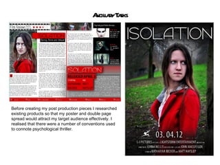
Evaluation Q1: In relation to ancillary tasks
- 1. A l r T sks ncilay a Before creating my post production pieces I researched existing products so that my poster and double page spread would attract my target audience effectively. I realised that there were a number of conventions used to connote psychological thriller.
- 2. The colours used in psychological thrillers are predominantly red, black and white. Red and black are also closely linked to horror. They connote danger, violence, blood, evil and mystery. Whereas in horror, these connotations are often literal, in psychological thrillers these connotations are often implied. Low-key lighting is often used on the main subjects to create enigma and mystery. The background is often dark to emphasise this. It also helps to create an unsettling atmosphere; building tension. Conventions used in my poster: • Close-up of protagonist looking worried • Dark colours used- red and black • Title stands out • Fonts used are condensed and small for credits • Inclusion of release date and production logo’s • Recurring motifs of red jacket and antagonist to create a striking image
- 3. M Doubl Pa Spr d Conv ions + Subv sions y e ge ea ent er Conventions: • Size 12 font for the main bulk of text (the size used in most magazine publishing) • Large image displaying the film being discussed within the article • Strong house style through the use of the red black and white throughout • Bold, edgy style to appeal to a younger audience which my film is aimed at Subversions: • The image isn’t spread across both pages because my image was vertical, not horizontal