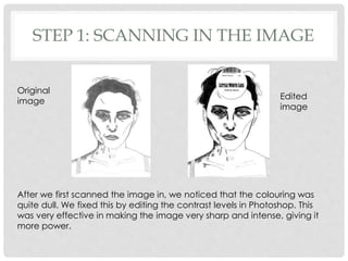
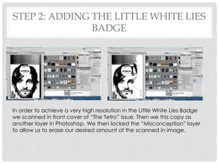
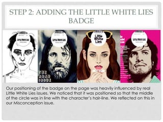
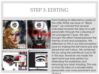
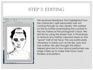
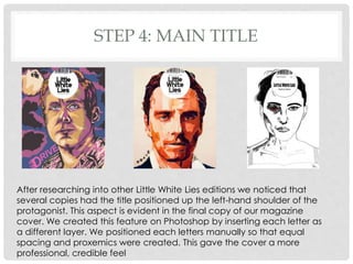
M I S C O N C E P T I O N
ADDING MAGAZINE
COVER CONVENTIONS
STEP 1: SCANNING IN THE IMAGE
After we first scanned the image in, we noticed that the colouring was
quite dull. We fixed this by editing the contrast levels in Photoshop. This
was very effective in making the image very sharp and intense, giving it
more power.
Original
image
Edited
image
STEP 2: ADDING THE LITTLE WHITE LIES
BADGE
In order to achieve a very high resolution in the Little White Lies Badge
we scanned in front cover of “The Tetro” issue. Then we this copy as
another layer in Photoshop. We then locked the “Misconception” layer
to allow us to erase our desired amount of the scanned in image.
STEP 2: ADDING THE LITTLE WHITE LIES
BADGE
Our positioning of the badge on the page was heavily influenced by real
Little White Lies issues. We noticed that it was positioned so that the middle
of the circle was in line with the character’s hair-line. We reflected on this in
our Misconception issue.
STEP 3: EDITING
From looking at alternative copies of
the Little White Lies Issue of “Black
Swan” we noticed that several
indicated towards the idea of a split
personality through the colouring of
the protagonist’s eyes. We also
thought this effect foreshadowed the
themes of evil and possession. We
reflected on this in our Misconception
issue by making the left-hand eye and
blood-shot red colour. We achieved
this by using the paintbrush tool to fill
in the eye. However we made the
right-hand eye look perfect by
extending the eyelashes and
removing any harsh shading. This was
so that the idea of a double-sided
personality was more prominent and
STEP 3: EDITING
We received feedback that highlighted how
the character’s split personality was not
coming through as very clearly. We worked
on this by further emphasising the contrast in
the two halves of the protagonist’s face. We
did this by using the eraser tool, in Photoshop,
to remove any harshly coloured areas on the
“good” half of her face. This was particularly
necessary in areas such as her lips, eye and
hair outline. We also thought this effect
helped give rise to how dance performers use
stage make-up to make their face’s look
flawless and perfect.
STEP 4: MAIN TITLE
After researching into other Little White Lies editions we noticed that
several copies had the title positioned up the left-hand shoulder of the
protagonist. This aspect is evident in the final copy of our magazine
cover. We created this feature on Photoshop by inserting each letter as
a different layer. We positioned each letters manually so that equal
spacing and proxemics were created. This gave the cover a more
professional, credible feel
STEP 4: MAIN TITLE
We also tried positioning a back-to-front
copy of the title on the other shoulder in an
attempt to further reflect on the themes of
mirrors and appearance and reality.
However, we decided against this as it went
against Little White Lies conventions and we
felt it overcomplicated and overcrowded
the page by adding unnecessary details.
STEP 5: SIGNATURE
Lastly, we added a signature in the bottom right-hand corner. We felt this
created a more authentic, original feel, further reflecting on how Little
White Lies has a very artistic style and spin on different products. Also, we
noticed a modest signature was another convention of Little White Lies
covers, therefore we thought it added further credibility to our
Misconception issue.

Making magazine cover part 2

  • 1.
    M I SC O N C E P T I O N ADDING MAGAZINE COVER CONVENTIONS
  • 2.
    STEP 1: SCANNINGIN THE IMAGE After we first scanned the image in, we noticed that the colouring was quite dull. We fixed this by editing the contrast levels in Photoshop. This was very effective in making the image very sharp and intense, giving it more power. Original image Edited image
  • 3.
    STEP 2: ADDINGTHE LITTLE WHITE LIES BADGE In order to achieve a very high resolution in the Little White Lies Badge we scanned in front cover of “The Tetro” issue. Then we this copy as another layer in Photoshop. We then locked the “Misconception” layer to allow us to erase our desired amount of the scanned in image.
  • 4.
    STEP 2: ADDINGTHE LITTLE WHITE LIES BADGE Our positioning of the badge on the page was heavily influenced by real Little White Lies issues. We noticed that it was positioned so that the middle of the circle was in line with the character’s hair-line. We reflected on this in our Misconception issue.
  • 5.
    STEP 3: EDITING Fromlooking at alternative copies of the Little White Lies Issue of “Black Swan” we noticed that several indicated towards the idea of a split personality through the colouring of the protagonist’s eyes. We also thought this effect foreshadowed the themes of evil and possession. We reflected on this in our Misconception issue by making the left-hand eye and blood-shot red colour. We achieved this by using the paintbrush tool to fill in the eye. However we made the right-hand eye look perfect by extending the eyelashes and removing any harsh shading. This was so that the idea of a double-sided personality was more prominent and
  • 6.
    STEP 3: EDITING Wereceived feedback that highlighted how the character’s split personality was not coming through as very clearly. We worked on this by further emphasising the contrast in the two halves of the protagonist’s face. We did this by using the eraser tool, in Photoshop, to remove any harshly coloured areas on the “good” half of her face. This was particularly necessary in areas such as her lips, eye and hair outline. We also thought this effect helped give rise to how dance performers use stage make-up to make their face’s look flawless and perfect.
  • 7.
    STEP 4: MAINTITLE After researching into other Little White Lies editions we noticed that several copies had the title positioned up the left-hand shoulder of the protagonist. This aspect is evident in the final copy of our magazine cover. We created this feature on Photoshop by inserting each letter as a different layer. We positioned each letters manually so that equal spacing and proxemics were created. This gave the cover a more professional, credible feel
  • 8.
    STEP 4: MAINTITLE We also tried positioning a back-to-front copy of the title on the other shoulder in an attempt to further reflect on the themes of mirrors and appearance and reality. However, we decided against this as it went against Little White Lies conventions and we felt it overcomplicated and overcrowded the page by adding unnecessary details.
  • 9.
    STEP 5: SIGNATURE Lastly,we added a signature in the bottom right-hand corner. We felt this created a more authentic, original feel, further reflecting on how Little White Lies has a very artistic style and spin on different products. Also, we noticed a modest signature was another convention of Little White Lies covers, therefore we thought it added further credibility to our Misconception issue.