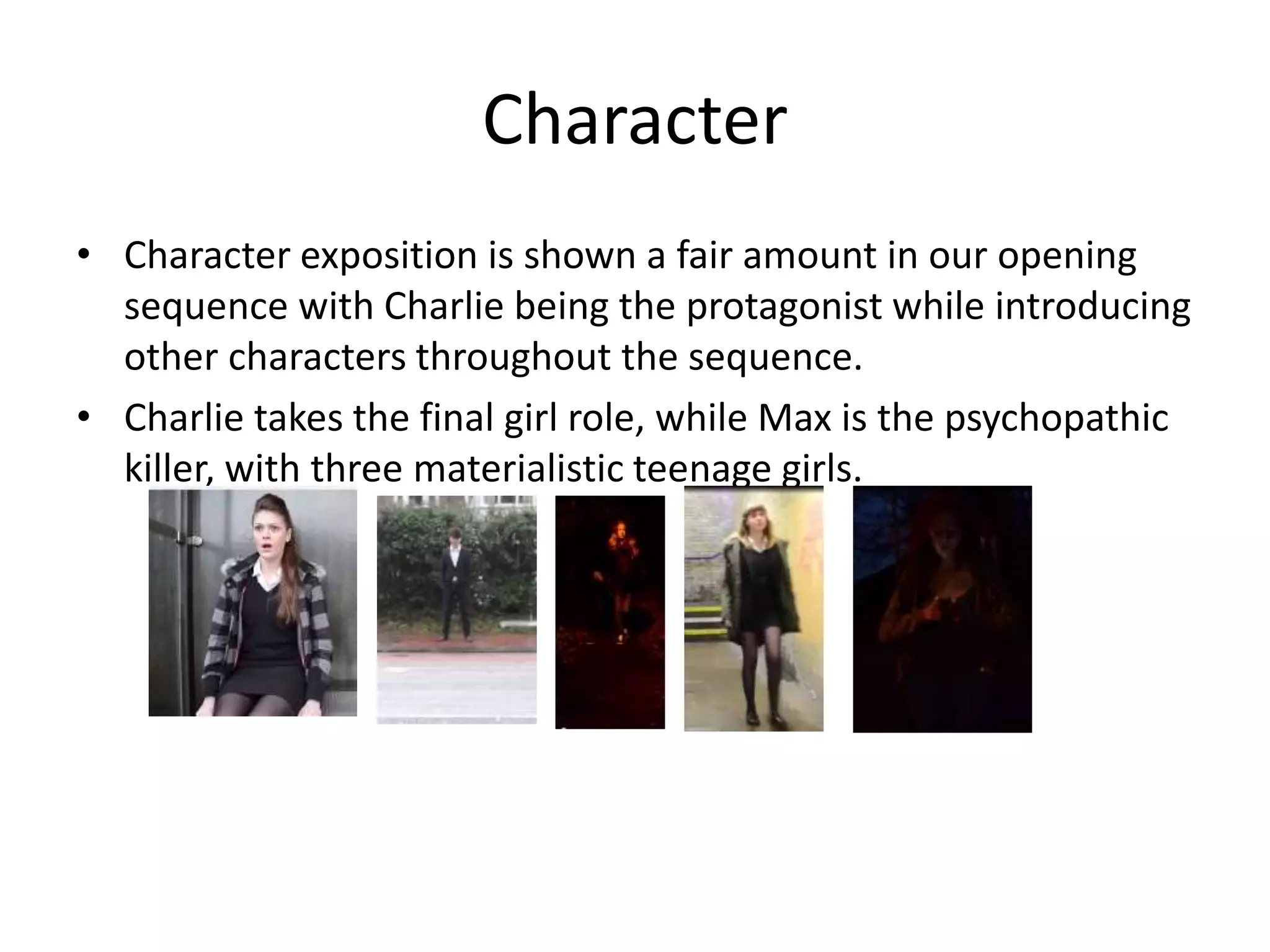
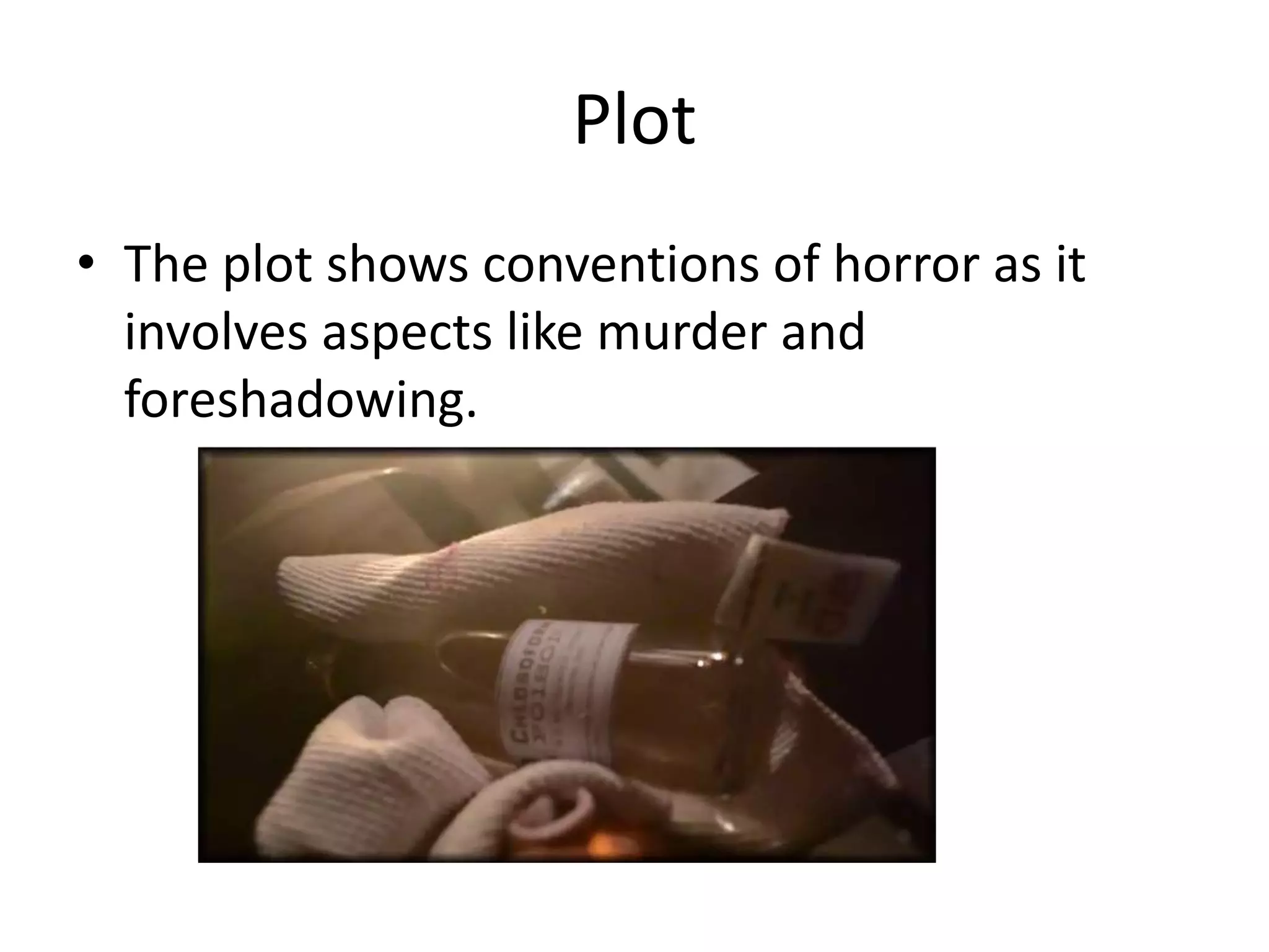
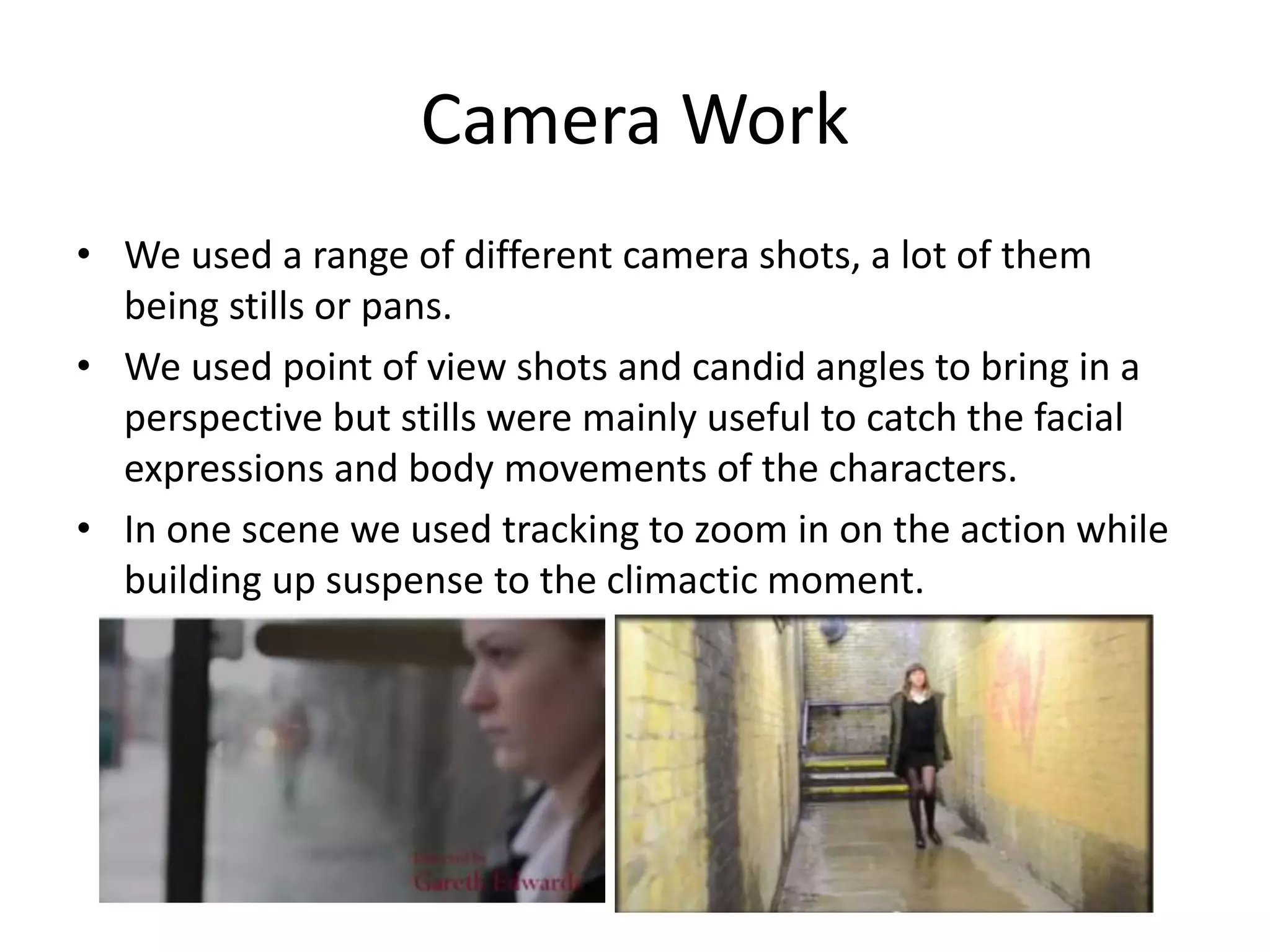
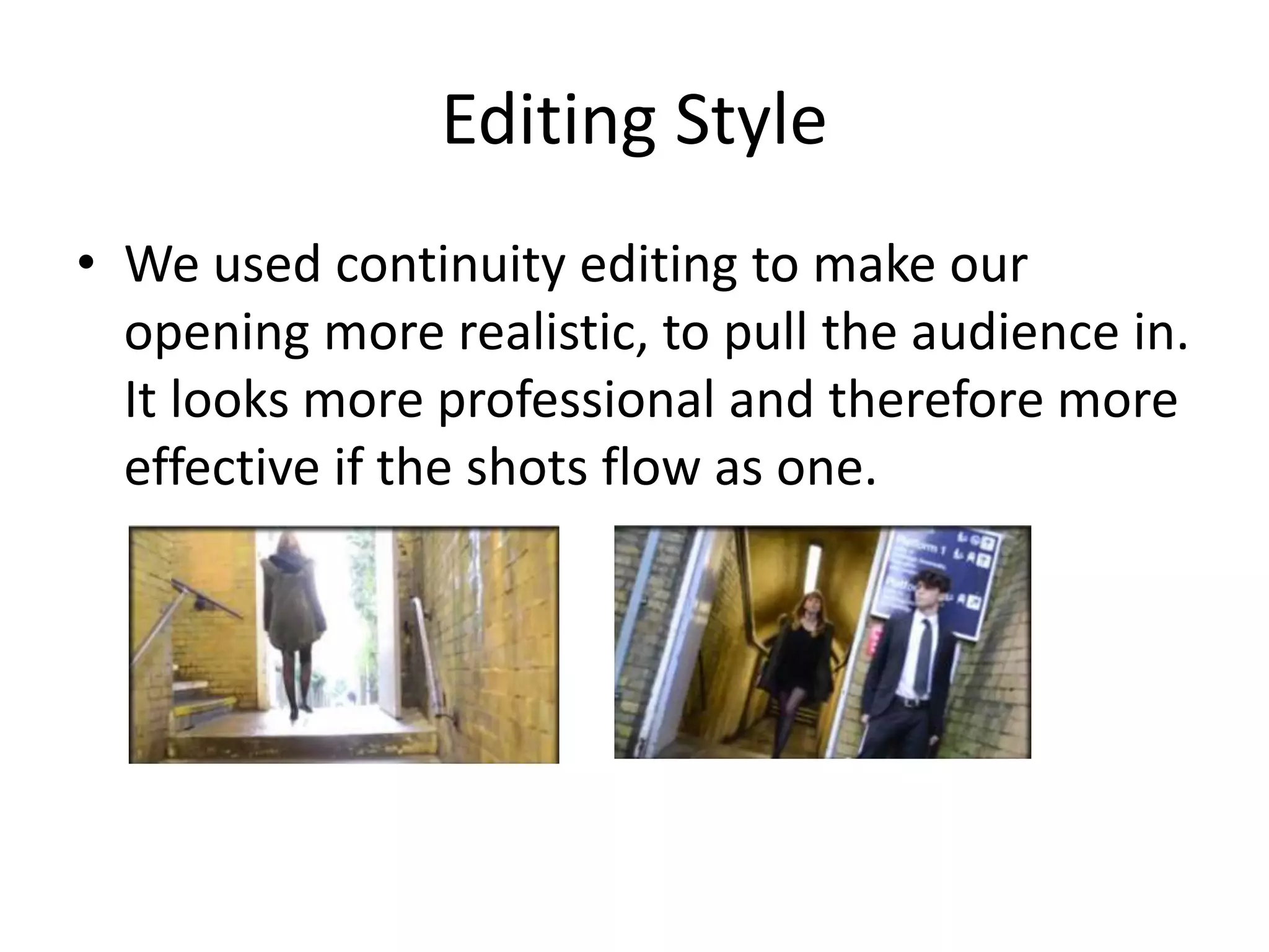
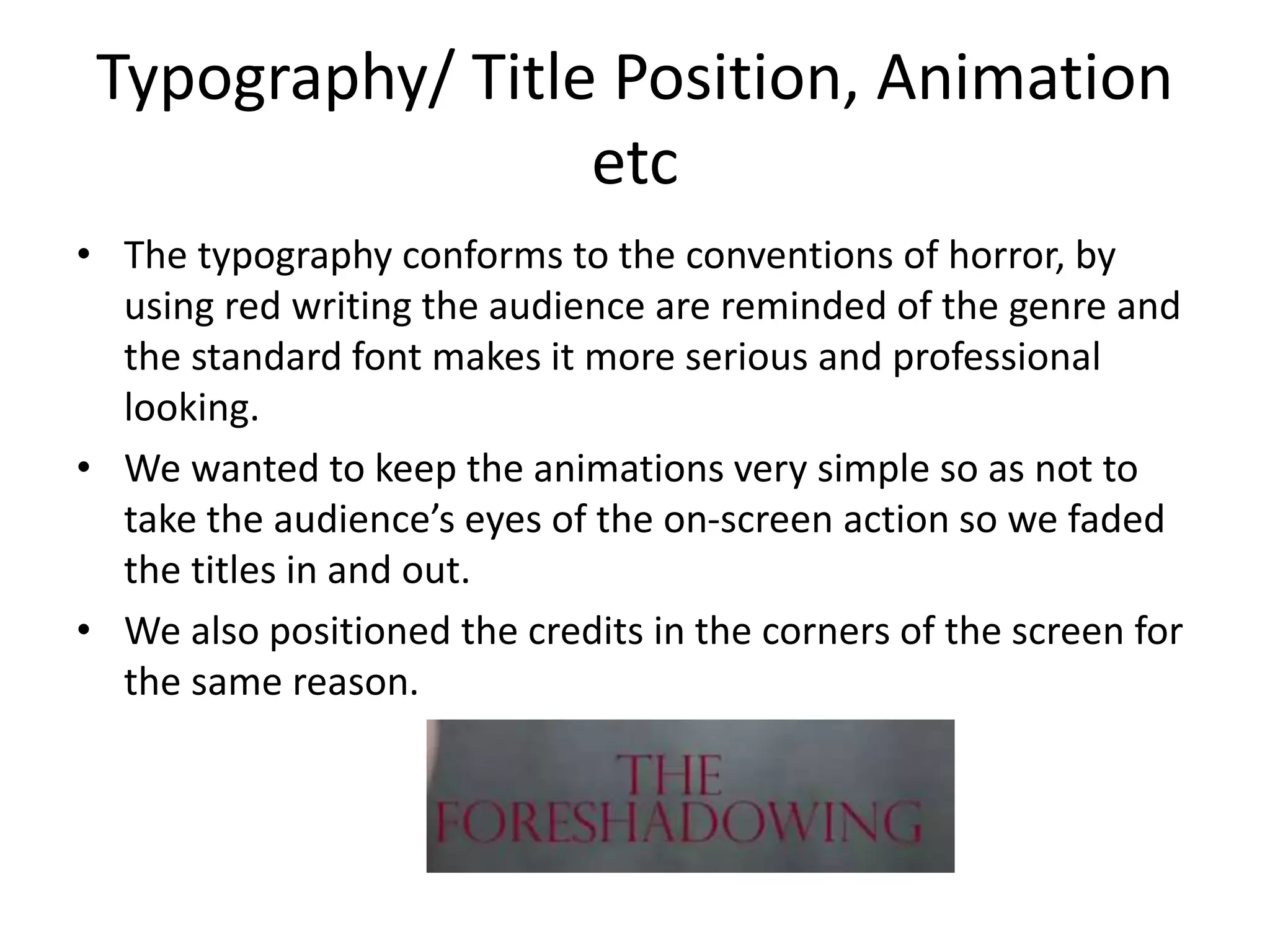
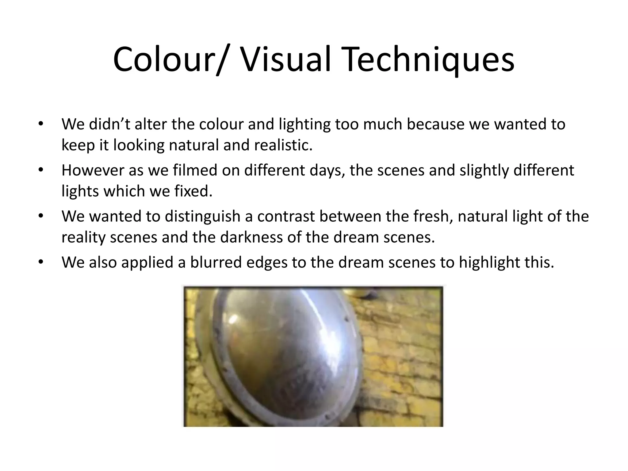
In what ways does your media
product use, develop or challenge
forms and conventions of real
media products?
Is the form of our opening
conventional?
• The form of our opening is conventional of a horror
film
• This is shown in the titles, red connotes danger and
death and is typical of a horror film
• The plot follows a psychological horror theme
• Character exposition is shown as very conventional of
horror for example the final girl.
• We create an enigma which can be interpreted in
different ways to leave the audience to apply their own
meaning to it. This is a frequent case in a lot of horror
films as a lot, especially psychological are based around
messing with the mind.
How does your opening conform or
challenge the conventions of our chosen
sub-genre of horror?

• Our opening conforms to the conventions of
our chosen subgenre of horror, psychological
horror.
Character
• Character exposition is shown a fair amount in our opening
sequence with Charlie being the protagonist while introducing
other characters throughout the sequence.
• Charlie takes the final girl role, while Max is the psychopathic
killer, with three materialistic teenage girls.
Plot
• The plot shows conventions of horror as it
involves aspects like murder and
foreshadowing.
Mise-en-scene
• We applied typical horror to most features of mise-en-scene.
• The costumes were all the same, all the characters wore black
which connotes darkness and fear.
• Low key lighting was used to create a scary atmosphere.
• Character blocking showed fear of the murderer which does
not challenge the conventions of horror.
Sound
• We used ambience to create suspense and
sharp high pitched sounds to put the audience
on edge.
• This is typical in horror films to make the
audience feel uncomfortable.
• All the rest was non-diagetic sound to keep up
the sense of reality.
Camera Work
• We used a range of different camera shots, a lot of them
being stills or pans.
• We used point of view shots and candid angles to bring in a
perspective but stills were mainly useful to catch the facial
expressions and body movements of the characters.
• In one scene we used tracking to zoom in on the action while
building up suspense to the climactic moment.
Editing Style
• We used continuity editing to make our
opening more realistic, to pull the audience in.
It looks more professional and therefore more
effective if the shots flow as one.
Typography/ Title Position, Animation
etc
• The typography conforms to the conventions of horror, by
using red writing the audience are reminded of the genre and
the standard font makes it more serious and professional
looking.
• We wanted to keep the animations very simple so as not to
take the audience’s eyes of the on-screen action so we faded
the titles in and out.
• We also positioned the credits in the corners of the screen for
the same reason.
Colour/ Visual Techniques
• We didn’t alter the colour and lighting too much because we wanted to
keep it looking natural and realistic.
• However as we filmed on different days, the scenes and slightly different
lights which we fixed.
• We wanted to distinguish a contrast between the fresh, natural light of the
reality scenes and the darkness of the dream scenes.
• We also applied a blurred edges to the dream scenes to highlight this.
Representation and Ideology
• The victims are all females while the attacker
is male, conveying a residual ideology of
gender roles.

In what ways does your media product use, develop or challenge forms and conventions of real media products?

  • 1.
    In what waysdoes your media product use, develop or challenge forms and conventions of real media products?
  • 2.
    Is the formof our opening conventional? • The form of our opening is conventional of a horror film • This is shown in the titles, red connotes danger and death and is typical of a horror film • The plot follows a psychological horror theme • Character exposition is shown as very conventional of horror for example the final girl. • We create an enigma which can be interpreted in different ways to leave the audience to apply their own meaning to it. This is a frequent case in a lot of horror films as a lot, especially psychological are based around messing with the mind.
  • 3.
    How does youropening conform or challenge the conventions of our chosen sub-genre of horror? • Our opening conforms to the conventions of our chosen subgenre of horror, psychological horror.
  • 4.
    Character • Character expositionis shown a fair amount in our opening sequence with Charlie being the protagonist while introducing other characters throughout the sequence. • Charlie takes the final girl role, while Max is the psychopathic killer, with three materialistic teenage girls.
  • 5.
    Plot • The plotshows conventions of horror as it involves aspects like murder and foreshadowing.
  • 6.
    Mise-en-scene • We appliedtypical horror to most features of mise-en-scene. • The costumes were all the same, all the characters wore black which connotes darkness and fear. • Low key lighting was used to create a scary atmosphere. • Character blocking showed fear of the murderer which does not challenge the conventions of horror.
  • 7.
    Sound • We usedambience to create suspense and sharp high pitched sounds to put the audience on edge. • This is typical in horror films to make the audience feel uncomfortable. • All the rest was non-diagetic sound to keep up the sense of reality.
  • 8.
    Camera Work • Weused a range of different camera shots, a lot of them being stills or pans. • We used point of view shots and candid angles to bring in a perspective but stills were mainly useful to catch the facial expressions and body movements of the characters. • In one scene we used tracking to zoom in on the action while building up suspense to the climactic moment.
  • 9.
    Editing Style • Weused continuity editing to make our opening more realistic, to pull the audience in. It looks more professional and therefore more effective if the shots flow as one.
  • 10.
    Typography/ Title Position,Animation etc • The typography conforms to the conventions of horror, by using red writing the audience are reminded of the genre and the standard font makes it more serious and professional looking. • We wanted to keep the animations very simple so as not to take the audience’s eyes of the on-screen action so we faded the titles in and out. • We also positioned the credits in the corners of the screen for the same reason.
  • 11.
    Colour/ Visual Techniques •We didn’t alter the colour and lighting too much because we wanted to keep it looking natural and realistic. • However as we filmed on different days, the scenes and slightly different lights which we fixed. • We wanted to distinguish a contrast between the fresh, natural light of the reality scenes and the darkness of the dream scenes. • We also applied a blurred edges to the dream scenes to highlight this.
  • 12.
    Representation and Ideology •The victims are all females while the attacker is male, conveying a residual ideology of gender roles.