3. Image of
feature
artist
Header, bold
stands out &
is the fist
thing you see
Mast head
Secondary
Image, encourages
reader to read on
Listings of
magazine
content
Buzz, entices
reader.
List, shows
more of the
inside content
Date of issue
4.
5.
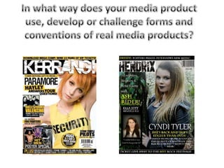
6. Whilst analysing existing magazines I focused on
“Kerrang”. I analysed many different issues and I
liked the colours that were used. This was what
influenced me to create my own rock magazine
similar to „Kerrang‟. From my research I saw that
most rock magazines had plain backgrounds
(either black, white or grey) and bright colours
used for the text. This is why decided to go with a
black, white and yellow colour scheme. You also
find colours schemes like this in other
rock/alternative music magazines such as „MOJO‟
and „Q‟. My mast head is black and white and in
the design „kill em all‟ which relates to my rock
theme and will appeal to my audience. My
audience would be a young adult who are in the
rock bands such as Paramore, Fall Out Boy & 30
Seconds to Mars.
The layout of my magazine is very similar to Kerrangs as it is very bust and has a lot
going on. This crowded and manic feel is exactly what needs to be achieved if you
want to create a successful rock magazine. I have used one main cover line and two
pugs (in the form of text & pictures) on my front cover, which is exactly what you
would see on the cover of Kerrang. Kerrang uses a large typeface on their cover
which is the artist/bands name which I have also used to present the feature artist.
This is the largest piece of text on the cover apart from the Masthead which makes
it stand out from the rest of the magazine ang grab the readers attention.