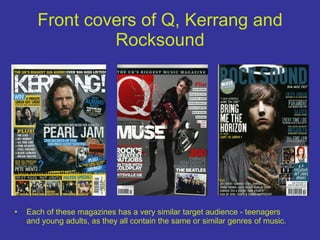
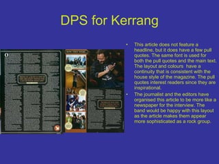
The document analyzes and compares the front covers and inside contents pages of three music magazines: Kerrang, Q, and RockSound.
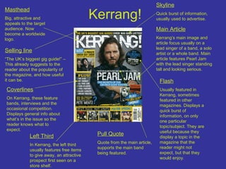
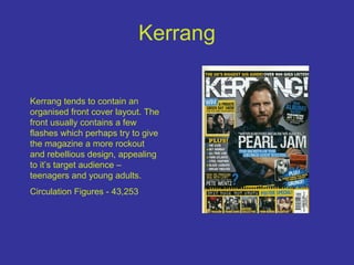
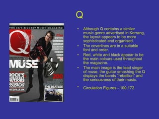
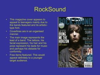
The summaries focus on the layout, target audiences, and styles of each magazine based on visual elements like images, colors, fonts, and organizational structures. Kerrang targets teenagers and young adults with a rock and rebellious style. Q has a more sophisticated layout in red, white, and black targeting a similar audience. RockSound appeals to teenagers with artistic fonts and images representing bands.
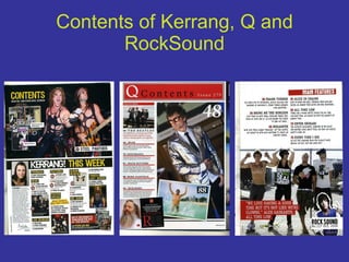
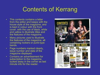
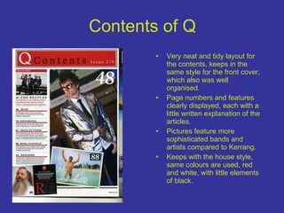
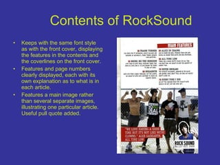
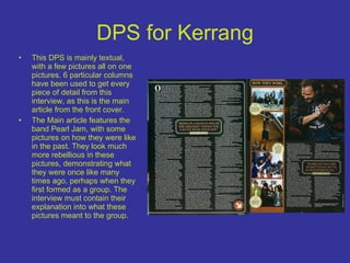
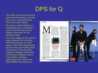
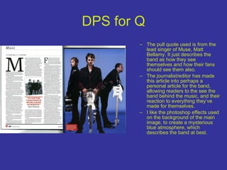
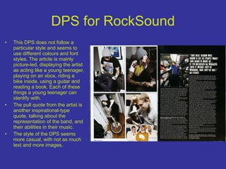
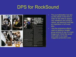
The inside contents pages maintain consistency with the covers' styles. Kerrang and Q articles have newspaper-like layouts while RockSound uses more images with inspirational quotes. Photoshop effects