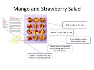
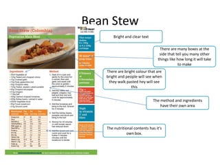
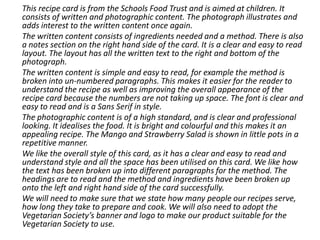
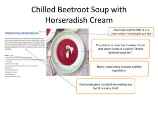
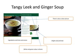
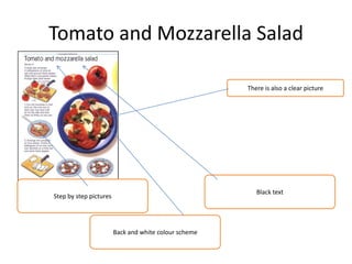
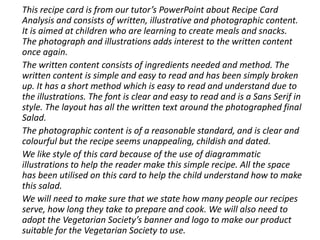
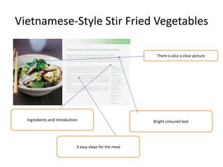
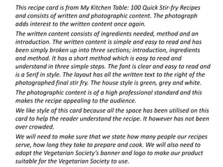
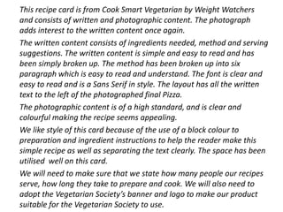
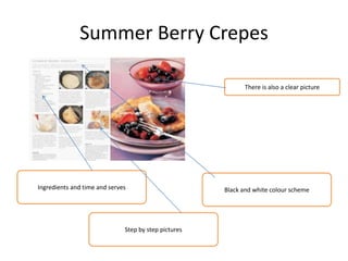
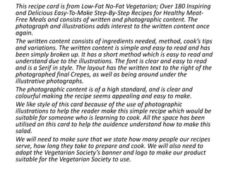
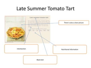
This document analyzes and summarizes the styles of various recipe cards from different organizations. It examines aspects like layout, use of images and text, font styles, and overall design appeal. Key elements that make for clear, easy to follow recipes are identified, such as breaking methods into numbered steps. Areas for improvement in some cards are also noted, such as removing unnecessary introductions. Overall recommendations are made for an effective recipe card design.


![Initial%20 ideas%20and%20feedback[1]](https://cdn.slidesharecdn.com/ss_thumbnails/initial20ideas20and20feedback1-130312041202-phpapp02-thumbnail.jpg?width=640&height=640&fit=bounds)


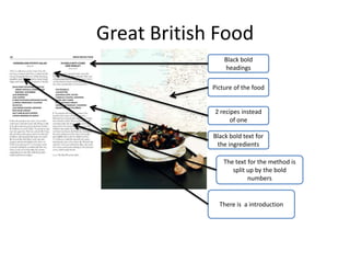
![Initial%20 ideas%20and%20feedback[1]](https://cdn.slidesharecdn.com/ss_thumbnails/initial20ideas20and20feedback1-130312040804-phpapp01-thumbnail.jpg?width=640&height=640&fit=bounds)


![T shirt%20 designs%20pro-forma(1)[1]](https://cdn.slidesharecdn.com/ss_thumbnails/t-shirt20designs20pro-forma11-130515100634-phpapp01-thumbnail.jpg?width=640&height=640&fit=bounds)
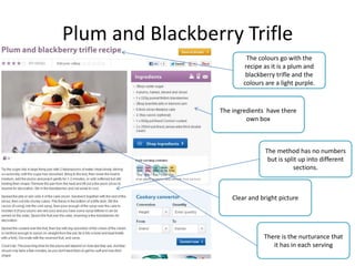
![Working%20to%20a%20 brief%20pro forma[1]](https://cdn.slidesharecdn.com/ss_thumbnails/working20to20a20brief20pro-forma1-130520073744-phpapp01-thumbnail.jpg?width=640&height=640&fit=bounds)


