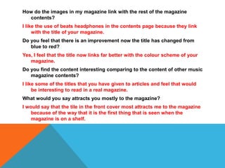
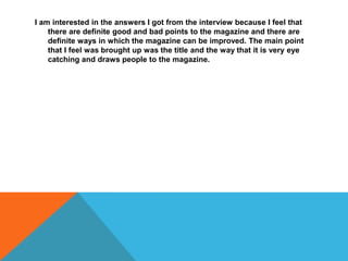
The document discusses a magazine and interviews conducted about its design. The interviews found that changing the title color from blue to red improved how well it linked to the magazine's color scheme. Interviewees also said the title on the front cover was the most attractive part because it's the first thing seen when browsing magazines on a shelf. The interviews provided feedback on good and bad aspects to help improve the magazine.


