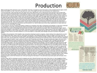
SlideShare a Scribd company logo
1 of 6
Evaluation
Planning
To start the Veganuary project I carried out both primary and secondary research to help find the information that I wanted to
feature in the booklet, learn more about veganism and to help find out what people don’t know about veganism. The primary
research that I carried out was to through interviews with a few people to find out more detail about the person and their thoughts
on veganism, from doing this I found that a lot of people didn’t really understand the basics of veganism and what good it can do. I
also carried out secondary research which I found articles from blogs, online newspapers and various different websites so that I
could learn more about veganism before producing my booklet, also from doing this research I was able to select what information I
wanted to put in my info graphics and what direction I wanted to go with my article as mine led me to discuss more on animal
welfare and how they are treated within the fashion industry and what goes on behind closed doors. So I based a large proportion of
my research on that side of veganism, and this formed the basis of my final article.
When looking for the information to go into the info graphics I originally wasn’t too sure what I wanted to do my info graphics on so I
collected a wide range of information from veganuary, I got information on everything ranging from the animals themselves and
what they go through, to health benefits and environmental impacts. By doing this it meant that I could make a range of info graphics
and then simply select the best and choose the ones that fitted with the overall look of my booklet as I wanted it all to flow together
and have smooth transitions between the pages. As well as this when finding information for the article I ensured that all my
information came from trustworthy sites i.e. Veganuary and The Vegan Society, by doing this it ensured that all my information would
be correct and not misleading as I used a lot of quotes within my article to break up the text and make it more readable and
interesting to look at.
When I was collecting the information for the fact file I made sure that all the logos and information on their menus came from their
official up to date menus and websites so that the facts I was providing would be trustworthy and helpful to anyone who would pick
up the booklet. As well as this by ensuring that I was using the correct and current logos meant that people would be more likely to
recognize the restaurants and be able to use the information I was providing and try out the vegan options in these places even if
they didn’t want to go completely vegan they could simply try the variety of foods there are even when being vegan.
Another thing I did in the planning stages of creating my book was to create a mood board to help me find the kind of style work I
would like to get inspiration from when it came to me producing my own booklet. Also by doing a mood board it helped me come up
with a colour scheme that I would use throughout the entire booklet, I found that by having a colour scheme really helped all the
pages of my booklet to flow and fit together so that they didn’t look odd and mismatched. In my mood board I also included ideas of
recipe cards that I used to help create my fact file as I got inspiration by looking at various different menus and recipe cards to see
how other people display menus and food. In my mood board I also looked at various different fonts that I could use throughout my
booklet to give it a more professional look, I selected one that would be used to create headlines and more bold text within the info
graphics and fact files and one that would be used to write smaller text for example the main text in the article was in an more basic
easy to read font. To help find the right look for my booklet I created two mood boards with very contrasting colours and ideas, as my
secondary mood board was a lot more minimalist and classic using dark blues and greens to relate to the environmental feel of the
booklet however I thought the bright pastel like colours would be better at making my booklet stand it and look more appealing to
someone walking by it.
Preparation
When preparing to start making my booklet I had to write my multipage article so that it was complete and ready to
just be put into InDesign and start the designing process. When writing my article I found most of my facts and
information from The Vegan Society, Veganuary and the PETA website as I knew these were trustworthy sites that
would give me useful information on veganism, as well as this these sites didn’t over complicate the basics of
veganism and kept it simple so all their information was easy to understand. Once I had gathered all my information
and had wrote the first draft of my article I had it checked and highlighted any mistakes in red that I had made, also
my original article needed shortening so that it didn’t drag on over many pages and wasn’t repetitive and boring for
people reading, as well as this by having a shorter article it meant that I could do more with the design work and make
more interesting pull quotes throughout. To get to the final copy of my article I did 4 redrafts so that I had reached a
concise and information packed article that was ready to be edited in InDesign to become a part of my booklet, the
conciseness of my article was noticed in the feedback sheets as someone said ‘One thing I like about the article is that
the points are not dragged out they are kept short and they get to the point this makes it more interesting and
engaging to the reader.’ which is what I was aiming for even though it is a multi page article and expected to be
information packed and quite long I still wanted to keep to the point so that the article didn’t get repetitive.
Another thing I did as part of the preparation stages was to have a look at pagination and see what pages I would like
to put where, I found this easiest to do by getting 6 pages of A4 paper and folding them in half to get a mock up copy
of the 12 page A5 booklet. By doing this it helped me visualize what the finished booklet would look like in page order.
As well as this by having a mock up copy I could see where images and pull quotes may go in my multipage article as it
was a more visual look at where things would go and work best in relation to the rest of the pages in the booklet.
Although it did need slightly adjusting to my original plans that I had put in the paper copy of the booklet, due to
having two different info graphics next to each other which I found would make the pages seem quite cluttered and
busy and they looked more effective spread throughout the booklet so there wasn’t any overpowering amounts on
information in one place.
Also during the preparation time before creating the booklet I created a production schedule which helped keep on
track of time so that I would complete the booklet on time with a couple of days to spare if any alterations needed to
be made. In my production schedule I did daily plans so that I had an in depth schedule that would help me keep on
track. As well as this I planned my page layout in a word document so that may pagination was clear and easy to
understand rather than just keeping it in the mock up paper copy.
During the preparation stages that the production schedule was most helpful to having me be on track to finish and
have the last week free to make any alterations that needed to be done or if I needed to spend extra time on a specific
page then I had it and this was very useful as there were some minor changes that needed to be made during this final
week.
As well as this by having all the page orders planned out it made it easier in the final week to just slot all the pages
together in the template rather than having to switch around the page order in the last few days it was already
prepared and meant that I could spend extra time on other pages within the booklet rather than focusing on what
order the pages should be put in.
ProductionWhen producing all the elements to go in the booklet I feel that I managed my time fairly well as I had completed all the pages a week
before the deadline so that I had time to go back over some of the pages and make some alterations and adjustments.
In the last few days I had to go back over and make some minor adjustments such as altering the front and back cover so they look
more symmetrical and keep the flow of the booklet running from front to back, also during these final few days I altered the chiquito
logo on my ‘where to eat?’ fact file as I found that the colours on there regular logo didn’t really fit with my colour scheme as well as
the others did. To make this logo fit better with the overall look of the page I used the magic wand tool to select the inside sections of
the logo that had a wood texture on them and used the paint bucket tool to fill in each letter with a solid light brown colour which
fitted more with the colour scheme and look of my booklet. By doing this it meant that the page fitted better with my overall booklet
and scheme as the logo was more of a flat colour then and this matched with the rest of my logos used in the fact file and by having
hem all using the same kind of colours it meant that the fact file looked more professional and flowed more with the same theme
throughout my fact file. One more adjustment I made in these last few days was to the back cover as I found that the information on
where to find out more got lost in the colours and tree behind it so I had to make some minor colour adjustments to make stand out
and be more of a memorable final page.
In the production period of making the booklet it helped me to develop some skills in Photoshop and InDesign as I had never produced
an info graphic or a fact file so by doing this helped me develop and learn new skills with Photoshop like how to transfer the
information from excel to Photoshop and how to edit it to make it more attractive to a reader. Also in the production stages I learnt
how to use InDesign in more detail for example I leant how to transfer graphics and edit a large amount of text and images and how to
break the text down so that it flows more and is easier for someone to just quickly pick up and read. The production stages was key to
helping me learn how to use these software's in a lot more depth as I had hardly used InDesign and excel to produce info graphics
before,
Throughout the production of the booklet I was constantly reviewing my work in progress, simply making minor adjustments as some
of my original ideas didn’t work a well as I had hoped, for example I had originally planned to have an image on the front cover but
when I tried this out I found that more basic shapes and bringing my colour scheme through it helped create more fluidity from front to
back of the cover, also by doing this I found that I could make almost symmetrical front and back covers I found to look more appealing.
When producing the booklet I used a variety of skills on both Photoshop and InDesign. During the production stages I did most of the
work on Photoshop as this was the quickest and easiest way to edit and create on. The only thing I did in InDesign what piecing the
article together, all of the elements however were made in Photoshop, for example the headline, pull quotes, backgrounds and
overlaying heads design. The only complication with working in Photoshop and InDesign is that the images had to be exactly the right
size to put in InDesign or the image became blurry and low quality. This meant that producing my article took slightly longer than all
the other parts of the booklet but I had allowed myself extra time in the final week to complete this once everything else was finished.
By having the extra week at the end which I had left free to complete any unfinished pages, I also had time to covert my original info
graphics into social media format, for example I altered both my info graphics into the 1080 pixels x 1080 pixels for Instagram. As the
page sizes had to be changed to fit the Instagram info graphics fit it meant that I had to slightly alter the original pages to fit the square
size, to do this and still give them the same look I simply shrunk down most of the statistics from the statistics info graphic and slightly
alter the positions of where each statistic went, for example the bar chart I changed from having it on the right side in the original info
graphic to putting it along the top in the Instagram info graphic so that I could fit all the other information in around this main section.
Also in this time I had the final day spare therefore I created an alternative info graphic which used a completely different style I played
around more with using images to show information rather than charts as I used a factory silhouette to represent how much of
greenhouse gases come from livestock and I think portraying the information in this alternative way works quite well and looks more
interesting.
Another thing I did for reviewing my work in progress was that I altered the back cover quite a few times as I was struggling to find a
layout that I liked but I knew that I wanted it to be fairly symmetrical to the front cover I just had more text and information to fit in on
the back cover so I originally tried flipping the chevron stripes so they were pointing towards the top of the page to make it slightly
different to the front cover but I found that the tree was then hidden and overshadowed by the chevron print so I decided to have
them looking the same as they od on the front cover. From this I chose to then make the tree slightly bigger so that the back page had
more of a focal point. I then couldn’t decide where I wanted to place the text so I tried it in various different places for example I tried
placing it directly on top of the tree however I found the text then got lost and looked randomly places so I decided to have the text
placed within the chevron stripes and have them all in contrasting colours to the stripes that they are placed on. Once I had done this I
had to tone down the pink writing on top of the blue stripe as it appeared to bright and overpowering in contrast with the other two
sets of information. Also I though that by having the details on where to find out more on the back may be very helpful for people if
they found that they were actually very interested in veganism and wanted to have a look into taking part in veganuary.
Final ProductI would say that my final product does reach the intentions I had when I started preparation for the product as I produced a 12 page A5 booklet
which included an info graphic, multi page fact file and front and back cover. As well as this I think my booklet isn't specifically more suited to a
female or male audience, I think its fairly gender neutral and therefore wouldn’t draw anyone away. As well as this as veganuarys main audience
are around 25-34 I tried to create my fact file based around what restaurants are vegan friendly and give different options in a recipe card style, it
thought by using the fact file on restaurants it interests everyone and there are options that would suit everyone, also by mainly featuring chain
restaurants is more helpful to people all over the country as there is more likely to me one of these places near them, this then helps to appeal to
a wider audience. I would also say my finished booklet it appropriate for the audience I was targeting due to the gender neutral colour scheme
and simplistic style throughout I think that it would suit most age groups from various different backgrounds as there is something in there fore
everyone ranging from the health benefits of veganism to the more moral side of things on how the animals are treated in the dairy and fashion
industry. Due to the content covering a variety of topics I think it helps to not alienate anyone and keeps the booklet interesting to most people
as there are a lot of smaller facts planted in the article in the form of pull quotes so everyone can learn something new. I think to improve the
content of the booklet I could've included more of the meat industry in my article, as well as this I think I could've made a more in depth fact file
of where to eat which included a full vegan menu from each restaurant rather than just one meal from each restaurant as I think this may have
been more helpful to readers who are looking for vegan friendly places to eat.
The overall style of my booklet flows throughout as I wanted it to have a similar look which flowed throughout every single page just like any
other published magazine would have where there's a clear look throughout every single page. As well as this I used similar style images
throughout for example I used mainly silhouettes for my images throughout except some had different coloured fills, by doing this I think it
helped to keep the fluidity of the pages all looking similar and also by having only the basic silhouettes looked more professional than a random
selection of images. I got a lot of inspiration for the idea of country farm shops which contain a lot of organic, vegan foods, as these contained a
lot of pastel healthy looking colours. Also I felt that this colour scheme would appeal to anyone and isn't using many stereotypical gender colours
such as more pinks and purples or blues and greens to target different genders, by having this gender neutral colour pallet I feel like the booklet
could appeal to anyone.
Overall I'm fairly happy with the finished look of my booklet as I feel it shows all the information clearly and flows from front cover to back cover,
however I feel that the booklet could be improved by having a more interesting front cover and back cover as I find it to be too simplistic and
uninteresting therefor if I had time to improve I would like alter this and make it more eye catching and have front cover which would make
some one want to pick up and read. Also another thing I feel could be improved is my multipage article as I find there is quite a lot of large chunks
of text which could be broken down using smaller images to keep people interested so there isn't just 3 pages of large paragraphs. When I asked
other people what could be improved in my survey generally people were saying that there was too much text on the article page as someone
said ‘Text could be broken up more, the large sections of text can be overwhelming and hard to take in’ which I agree with as it could be broken
down more, and this would help keep those pages looking interesting and not plain and bland.
Another thing I asked in my survey was what people learnt from reading the book so that I knew it would actually help people, from reading the
booklet everyone found out something different from learning the small facts on how much water can be saved from going vegan, to how eating
meat effects those in third world countries as well. By finding out that everyone learnt something from the booklet helped to know what I had
produced would actually be helpful to the general public for people to find out more, also it meant that I ad reached my original intentions to
produce a stylish, appealing and helpful booklet of veganism.
I think the info graphic featuring all the statistics and number was the most useful part of the booklet as it showed small amounts of information
in more interesting ways that would catch peoples attention more as shown in my survey as someone said ‘The small diagrams, charts etc make it
more enjoyable to read’ when I asked what they found most useful as well as this, this info graphic could be translated well onto social media as
all the colours and small diagrams I find to be quite eye catching even if you were scrolling through social media they still might catch someone
attention.
From the feedback I got from peers I found that people generally liked how there was a consistent colour scheme and use of circles in both the
info graphics and multipage article. As well as this on the front page of the article there's the overlaying mans head and cows head and in the
feedback sheets people found the symbolism in this in relation to the article and liked what it represented.
When producing the booklet I learnt a lot of new skills in InDesign as I had never used it previously so I learnt a lot of the basics in this time such
as how to link the columns and transfer images and backgrounds at the correct size to fit the page. In the production stages I also developed
some skills in Photoshop for example overlaying the two heads using the multiply filter, also I used the magic wand tool a lot more frequently in
this project than in others, therefor I developed my knowledge on how to use the auto selection tools more as I used them a lot when creating
my info graphic which contained lots of statistics for example when transferring the bar charts across from excel and then using them as a
template to produce the more colourful and interesting.
I think my work is most similar to this info graphic by abbey well water as there info graphic and
mine both contain a lot of facts and statistics displayed in charts and different types of imagery. I
think by putting a lot of facts and statistics onto one page creates a more busy and interesting
look and helps to keep the page looking interesting. I think their blue pink and white colour
scheme may be slightly more effective than mine as the white background of their info graphic
helps it look a lot brighter and appear a lot more eye catching whereas the mine looks a lot more
dull in contrast dull to the muted green background however it does match with my colour
scheme and rest of the booklet. As well as this from looking at the other info graphics I feel like
the social media version of my info graphic could’ve had a lot bolder colours which would have
stood out more when scrolling through Instagram or Facebook, as well as this by using a brighter
colour scheme it would have meant that it would’ fitted more with Veganuarys look. One thing I
think is effective that is used on both is the way the information is quite busy meaning that the
pages are fairly full and look a lot more eye catching due to the variety of different shapes,
colours and facts on the page. As well as this I think by pulling out key numbers helps to catch
someone's attention and make them more likely to read the full fact and therefore they are more
likely to learn something from it. I think that the use of lots of information means that everyone
will learn something from it as there is more than just one basic fact, like both my info graphic and
the abbey well info graphic have a lot more than just one piece of information and I think that this
is very helpful and beneficial. Another thing both the info graphics have in common is the way
both of them include silhouettes rather than images of that specific thing, I think that by doing
this it makes the overall look appear a lot more professional and effective.
When creating my article I chose a more alternative approach therefore it doesn’t really look like any other magazine
article as it wasn created for that purpose. Although both my article and the Marie Claire article still have some similar
conventions of magazine articles such as having the masthead and the top and in the center of the page and then having
pull quotes from the article. One very different thing about my article is that it doesn’t include one large key image which
relates to the article which in a lot of magazines covers one full A4 side of the double page spread however I chose to go
against this and only used silhouettes and logos throughout y article as I found it fitted with the overall style of my
booklet better, as well as this I found that by using images just from Google looked quite unprofessional and odd as
nothing else within my booklet included real images of actual animals or scenery. Another thing that I chose to do
differently was to much bigger pull quotes than you would normally see as well as this I found that by having much larger
text for my pull quotes was more eye catching and broke up the text more than just having simple and small pull quotes.
Also the majority of articles within magazines have a more black and white colour scheme with a white background and I
think this is effective as making the text stand out and makes the article look more interesting and inviting due to the
brighter colour scheme. Another way in which I think my article is a bit different is how I've put silhouettes into the
background rather than just having one block colour and I think this it effective to a certain extent as it some what adds
interest to the page however I think it makes it looks less professional than having the simple black and white classic look
and colour scheme.

More Related Content

What's hot

What's hot (19)

Final eval for maga
Final eval for magaFinal eval for maga
Final eval for maga
 
evaluation
evaluationevaluation
evaluation
 
Fl evaluation
Fl evaluationFl evaluation
Fl evaluation
 
7. evaluation(6)
7. evaluation(6)7. evaluation(6)
7. evaluation(6)
 
Evaluation 2
Evaluation 2Evaluation 2
Evaluation 2
 
7. evaluation(1)
7. evaluation(1)7. evaluation(1)
7. evaluation(1)
 
Evaluation Question 4
Evaluation Question 4Evaluation Question 4
Evaluation Question 4
 
Magazine design evaluation
Magazine design evaluationMagazine design evaluation
Magazine design evaluation
 
Task 6 evaluation finished
Task 6 evaluation finishedTask 6 evaluation finished
Task 6 evaluation finished
 
Task 6 evaluation finished2
Task 6 evaluation finished2Task 6 evaluation finished2
Task 6 evaluation finished2
 
Booklet review
Booklet reviewBooklet review
Booklet review
 
Writing copy evaluation
Writing copy evaluationWriting copy evaluation
Writing copy evaluation
 
Writing copy evaluation
Writing copy evaluationWriting copy evaluation
Writing copy evaluation
 
Evanuation
EvanuationEvanuation
Evanuation
 
Fmp evaluation real
Fmp evaluation realFmp evaluation real
Fmp evaluation real
 
Media evaluation
Media evaluationMedia evaluation
Media evaluation
 
Booklet review
Booklet reviewBooklet review
Booklet review
 
Magazine design evaluation
Magazine design evaluationMagazine design evaluation
Magazine design evaluation
 
Evaluation
EvaluationEvaluation
Evaluation
 

Viewers also liked

LeadHit - Description
LeadHit - DescriptionLeadHit - Description
LeadHit - DescriptionKsenia Jury
 
Measurement & Verification
Measurement & VerificationMeasurement & Verification
Measurement & VerificationEnergyCAP, Inc.
 
DaaS/IaaS Forum Moscow - Najat Messaoud
DaaS/IaaS Forum Moscow - Najat MessaoudDaaS/IaaS Forum Moscow - Najat Messaoud
DaaS/IaaS Forum Moscow - Najat MessaoudDenis Gundarev
 
Özgüven Geliştirme Yöntemleri-2
Özgüven Geliştirme Yöntemleri-2Özgüven Geliştirme Yöntemleri-2
Özgüven Geliştirme Yöntemleri-2Univerist
 
Digital broadcasting market brief 2016 12
Digital broadcasting market brief 2016 12Digital broadcasting market brief 2016 12
Digital broadcasting market brief 2016 12Nasmedia
 
나스리포트 261호 total
나스리포트 261호 total나스리포트 261호 total
나스리포트 261호 totalNasmedia
 
2016 상반기 보고서_매체별_20160713%28f%29_수정_반영
2016 상반기 보고서_매체별_20160713%28f%29_수정_반영2016 상반기 보고서_매체별_20160713%28f%29_수정_반영
2016 상반기 보고서_매체별_20160713%28f%29_수정_반영Nasmedia
 

Viewers also liked (13)

Metadata ppt
Metadata pptMetadata ppt
Metadata ppt
 
Lr4 kramarenko
Lr4 kramarenkoLr4 kramarenko
Lr4 kramarenko
 
scientists
scientistsscientists
scientists
 
LeadHit - Description
LeadHit - DescriptionLeadHit - Description
LeadHit - Description
 
Kajian manajemen perbatasan (fokus inovasi pendidikan) 2015
Kajian manajemen perbatasan (fokus inovasi pendidikan) 2015Kajian manajemen perbatasan (fokus inovasi pendidikan) 2015
Kajian manajemen perbatasan (fokus inovasi pendidikan) 2015
 
Measurement & Verification
Measurement & VerificationMeasurement & Verification
Measurement & Verification
 
AML workshop - Deployment reports 1
AML workshop - Deployment reports 1AML workshop - Deployment reports 1
AML workshop - Deployment reports 1
 
DaaS/IaaS Forum Moscow - Najat Messaoud
DaaS/IaaS Forum Moscow - Najat MessaoudDaaS/IaaS Forum Moscow - Najat Messaoud
DaaS/IaaS Forum Moscow - Najat Messaoud
 
Bibliografia de procesos manufactura
Bibliografia de procesos manufacturaBibliografia de procesos manufactura
Bibliografia de procesos manufactura
 
Özgüven Geliştirme Yöntemleri-2
Özgüven Geliştirme Yöntemleri-2Özgüven Geliştirme Yöntemleri-2
Özgüven Geliştirme Yöntemleri-2
 
Digital broadcasting market brief 2016 12
Digital broadcasting market brief 2016 12Digital broadcasting market brief 2016 12
Digital broadcasting market brief 2016 12
 
나스리포트 261호 total
나스리포트 261호 total나스리포트 261호 total
나스리포트 261호 total
 
2016 상반기 보고서_매체별_20160713%28f%29_수정_반영
2016 상반기 보고서_매체별_20160713%28f%29_수정_반영2016 상반기 보고서_매체별_20160713%28f%29_수정_반영
2016 상반기 보고서_매체별_20160713%28f%29_수정_반영
 

Similar to Evaluation (20)

Evaluation
EvaluationEvaluation
Evaluation
 
Evaluation
EvaluationEvaluation
Evaluation
 
Veganism evaluation
Veganism evaluationVeganism evaluation
Veganism evaluation
 
Evaluation factual writing
Evaluation  factual writingEvaluation  factual writing
Evaluation factual writing
 
Evaluation
Evaluation Evaluation
Evaluation
 
Evaluation factual writing
Evaluation  factual writingEvaluation  factual writing
Evaluation factual writing
 
Veganuary evaluation
Veganuary evaluationVeganuary evaluation
Veganuary evaluation
 
7. evaluation(2) copy (1)
7. evaluation(2)   copy (1)7. evaluation(2)   copy (1)
7. evaluation(2) copy (1)
 
Evaluation vegnauary
Evaluation vegnauaryEvaluation vegnauary
Evaluation vegnauary
 
5. evaluation(1) 2
5. evaluation(1) 25. evaluation(1) 2
5. evaluation(1) 2
 
Evaluation
EvaluationEvaluation
Evaluation
 
7. Evaluation
7. Evaluation7. Evaluation
7. Evaluation
 
Evaluation
EvaluationEvaluation
Evaluation
 
Evaluation
EvaluationEvaluation
Evaluation
 
Evaluation vegnauary
Evaluation vegnauaryEvaluation vegnauary
Evaluation vegnauary
 
7. evaluation
7. evaluation7. evaluation
7. evaluation
 
Evaluation
EvaluationEvaluation
Evaluation
 
Task 10
Task 10Task 10
Task 10
 
Work evolution
Work evolutionWork evolution
Work evolution
 
Evaluation 1
Evaluation 1Evaluation 1
Evaluation 1
 

More from Emily Shaw

Critical analysis treatment
Critical analysis treatmentCritical analysis treatment
Critical analysis treatmentEmily Shaw
 
Critical analysis treatment
Critical analysis treatmentCritical analysis treatment
Critical analysis treatmentEmily Shaw
 
Critical analysis
Critical analysisCritical analysis
Critical analysisEmily Shaw
 
Working to a brief pro forma
Working to a brief pro formaWorking to a brief pro forma
Working to a brief pro formaEmily Shaw
 
Idea development pro forma
Idea development pro formaIdea development pro forma
Idea development pro formaEmily Shaw
 
Evaluation finished
Evaluation finishedEvaluation finished
Evaluation finishedEmily Shaw
 
Campaign posters
Campaign postersCampaign posters
Campaign postersEmily Shaw
 
Mood board for logo
Mood board for logoMood board for logo
Mood board for logoEmily Shaw
 
Campaign posters
Campaign postersCampaign posters
Campaign postersEmily Shaw
 

More from Emily Shaw (20)

Critical analysis treatment
Critical analysis treatmentCritical analysis treatment
Critical analysis treatment
 
Evaluation
Evaluation Evaluation
Evaluation
 
Critical analysis treatment
Critical analysis treatmentCritical analysis treatment
Critical analysis treatment
 
Critical analysis
Critical analysisCritical analysis
Critical analysis
 
Evaluation
Evaluation Evaluation
Evaluation
 
Evaluation
Evaluation Evaluation
Evaluation
 
Working to a brief pro forma
Working to a brief pro formaWorking to a brief pro forma
Working to a brief pro forma
 
Pitch
PitchPitch
Pitch
 
Idea development pro forma
Idea development pro formaIdea development pro forma
Idea development pro forma
 
Evaluation finished
Evaluation finishedEvaluation finished
Evaluation finished
 
Evaluation
Evaluation Evaluation
Evaluation
 
Evaluation
Evaluation Evaluation
Evaluation
 
Evaluation
Evaluation Evaluation
Evaluation
 
Evaluation
Evaluation Evaluation
Evaluation
 
Research
Research Research
Research
 
Final designs
Final designsFinal designs
Final designs
 
Campaign posters
Campaign postersCampaign posters
Campaign posters
 
Merchandise
MerchandiseMerchandise
Merchandise
 
Mood board for logo
Mood board for logoMood board for logo
Mood board for logo
 
Campaign posters
Campaign postersCampaign posters
Campaign posters
 

Recently uploaded

Patrakarpuram ) Cheap Call Girls In Lucknow (Adult Only) 🧈 8923113531 𓀓 Esco...
Patrakarpuram ) Cheap Call Girls In Lucknow  (Adult Only) 🧈 8923113531 𓀓 Esco...Patrakarpuram ) Cheap Call Girls In Lucknow  (Adult Only) 🧈 8923113531 𓀓 Esco...
Patrakarpuram ) Cheap Call Girls In Lucknow (Adult Only) 🧈 8923113531 𓀓 Esco...akbard9823
 
Akola Call Girls #9907093804 Contact Number Escorts Service Akola
Akola Call Girls #9907093804 Contact Number Escorts Service AkolaAkola Call Girls #9907093804 Contact Number Escorts Service Akola
Akola Call Girls #9907093804 Contact Number Escorts Service Akolasrsj9000
 
Turn Lock Take Key Storyboard Daniel Johnson
Turn Lock Take Key Storyboard Daniel JohnsonTurn Lock Take Key Storyboard Daniel Johnson
Turn Lock Take Key Storyboard Daniel Johnsonthephillipta
 
Lucknow 💋 Cheap Call Girls In Lucknow Finest Escorts Service 8923113531 Avail...
Lucknow 💋 Cheap Call Girls In Lucknow Finest Escorts Service 8923113531 Avail...Lucknow 💋 Cheap Call Girls In Lucknow Finest Escorts Service 8923113531 Avail...
Lucknow 💋 Cheap Call Girls In Lucknow Finest Escorts Service 8923113531 Avail...anilsa9823
 
exhuma plot and synopsis from the exhuma movie.pptx
exhuma plot and synopsis from the exhuma movie.pptxexhuma plot and synopsis from the exhuma movie.pptx
exhuma plot and synopsis from the exhuma movie.pptxKurikulumPenilaian
 
FULL ENJOY - 9953040155 Call Girls in New Ashok Nagar | Delhi
FULL ENJOY - 9953040155 Call Girls in New Ashok Nagar | DelhiFULL ENJOY - 9953040155 Call Girls in New Ashok Nagar | Delhi
FULL ENJOY - 9953040155 Call Girls in New Ashok Nagar | DelhiMalviyaNagarCallGirl
 
SHIVNA SAHITYIKI APRIL JUNE 2024 Magazine
SHIVNA SAHITYIKI APRIL JUNE 2024 MagazineSHIVNA SAHITYIKI APRIL JUNE 2024 Magazine
SHIVNA SAHITYIKI APRIL JUNE 2024 MagazineShivna Prakashan
 
Call Girl Service In Dubai #$# O56521286O #$# Dubai Call Girls
Call Girl Service In Dubai #$# O56521286O #$# Dubai Call GirlsCall Girl Service In Dubai #$# O56521286O #$# Dubai Call Girls
Call Girl Service In Dubai #$# O56521286O #$# Dubai Call Girlsparisharma5056
 
Downtown Call Girls O5O91O128O Pakistani Call Girls in Downtown
Downtown Call Girls O5O91O128O Pakistani Call Girls in DowntownDowntown Call Girls O5O91O128O Pakistani Call Girls in Downtown
Downtown Call Girls O5O91O128O Pakistani Call Girls in Downtowndajasot375
 
Hazratganj ] (Call Girls) in Lucknow - 450+ Call Girl Cash Payment 🧄 89231135...
Hazratganj ] (Call Girls) in Lucknow - 450+ Call Girl Cash Payment 🧄 89231135...Hazratganj ] (Call Girls) in Lucknow - 450+ Call Girl Cash Payment 🧄 89231135...
Hazratganj ] (Call Girls) in Lucknow - 450+ Call Girl Cash Payment 🧄 89231135...akbard9823
 
FULL ENJOY - 9953040155 Call Girls in Mahipalpur | Delhi
FULL ENJOY - 9953040155 Call Girls in Mahipalpur | DelhiFULL ENJOY - 9953040155 Call Girls in Mahipalpur | Delhi
FULL ENJOY - 9953040155 Call Girls in Mahipalpur | DelhiMalviyaNagarCallGirl
 
The First Date by Daniel Johnson (Inspired By True Events)
The First Date by Daniel Johnson (Inspired By True Events)The First Date by Daniel Johnson (Inspired By True Events)
The First Date by Daniel Johnson (Inspired By True Events)thephillipta
 
San Jon Motel, Motel/Residence, San Jon NM
San Jon Motel, Motel/Residence, San Jon NMSan Jon Motel, Motel/Residence, San Jon NM
San Jon Motel, Motel/Residence, San Jon NMroute66connected
 
Lucknow 💋 Virgin Call Girls Lucknow | Book 8923113531 Extreme Naughty Call Gi...
Lucknow 💋 Virgin Call Girls Lucknow | Book 8923113531 Extreme Naughty Call Gi...Lucknow 💋 Virgin Call Girls Lucknow | Book 8923113531 Extreme Naughty Call Gi...
Lucknow 💋 Virgin Call Girls Lucknow | Book 8923113531 Extreme Naughty Call Gi...anilsa9823
 
FULL ENJOY - 9953040155 Call Girls in Indirapuram | Delhi
FULL ENJOY - 9953040155 Call Girls in Indirapuram | DelhiFULL ENJOY - 9953040155 Call Girls in Indirapuram | Delhi
FULL ENJOY - 9953040155 Call Girls in Indirapuram | DelhiMalviyaNagarCallGirl
 
Roadrunner Lodge, Motel/Residence, Tucumcari NM
Roadrunner Lodge, Motel/Residence, Tucumcari NMRoadrunner Lodge, Motel/Residence, Tucumcari NM
Roadrunner Lodge, Motel/Residence, Tucumcari NMroute66connected
 
Vip Hisar Call Girls #9907093804 Contact Number Escorts Service Hisar
Vip Hisar Call Girls #9907093804 Contact Number Escorts Service HisarVip Hisar Call Girls #9907093804 Contact Number Escorts Service Hisar
Vip Hisar Call Girls #9907093804 Contact Number Escorts Service Hisarsrsj9000
 
FULL ENJOY - 9953040155 Call Girls in Old Rajendra Nagar | Delhi
FULL ENJOY - 9953040155 Call Girls in Old Rajendra Nagar | DelhiFULL ENJOY - 9953040155 Call Girls in Old Rajendra Nagar | Delhi
FULL ENJOY - 9953040155 Call Girls in Old Rajendra Nagar | DelhiMalviyaNagarCallGirl
 
FULL ENJOY - 9953040155 Call Girls in Noida | Delhi
FULL ENJOY - 9953040155 Call Girls in Noida | DelhiFULL ENJOY - 9953040155 Call Girls in Noida | Delhi
FULL ENJOY - 9953040155 Call Girls in Noida | DelhiMalviyaNagarCallGirl
 
Charbagh / best call girls in Lucknow - Book 🥤 8923113531 🪗 Call Girls Availa...
Charbagh / best call girls in Lucknow - Book 🥤 8923113531 🪗 Call Girls Availa...Charbagh / best call girls in Lucknow - Book 🥤 8923113531 🪗 Call Girls Availa...
Charbagh / best call girls in Lucknow - Book 🥤 8923113531 🪗 Call Girls Availa...gurkirankumar98700
 

Recently uploaded (20)

Patrakarpuram ) Cheap Call Girls In Lucknow (Adult Only) 🧈 8923113531 𓀓 Esco...
Patrakarpuram ) Cheap Call Girls In Lucknow  (Adult Only) 🧈 8923113531 𓀓 Esco...Patrakarpuram ) Cheap Call Girls In Lucknow  (Adult Only) 🧈 8923113531 𓀓 Esco...
Patrakarpuram ) Cheap Call Girls In Lucknow (Adult Only) 🧈 8923113531 𓀓 Esco...
 
Akola Call Girls #9907093804 Contact Number Escorts Service Akola
Akola Call Girls #9907093804 Contact Number Escorts Service AkolaAkola Call Girls #9907093804 Contact Number Escorts Service Akola
Akola Call Girls #9907093804 Contact Number Escorts Service Akola
 
Turn Lock Take Key Storyboard Daniel Johnson
Turn Lock Take Key Storyboard Daniel JohnsonTurn Lock Take Key Storyboard Daniel Johnson
Turn Lock Take Key Storyboard Daniel Johnson
 
Lucknow 💋 Cheap Call Girls In Lucknow Finest Escorts Service 8923113531 Avail...
Lucknow 💋 Cheap Call Girls In Lucknow Finest Escorts Service 8923113531 Avail...Lucknow 💋 Cheap Call Girls In Lucknow Finest Escorts Service 8923113531 Avail...
Lucknow 💋 Cheap Call Girls In Lucknow Finest Escorts Service 8923113531 Avail...
 
exhuma plot and synopsis from the exhuma movie.pptx
exhuma plot and synopsis from the exhuma movie.pptxexhuma plot and synopsis from the exhuma movie.pptx
exhuma plot and synopsis from the exhuma movie.pptx
 
FULL ENJOY - 9953040155 Call Girls in New Ashok Nagar | Delhi
FULL ENJOY - 9953040155 Call Girls in New Ashok Nagar | DelhiFULL ENJOY - 9953040155 Call Girls in New Ashok Nagar | Delhi
FULL ENJOY - 9953040155 Call Girls in New Ashok Nagar | Delhi
 
SHIVNA SAHITYIKI APRIL JUNE 2024 Magazine
SHIVNA SAHITYIKI APRIL JUNE 2024 MagazineSHIVNA SAHITYIKI APRIL JUNE 2024 Magazine
SHIVNA SAHITYIKI APRIL JUNE 2024 Magazine
 
Call Girl Service In Dubai #$# O56521286O #$# Dubai Call Girls
Call Girl Service In Dubai #$# O56521286O #$# Dubai Call GirlsCall Girl Service In Dubai #$# O56521286O #$# Dubai Call Girls
Call Girl Service In Dubai #$# O56521286O #$# Dubai Call Girls
 
Downtown Call Girls O5O91O128O Pakistani Call Girls in Downtown
Downtown Call Girls O5O91O128O Pakistani Call Girls in DowntownDowntown Call Girls O5O91O128O Pakistani Call Girls in Downtown
Downtown Call Girls O5O91O128O Pakistani Call Girls in Downtown
 
Hazratganj ] (Call Girls) in Lucknow - 450+ Call Girl Cash Payment 🧄 89231135...
Hazratganj ] (Call Girls) in Lucknow - 450+ Call Girl Cash Payment 🧄 89231135...Hazratganj ] (Call Girls) in Lucknow - 450+ Call Girl Cash Payment 🧄 89231135...
Hazratganj ] (Call Girls) in Lucknow - 450+ Call Girl Cash Payment 🧄 89231135...
 
FULL ENJOY - 9953040155 Call Girls in Mahipalpur | Delhi
FULL ENJOY - 9953040155 Call Girls in Mahipalpur | DelhiFULL ENJOY - 9953040155 Call Girls in Mahipalpur | Delhi
FULL ENJOY - 9953040155 Call Girls in Mahipalpur | Delhi
 
The First Date by Daniel Johnson (Inspired By True Events)
The First Date by Daniel Johnson (Inspired By True Events)The First Date by Daniel Johnson (Inspired By True Events)
The First Date by Daniel Johnson (Inspired By True Events)
 
San Jon Motel, Motel/Residence, San Jon NM
San Jon Motel, Motel/Residence, San Jon NMSan Jon Motel, Motel/Residence, San Jon NM
San Jon Motel, Motel/Residence, San Jon NM
 
Lucknow 💋 Virgin Call Girls Lucknow | Book 8923113531 Extreme Naughty Call Gi...
Lucknow 💋 Virgin Call Girls Lucknow | Book 8923113531 Extreme Naughty Call Gi...Lucknow 💋 Virgin Call Girls Lucknow | Book 8923113531 Extreme Naughty Call Gi...
Lucknow 💋 Virgin Call Girls Lucknow | Book 8923113531 Extreme Naughty Call Gi...
 
FULL ENJOY - 9953040155 Call Girls in Indirapuram | Delhi
FULL ENJOY - 9953040155 Call Girls in Indirapuram | DelhiFULL ENJOY - 9953040155 Call Girls in Indirapuram | Delhi
FULL ENJOY - 9953040155 Call Girls in Indirapuram | Delhi
 
Roadrunner Lodge, Motel/Residence, Tucumcari NM
Roadrunner Lodge, Motel/Residence, Tucumcari NMRoadrunner Lodge, Motel/Residence, Tucumcari NM
Roadrunner Lodge, Motel/Residence, Tucumcari NM
 
Vip Hisar Call Girls #9907093804 Contact Number Escorts Service Hisar
Vip Hisar Call Girls #9907093804 Contact Number Escorts Service HisarVip Hisar Call Girls #9907093804 Contact Number Escorts Service Hisar
Vip Hisar Call Girls #9907093804 Contact Number Escorts Service Hisar
 
FULL ENJOY - 9953040155 Call Girls in Old Rajendra Nagar | Delhi
FULL ENJOY - 9953040155 Call Girls in Old Rajendra Nagar | DelhiFULL ENJOY - 9953040155 Call Girls in Old Rajendra Nagar | Delhi
FULL ENJOY - 9953040155 Call Girls in Old Rajendra Nagar | Delhi
 
FULL ENJOY - 9953040155 Call Girls in Noida | Delhi
FULL ENJOY - 9953040155 Call Girls in Noida | DelhiFULL ENJOY - 9953040155 Call Girls in Noida | Delhi
FULL ENJOY - 9953040155 Call Girls in Noida | Delhi
 
Charbagh / best call girls in Lucknow - Book 🥤 8923113531 🪗 Call Girls Availa...
Charbagh / best call girls in Lucknow - Book 🥤 8923113531 🪗 Call Girls Availa...Charbagh / best call girls in Lucknow - Book 🥤 8923113531 🪗 Call Girls Availa...
Charbagh / best call girls in Lucknow - Book 🥤 8923113531 🪗 Call Girls Availa...
 

Evaluation

  • 2. Planning To start the Veganuary project I carried out both primary and secondary research to help find the information that I wanted to feature in the booklet, learn more about veganism and to help find out what people don’t know about veganism. The primary research that I carried out was to through interviews with a few people to find out more detail about the person and their thoughts on veganism, from doing this I found that a lot of people didn’t really understand the basics of veganism and what good it can do. I also carried out secondary research which I found articles from blogs, online newspapers and various different websites so that I could learn more about veganism before producing my booklet, also from doing this research I was able to select what information I wanted to put in my info graphics and what direction I wanted to go with my article as mine led me to discuss more on animal welfare and how they are treated within the fashion industry and what goes on behind closed doors. So I based a large proportion of my research on that side of veganism, and this formed the basis of my final article. When looking for the information to go into the info graphics I originally wasn’t too sure what I wanted to do my info graphics on so I collected a wide range of information from veganuary, I got information on everything ranging from the animals themselves and what they go through, to health benefits and environmental impacts. By doing this it meant that I could make a range of info graphics and then simply select the best and choose the ones that fitted with the overall look of my booklet as I wanted it all to flow together and have smooth transitions between the pages. As well as this when finding information for the article I ensured that all my information came from trustworthy sites i.e. Veganuary and The Vegan Society, by doing this it ensured that all my information would be correct and not misleading as I used a lot of quotes within my article to break up the text and make it more readable and interesting to look at. When I was collecting the information for the fact file I made sure that all the logos and information on their menus came from their official up to date menus and websites so that the facts I was providing would be trustworthy and helpful to anyone who would pick up the booklet. As well as this by ensuring that I was using the correct and current logos meant that people would be more likely to recognize the restaurants and be able to use the information I was providing and try out the vegan options in these places even if they didn’t want to go completely vegan they could simply try the variety of foods there are even when being vegan. Another thing I did in the planning stages of creating my book was to create a mood board to help me find the kind of style work I would like to get inspiration from when it came to me producing my own booklet. Also by doing a mood board it helped me come up with a colour scheme that I would use throughout the entire booklet, I found that by having a colour scheme really helped all the pages of my booklet to flow and fit together so that they didn’t look odd and mismatched. In my mood board I also included ideas of recipe cards that I used to help create my fact file as I got inspiration by looking at various different menus and recipe cards to see how other people display menus and food. In my mood board I also looked at various different fonts that I could use throughout my booklet to give it a more professional look, I selected one that would be used to create headlines and more bold text within the info graphics and fact files and one that would be used to write smaller text for example the main text in the article was in an more basic easy to read font. To help find the right look for my booklet I created two mood boards with very contrasting colours and ideas, as my secondary mood board was a lot more minimalist and classic using dark blues and greens to relate to the environmental feel of the booklet however I thought the bright pastel like colours would be better at making my booklet stand it and look more appealing to someone walking by it.
  • 3. Preparation When preparing to start making my booklet I had to write my multipage article so that it was complete and ready to just be put into InDesign and start the designing process. When writing my article I found most of my facts and information from The Vegan Society, Veganuary and the PETA website as I knew these were trustworthy sites that would give me useful information on veganism, as well as this these sites didn’t over complicate the basics of veganism and kept it simple so all their information was easy to understand. Once I had gathered all my information and had wrote the first draft of my article I had it checked and highlighted any mistakes in red that I had made, also my original article needed shortening so that it didn’t drag on over many pages and wasn’t repetitive and boring for people reading, as well as this by having a shorter article it meant that I could do more with the design work and make more interesting pull quotes throughout. To get to the final copy of my article I did 4 redrafts so that I had reached a concise and information packed article that was ready to be edited in InDesign to become a part of my booklet, the conciseness of my article was noticed in the feedback sheets as someone said ‘One thing I like about the article is that the points are not dragged out they are kept short and they get to the point this makes it more interesting and engaging to the reader.’ which is what I was aiming for even though it is a multi page article and expected to be information packed and quite long I still wanted to keep to the point so that the article didn’t get repetitive. Another thing I did as part of the preparation stages was to have a look at pagination and see what pages I would like to put where, I found this easiest to do by getting 6 pages of A4 paper and folding them in half to get a mock up copy of the 12 page A5 booklet. By doing this it helped me visualize what the finished booklet would look like in page order. As well as this by having a mock up copy I could see where images and pull quotes may go in my multipage article as it was a more visual look at where things would go and work best in relation to the rest of the pages in the booklet. Although it did need slightly adjusting to my original plans that I had put in the paper copy of the booklet, due to having two different info graphics next to each other which I found would make the pages seem quite cluttered and busy and they looked more effective spread throughout the booklet so there wasn’t any overpowering amounts on information in one place. Also during the preparation time before creating the booklet I created a production schedule which helped keep on track of time so that I would complete the booklet on time with a couple of days to spare if any alterations needed to be made. In my production schedule I did daily plans so that I had an in depth schedule that would help me keep on track. As well as this I planned my page layout in a word document so that may pagination was clear and easy to understand rather than just keeping it in the mock up paper copy. During the preparation stages that the production schedule was most helpful to having me be on track to finish and have the last week free to make any alterations that needed to be done or if I needed to spend extra time on a specific page then I had it and this was very useful as there were some minor changes that needed to be made during this final week. As well as this by having all the page orders planned out it made it easier in the final week to just slot all the pages together in the template rather than having to switch around the page order in the last few days it was already prepared and meant that I could spend extra time on other pages within the booklet rather than focusing on what order the pages should be put in.
  • 4. ProductionWhen producing all the elements to go in the booklet I feel that I managed my time fairly well as I had completed all the pages a week before the deadline so that I had time to go back over some of the pages and make some alterations and adjustments. In the last few days I had to go back over and make some minor adjustments such as altering the front and back cover so they look more symmetrical and keep the flow of the booklet running from front to back, also during these final few days I altered the chiquito logo on my ‘where to eat?’ fact file as I found that the colours on there regular logo didn’t really fit with my colour scheme as well as the others did. To make this logo fit better with the overall look of the page I used the magic wand tool to select the inside sections of the logo that had a wood texture on them and used the paint bucket tool to fill in each letter with a solid light brown colour which fitted more with the colour scheme and look of my booklet. By doing this it meant that the page fitted better with my overall booklet and scheme as the logo was more of a flat colour then and this matched with the rest of my logos used in the fact file and by having hem all using the same kind of colours it meant that the fact file looked more professional and flowed more with the same theme throughout my fact file. One more adjustment I made in these last few days was to the back cover as I found that the information on where to find out more got lost in the colours and tree behind it so I had to make some minor colour adjustments to make stand out and be more of a memorable final page. In the production period of making the booklet it helped me to develop some skills in Photoshop and InDesign as I had never produced an info graphic or a fact file so by doing this helped me develop and learn new skills with Photoshop like how to transfer the information from excel to Photoshop and how to edit it to make it more attractive to a reader. Also in the production stages I learnt how to use InDesign in more detail for example I leant how to transfer graphics and edit a large amount of text and images and how to break the text down so that it flows more and is easier for someone to just quickly pick up and read. The production stages was key to helping me learn how to use these software's in a lot more depth as I had hardly used InDesign and excel to produce info graphics before, Throughout the production of the booklet I was constantly reviewing my work in progress, simply making minor adjustments as some of my original ideas didn’t work a well as I had hoped, for example I had originally planned to have an image on the front cover but when I tried this out I found that more basic shapes and bringing my colour scheme through it helped create more fluidity from front to back of the cover, also by doing this I found that I could make almost symmetrical front and back covers I found to look more appealing. When producing the booklet I used a variety of skills on both Photoshop and InDesign. During the production stages I did most of the work on Photoshop as this was the quickest and easiest way to edit and create on. The only thing I did in InDesign what piecing the article together, all of the elements however were made in Photoshop, for example the headline, pull quotes, backgrounds and overlaying heads design. The only complication with working in Photoshop and InDesign is that the images had to be exactly the right size to put in InDesign or the image became blurry and low quality. This meant that producing my article took slightly longer than all the other parts of the booklet but I had allowed myself extra time in the final week to complete this once everything else was finished. By having the extra week at the end which I had left free to complete any unfinished pages, I also had time to covert my original info graphics into social media format, for example I altered both my info graphics into the 1080 pixels x 1080 pixels for Instagram. As the page sizes had to be changed to fit the Instagram info graphics fit it meant that I had to slightly alter the original pages to fit the square size, to do this and still give them the same look I simply shrunk down most of the statistics from the statistics info graphic and slightly alter the positions of where each statistic went, for example the bar chart I changed from having it on the right side in the original info graphic to putting it along the top in the Instagram info graphic so that I could fit all the other information in around this main section. Also in this time I had the final day spare therefore I created an alternative info graphic which used a completely different style I played around more with using images to show information rather than charts as I used a factory silhouette to represent how much of greenhouse gases come from livestock and I think portraying the information in this alternative way works quite well and looks more interesting. Another thing I did for reviewing my work in progress was that I altered the back cover quite a few times as I was struggling to find a layout that I liked but I knew that I wanted it to be fairly symmetrical to the front cover I just had more text and information to fit in on the back cover so I originally tried flipping the chevron stripes so they were pointing towards the top of the page to make it slightly different to the front cover but I found that the tree was then hidden and overshadowed by the chevron print so I decided to have them looking the same as they od on the front cover. From this I chose to then make the tree slightly bigger so that the back page had more of a focal point. I then couldn’t decide where I wanted to place the text so I tried it in various different places for example I tried placing it directly on top of the tree however I found the text then got lost and looked randomly places so I decided to have the text placed within the chevron stripes and have them all in contrasting colours to the stripes that they are placed on. Once I had done this I had to tone down the pink writing on top of the blue stripe as it appeared to bright and overpowering in contrast with the other two sets of information. Also I though that by having the details on where to find out more on the back may be very helpful for people if they found that they were actually very interested in veganism and wanted to have a look into taking part in veganuary.
  • 5. Final ProductI would say that my final product does reach the intentions I had when I started preparation for the product as I produced a 12 page A5 booklet which included an info graphic, multi page fact file and front and back cover. As well as this I think my booklet isn't specifically more suited to a female or male audience, I think its fairly gender neutral and therefore wouldn’t draw anyone away. As well as this as veganuarys main audience are around 25-34 I tried to create my fact file based around what restaurants are vegan friendly and give different options in a recipe card style, it thought by using the fact file on restaurants it interests everyone and there are options that would suit everyone, also by mainly featuring chain restaurants is more helpful to people all over the country as there is more likely to me one of these places near them, this then helps to appeal to a wider audience. I would also say my finished booklet it appropriate for the audience I was targeting due to the gender neutral colour scheme and simplistic style throughout I think that it would suit most age groups from various different backgrounds as there is something in there fore everyone ranging from the health benefits of veganism to the more moral side of things on how the animals are treated in the dairy and fashion industry. Due to the content covering a variety of topics I think it helps to not alienate anyone and keeps the booklet interesting to most people as there are a lot of smaller facts planted in the article in the form of pull quotes so everyone can learn something new. I think to improve the content of the booklet I could've included more of the meat industry in my article, as well as this I think I could've made a more in depth fact file of where to eat which included a full vegan menu from each restaurant rather than just one meal from each restaurant as I think this may have been more helpful to readers who are looking for vegan friendly places to eat. The overall style of my booklet flows throughout as I wanted it to have a similar look which flowed throughout every single page just like any other published magazine would have where there's a clear look throughout every single page. As well as this I used similar style images throughout for example I used mainly silhouettes for my images throughout except some had different coloured fills, by doing this I think it helped to keep the fluidity of the pages all looking similar and also by having only the basic silhouettes looked more professional than a random selection of images. I got a lot of inspiration for the idea of country farm shops which contain a lot of organic, vegan foods, as these contained a lot of pastel healthy looking colours. Also I felt that this colour scheme would appeal to anyone and isn't using many stereotypical gender colours such as more pinks and purples or blues and greens to target different genders, by having this gender neutral colour pallet I feel like the booklet could appeal to anyone. Overall I'm fairly happy with the finished look of my booklet as I feel it shows all the information clearly and flows from front cover to back cover, however I feel that the booklet could be improved by having a more interesting front cover and back cover as I find it to be too simplistic and uninteresting therefor if I had time to improve I would like alter this and make it more eye catching and have front cover which would make some one want to pick up and read. Also another thing I feel could be improved is my multipage article as I find there is quite a lot of large chunks of text which could be broken down using smaller images to keep people interested so there isn't just 3 pages of large paragraphs. When I asked other people what could be improved in my survey generally people were saying that there was too much text on the article page as someone said ‘Text could be broken up more, the large sections of text can be overwhelming and hard to take in’ which I agree with as it could be broken down more, and this would help keep those pages looking interesting and not plain and bland. Another thing I asked in my survey was what people learnt from reading the book so that I knew it would actually help people, from reading the booklet everyone found out something different from learning the small facts on how much water can be saved from going vegan, to how eating meat effects those in third world countries as well. By finding out that everyone learnt something from the booklet helped to know what I had produced would actually be helpful to the general public for people to find out more, also it meant that I ad reached my original intentions to produce a stylish, appealing and helpful booklet of veganism. I think the info graphic featuring all the statistics and number was the most useful part of the booklet as it showed small amounts of information in more interesting ways that would catch peoples attention more as shown in my survey as someone said ‘The small diagrams, charts etc make it more enjoyable to read’ when I asked what they found most useful as well as this, this info graphic could be translated well onto social media as all the colours and small diagrams I find to be quite eye catching even if you were scrolling through social media they still might catch someone attention. From the feedback I got from peers I found that people generally liked how there was a consistent colour scheme and use of circles in both the info graphics and multipage article. As well as this on the front page of the article there's the overlaying mans head and cows head and in the feedback sheets people found the symbolism in this in relation to the article and liked what it represented. When producing the booklet I learnt a lot of new skills in InDesign as I had never used it previously so I learnt a lot of the basics in this time such as how to link the columns and transfer images and backgrounds at the correct size to fit the page. In the production stages I also developed some skills in Photoshop for example overlaying the two heads using the multiply filter, also I used the magic wand tool a lot more frequently in this project than in others, therefor I developed my knowledge on how to use the auto selection tools more as I used them a lot when creating my info graphic which contained lots of statistics for example when transferring the bar charts across from excel and then using them as a template to produce the more colourful and interesting.
  • 6. I think my work is most similar to this info graphic by abbey well water as there info graphic and mine both contain a lot of facts and statistics displayed in charts and different types of imagery. I think by putting a lot of facts and statistics onto one page creates a more busy and interesting look and helps to keep the page looking interesting. I think their blue pink and white colour scheme may be slightly more effective than mine as the white background of their info graphic helps it look a lot brighter and appear a lot more eye catching whereas the mine looks a lot more dull in contrast dull to the muted green background however it does match with my colour scheme and rest of the booklet. As well as this from looking at the other info graphics I feel like the social media version of my info graphic could’ve had a lot bolder colours which would have stood out more when scrolling through Instagram or Facebook, as well as this by using a brighter colour scheme it would have meant that it would’ fitted more with Veganuarys look. One thing I think is effective that is used on both is the way the information is quite busy meaning that the pages are fairly full and look a lot more eye catching due to the variety of different shapes, colours and facts on the page. As well as this I think by pulling out key numbers helps to catch someone's attention and make them more likely to read the full fact and therefore they are more likely to learn something from it. I think that the use of lots of information means that everyone will learn something from it as there is more than just one basic fact, like both my info graphic and the abbey well info graphic have a lot more than just one piece of information and I think that this is very helpful and beneficial. Another thing both the info graphics have in common is the way both of them include silhouettes rather than images of that specific thing, I think that by doing this it makes the overall look appear a lot more professional and effective. When creating my article I chose a more alternative approach therefore it doesn’t really look like any other magazine article as it wasn created for that purpose. Although both my article and the Marie Claire article still have some similar conventions of magazine articles such as having the masthead and the top and in the center of the page and then having pull quotes from the article. One very different thing about my article is that it doesn’t include one large key image which relates to the article which in a lot of magazines covers one full A4 side of the double page spread however I chose to go against this and only used silhouettes and logos throughout y article as I found it fitted with the overall style of my booklet better, as well as this I found that by using images just from Google looked quite unprofessional and odd as nothing else within my booklet included real images of actual animals or scenery. Another thing that I chose to do differently was to much bigger pull quotes than you would normally see as well as this I found that by having much larger text for my pull quotes was more eye catching and broke up the text more than just having simple and small pull quotes. Also the majority of articles within magazines have a more black and white colour scheme with a white background and I think this is effective as making the text stand out and makes the article look more interesting and inviting due to the brighter colour scheme. Another way in which I think my article is a bit different is how I've put silhouettes into the background rather than just having one block colour and I think this it effective to a certain extent as it some what adds interest to the page however I think it makes it looks less professional than having the simple black and white classic look and colour scheme.