Download to read offline
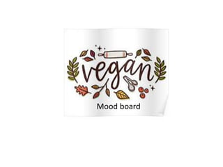
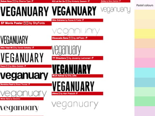
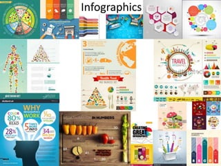
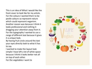
The document outlines a proposed design for the front cover of an article on veganism. It suggests using pastel colors to represent nature and veganism, along with various types of typography and infographics circled around the text. Images of fruits and vegetables are also proposed to draw the reader's eye to the key messages in a simple, uncluttered layout with ample white space.


![[rokonz.com] Glossary of Semantic SEO Part-1.pdf](https://cdn.slidesharecdn.com/ss_thumbnails/rokonz-260123200456-440e4060-thumbnail.jpg?width=640&height=640&fit=bounds)
![[rokonz.com] Glossary of Semantic SEO Part-2.pdf](https://cdn.slidesharecdn.com/ss_thumbnails/rokonz-260123200719-92199ba8-thumbnail.jpg?width=640&height=640&fit=bounds)


