 How did you think about target
  audience?
 How did awareness of that audience
  impact upon your visual design and
  choice of language?
 What key points did you learn about
  Adobe Photoshop and InDesign in
  constructing your artefacts?
   College Cover      College Contents
 What would you do differently next time?
 What kind of feedback did you get that
  might influence you?
 What aspects of your understanding of
  Adobe Photoshop & InDesign do you
  need to improve?
   Genre is Indie Music.


   and my chosen title is NMM because
    my magazines aim is to bring New
    Music Monthly to young music loving
    individuals.
   Model 1   Model 2      Model 3   Model 4
   I learnt from these 4 models that         I learnt from these 4 models that
    indie magazines tend to have               the cover lines can variety of sizes
    both one main image as well as             for example NME main cover line
    groups of people, how ever they            is a larger size to the other cover
    tend to just have one main image           lines. I also learnt that these
    and not lots of other supporting           magazines used a varied amount
    images. I also learnt that all indie       over cover lines from 6 to 3 cover
    magazines have edgy and                    lines. The fonts uses also were very
    creative lay outs which vary and           different from modern sans serif
    they do not follow the normal              fonts to more traditional serif fonts.
    magazine conventions. However
    they all follow the convention of
    have the mast head at the top of
    the page, a few cover lines, one
    main cover line and optional
    elements such as skylines how
    ever this allows the magazines to
    be organised and identifiable as
    magazines and not leaflets for
    example.
   Target Audience: 15-20year olds.

   Frequency: Monthly issues.

   Cover price:£1.75

   Publisher: IPC

   Unique Selling Point: Bringing you New
    Music Every Month.
   Front cover      Here is my magazine I have used a neutral colour
                      scheme consisting of shades of black and white
                      with red and blue accents. I have uses a skyline as
                      a way to include another cover story. My mast
                      head is placed to the left of my front page the
                      Font I used was downloaded from DaFonts.com
                      and is called Vision Division. The image I used I
                      altered and layered behind all the text including
                      the masthead. My cover lines as place to the left
                      of the page and the font used was called Cerbro
                      Autodestuctivo and was also from DaFonts.com. I
                      layered block colour circles onto of the main
                      cover line to add some originality. I also have
                      block colour rectangles being the main cover
                      lines but I altered the transparency. I then
                      constructed the rest of the cover lines by
                      following the same steps as the mast head. The
                      font I used for the other cover lines was called
                      Dlyodastuff. I then add a bar code the price of
                      the magazine which I rotated 90 degrees. I lastly
                      constructed the album review above the
                      barcode I did this by layering text on top of a
                      block coloured circle.
   Raw 1                                    Final 1


   To get from my raw photo to my final photo I first flip the photo
    horizontally then I changed the colour to Black and white. I did this by
    right clicking then transform then selecting flip horizontally (in
    Photoshop). The reason I flip the picture was so the main cover lines and
    supporting cover lines were more visible as on of the models clothing
    was darker which would have made the white text more visible. I also
    flipped the photo so the majority of the Mast head was not obstructed. I
    change the colour of the photo because I wanted a neutral
    background as a posed to the raw background of the original photo. I
    did this by clicking ALT+SHIFT+CTRL+B (in Photoshop).
   Raw 2                                  Final 2


   As I took this photo in natural daylight I did not edit the appearance
    of this photo.
   Raw 3                                Final 3


   I altered my raw photo by changing the saturation I did this by
    selecting image at the top of the screen and then adjusting the
    levels. The reason I did this was because the raw photo was dull and
    needed brightening up.
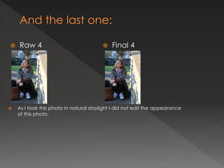
   Raw 4                                  Final 4


   As I took this photo in natural daylight I did not edit the appearance
    of this photo.
Contents Page
                       For my contents page the main features are
                       images which I have uses in stead of lots of text
                        however I have used text which I centre to the
                        right of the page. To contrast the back ground
                        colour white and the photo background black
                        alter the colour of the text depending on the
                        position. I have used a mixture of fonts which I
                        download from Dafonts.com the reason was to
                        add variety and not have simplistic contents
                        page.
   My contents page links back to my font cover by following the same colour
    scheme of black white and red. However I have used a range of colours for
    the page number so it is easy for the reader to pick out the article which
    most interest them. As well as this I have linked the too pages by using the
    same models in similar positioning's to emphasis this is the main article and
    will be part of my double page spread. I also have uses similar modern and
    urban fonts which have also been used on the from cover. The images I have
    used all have a theme of indie style which is my chosen genre.


                         I have used the
                         same colour
                         scheme and the
                         images
                         highlight the
                         same article.
       How have you made the reader want to read on?
        By adding a balanced of images and text I intents to cater for more visual individuals as well as this I
         have also used a variety of colours for the page numbers this is to ensure readers can easily pick out
        the most interesting article . As well as this I have used eye catching and interesting images that tie in
                       with my theme of indie music which will encourage readers to read on.

          What are the links between images and words?
       The main link between the images and the word is my magazine aim to give informative interview with popular
         indie artist buy showing picture of alternative indie artist and in the text area stating who the artist the readers
                                                can see the purpose for the mages.


                    What determines the dominant stories?
        The dominant stories are identifiable by the pictures used which have the
         page numbers attached to the I feel this makes the dominate stories more
                                   evident to the readers.

                   How have you gone about ordering the
                          information on the page?
        The information is orders by chronological numerical older which is easer to
                        read rather than unordered page numbers.
   The main image on my contents page is of the interviewee of my double
    page spread, by having this on my front page and contents I hope that my
    readers will acknowledge this and look forward to reading this article. As well
    as this above to the main article in the text area I have “EXCLUSIVE” in red
    next to the story line and page number, by having this here I hope to draw
    attention to my main story.
I feel this double page was works because the lay out
is simple how ever the use of transparent images and
the wave lengths which over lap the images give an
original feel as well as conveying an Indie music
theme. The large title is attractive and the font and
colour are bold and the chosen title encourages the
reader to read on. As the reader of this magazine will
be young the balance of text to image Is right. The
article its self is short yet informative. Overall I feel this
is a successful and originally designed double page
spread.
   My double page spread works by following the
    main aspect of the double page I feel was
    successful by using a simplistic layout and colour
    scheme. I the font I used was modern font to
    ensure the text did not look washed out I altered
    the colour of the interviewer and the interviewee
    my aim was to ensure the reader could easily read
    article. The image I used I keep simple by not
    adding any effects this was because the natural
    sun light allow the image to have a bright look. I
    add pull quote to break up the text and also to
    engage readers. The title I made bigger and italics
    so it stood out from the other text.
   By sticking to a colour scheme all through out my magazine page I feel they
    all link together and carry the same theme and style. The images I used are
    all taken at the same time so the same feel is carried through out the 3
    component. All images have an indie feel to them which is my genre I feel all
    my main images are original and I moves away form the glossy magazine
    images because indie music and cultures challenge these ideas and
    subject. As well as this I made sure all components in each page from fonts
    to pictures to content had a modern feel which tied in well with my genre.


                  The all
                 highlight
                the same
                   article
                 through
                  image.                   The all share the same colour scheme.
   Cover Page      Key modifications
                     from feedback
   Cover Page      Key modifications
                     from feedback
   Double spread
   You can find my blog here:

(URL)
And
 You can find my evaluation with responses to the 7
   questions here:
(URL)

NB. Make sure you have completed slides 11-15 with
  downloads of the minimum 4 original images
  before thinking this is finished. Then erase this
  reminder.

Presentation slides

  • 3.
     How didyou think about target audience?  How did awareness of that audience impact upon your visual design and choice of language?  What key points did you learn about Adobe Photoshop and InDesign in constructing your artefacts?
  • 4.
    College Cover  College Contents
  • 5.
     What wouldyou do differently next time?  What kind of feedback did you get that might influence you?  What aspects of your understanding of Adobe Photoshop & InDesign do you need to improve?
  • 6.
    Genre is Indie Music.  and my chosen title is NMM because my magazines aim is to bring New Music Monthly to young music loving individuals.
  • 7.
    Model 1 Model 2  Model 3 Model 4
  • 8.
    I learnt from these 4 models that  I learnt from these 4 models that indie magazines tend to have the cover lines can variety of sizes both one main image as well as for example NME main cover line groups of people, how ever they is a larger size to the other cover tend to just have one main image lines. I also learnt that these and not lots of other supporting magazines used a varied amount images. I also learnt that all indie over cover lines from 6 to 3 cover magazines have edgy and lines. The fonts uses also were very creative lay outs which vary and different from modern sans serif they do not follow the normal fonts to more traditional serif fonts. magazine conventions. However they all follow the convention of have the mast head at the top of the page, a few cover lines, one main cover line and optional elements such as skylines how ever this allows the magazines to be organised and identifiable as magazines and not leaflets for example.
  • 9.
    Target Audience: 15-20year olds.  Frequency: Monthly issues.  Cover price:£1.75  Publisher: IPC  Unique Selling Point: Bringing you New Music Every Month.
  • 10.
    Front cover  Here is my magazine I have used a neutral colour scheme consisting of shades of black and white with red and blue accents. I have uses a skyline as a way to include another cover story. My mast head is placed to the left of my front page the Font I used was downloaded from DaFonts.com and is called Vision Division. The image I used I altered and layered behind all the text including the masthead. My cover lines as place to the left of the page and the font used was called Cerbro Autodestuctivo and was also from DaFonts.com. I layered block colour circles onto of the main cover line to add some originality. I also have block colour rectangles being the main cover lines but I altered the transparency. I then constructed the rest of the cover lines by following the same steps as the mast head. The font I used for the other cover lines was called Dlyodastuff. I then add a bar code the price of the magazine which I rotated 90 degrees. I lastly constructed the album review above the barcode I did this by layering text on top of a block coloured circle.
  • 12.
    Raw 1  Final 1  To get from my raw photo to my final photo I first flip the photo horizontally then I changed the colour to Black and white. I did this by right clicking then transform then selecting flip horizontally (in Photoshop). The reason I flip the picture was so the main cover lines and supporting cover lines were more visible as on of the models clothing was darker which would have made the white text more visible. I also flipped the photo so the majority of the Mast head was not obstructed. I change the colour of the photo because I wanted a neutral background as a posed to the raw background of the original photo. I did this by clicking ALT+SHIFT+CTRL+B (in Photoshop).
  • 13.
    Raw 2  Final 2  As I took this photo in natural daylight I did not edit the appearance of this photo.
  • 14.
    Raw 3  Final 3  I altered my raw photo by changing the saturation I did this by selecting image at the top of the screen and then adjusting the levels. The reason I did this was because the raw photo was dull and needed brightening up.
  • 15.
    Raw 4  Final 4  As I took this photo in natural daylight I did not edit the appearance of this photo.
  • 18.
    Contents Page  For my contents page the main features are  images which I have uses in stead of lots of text however I have used text which I centre to the right of the page. To contrast the back ground colour white and the photo background black alter the colour of the text depending on the position. I have used a mixture of fonts which I download from Dafonts.com the reason was to add variety and not have simplistic contents page.
  • 19.
    My contents page links back to my font cover by following the same colour scheme of black white and red. However I have used a range of colours for the page number so it is easy for the reader to pick out the article which most interest them. As well as this I have linked the too pages by using the same models in similar positioning's to emphasis this is the main article and will be part of my double page spread. I also have uses similar modern and urban fonts which have also been used on the from cover. The images I have used all have a theme of indie style which is my chosen genre. I have used the same colour scheme and the images highlight the same article.
  • 20.
    How have you made the reader want to read on?  By adding a balanced of images and text I intents to cater for more visual individuals as well as this I have also used a variety of colours for the page numbers this is to ensure readers can easily pick out the most interesting article . As well as this I have used eye catching and interesting images that tie in with my theme of indie music which will encourage readers to read on.  What are the links between images and words?  The main link between the images and the word is my magazine aim to give informative interview with popular indie artist buy showing picture of alternative indie artist and in the text area stating who the artist the readers can see the purpose for the mages.  What determines the dominant stories?  The dominant stories are identifiable by the pictures used which have the page numbers attached to the I feel this makes the dominate stories more evident to the readers.  How have you gone about ordering the information on the page?  The information is orders by chronological numerical older which is easer to read rather than unordered page numbers.
  • 21.
    The main image on my contents page is of the interviewee of my double page spread, by having this on my front page and contents I hope that my readers will acknowledge this and look forward to reading this article. As well as this above to the main article in the text area I have “EXCLUSIVE” in red next to the story line and page number, by having this here I hope to draw attention to my main story.
  • 23.
    I feel thisdouble page was works because the lay out is simple how ever the use of transparent images and the wave lengths which over lap the images give an original feel as well as conveying an Indie music theme. The large title is attractive and the font and colour are bold and the chosen title encourages the reader to read on. As the reader of this magazine will be young the balance of text to image Is right. The article its self is short yet informative. Overall I feel this is a successful and originally designed double page spread.
  • 25.
    My double page spread works by following the main aspect of the double page I feel was successful by using a simplistic layout and colour scheme. I the font I used was modern font to ensure the text did not look washed out I altered the colour of the interviewer and the interviewee my aim was to ensure the reader could easily read article. The image I used I keep simple by not adding any effects this was because the natural sun light allow the image to have a bright look. I add pull quote to break up the text and also to engage readers. The title I made bigger and italics so it stood out from the other text.
  • 26.
    By sticking to a colour scheme all through out my magazine page I feel they all link together and carry the same theme and style. The images I used are all taken at the same time so the same feel is carried through out the 3 component. All images have an indie feel to them which is my genre I feel all my main images are original and I moves away form the glossy magazine images because indie music and cultures challenge these ideas and subject. As well as this I made sure all components in each page from fonts to pictures to content had a modern feel which tied in well with my genre. The all highlight the same article through image. The all share the same colour scheme.
  • 27.
    Cover Page  Key modifications from feedback
  • 28.
    Cover Page  Key modifications from feedback
  • 29.
    Double spread
  • 31.
    You can find my blog here: (URL) And You can find my evaluation with responses to the 7 questions here: (URL) NB. Make sure you have completed slides 11-15 with downloads of the minimum 4 original images before thinking this is finished. Then erase this reminder.