
Recommended
More Related Content
What's hot
What's hot (18)
Viewers also liked
Similar to Contents Page
Similar to Contents Page (20)
Recently uploaded
Recently uploaded (20)
Contents Page
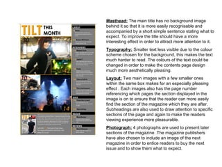
- 1. Masthead: The main title has no background image behind it so that it is more easily recognisable and accompanied by a short simple sentence stating what to expect. To improve the title should have a more interesting effect in order to attract more attention to it. Typography: Smaller text less visible due to the colour scheme chosen for the background, this makes the text much harder to read. The colours of the text could be changed in order to make the contents page design much more aesthetically pleasing. Layout: Two main images with a few smaller ones within the same box makes for an especially pleasing effect . Each images also has the page number referencing which pages the section displayed in the image is on to ensure that the reader can more easily find the section of the magazine which they are after. Subheadings are also used to draw attention to specific sections of the page and again to make the readers viewing experience more pleasurable. Photograph: 4 photographs are used to present later sections of the magazine. The magazine publishers have also chosen to include an image of the next magazine in order to entice readers to buy the next issue and to show them what to expect.
- 2. Masthead: Main title for the page is not in the most obvious of places and does not contrast well with the background and so does not attract as much attention as it should. However the title does follow the main colour scheme of the rest of the page. Typography: Smaller text is printed in a contrasting colour to the background to make it more easily readable and to attract attention to it, there is also very little text of this page. All text featured on the page follows a consistent size and style. Layout: The bottom of the page is dominated one large image, be it underexposed and blurry I am particularly drawn to this layout, however in this particular magazine the bottom image does not attract sufficient attention due to the colour scheme used. Text presented in the conventional manor down one side of the page with smaller quotes within the borders of an image. Photograph: Many of the photographs used within this page are too dark and so blend into the background creating a washed out effect which does not work as well as it should. The photography used within the particular magazine is not as well presented as within professional magazines.
- 3. Masthead: The main masthead is not one of the most obvious titles and is actually presented underneath the title of the page, although it is in-fact the largest body of text. Typography: The titles appear extremely large when in comparison to other text present within this magazine, although this style works well when drawing attention to specific titles and sections of the later pages the effect also distracts attention away from the text underneath. Layout: The layout of this particular magazine appears clustered and does not strike the viewers attention, The titles do not follow the conventional style as used within the majority of other magazines. Photograph: The main image used on this particular page is not the most striking in the sense that it is dramatically underexposed ; however, many of the images used within this page contrast with each other and so do not complement the page well as a whole, I shall avoid this style of layout within my own work