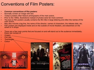
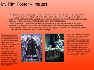
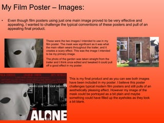
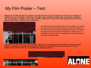
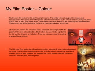
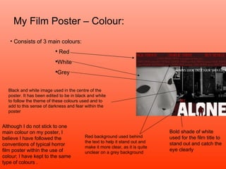
The document discusses conventions of film posters and analyzes the poster created by the author. It begins by defining what a film poster is and common conventions, such as including images of main actors and the film title. The author then explains their poster, which challenges conventions by using two images rather than one large central image. The text in the poster follows conventions by including the title and credits but in a non-traditional location. Color choices on the poster, like dark tones, also align with typical horror film poster conventions. In summarizing their poster design choices, the author evaluates how their poster both challenges conventions and adheres to common expectations for film posters.