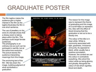
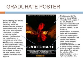
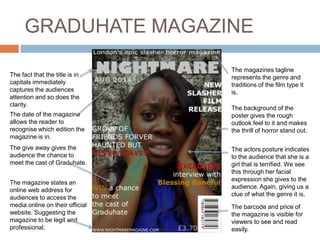
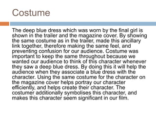
HOW EFFECTIVE IS THE
COMBINATION OF YOUR
MAIN PRODUCT AND
ANCILLARY TEXT
(POSTER AND MAGAZINE)
By Temi Adeuya
Introduction
My A2 media studies coursework required my group
and I to make a film trailer and together produce a
film poster and magazine to go with the film.
When we were making our trailer, poster and
magazine cover we intended to make the three link
together as much as possible through the use of
different elements.
This perhaps would include the use of;
props, costume, hair & make up, colours, fonts and
the main characters themselves.
For the rest of this presentation I will show how the
combination of the two products with the trailers
portrayal of effectiveness.
The film poster
After researching and annotating a real film
poster, the purpose of a poster became clear to
me and the purpose is to advertise the film
through the title, the images portrayed, the
actors’ names, the design/ colours and the
tagline. Using these elements to make the
poster sellable, attractive and connected with the
other products, my group and I created our own
film poster. The next slide is my analysis of the
Graduhate poster.
GRADUHATE POSTER
The colour of the title is in
clear white. White is
commonly associated with
light, goodness, innocence
and purity. As apposed to
black, white usually has a
positive connotation.
However, the context we use
this colour in contradicts
everything. We cohort the
colour white as being gloomy
and ghostly. Alongside the
colour of red which signifies
blood and death.
The film tagline makes the
audience gain a higher
interest in the film as the
tagline illustrates the film in
one short sentence.
The photography is an
ordinary one as such can be
portrayed in real life, but at
the same time exclusive.
The picture leaves the
audience interpreting
meanings from this image.
The anchoring text of the
film title ties down the
image, building judgment of
what symbolises a
graduation.
The reason for this image
was to represent the theme
of graduating and this image
of a scroll helps us represent
this. Also with the effect of
blood showing that this
graduation is set out to be a
bloody one.
The use of jewellery on the
wrist of a female shows that
a dressy event is taking
place within the film. This
perhaps could target female
audiences.
GRADUHATE POSTER
The mentioning of a film the
director has made
previously shows the
audience that the director is
known for what they do. As
the movie ‘Hurt’ is a highly
rated movie in the film
industry. So having
apparent the directors in
our movie is a way of
promoting and advertising
our film.
The names of the actors are
in bold and other words are
written in capitals but not in
bold writing. This is to get
the attention of the
audience as they have a
high interest of the film.
‘GRADUHATE’, the film title
is at the bottom of the page
which I personally feel is
ideal seeing as the films tag
line is placed at the top of
the page, leaving space
between the two significant
sections.
The film title is in the same
font in the trailer and the
film poster showing links
between the products. The
title also indicates the
thriller genre signifying
mystery and gore.
The background of the
poster is dark and helps
reflect the thriller aspect of
the film. The black
background also allows all
the other features on the
poster to stand out to our
audience.
The magazine cover
After researching, analyzing and annotating
magazine covers for films I discovered that the
magazine cover should include the USP of the
film and the main character/s so that the
audience can make links between the
cover, poster and trailer. My group and I created
our own film magazine cover. The next slide is
my analysis of the Graduhate magazine cover.
GRADUHATE MAGAZINE
The fact that the title is in
capitals immediately
captures the audiences
attention and so does the
clarity.
The actors posture indicates
to the audience that she is a
girl that is terrified. We see
this through her facial
expression she gives to the
audience. Again, giving us a
clue of what the genre it is.
The magazines tagline
represents the genre and
traditions of the film type it
is.
The date of the magazine
allows the reader to
recognise which edition the
magazine is in.
The background of the
poster gives the rough
outlook feel to it and makes
the thrill of horror stand out.
The magazine states an
online web address for
audiences to access the
media online on their official
website. Suggesting the
magazine to be legit and
professional.
The barcode and price of
the magazine is visible for
viewers to see and read
easily.
The give away gives the
audience the chance to
meet the cast of Graduhate.
Costume
The deep blue dress which was worn by the final girl is
shown in the trailer and the magazine cover. By showing
the same costume as in the trailer, made this ancillary
link together, therefore making the same feel, and
preventing confusion for our audience. Costume was
important to keep the same throughout because we
wanted our audience to think of this character whenever
they saw a deep blue dress. By doing this it will help the
audience when they associate a blue dress with the
character. Using the same costume for the character on
the magazine cover helps portray our character
efficiently, and helps create their character. The
costumer additionally symbolises this character, and
makes this character seem significant in our film.
Hair and make up
In the area of hair and make up we wanted to
make sure that this was kept the same for
stability. At every moment I was being filmed I
assured myself my hair was kept the same
throughout all times when being filmed on
camera.
The make up of blood that was done on the
character of Kian played by Emmanuel was
created by me and assisted by Martina. As well
as the blood that was done on the character of
amber which was played by myself, was done by
the girls.
Colour
Within the trailer, the only coloured lights that
were used were red and gold. Transparent paper
had been placed upon the led light frame to give
an effect that the surroundings we were in were
naturally that colour. Red paper had been used
for when the teacher was captured inside of the
store cupboard. Whereas a darker and an
intense shade of yellow was used for when
Amber dies in the music room. The colour red is
again used for when the final girl confronts the
killer. Replicating this colour illustrates
meaningfulness in it.
Font
For the title of our trailer we used the font
‘ledlight’ we selected from a website called
DaFont.com. We felt this font gave the phantom
feel of there being a ghost, that is haunting over
the lives of those alive.
In the trailer, the words in red that you shown
upon the black screen was also shown in the
same font throughout. This shows that all the
different words shown is related to each other
purposely forming up a sentence/ rhetorical
question.
Characters
Lastly, the protagonist and antagonist were a
massive element that we included in the poster,
magazine and trailer. These two characters were
used in at least two of the three, if not all, making
them the dominant image on the ancillary task.
Using them helped portray the characters well, and
suggesting to the audience that they are the
dominant characters in the film.
In order for the audience to see this, we decided to
use the main chanters repeatedly in our trailer, from
start to end.
Conclusion & Consistency
Comparing our three media products, we kept the
same typography text and colouring. This
establishes that this product is iconic production
through continuity.
The image of the scroll on the poster is attentive to
teens and above as it is aspect they may
experience or had of experience.
It is really important to repeat elements of a trailer in
other media’s to help promote a film effectively. It
helps tie all the media’s together, making them one
whole piece, preventing confusion from potential
audiences.

Poster and magazine analysis media

  • 1.
    HOW EFFECTIVE ISTHE COMBINATION OF YOUR MAIN PRODUCT AND ANCILLARY TEXT (POSTER AND MAGAZINE) By Temi Adeuya
  • 2.
    Introduction My A2 mediastudies coursework required my group and I to make a film trailer and together produce a film poster and magazine to go with the film. When we were making our trailer, poster and magazine cover we intended to make the three link together as much as possible through the use of different elements. This perhaps would include the use of; props, costume, hair & make up, colours, fonts and the main characters themselves. For the rest of this presentation I will show how the combination of the two products with the trailers portrayal of effectiveness.
  • 3.
    The film poster Afterresearching and annotating a real film poster, the purpose of a poster became clear to me and the purpose is to advertise the film through the title, the images portrayed, the actors’ names, the design/ colours and the tagline. Using these elements to make the poster sellable, attractive and connected with the other products, my group and I created our own film poster. The next slide is my analysis of the Graduhate poster.
  • 4.
    GRADUHATE POSTER The colourof the title is in clear white. White is commonly associated with light, goodness, innocence and purity. As apposed to black, white usually has a positive connotation. However, the context we use this colour in contradicts everything. We cohort the colour white as being gloomy and ghostly. Alongside the colour of red which signifies blood and death. The film tagline makes the audience gain a higher interest in the film as the tagline illustrates the film in one short sentence. The photography is an ordinary one as such can be portrayed in real life, but at the same time exclusive. The picture leaves the audience interpreting meanings from this image. The anchoring text of the film title ties down the image, building judgment of what symbolises a graduation. The reason for this image was to represent the theme of graduating and this image of a scroll helps us represent this. Also with the effect of blood showing that this graduation is set out to be a bloody one. The use of jewellery on the wrist of a female shows that a dressy event is taking place within the film. This perhaps could target female audiences.
  • 5.
    GRADUHATE POSTER The mentioningof a film the director has made previously shows the audience that the director is known for what they do. As the movie ‘Hurt’ is a highly rated movie in the film industry. So having apparent the directors in our movie is a way of promoting and advertising our film. The names of the actors are in bold and other words are written in capitals but not in bold writing. This is to get the attention of the audience as they have a high interest of the film. ‘GRADUHATE’, the film title is at the bottom of the page which I personally feel is ideal seeing as the films tag line is placed at the top of the page, leaving space between the two significant sections. The film title is in the same font in the trailer and the film poster showing links between the products. The title also indicates the thriller genre signifying mystery and gore. The background of the poster is dark and helps reflect the thriller aspect of the film. The black background also allows all the other features on the poster to stand out to our audience.
  • 6.
    The magazine cover Afterresearching, analyzing and annotating magazine covers for films I discovered that the magazine cover should include the USP of the film and the main character/s so that the audience can make links between the cover, poster and trailer. My group and I created our own film magazine cover. The next slide is my analysis of the Graduhate magazine cover.
  • 7.
    GRADUHATE MAGAZINE The factthat the title is in capitals immediately captures the audiences attention and so does the clarity. The actors posture indicates to the audience that she is a girl that is terrified. We see this through her facial expression she gives to the audience. Again, giving us a clue of what the genre it is. The magazines tagline represents the genre and traditions of the film type it is. The date of the magazine allows the reader to recognise which edition the magazine is in. The background of the poster gives the rough outlook feel to it and makes the thrill of horror stand out. The magazine states an online web address for audiences to access the media online on their official website. Suggesting the magazine to be legit and professional. The barcode and price of the magazine is visible for viewers to see and read easily. The give away gives the audience the chance to meet the cast of Graduhate.
  • 8.
    Costume The deep bluedress which was worn by the final girl is shown in the trailer and the magazine cover. By showing the same costume as in the trailer, made this ancillary link together, therefore making the same feel, and preventing confusion for our audience. Costume was important to keep the same throughout because we wanted our audience to think of this character whenever they saw a deep blue dress. By doing this it will help the audience when they associate a blue dress with the character. Using the same costume for the character on the magazine cover helps portray our character efficiently, and helps create their character. The costumer additionally symbolises this character, and makes this character seem significant in our film.
  • 9.
    Hair and makeup In the area of hair and make up we wanted to make sure that this was kept the same for stability. At every moment I was being filmed I assured myself my hair was kept the same throughout all times when being filmed on camera. The make up of blood that was done on the character of Kian played by Emmanuel was created by me and assisted by Martina. As well as the blood that was done on the character of amber which was played by myself, was done by the girls.
  • 10.
    Colour Within the trailer,the only coloured lights that were used were red and gold. Transparent paper had been placed upon the led light frame to give an effect that the surroundings we were in were naturally that colour. Red paper had been used for when the teacher was captured inside of the store cupboard. Whereas a darker and an intense shade of yellow was used for when Amber dies in the music room. The colour red is again used for when the final girl confronts the killer. Replicating this colour illustrates meaningfulness in it.
  • 11.
    Font For the titleof our trailer we used the font ‘ledlight’ we selected from a website called DaFont.com. We felt this font gave the phantom feel of there being a ghost, that is haunting over the lives of those alive. In the trailer, the words in red that you shown upon the black screen was also shown in the same font throughout. This shows that all the different words shown is related to each other purposely forming up a sentence/ rhetorical question.
  • 12.
    Characters Lastly, the protagonistand antagonist were a massive element that we included in the poster, magazine and trailer. These two characters were used in at least two of the three, if not all, making them the dominant image on the ancillary task. Using them helped portray the characters well, and suggesting to the audience that they are the dominant characters in the film. In order for the audience to see this, we decided to use the main chanters repeatedly in our trailer, from start to end.
  • 13.
    Conclusion & Consistency Comparingour three media products, we kept the same typography text and colouring. This establishes that this product is iconic production through continuity. The image of the scroll on the poster is attentive to teens and above as it is aspect they may experience or had of experience. It is really important to repeat elements of a trailer in other media’s to help promote a film effectively. It helps tie all the media’s together, making them one whole piece, preventing confusion from potential audiences.