How effective is the
combination of your main
product and ancillary texts?
Becky Robe
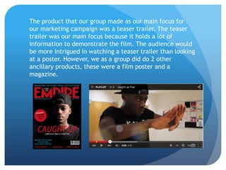
The product that our group made as our main focus for
our marketing campaign was a teaser trailer. The teaser
trailer was our main focus because it holds a lot of
information to demonstrate the film. The audience would
be more intrigued in watching a teaser trailer than looking
at a poster. However, we as a group did do 2 other
ancillary products, these were a film poster and a
magazine.
Film Poster
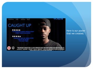
The poster is an ancillary text. This is a product which allows an audience
to gain more information, for example this consist of the date of release,
the producers as well as the directors. The information that you would not
usually find displayed throughout a teaser trailer is what has been placed
on the other forms of products we have made. In our poster we have made
the main character our main focus, we have created an edgy and urban feel
by making the poster look quite dark. By having a dark background we are
able to represent our narrative, the narrative contain drugs which are bad.
Therefore this creates a darkened atmosphere. We decided to have a blue
colour title, this was to stand out from the darkness and catch the
audiences eye. We have used the same font and colour of blue throughout
our teaser trailer and other products. This colour and font became part of
our branding. The reason for this is because it has been used throughout
and therefore an audience may be able to relate the fonts and colours back
to our film teaser. As well as this we used quotes throughout our poster
enhancing our dancing theme, the purpose was so the audience will see the
poster and hopefully spark their memory and recognise its our film.
Here is our poster
that we created.
Magazine Cover
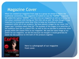
When we created our magazine front page as a group we aimed to follow the
traditional conventions, the magazine we looked at was the “EMPIRE” magazine.
We added the typical “EMPIRE” red title onto our magazine as well as keeping the
red colour consistent with having our film title red as well. We also thought it was
important to incorporate some blue titles to keep our branding of colours
consistent within all of our products. We have placed a slogan on our cover, this
slogan says “Limitless meets Step Up” The purpose of this slogan is to advertise to
the audience that this is a dance film. As well as this we decided to advertise other
groups within the classes films on our magazine. We used the same image as our
poster for our magazine, we did this because we thought it would generally be
easier for the audience to link both of the products together.
Here is a photograph of our magazine
front cover.
Main product – Teaser Trailer
Our main product was our teaser trailer, this incorporate ancillary
texts into a more detailed final product. Again, our teaser trailer
uses the same consistent colour schemes and fonts throughout the
trailer, the difference of the trailer and the other products is that
the trailer actually tells the audience part of the narrative without
actually giving it all away. The teaser trailer relates to the poster
and magazine cover, however it demonstrates the trailer in a much
more detailed way. Luckily, our trailer doesn't give away the plot.
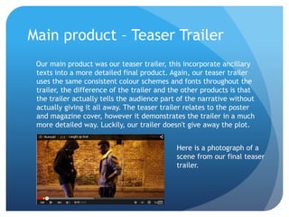
Here is a photograph of a
scene from our final teaser
trailer.

Evaluation question 2

  • 1.
    How effective isthe combination of your main product and ancillary texts? Becky Robe
  • 2.
    The product thatour group made as our main focus for our marketing campaign was a teaser trailer. The teaser trailer was our main focus because it holds a lot of information to demonstrate the film. The audience would be more intrigued in watching a teaser trailer than looking at a poster. However, we as a group did do 2 other ancillary products, these were a film poster and a magazine.
  • 3.
    Film Poster The posteris an ancillary text. This is a product which allows an audience to gain more information, for example this consist of the date of release, the producers as well as the directors. The information that you would not usually find displayed throughout a teaser trailer is what has been placed on the other forms of products we have made. In our poster we have made the main character our main focus, we have created an edgy and urban feel by making the poster look quite dark. By having a dark background we are able to represent our narrative, the narrative contain drugs which are bad. Therefore this creates a darkened atmosphere. We decided to have a blue colour title, this was to stand out from the darkness and catch the audiences eye. We have used the same font and colour of blue throughout our teaser trailer and other products. This colour and font became part of our branding. The reason for this is because it has been used throughout and therefore an audience may be able to relate the fonts and colours back to our film teaser. As well as this we used quotes throughout our poster enhancing our dancing theme, the purpose was so the audience will see the poster and hopefully spark their memory and recognise its our film.
  • 4.
    Here is ourposter that we created.
  • 5.
    Magazine Cover When wecreated our magazine front page as a group we aimed to follow the traditional conventions, the magazine we looked at was the “EMPIRE” magazine. We added the typical “EMPIRE” red title onto our magazine as well as keeping the red colour consistent with having our film title red as well. We also thought it was important to incorporate some blue titles to keep our branding of colours consistent within all of our products. We have placed a slogan on our cover, this slogan says “Limitless meets Step Up” The purpose of this slogan is to advertise to the audience that this is a dance film. As well as this we decided to advertise other groups within the classes films on our magazine. We used the same image as our poster for our magazine, we did this because we thought it would generally be easier for the audience to link both of the products together. Here is a photograph of our magazine front cover.
  • 6.
    Main product –Teaser Trailer Our main product was our teaser trailer, this incorporate ancillary texts into a more detailed final product. Again, our teaser trailer uses the same consistent colour schemes and fonts throughout the trailer, the difference of the trailer and the other products is that the trailer actually tells the audience part of the narrative without actually giving it all away. The teaser trailer relates to the poster and magazine cover, however it demonstrates the trailer in a much more detailed way. Luckily, our trailer doesn't give away the plot. Here is a photograph of a scene from our final teaser trailer.