
Recommended
More Related Content
What's hot
What's hot (17)
Viewers also liked
Viewers also liked (13)
Similar to Evaluation
Similar to Evaluation (20)
Recently uploaded
Recently uploaded (20)
Evaluation
- 2. 1. In what ways does your media product use, develop or challenge forms and conventions of real media products? Front Page Similarities Masthead Main Image Cover lines Coloured background and similar colours are used for fonts (black, white and red) Barcode Logo
- 3. Title Differences The student I have chosen appears to be posing, crossed arms with a smile. He is also looking away giving an effect he is aiming for something whereas Trey Songz has a mean look on his face and is flexing off his body. The title I have used is not as big as the title ‘VIBE’ have used, I have also used a sub heading however ‘VIBE’ has not. Although the backgrounds are both coloured, I have used the back of an office to create a more student feel. ‘VIBE’ has used a mosaic black background, this draws more focus to Trey Songz thus drawing in the intended audience even more. ‘VIBE’ has a picture of the previous magazine on the front.
- 4. Both titles have the same format of text which is bold writing. Pages go up in two Both magazines have 3 pictures
- 5. Standard colour is used for the font however my one has an eye catching appearance. The contents they have used is similar to that of Google, this can bore the reader as most people can identify the theme. However I have used contrasting colours which is less likely to bore readers. I have used a grey background as opposed to the white one ‘Half Court’ have used as it makes the writing stand out more.
- 6. I have learnt a lot about technology throughout constructing this product, I have learnt how to use a camera properly. I have also learnt about adobe Photoshop and how I can use its services to manipulate my images and texts. I also used In Design to make my contents page, this was quite easy to use as the contents page I wanted was quite simplistic.
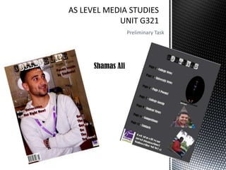
- 7. When taking pictures for my magazine cover I was looking for someone who looked like the could represent the college justly. I found this in a student called Hassan, throughout all the pictures I took I loved the way his pose seemed to look. He was looking to the side, this was somewhat portraying he is looking towards something, aiming towards something, as we all are in in college! My use of Adobe Photoshop was also important as it help me to give my image more an overall and pleasing effect to the customer. As you can see in the picture above it is light and not very pleasant on the eye, whereas when I gave it some levels and made it slightly darker it looks exactly what a magazine cover should look like. I also cropped out the top as the picture was originally too big, I also zoomed in closer taking away the door from the picture.
- 8. When using In Design for my contents page the word simplistic sprang to my mind. I kept it really simple by using a dark grey background to make the writing on the page stand out more, I also added three images. The artistic picture was essentially a really bad picture of a student but after playing about a bit I realised that I had made something similar to a digital art picture, I then added to my contents page to give it another dimension and it is also something different from a normal picture. Maybe I should have used a different colour for my background as the colour grey is kind of dull.