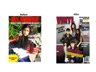
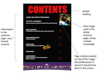
The document compares the learner's preliminary magazine project to their final music magazine project. Some of the key improvements noted include:
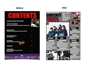
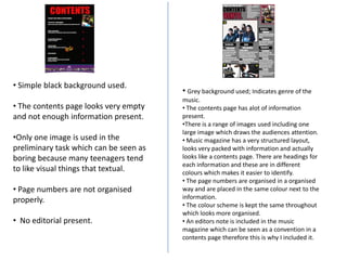
- Developing stronger Photoshop skills like cropping images, adding gradients, and making elements look more 3D
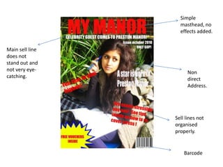
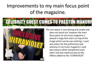
- Including more magazine conventions like mastheads, slogans, sell lines, and freebies
- Designing for the target audience better by researching genres and including relevant images/content
- Organizing elements more professionally and cohesively across pages


![Preliminary task, school magazine compared to music[1]](https://cdn.slidesharecdn.com/ss_thumbnails/preliminarytaskschoolmagazinecomparedtomusic1-130201041120-phpapp02-thumbnail.jpg?width=640&height=640&fit=bounds)


