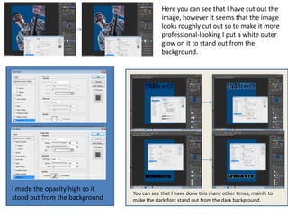
Skills Development

By Luke Gort for AS Media
You can see here that I have added
   some light blue rectangles and put
   them on the slant so the background
   for my music magazine wouldn’t be
   so plain and would stand out a lot
   more.


On this practice page for Photoshop
you can see I have placed an image
onto a font (the name and the picture
both relating to each other). I done
this using the colour range in order to
select the black of the font. I then
deselected the layer and selected the
layer with the picture on it, inversed
and deleted the part of the picture in
which only left the picture shaped
into the font. This process is called
image to texting.
Here you can see that I have cut
                                                         out the persons head of practice
                                                         image I took using the magnetic
                                                         lasso tool.


Here as a practice before making my album cover, or magazine covers you can see
that I have used colour splash to change the lion to the colour grey and then used
the magnetic lasso tool to cut out his eyes on the original coloured lion in which I
then place on top of my grey lion making it look like the lion had normal coloured
eyes whilst it was still grey.
I also learnt how to cut out images such as the fonts from dafont, such
as the ‘features’ title without it having a rough edge in which would
look poor. I did this by pasting the font into a separate blank document
and then clicking ‘select’ and then ‘colour range’. I then took the font
and pasted it into my magazine document.


When using artists in my contents page I tried to make it so that the reader will
recognise the bang by a similar style as their albums or logos, so I have tried to
make You Me At Six on my contents page look like their album ‘Take Off Your
Colours’ by first getting a similar font off dafont.com and using the paint brush from
Photoshop to make it similar to the paint splatters on the album cover.
Here you can see that I have cut out the
                                            image, however it seems that the image
                                            looks roughly cut out so to make it more
                                            professional-looking I put a white outer
                                            glow on it to stand out from the
                                            background.


I made the opacity high so it
                                You can see that I have done this many other times, mainly to
stood out from the background   make the dark font stand out from the dark background.
Skills development

Skills development

  • 1.
    Skills Development By LukeGort for AS Media
  • 2.
    You can seehere that I have added some light blue rectangles and put them on the slant so the background for my music magazine wouldn’t be so plain and would stand out a lot more. On this practice page for Photoshop you can see I have placed an image onto a font (the name and the picture both relating to each other). I done this using the colour range in order to select the black of the font. I then deselected the layer and selected the layer with the picture on it, inversed and deleted the part of the picture in which only left the picture shaped into the font. This process is called image to texting.
  • 3.
    Here you cansee that I have cut out the persons head of practice image I took using the magnetic lasso tool. Here as a practice before making my album cover, or magazine covers you can see that I have used colour splash to change the lion to the colour grey and then used the magnetic lasso tool to cut out his eyes on the original coloured lion in which I then place on top of my grey lion making it look like the lion had normal coloured eyes whilst it was still grey.
  • 4.
    I also learnthow to cut out images such as the fonts from dafont, such as the ‘features’ title without it having a rough edge in which would look poor. I did this by pasting the font into a separate blank document and then clicking ‘select’ and then ‘colour range’. I then took the font and pasted it into my magazine document. When using artists in my contents page I tried to make it so that the reader will recognise the bang by a similar style as their albums or logos, so I have tried to make You Me At Six on my contents page look like their album ‘Take Off Your Colours’ by first getting a similar font off dafont.com and using the paint brush from Photoshop to make it similar to the paint splatters on the album cover.
  • 5.
    Here you cansee that I have cut out the image, however it seems that the image looks roughly cut out so to make it more professional-looking I put a white outer glow on it to stand out from the background. I made the opacity high so it You can see that I have done this many other times, mainly to stood out from the background make the dark font stand out from the dark background.