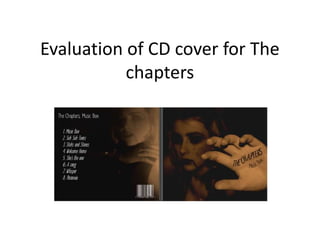
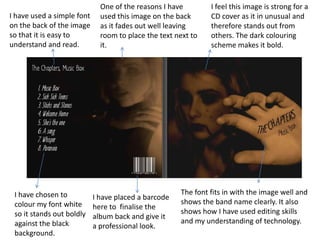
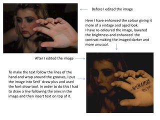
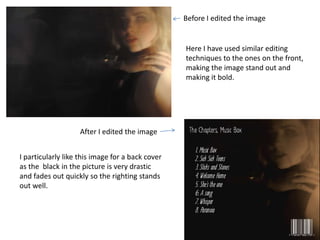
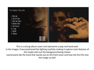
Evaluation of CD cover for The
           chapters
Imagery that I took as options for my cover picture...


                                           I did not use these
                                           images in the end as I
                                           did not feel they were
                                           strong enough to be on
                                           the front of a CD cover
One of the reasons I have        I feel this image is strong for a
I have used a simple font     used this image on the back      CD cover as it in unusual and
on the back of the image      as it fades out well leaving     therefore stands out from
so that it is easy to         room to place the text next to   others. The dark colouring
understand and read.          it.                              scheme makes it bold.


 I have chosen to                                     The font fits in with the image well and
                            I have placed a barcode
 colour my font white                                 shows the band name clearly. It also
                            here to finalise the
 so it stands out boldly                              shows how I have used editing skills
                            album back and give it
 against the black                                    and my understanding of technology.
                            a professional look.
 background.
Before I edited the image

                                                Here I have enhanced the colour giving it
                                                more of a vintage and aged look.
                                                I have re-coloured the image, lowered
                                                the brightness and enhanced the
                                                contrast making the imaged darker and
                                                more unusual.


                 After I edited the image


To make the text follow the lines of the
hand and wrap around the grooves, I put
the image into Serif draw plus and used
the font draw tool. In order to do this I had
to draw a line following the ones in the
image and then insert text on top of it.
Before I edited the image


                                                  Here I have used similar editing
                                                  techniques to the ones on the front,
                                                  making the image stand out and
                                                  making it bold.


                    After I edited the image


I particularly like this image for a back cover
as the black in the picture is very drastic
and fades out quickly so the righting stands
out well.
This is a strong album cover and represents a pop rock band well.
In the images I have positioned the lighting carefully making it capture main features of
                      the model with out the background being shown.
 I particularly like the hand that stands out on the front cover and how the font fits into
                                      the image so well.

Evaluation of chapters cd cover

  • 1.
    Evaluation of CDcover for The chapters
  • 2.
    Imagery that Itook as options for my cover picture... I did not use these images in the end as I did not feel they were strong enough to be on the front of a CD cover
  • 3.
    One of thereasons I have I feel this image is strong for a I have used a simple font used this image on the back CD cover as it in unusual and on the back of the image as it fades out well leaving therefore stands out from so that it is easy to room to place the text next to others. The dark colouring understand and read. it. scheme makes it bold. I have chosen to The font fits in with the image well and I have placed a barcode colour my font white shows the band name clearly. It also here to finalise the so it stands out boldly shows how I have used editing skills album back and give it against the black and my understanding of technology. a professional look. background.
  • 4.
    Before I editedthe image Here I have enhanced the colour giving it more of a vintage and aged look. I have re-coloured the image, lowered the brightness and enhanced the contrast making the imaged darker and more unusual. After I edited the image To make the text follow the lines of the hand and wrap around the grooves, I put the image into Serif draw plus and used the font draw tool. In order to do this I had to draw a line following the ones in the image and then insert text on top of it.
  • 5.
    Before I editedthe image Here I have used similar editing techniques to the ones on the front, making the image stand out and making it bold. After I edited the image I particularly like this image for a back cover as the black in the picture is very drastic and fades out quickly so the righting stands out well.
  • 6.
    This is astrong album cover and represents a pop rock band well. In the images I have positioned the lighting carefully making it capture main features of the model with out the background being shown. I particularly like the hand that stands out on the front cover and how the font fits into the image so well.