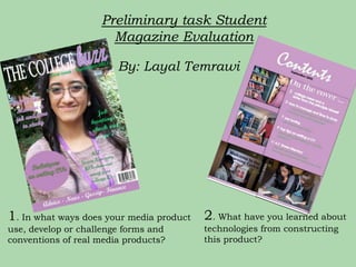
My media product uses conventions of real magazines by including a masthead, cover lines, rule of thirds placement of images, and different color schemes. I learned various techniques using Photoshop, InDesign, and a camera. Photoshop allowed me to crop and resize images while InDesign helped set up the contents page. Moodle provided resources to research magazine elements. Overall, constructing this magazine helped improve my technical skills with design software and taking quality photos.
1. Preliminary task Student
Magazine Evaluation
By: Layal Temrawi
1. In what ways does your media product 2. What have you learned about
use, develop or challenge forms and technologies from constructing
conventions of real media products? this product?
2. In what ways does your media product use,
develop or challenge forms and conventions of
other media products? FRONT COVER
Masthead
Cover
lines
Dominant
image
Backgrou
nd
(white
backgrou
Colour
nd)
schemes
Barcode
Rule of Thirds Rule of Thirds
Banner
3. Differences between front covers
MASTHEAD- Miley is slightly hiding a
bit of the ‘L’, this shows that editors at
ELLE are confident that although a bit of
the title is hidden, readers will still
recognise the magazine. However, I was
not able to afford to do that since this is
the first issue of ‘The College Buzz’ and
brand recognition has not been
developed yet.
COLOURS - Different colour schemes. My
BACKGROUND -Instead of having main colours were purple white and green.
whitespace ( as shown on the Used to attract a combination of both
opposing cover) I decided to use genders
college scenery as my background. • green(males)
I also chose to match the colour of • purple(females)
the trees and her clothing because
they complimented each other ( The colours they have used tend to be
these are also Solihull Sixth Form’s more sophisticated and associate with the
branded colours) theme of then issue.
4. Differences between front covers
MODELS- The model on my
cover looks more approachable
and friendly, even though both
youths are smiling. Miley Cyrus
seems to look more like a sex
symbol ( Since the main cover
story is ‘ On Dad, boyfriends, and
why she’s not a kid anymore) the
attire placed on each model also
varies. Both youths are placed in
the centre of the page and are
making eye contact with the
reader. This means that we have
both taken the rule of thirds into
consideration.
COVER LINES -Different cover lines. Articles that would interest college
students in general as they are my target audience, rather than just females
with a flare for fashion.
5. In what ways does your media product
use, develop or challenge forms and
conventions of other media products?
CONTENTS PAGE
Masthead
Text layout of
Contents
Use of sub
headings to assist
reader
Images
6. Differences between Contents page
MASTHEAD -My
masthead is more
dominant. It stands
out, whereas ‘ELLE’
seems to blend in
with the
background. I have
chosen to put my
masthead in the top
center whereas, in
the opposing
contents page it is
on the top left
corner.
SUBHEADINGS- I have similarly
added sub headings as ELLE has, to
help and direct readers on finding
the articles that will interest them
most.
7. Differences between Contents page
IMAGES -I have laid out the images clearly so that
everything is visible to the reader. ELLE has
combined their images in the form of a collage.
They have obviously used a more professional
camera which has produced the images in high
resolution.
CONTENTS LAYOUT- I have spread out the writing to
make it clear, readable and have placed it on the right
side of the page. On the other hand, ELLE have used a
smaller font since they have a wider range of articles and
can afford to squish the writing together because readers
already know what to expect from the magazine.
8. What have you learned about
technologies from constructing this
product?
Using
Photoshop to
manipulate
images
Using InDesign
to set up and
produce my
contents page.
Gathering
resources and
information
using Moodle.
9. What have you learned about
technologies from constructing this
product?
Using a Camera to
take images and
the USB port to
transfer images on the
Computer
10. ADOBE PHOTOSHOP
ADOBE PHOTOSHOP – For my
front cover
I learned various techniques whilst
using adobe Photoshop. A number of
these would include:
Converting a regular A4 paper into Click on file then
international. open new, and
Using the crop tool and magic wand then on present. I
to erase any anomalies and scrolled down to
unsolicited parts. international
paper
Opening images into Photoshop
and resizing without stretching
them or weakening the resolution.
And I was able to experiment with
different fonts on both Photoshop
and InDesign
11. ADOBE INDESIGN
Click on file then
export and then ADOBE INDESIGN
I learned various techniques
whilst using adobe InDesign.
Click on the rectangular tool
and then click and drag the
A number of these would
box to your preference. include:
Adding rectangles to put
in my images and text
boxes.
Exporting the page when
finished.
Filling in the colour of the
page.
12. MOODLE
Moodle had been very
beneficial throughout the
whole process because
there were lots of
different documents and I
able to refresh my mind
on the various types of
shots and gather another
preliminary task booklet
since I had misplaced
mine.
13. CAMERA
While using the camera I learned about…
• Using a cable I was able
to transfer images from
the camera and onto my
Media folder on the
computer.
Ensuring my image was an MCU. I
ensured that I got her in the
centre and that I had also left
room for the masthead above.