Esri News for Oceans Fall 2012 newsletter
•
1 like•886 views

SeaSketch is a new online geospatial planning tool developed by researchers at the University of California, Santa Barbara that incorporates ArcGIS technologies. It allows stakeholders to collaboratively plan marine resource use by sketching out proposals, analyzing impacts, and producing reports in an online workspace. SeaSketch improves on previous tools by being less expensive, easier to maintain, and faster to deploy for marine spatial planning projects. It leverages existing ArcGIS for Server map services and ArcGIS Online data to provide users with robust analytical capabilities and large amounts of geospatial data.

Recommended
More Related Content
What's hot
What's hot (20)
Viewers also liked
Viewers also liked (20)
Similar to Esri News for Oceans Fall 2012 newsletter
Similar to Esri News for Oceans Fall 2012 newsletter (20)
More from Esri
More from Esri (20)
Recently uploaded
Recently uploaded (20)
Esri News for Oceans Fall 2012 newsletter
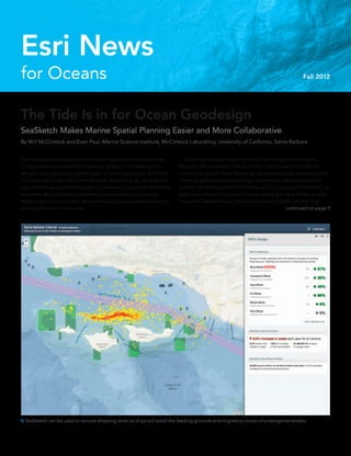
- 1. The Tide Is in for Ocean Geodesign SeaSketch Makes Marine Spatial Planning Easier and More Collaborative By Will McClintock and Evan Paul, Marine Science Institute, McClintock Laboratory, University of California, Santa Barbara Technology enables planners to conduct rapid and iterative analysis of the impacts of a potential initiative or project. This feedback on designs using geospatial technologies is called geodesign, and it has come to play a large role in diverse fields of planning. By using geode- sign techniques and technologies to create plans, scientists and others are better able to balance competing interests among the policy makers, resource managers, environmentalists, and stakeholders who manage the earth’s resources. for Oceans Esri News Fall 2012 Geodesign is beginning to be used in planning for the oceans. Recently, Esri launched its Oceans GIS initiative, which includes im- proving the global Ocean Basemap, developing better oceanographic charting capabilities, and creating a bathymetric data management solution. Another part of this initiative is Esri’s support of SeaSketch, an application that will be used in marine spatial planning efforts around the world. SeaSketch is a Software as a Service (SaaS) solution that SeaSketch can be used to reroute shipping lanes so ships will avoid the feeding grounds and migratory routes of endangered whales. continued on page 3
- 2. Fall 2012 Esri News for Oceans is a publication of the Oceans Solutions Group of Esri. To contact the Esri Desktop Order Center, call 1-800-447-9778 within the United States or 909-793-2853, extension 1-1235, outside the United States. Visit the Esri website at esri.com. View Esri News for Oceans online at esri.com/oceans or scan the code below with your smartphone. Advertise with Us E-mail ads@esri.com. Submit Content To submit articles for publication in Esri News for Oceans, contact Drew Stephens, industry solutions consultant at dstephens@esri.com, or Barbara Shields, editor, at bshields@esri.com. Manage Your Subscription To update your mailing address or subscribe or unsubscribe to Esri publications, visit esri.com/manageyoursubscription. International customers should contact an Esri distributor to manage their subscriptions. For a directory of distributors, visit esri.com/distributors. Circulation Services For back issues, missed issues, and other circulation services, e-mail requests@esri.com; call 909-793-2853, extension 2778; or fax 909-798-0560. 2 Esri News for Oceans Fall 2012 Contents Cover 1 The Tide Is in for Ocean Geodesign Esri Ocean GIS Initiative 4 Chief Scientist Announces Esri Ocean GIS Initiative 5 ArcGIS Resource Center Offers Ocean GIS Services 5 Esri Oceans Summit Guides GIS Development 5 Esri Joins World Ocean Council 6 Create Charts and Manage Bathymetric Data on the Platform 7 Ocean Basemap Is on ArcGIS Online Case Study 8 Digital Maps Improve Polar Ice Navigation Esri News 11 Esri Career Opportunities 11 Esri on the Road 11 GIS for the Oceans Is More Than a Sea Tale The information contained in this work is the exclusive property of Esri or its licensors. This work is protected under United States copyright law and other international copyright treaties and conventions. No part of this work may be reproduced or transmitted in any form or by any means, electronic or mechanical, including photocopying and recording, or by any information storage or retrieval system, except as expressly permitted in writing by Esri. All requests should be sent to Attention: Contracts and Legal Services Manager, Esri, 380 New York Street, Redlands, CA 92373-8100 usa. The information contained in this work is subject to change without notice. Esri, the Esri globe logo, ArcGIS, arcgis.com, esri.com, and @esri.com are trademarks, registered marks, or service marks of Esri in the United States, the European Community, or certain other jurisdictions. Other companies and products or services mentioned herein may be trademarks, service marks, or registered marks of their respective mark owners. Copyright © 2012 Esri. All rights reserved. Printed in the United States of America.
- 3. incorporates ArcGIS technologies. People will find SeaSketch useful for marine work such as aquaculture (fisheries) siting, offshore energy development, and marine protected area management planning. Researchers at the University of California, Santa Barbara (UCSB), re- cently finished the initial development of SeaSketch. It’s a GIS platform designed for marine spatial planners and ocean resource managers who need to work with partner agencies and stakeholders to make de- cisions about ocean resources. In SeaSketch, planners set up an online collaborative workspace where stakeholders sketch plan elements (e.g., marine protected areas, aquaculture sites, offshore energy facilities), understand the designs’ potential consequences, and work with other users to find agreement. SeaSketch can be customized for particular planning tasks, and analytical tools can be incorporated for the specific needs of planning projects. Users can plan diverse sketch elements with tailored analyti- cal tools within SeaSketch. This workflow supports multiple-objective planning by providing a venue for comprehensive data visualization and analysis and a forum for productive, cross-disciplinary discus- sions. The designs can then be submitted for consideration within the decision-making process to determine how best to protect marine life, manage fisheries, modify shipping lanes, and produce energy within the constraints of regulations, boundaries, timelines, and budgets. Traditional planning techniques have been constrained by time, dis- tance, and the availability of expertise. SeaSketch enables stakeholders to participate remotely and in face-to-face meetings, at any time, and use an intuitive mapping interface to better understand and discuss proposals. The result is a more robust, authentic, and science-based involvement of stakeholders in the planning process. SeaSketch developers built on the many strengths of MarineMap, their previous marine spatial planning tool. MarineMap was initially developed to support the planning process for California’s Marine Life Protection Act Initiative, which required the state to evaluate and redesign its system of marine protected areas. Users with web access can take advantage of MarineMap to display maps, sketch marine protected area proposals, generate analytical reports, and share proposals with others. SeaSketch is less expensive, easier to maintain, and faster to deploy than its predecessor. Project managers use an administrative interface to create and configure new projects. They also configure details such as the study area, available data layers, and the feature classes to be collected from users. Because SeaSketch incorporates Esri’s ArcGIS API for JavaScript, project managers move seamlessly from their ArcGIS for Desktop and ArcGIS for Server environments into SeaSketch. SeaSketch also leverages an agency’s investments in ArcGIS for Server by directly pulling in the agency’s published map services, ensuring that SeaSketch is using the organization’s most current data. Esri’s ArcGIS Online map service, which is a cloud-based, collaborative content management system for maps, applications, data, and other geospatial information, plays a major role in SeaSketch by enabling project managers to discover and view an enormous amount of ad- ditional geospatial data that may be helpful for their projects. For more information about SeaSketch, contact Will McClintock at mcclintock@ msi.ucsb.edu. If you are interested in using SeaSketch for an upcoming marine spatial planning project, contact Evan Paul at evan.paul@msi.ucsb.edu. Read more about geodesign at esri.com/geodesign. Ñ Stakeholders can propose new designs, conduct analyses, and produce reports. 3Fall 2012 esri.com/oceans The Tide Is in for Ocean Geodesign continued from page 1
- 4. Chief Scientist Announces Esri Ocean GIS Initiative GIS technology, which has long provided effective solutions for the integration, visualization, and analysis of information about land, is now being similarly applied to oceans. Our ability to measure change in the oceans (including open ocean, nearshore, and coast) is increasing not only because of improved measuring devices and scientific techniques but also because new GIS technology is aiding us in better understanding this dynamic environment. The domain has progressed from applications that merely collect and display data to complex simulation and modeling and the development of new research methods and concepts. Esri chief scientist Dawn Wright announced Esri’s Ocean GIS Initiative at the 2012 Esri International User Conference. “The team supporting this initiative is composed of professional services staff, GIS software engineers, project managers, instructors, Esri partners, and many others,” said Wright. For several years, Esri has provided GIS nautical chart production tools and applications for commercial shipping and maritime defense/ intelligence. With the Ocean GIS Initiative, Esri will develop technology useful for offshore energy (e.g., oil and gas, wind energy), ocean science, and resource management. Esri is pursuing a greater engagement with the ocean science community, as complex questions and data are increasingly used to inform the responsible use and governance of the oceans as well as effective management and conservation. Many of the following ocean initiative activities are under way: •• Growing the Ocean Basemap •• Building a more integrated elevation service •• Providing intelligent bathymetry in the cloud •• Establishing ArcGIS Resource Center for oceans and maritime •• Convening an Oceans Summit to build consensus on GIS needs •• Updating and supporting the Arc Marine Data Model •• Developing vertical, time-dependent data transformations •• Improving support for multidimensional data analyses •• Supporting ocean numerical models For more information about Esri’s Ocean GIS Initiative, download the e-book at esri.com/oceangis. “Esri has recently launched a major Ocean GIS Initiative across the entire company.” Dawn Wright, Esri Chief Scientist Ô Dawn Wright announced the Esri Ocean GIS Initiative at the Esri International User Conference.
- 5. Esri Ocean GIS Initiative Esri Oceans Summit Guides GIS Development The Esri Oceans Summit is the first GIS event dedicated to oceans. Esri invited members of the international ocean science community to Esri headquarters in Redlands, California, on November 7–8, 2012, to define and prioritize technology gaps in ocean science GIS and address data and method standards. Their input will help Esri better support ocean data integration and develop analytical tools that improve standardization, workflows, and collaborative platforms for the ocean science community. Esri Joins World Ocean Council Esri has joined the ocean business alliance World Ocean Council (WOC) and will support its international initiatives for sustainable de- velopment and conservation of the ocean. Esri’s chief scientist Dawn Wright will share her geospatial expertise with WOC’s working groups Coastal and Marine Spatial Planning (CMSP) and Ocean Science. WOC develops and implements programs that improve the sci- ence, data, and maps needed to address the challenges of sustain- able ocean use. For example, WOC helps ocean organizations un- derstand and participate in geospatial activities that support robust ocean use maps. In addition, WOC has launched the Smart Ocean/ Smart Industries program, which will increase the number and types of industry vessels and ocean platforms that collect georeferenced ocean, climate, and weather data. “Esri’s alliance with the World Ocean Council and participation in its working groups will help us advance our Ocean GIS Initiative,” said Wright. “The success of the council’s programs and objectives requires spatial thinking, spatial data, and spatial methods. GIS will play a key role in meeting sustainability objectives and developing international ocean policy.“ ArcGIS Resource Center Offers Ocean GIS Services Esri’s ArcGIS Resource Center helps you stay up-to-date with what’s trending with GIS. Access the community resource pages Ocean Use Planning (resources) and ArcGIS for Maritime (charting). This portal puts web mapping data services, basemaps, and templates at your fingertips. Join a forum discussion, share ideas, link to ocean agency GIS sites, watch videos, stroll through the ocean map gallery, and follow social media. We have put it all together for you in one place. Connect to an ArcGIS Resource community at resources.arcgis.com/en/communities. Stay current with ocean technology at the ArcGIS Resource Center. 5Fall 2012 esri.com/oceans
- 6. Create Charts and Manage Bathymetric Data on the Platform ArcGIS for Maritime is a comprehensive geospatial platform for chart production and nautical and bathymetric data management. The plat- form helps users manage maritime information systems and efficiently generate a variety of navigational and nonnavigational products in compliance with industry and organizational standards and require- ments. This platform supports a wide variety of users in port manage- ment, maritime transport, coastal management, offshore activities, nautical chart production, and maritime defense. Use the ArcGIS for Maritime platform to build, maintain, and create standard nautical charts. Manage, visualize, and share bathymetric data as measurements and surfaces. The platform provides multiuser search tools to access massive collections of nautical information. ArcGIS for Maritime supports two products, ArcGIS for Maritime: Charting, which helps in creating map products, and ArcGIS for Maritime: Bathymetry, which helps in managing data. ArcGIS for Maritime: Charting makes it easier for users to create, edit, manage, and distribute nautical products. Useful for national hydrographic offices, charting agencies, and subcontractors, it sig- nificantly increases the speed and flexibility of production operations. It is interoperable and improves, standardizes, and expedites data and workflow management from data acquisition to product creation. Users can produce charts in days, not weeks, and share data across the organization and with other agencies. With ArcGIS for Maritime: Charting, users can do the following: •• Generate high-quality electronic, hard-copy, and raster prod- ucts directly from the database that comply with International Hydrographic Organization (IHO) M4 and S-57 standards for navigational products •• Allow the widest possible use of data by storing, managing, and sharing it efficiently and flexibly without the need to export to a separate product •• Combine data for myriad uses, from real-time emergency planning to protected area analysis, using dynamic data sources that were previously trapped in static products •• Ensure the quality and timeli- ness of data by tracking who updated the data, what the updates were, and why and when the updates were made •• Interact with other ArcGIS products to enhance the visualization and reporting experience ArcGIS for Maritime: Bathymetry allows scientific, government, and commercial organizations to simplify and unify management of their bathymetric data. This makes it easier to use the same data for various common bathymetric purposes. Use ArcGIS for Maritime: Bathymetry for these tasks: •• Create a single bathymetric surface on the fly to visualize multiple surfaces in one frame of reference. •• Control hydrographic survey footprints to identify data holdings and quickly see data gaps. •• Combine it with other extraction capabilities and geoprocessing tools for spatial analysis of bathymetric data. •• Work directly with ArcGIS for Maritime: Charting for a continuous and seamless workflow on the same platform. Learn how the ArcGIS for Maritime geospatial platform can help organizations significantly improve data and chart workflow efficiency. Visit esri.com/maritime. ArcGIS for Maritime provides tools for creating, publishing, and distributing nautical charts. 6 Esri News for Oceans Fall 2012
- 7. Esri Ocean GIS Initiative Ocean Basemap Is on ArcGIS Online The Ocean Basemap is a global GIS map that shows the seafloor of the oceans, along with both surface and subsurface feature names. Esri developed the map service and hosts it on ArcGIS Online (ArcGIS.com) so that people interested in bathymetry, marine science and resource conservation, and oceanic mapping in general have a superior cartographic refer- ence map of the ocean. The Ocean Basemap contains more information about the ocean than any exist- ing terrestrial basemap service. It includes bathymetric portrayal, marine water body names, undersea feature names, and derived depth values in meters. The information in the Ocean Basemap is a cached cartographic representation of the seabed to be used as a basemap. Think of the Ocean Basemap as the basement of the ocean. It shows coastal regions and ocean seafloor rather than dry land masses. The Ocean Basemap includes higher-res- olution bathymetric and altimetric data from coastal areas, which are the most surveyed parts of the ocean. Data tends to be plentiful along the shore and becomes sparser away from the coastline toward deeper seas. The Ocean Basemap currently provides coverage for the world with resolution down to a scale of around 1:577,000. Additional data coverage for United States waters improves resolution down to 1:72,000. A few data pro- viders have added bathymetry data at an even higher resolution of 1:9,000. This demonstrates how the Ocean Basemap will be extended with higher-resolution bathymetric data. Information Sources The Ocean Basemap blends publicly available, authoritative ocean data sources into one car- tographically uniform basemap. Some Ocean Basemap data contributors are the National Oceanic and Atmospheric Administration (NOAA), National Geographic, DeLorme, and NAVTEQ. Worldwide coverage is sourced from the General Bathymetric Chart of the Oceans GEBCO_08 Grid version 20100927, International Hydrographic Organization— Intergovernmental Oceanographic Commission (IHO-IOC) GEBCO Gazetteer of Undersea Feature Names (August 2010 ver- sion), and Esri topographic content. to underlie their research and create maps. ArcGIS users can access the basemap through ArcGIS for Desktop or any of the ArcGIS ap- plications for smartphones and tablets (iOS, Android, and Windows Mobile). Users have access to the same basemap anywhere, at their desk or on the go. To make maps using the Ocean Basemap, go to ArcGIS.com and access the web service. To bring map service data into an ArcGIS 10.1 for Desktop project, choose File > Add Data > Add Basemap (in version 9.3, choose File > Add Data From ArcGIS Online) and select Ocean Basemap. You can also add a layer package (LPK file) into your ArcGIS for Desktop map or globe. The LPK file combines the Ocean Basemap map service and the World Physical map service and its associated reference layers. Find helpful hints and participate in Esri’s ocean GIS community at resources.arcgis.com/en /communities/oceans. Agencies, commercial concerns, academic institutions, and nongovernmental organiza- tions can contribute their authoritative data to the Ocean Basemap through Esri’s Community Maps Program. Esri makes sure data contributions are of high quality and the datasets have permissions in place for public use. On the production side, Esri’s cartographers build the map by integrating newly contributed data with the existing product. They then publish it to ArcGIS Online as a map service. For example, the Canadian Hydrographic Service (CHS) contributed addi- tional marine data of its vast coastline via Esri Canada Limited through the Community Maps Program. Esri Canada updated the basemap with CHS coastal area data at a resolution between 1:500 meters and 1:1,000 meters. How to Use the Ocean Basemap The Ocean Basemap was created with uniform cartography for consistency and a muted color palette, which makes it ideal when overlaying additional user-specific content or content from ArcGIS Online. Maritime professionals, such as ocean scientists, port managers, and ocean use planners, now have a consolidated, uniform cartographic source The Ocean Basemap is part of Esri’s Community Maps Program. This map showing the Aleutian Trench in the Bering Sea was built using data provided by Esri; GEBCO; NOAA; California State University, Monterey Bay (CSUMB); National Geographic; DeLorme; and NAVTEQ. 7Fall 2012 esri.com/oceans
- 8. Digital Maps Improve Polar Ice Navigation By Barbara Shields, Esri The Arctic polar ice cap is thinning and shrink- ing. This creates longer navigation seasons, which opens routes for commerce; makes natural resources more accessible for drilling; and provides opportunities for shorter, more efficient voyage routing, all of which lead to increased ship traffic in icy arctic waters. Ship commanders operating near, through, and beneath sea ice rely on ice data supplied by the National Ice Center (NIC). NIC is a cooperative partnership be- tween the US Navy, the US Coast Guard, and the National Oceanic and Atmospheric Administration (NOAA). Residing in the NOAA Satellite Operations Facility in Suitland, Maryland, NIC is tucked into a corner of a striking postmodern structure bedecked with satellite dishes. In an operations room, a staff of 15–18 ice analysts (most of whom have a background in meteorology) study and interpret ice images. They are supported by small teams of cryogenics scientists and GIS/ IT technicians using ArcGIS from Esri. NIC experts analyze data from satellite im- agery and other sources to assess, on a daily, Each GeoPDF provides a quick visual display of the nutrient spreading restrictions currently in place. Determinations are based on slope, bodies of water, infrastructure, and many other factors. weekly, and biweekly basis, sea ice conditions in the Arctic, the Antarctic, the Great Lakes, and Chesapeake Bay. They decipher the types of ice at the poles based primarily on images from a diverse number of satellite missions such as SCA, RADARSAT-1 and 2, ESA Envisat, and NASA Terra and Aqua. Making sense of ice data is very different from deciphering land use. Images of sea ice do not have many traditionally recognizable features, so interpretation requires differ- ent skills. Rather than vegetation, rivers, and human development, the ice analyst looks for visual clues indicating characteristics such as ice concentration, stage of development (age), and ice form (floe size). More than 95 percent of the data used in sea ice analyses is derived from polar orbiting satellites. Every day, the center receives ap- proximately 6,000 images, or roughly 160 gigabytes of data, which automated routines migrate into GIS-ready files. These images are cataloged and made available to the individual analysts through a custom imagery browser application. They load their “ArcGIS is providing us with wonderful data management, image analysis, output, and dissemination capabilities.” Semeon Sertsu, Director of Information Technology, NIC Ô The National Ice Center is located in the NOAA Satellite Operations Facility in Suitland, Maryland.
- 9. imagery selections into an ArcGIS extension called the Satellite Image Processing and Analysis System (SIPAS). The majority of the analysts’ work takes place in this environment. This extension makes the workflow more efficient. The analyst opens SIPAS, zooms to a polar sector, selects imagery from the Image Browser, and sets to work. The analyst examines and compares images and then selects the most appropriate source for determining the significant characteristics of the ice for that particular location. Next, the analyst carefully digitizes the edges of the various ice types (defined by thickness; floe size; and age—first year, second year, or older) to delineate each from different types of ice nearby and from the open sea. Features such as fractures, leads, and polynyas (FLAP) are also captured. A fracture is a break or rupture in close-packed ice, a lead is a fracture or pas- sageway through sea ice that is navigable by surface vessels, and a polynya is a nonlinear area of open water enclosed by ice. All these descriptors characterize the ice and surround- ing waters. With this information, the ship’s master knows about conditions and risks that Case Study lie ahead and can make informed decisions about how, or if, to proceed. SIPAS is designed to allow analysts to focus on the critical and difficult task of understand- ing the ice conditions they see by freeing them from other concerns. For example, preconfigured constraints built into the at- tribute coding tools help ensure quality of the data. Map topology rules are in place so that splinters or overlapping polygons aren’t cre- ated. Additional quality checks verify that an area’s regional boundary edges and attributes match polygons already created in neighbor- ing regions. Digitized polygons are directly input to NIC’s enterprise geodatabase. “A great majority of NIC ice information products are created using the ArcGIS SIPAS editor,” explained Mark Denil, GIS analyst, NIC. “This editing environment handles most of the data shuffling, processing, and housekeeping operations for ice analysts, allowing experts to concentrate on interpreting ice conditions.” In addition to mapping sea ice, NIC also names, tracks, and reports weekly on large icebergs in the Southern Hemisphere. An iceberg must be at least 10 nautical miles across to receive this attention, so these are more ice islands than bergs. Still, NIC tracked 41 of these through 2011 and has tracked 223 since 1973. Iceberg tracking is one of the few NIC analysis activities not handled through SIPAS; it has its own ArcGIS software-based data creation and mapping tool. NIC usually generates between 70 and 80 standard output products each week that are used by the US Navy as well as by organi- zations interested in cargo shipment, oil and gas exploration, fishing access, and scientific study. Almost all these products are made available to the public via the NIC website. In addition to these automated products, NIC also creates ice analysis maps and reports on request in support of a variety of special operations. Special support products are made avail- able directly to the requesting customer through a variety of avenues. A consumer visiting the NIC website can, with a few clicks, access maps and data through interactive map interfaces and/or download data in formats such as a shapefile, geodatabase Ñ Using the Image Browser utility, the analyst searches by area, date, and sensor to see available images. 9Fall 2012 esri.com/oceans continued on page 10
- 10. feature class, raster layer, PDF, KML, and movie loop. Since many NIC data consum- ers operate in remote regions with very low bandwidth capabilities, the website provides options for selecting high- or low-bandwidth interfaces. With either option, the user can search and query the data by date and area of interest. A calendar tool facilitates access to historical data so users can see how the ice has changed during the last 40 years. The site also has interactive user help and allows the user to provide feedback. Because NIC has been keeping track of polar ice since 1972, it has built a baseline for evaluating change. In the early days, NIC produced all its global ice condition charts using hard-copy cartography techniques for dissemination by fax. Starting in 1996, however, NIC began making its historical data more useful for environmental research and studying ice-related climatology by digitiz- ing the archive of older paper-based charts, reconfiguring its data so it could be used for digital analysis. In 1999, Semeon Sertsu, the center’s director of information technology, committed NIC to using GIS because it had the greatest capacity to meet the center’s needs. “It was worth the effort, because today ArcGIS is providing us with wonderful data management, image analysis, output, and dissemination capabili- ties,” said Sertsu. “For instance, we have a GIS tool that can perform a routine in about 30 seconds that once took us a week to do.” The analyst team includes US Navy civilian employees and enlisted men and women. Most come to NIC with no previous GIS expe- rience, but they find they can easily step up to the workflow requirements, because imagery handling and data generation are integrated in a unified and accessible ArcGIS software environment. This means users no longer need to learn to manipulate and integrate multiple types of imagery viewing and data generation software and tools. Professionals, such as ice analyst Brian Jackson, are assigned to analyze a specific area. Using the graphic, menu-driven Image Browser, Jackson selects the best satellite imagery and brings it into the SIPAS work environment. He then manually analyzes the images using heads-up digitizing to draw boundaries of specific ice types. He does not have to transfer data between systems. He draws a line in ArcGIS and shares it in the exact same file so there is no loss of clarity. “One aspect of the software that I par- ticularly find amazing is that I can be working on an Arctic polar section, click an icon, and within 20 seconds access Antarctic real-time satellite data, within the same desktop envi- ronment,” Jackson said. Although Jackson sees polar regions changing, he will not venture an opinion as to whether this is caused by climate change, nor will anyone else at NIC. They leave this to the scientific community. However, they did comment that there are notable changes in the northern sea route (along the Asian coast north of Siberia), which in 2011 was open for four weeks—the longest period in NIC’s 40 years of analysis. This creates opportunity for surrounding nations to develop shipping, fishing, and natural resource enterprises. Sertsu has been working with a collabora- tive committee to get nations located around the poles to share their polar data for collabo- ration. “Nobody knows their own backyard better,” he said. “If nations agree to this idea, they will have a comprehensive polar map. Working together on such a map may well lead them to work together as a global com- munity to address polar ice cap concerns.” Digital Maps Improve Polar Ice Navigation continued from page 9 A SIPAS interface makes it possible for the user to load a moderate- resolution imaging spectroradiometer (MODIS) image into GIS and edit this region for the Chukchi Sea. An ice analyst draws a polygon on the MODIS ice image and uses a SIPAS attributing tool to create an egg diagram that describes ice concentration and type. 10 Esri News for Oceans Fall 2012
- 11. Geodesign Summit January 24–25, 2013 Redlands, California, USA geodesignsummit.com Esri Federal GIS Conference February 25–27, 2013 Washington, DC, USA esri.com/fedcon Esri Developer Summit March 25–28, 2013 Palm Springs, California, USA Esri Homeland Security Summit July 2013 date to be announced San Diego, California, USA esri.com/homeland Esri International User Conference July 8–12, 2013 San Diego, California, USA esri.com.user-conference Esri on the Road 11Fall 2012 esri.com/oceans GIS for the Oceans Is More Than a Sea Tale Download the free e-book at esri.com/library/ebooks/oceans. Consultant/Project Manager—Natural Resources/Environmental (Redlands, CA)—Use your consulting and project management experience in the natural resources and environmental markets to support our users with the implementation of solutions throughout the entire life cycle—from requirements to rollout. Our projects range from small, focused technology transfer to large enterprise implementations of mission-critical systems. Environmental Industry Solutions Manager (Redlands, CA)—Use your years of industry experience and knowledge to assess and identify practical applications of GIS in the environmental field. Lead and manage Esri’s strategic marketing and community outreach efforts as they relate to the development and use of GIS within the environmental market globally. Learn more about a career on our natural resources team and apply online at esri.com/careers/enviro. Esri Career Opportunities Esri News Esri’s e-book GIS for the Oceans is an anthology of stories about people using GIS for exploration, ecosystems, energy, and climate change in the unique environment of the ocean.
- 12. Presorted Standard US Postage Paid Esri 380 New York Street Redlands, California 92373-8100 usa 132750 DUAL3.7M10/12tk 30-day free trial: esri.com/agol Creating your own map from maps published by other users is just one of many ways to take advantage of the rich collection of data and resources ArcGIS SM Online makes available to you. Welcome to the new frontier in geographic information systems. ArcGIS Online Copyright © 2012 Esri. All rights reserved. 30-day free trial: esri.com/agol Creating your own map from maps published by other users is just one of many ways to take advantage of the rich collection of data and resources ArcGIS SM Online makes available to you. Welcome to the new frontier in geographic information systems. ArcGIS Online Maps made better. (Some assembly required.) Copyright © 2012 Esri. All rights reserved.