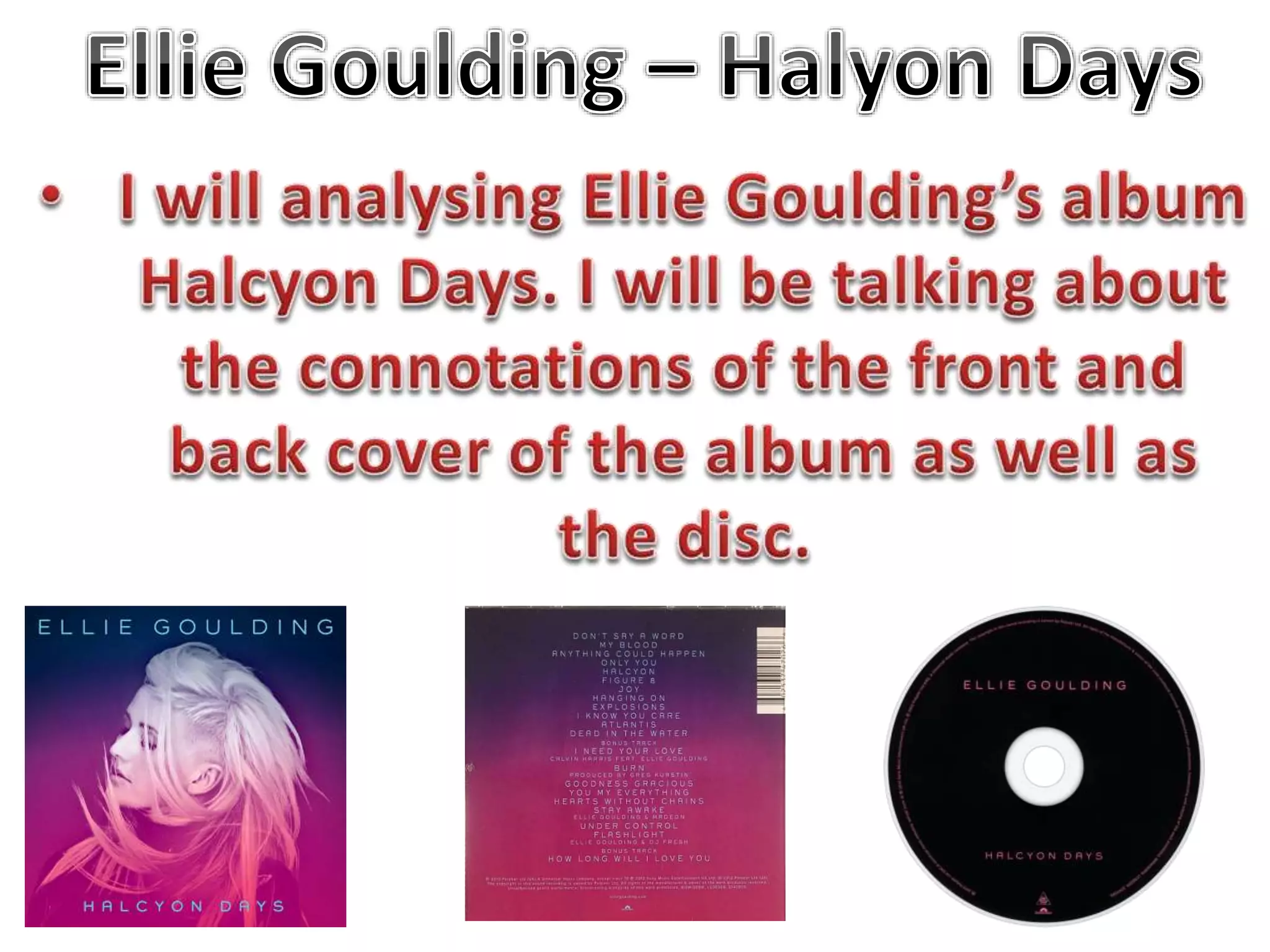
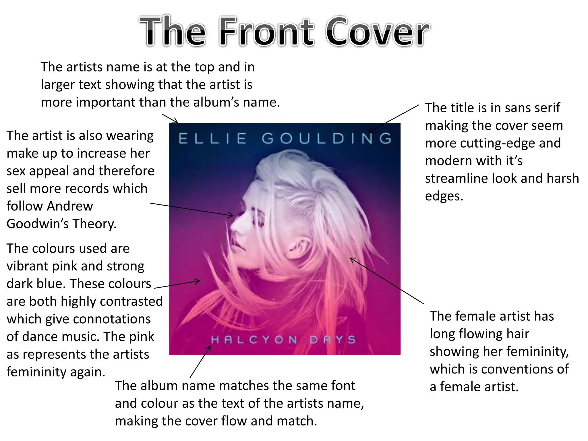
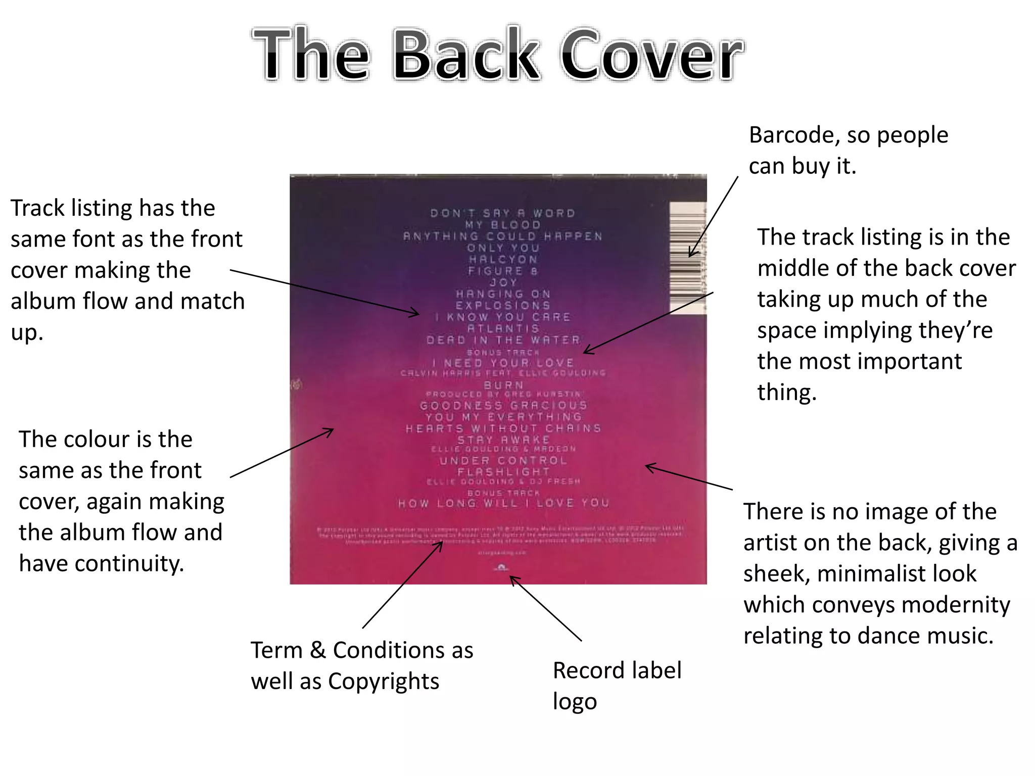
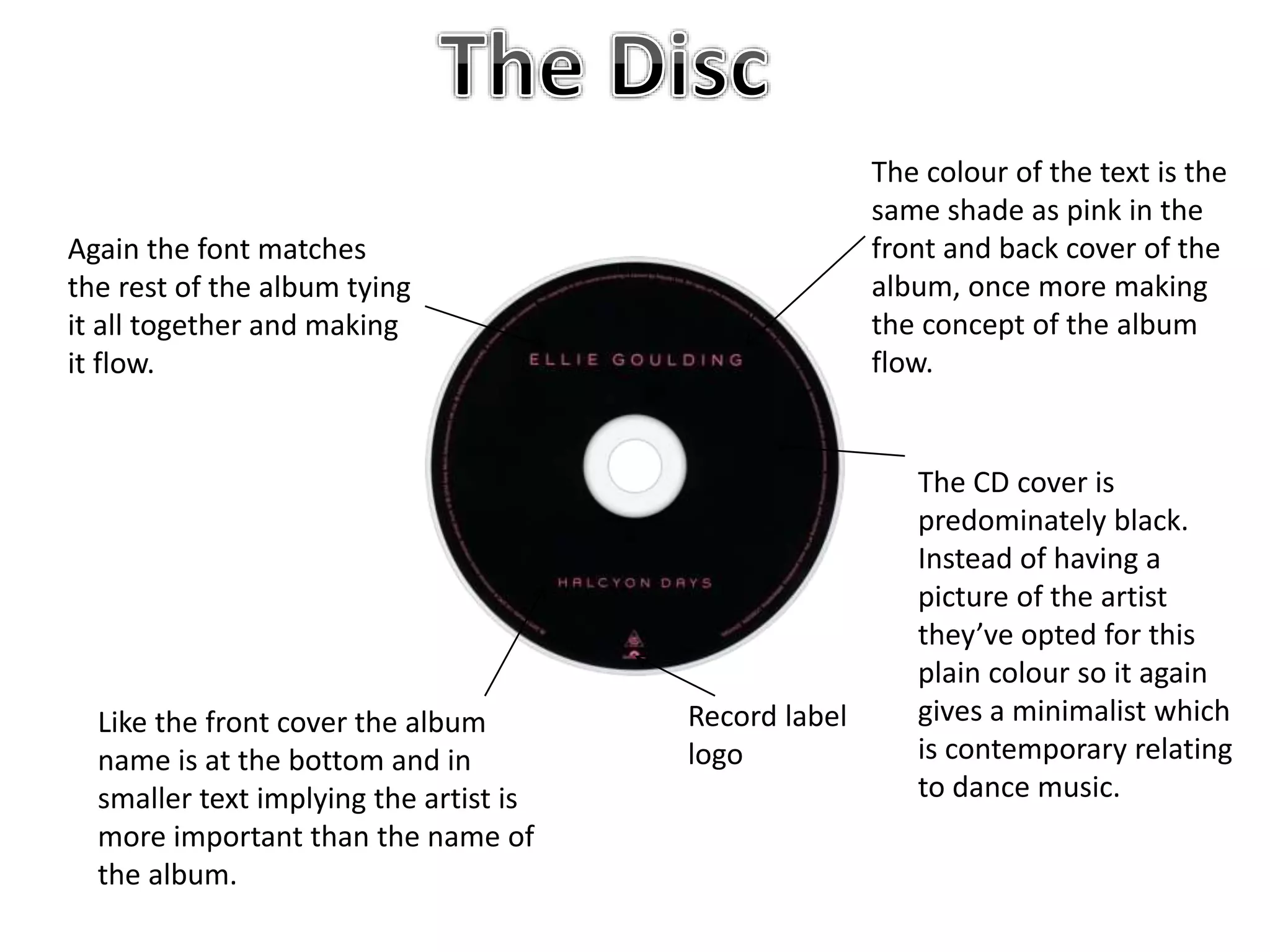
The title is in sans serif
making the cover seem
more cutting-edge and
modern with it’s
streamline look and harsh
edges.
The album name matches the same font
and colour as the text of the artists name,
making the cover flow and match.
The artists name is at the top and in
larger text showing that the artist is
more important than the album’s name.
The female artist has
long flowing hair
showing her femininity,
which is conventions of
a female artist.
The artist is also wearing
make up to increase her
sex appeal and therefore
sell more records which
follow Andrew
Goodwin’s Theory.
The colours used are
vibrant pink and strong
dark blue. These colours
are both highly contrasted
which give connotations
of dance music. The pink
as represents the artists
femininity again.
Barcode, so people
can buy it.
Record label
logo
Term & Conditions as
well as Copyrights
Track listing has the
same font as the front
cover making the
album flow and match
up.
The colour is the
same as the front
cover, again making
the album flow and
have continuity.
The track listing is in the
middle of the back cover
taking up much of the
space implying they’re
the most important
thing.
There is no image of the
artist on the back, giving a
sheek, minimalist look
which conveys modernity
relating to dance music.
Again the font matches
the rest of the album tying
it all together and making
it flow.
Like the front cover the album
name is at the bottom and in
smaller text implying the artist is
more important than the name of
the album.
Record label
logo
The CD cover is
predominately black.
Instead of having a
picture of the artist
they’ve opted for this
plain colour so it again
gives a minimalist which
is contemporary relating
to dance music.
The colour of the text is the
same shade as pink in the
front and back cover of the
album, once more making
the concept of the album
flow.

Ellie goulding Digipak Analysis

  • 2.
    The title isin sans serif making the cover seem more cutting-edge and modern with it’s streamline look and harsh edges. The album name matches the same font and colour as the text of the artists name, making the cover flow and match. The artists name is at the top and in larger text showing that the artist is more important than the album’s name. The female artist has long flowing hair showing her femininity, which is conventions of a female artist. The artist is also wearing make up to increase her sex appeal and therefore sell more records which follow Andrew Goodwin’s Theory. The colours used are vibrant pink and strong dark blue. These colours are both highly contrasted which give connotations of dance music. The pink as represents the artists femininity again.
  • 3.
    Barcode, so people canbuy it. Record label logo Term & Conditions as well as Copyrights Track listing has the same font as the front cover making the album flow and match up. The colour is the same as the front cover, again making the album flow and have continuity. The track listing is in the middle of the back cover taking up much of the space implying they’re the most important thing. There is no image of the artist on the back, giving a sheek, minimalist look which conveys modernity relating to dance music.
  • 4.
    Again the fontmatches the rest of the album tying it all together and making it flow. Like the front cover the album name is at the bottom and in smaller text implying the artist is more important than the name of the album. Record label logo The CD cover is predominately black. Instead of having a picture of the artist they’ve opted for this plain colour so it again gives a minimalist which is contemporary relating to dance music. The colour of the text is the same shade as pink in the front and back cover of the album, once more making the concept of the album flow.