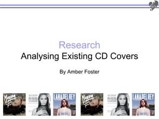
2. CD Cover 1
Target audience: The target
audience of this album is
primarily female as the female
artist naturally attracts female
listeners, but due to the colour
scheme which is unisex both
male and female audiences are
targeted.
Her previous album
cover holds the
Front same aspects and Back
follows the theme Barcode: It is placed on the back as it
Costume: The shirt used is
that this more recent would impact the visual impact of the
considerably vintage ;this
album does. cover art if it was located on the front of
fits with both her music style
the album.
and personality.
Album name: The album name is ‘Born to die’ But attention is drawn away from this to the more noticeable name of the artist which
dominated the upper half of the album cover. The album name is coincidentally the name of her number one hit single ‘Born To Die’.
Image: The medium close up that is Font: The same font is used on both the front Colour: Dramatic colour change, both colours
used is framed by the masthead and the and the back of the album ‘Born To Die’, contrast but the red is also seen on the front of the
album name drawing attention to the connecting them through this conventional album album cover as it is the colour of her bra under the
album art and the artist. Also Lana Del cover technique. The font used fits with the white shirt which is the colour that is also seen on
Rey is also making eye contact with the theme of the music and the artists personality, the back. Also on the back there is a use of
camera which immediately includes and therefore furthering the feel of the music through contrasting colours, the white and black on the red
personally targets each individual the album art. The font is both bold and eye- makes it more noticeable and distinct. Additionally,
potential customer. Also this is a catching, the size of the font used for the name the colours contrast also on the front as the sky
conventional aspect found in all 3 album of artist is larger than the album name so that blue, is contrasted on the white shirt and the white
cover that I have analysed. she is more recognisable. colour of the shirt is contrasted with the sky : the
artists name.
3. CD Cover 2
Target audience: The target
audience of this album is largely
female based; as the female
artists image naturally attracts
female listeners. The colour
scheme is unisex but the
feminine feel of this cover (both
front and back) attracts female
potential customers
The only similar aspects
about this more modern
Front cover is the font is roughly Back
Costume: The costume on this the same but significantly Barcode: It is placed on the back as it
more spaced out. Colours
album cover is considerably would impact the visual impact of the
have been used and the
modest with the high neck shirt, artists eye contact has cover art if it was located on the front of
therefore this shows that she changed to a lack of. the album.
doesn’t want to rely on her looks
to create an audience, her music Album name: The album name is ‘I am…Sasha Fierce’, this is a very personal insight to the
speaks for itself. artists life as this is her real name not her stage name ‘Beyoncé’ conveying that she is going
Image: The image is in black and white to fit the to also be emotional and personal in the music selected for her album.
‘soul’ theme, it also fits with the theme of ‘Platinum
Edition’ as there are metallic tones on the cover. Font: Firstly, the font that is used on the Colour: More over, the colours that are primarily
The theme of black and white is also found on the cover has a metallic finish which furthers the used are shades of grey, white and black, on both
back of the album but there is metallic gold colours strong feel that the album name created ‘ I front and back, this lack of colour contrasts with other
used. Additionally, this isn't conventional as album albums on the shelves which rely on bright primary
am Sasha Fierce’. The font is a serif font, on
covers usually really on bright colours for visual colours to attract their audience, therefore attracting
both front and back of the album, thus
impacts, but by not following this theme ‘I am potential customer attention due to its lack of colour.
another way the front and back link together. Furthermore, this dark shades shows the lever of
Sasha Fierce' draws attention due to its lack of
Additionally, the font used for the artists emotion that for Beyoncé everything isn't plain ‘Black
colour. Moreover, the images contrast on the front
name and album name, has a middle and White’ and that’s what she's trying to convey
and back of the album on the front she is wearing
little makeup where as on the back she is wearing gradient (lighter in the middle but darker throughout the album. On the other side of the album,
heavy eye makeup conveying how underneath she round the edges which fits with the a gold metallic colour is used on the costume, this
strong and powerful, which fits with the colour background on the front of the album as this adds colour to the album and keeps it from being too
scheme, theme and album name. has a similar effect but in different shades of simple.
4. CD Cover 3
Target audience: The target
audience of this cover would yet
again be mostly female ages
15+ as the colour scheme,
models pose and eye contact all
make this cover notably female
orientated.
Her previous album
cover holds the same
aspects as the previous
album. For instance the
Front pose and eye contact,
Back
Costume: On the front of the album but the font and colour Barcode: It is placed on the back as it
there isn't a costume visible, where as schemes have would impact the visual impact of the
on the back of the album it is more dramatically changed. cover art if it was located on the front of
obvious she isn't wearing one, this the album.
shows that she is going to get the Album name: the album name is ‘The Family Jewels’ which is both a quirky and interesting name, as it
‘naked truth’ in her music and let the suggests through her music is going to have some underlying personal message or feel, hence the word
audience in to her emotions, which is use of ‘Family’ in her album name as this is a word universally related to personality and personal
conventional of a soul/pop genre artist. lifestyles.
Image: The image used is of the artist from Colour: The colours used for the image are
‘Marina and the diamonds’ in a lying down greatly enhanced, showing that the artist is
pose on both front and back of the album. The Font: The font used for both the album and after a more painted/portrait look for her album
two images are very similar yet are taking at artist name on the cover of the album is also (hence the font style: hand written and the
different angles and with different aspects, for used on the back of the album to show the background which looks like canvas material).
instance the front image if of the artist making songs that are going to be on the album. Sans This is both the case for front and back of the
eye contact with the audience; directly serif is the type of font that is used, it is also album. Additionally the white used for the
targeting her market, but on the other hand bold and has a hand written look conveying information contrasts immensely with the
she's looking away in the back image as that she's written it herself and has actually enhanced darkness of her hair and the dark
capturing the audience through eye contact is taken interest in her album and that to her its colours used on the front of the album,
no longer needed as they are already showing about the music not making money, which is therefore drawing instant attention to it.
interest by looking at the back of the album. how many artists come across.
6. Poster 1
Colour Scheme: The colour scheme that is used fit with both the
theme of the poster and the album name: Circus. For instance, the
bright primary colours are conventional of a circus poster and it is also
conventional that album release posters or tour posters relate to the
artists album releases.
Layout: On this poster there is a page border which is conventional
in circus themes posters (as those located to the left) which makes
it look unique and authentic compared to other release posters.
‘Britney Spears’ in a large font is central on the poster and
therefore the most eye-catching characteristic, by doing this she is
proving that she is already an established artist as her audience
and fan base will recogniser her name alone and will be compelled
to look at the poster.
Image: There is a lack of imagery used on this poster, no image of the
artist or the album cover suggesting that the artists is confident enough
that her name will be enough to sell the album, along with the name of a
popular song from her album ‘Womaniser‘. Additionally, the use of the
border is also seen on the album cover.
Target audience: The target audience of this release poster is
roughly 15+; and due to the colours being unisex both genders,
male and female are potential customers.
Information: There are various details on this poster which
promote things such as: album name, release date, the artist, a
single ‘Womaniser’. All of this is information is considered
important to the audience and what they need to know in order to
purchase the album and find incentive to purchase it .
7. Poster 2
Colour Scheme: The colour scheme of the ‘I am… Yours’ tour
poster is similar to the ‘I am Sasha Fierce’ album colour
scheme, the same technique with the fonts gradient for
‘Beyoncé’ is used on both poster and album cover. Additionally,
the same use of grey tones is used but with an other colour to
stop the poster and cd cover being too plain. The colour of the
dress matches the twist on the album name: ‘I Am… Yours’,
adding a glamour's luxury feel to the poster.
Layout: The tour poster has a similar layout to the album
cover, for instance, the placement of ‘Beyoncé’ is exactly the
same as the album cover, thus linking both together, so the
target audience and owners of the Beyoncé album would
recognise this as her poster without relying on the image .
Image: Firstly, the image that is used completely contrasts
with the image that was previously used on her album cover,
where the artist doesn’t rely on her looks to attract and
audience where as with this tour poster she does. The album
cover is more directed at women than men, but in this tour
poster she is still targeting women but she's trying to target a
male audience through her looks and pose.
Target audience: Primarily, the target audience isn't
necessarily affected by the colour scheme yet the image, this
image is a case of ‘Men want her’ and ‘Women want to be her’,
therefore attracting both genders, although the ages of the
audience would roughly be 16-45 year olds.
Information: The information on this tour poster has the
conventional aspects as other tour posters such as the artists
image, name, tour dates, where the tour is situated and if
tickets are on sale/when they go on sale.
8. Poster 3
Colour Scheme: The colour scheme of the ‘El Rey Theatre’ tour
poster is pink, black white brown and green, all used to contrast
one another . For instance, the pink of the background used on the
artists name contrasts with the black to make it more distinct. This
also goes for the tour dates and theatre, the important details. A
softer lighter pink is also used for the songs on the background to
make them noticeable but not the key characteristic of the poster.
Layout: The main characteristic of this poster is the pop art
version of the artist, as its directly central, but accompanying this
is ‘Lana Del Rey’ cutting through the mid section of the image, so
when the audience is looking at the picture they will automatically
see the important details that are required to participate in the
tour.
Image: The imaged used on this poster isn't conventional to the
soul/pop genre, therefore its key characterise , the image, makes
it more diverse. Moreover, the image is distinctly Lana Del Rey as
her key characteristics are highlighted and emphasised, such as
her wavy hair and lips. Additionally, the image is also quirky and
distinctive and links perfectly with her album covers which also
follow this theme.
Target audience: As an estimate, the target audience of this
tour poster would be 13- 35, primarily women as the poster is
extremely feminine, from the feminine pinks to the image.
Information: There is also conventional information on this poster
like the others I have analysed : Artists name, artists image,
location and tour dates.