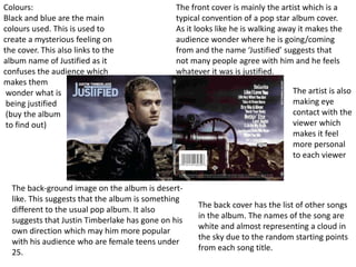
Colours:
Black and blue are the main
colours used. This is used to
create a mysterious feeling on
the cover. This also links to the
album name of Justified as it
confuses the audience which
makes them
wonder what is
being justified
(buy the album
to find out)
The front cover is mainly the artist which is a
typical convention of a pop star album cover.
As it looks like he is walking away it makes the
audience wonder where he is going/coming
from and the name ‘Justified’ suggests that
not many people agree with him and he feels
whatever it was is justified.
The back cover has the list of other songs
in the album. The names of the song are
white and almost representing a cloud in
the sky due to the random starting points
from each song title.
The artist is also
making eye
contact with the
viewer which
makes it feel
more personal
to each viewer
The back-ground image on the album is desert-
like. This suggests that the album is something
different to the usual pop album. It also
suggests that Justin Timberlake has gone on his
own direction which may him more popular
with his audience who are female teens under
25.
The main colours used on this
album cover is: black, white and
red. The things written in red are
made to stick out such as the
artist name, album title and
‘special edition’. The black and
white effect makes
it seem as if it was
written paper which
gives it a doodle
effect that might have
been made at school
which suggests he
is very childish
The album cover follows typical pop album
conventions as it has the artist on the main cover.
This makes the artist the centre of the whole
album and tells the audience who is singing it.
Although his face is covered up by the title of the
album, he is well known enough to just have his
eyes and hair on show,
The back cover has the list of songs. They are in
a different colour that doesn’t really match the
rest of the album. However this could be
because if they were written in black, the songs
wouldn’t stand out and people wouldn’t be
able to find their favourite song quickly and
therefore they are less likely to buy the album.
The artist is also wearing fashionable
clothes which follows a typical pop
convention. A shirt and waistcoat
shows he has good dress sense but is
also trying to make a statement
which he is hoping people may start
to follow.
The main colours used on this album
cover is black, gold and white. This gives
the album a feel that it is the best album
due to the amount of gold on show.
The artists eyes are covered up by
a women behind him. This
creates a very sexual feel to the
cover which is also backed-up by
the title ‘Sexlove’. It creates a
sense of mystery as he doesn’t
know who is behind him.
The artist is only wearing a white
shirt with everything else behind
him in a gold tint. This creates a
Godly feel to the album cover and
further represents that this is the
best album.
On the back cover, the name of the
album is much larger and more visible
than the list of songs. This goes against
the typical convention of pop albums as
the name of all the songs are difficult to
see which suggests they might not be as
well known songs
The artists publisher
appears on the back
cover of the album
in silver which
makes the album
look classy
The barcode and
terms and
conditions and
publisher are all in
a column on the
side which shows
that they are not
as significant as his
album as they
don’t get their own
spaces

Album covers

  • 1.
    Colours: Black and blueare the main colours used. This is used to create a mysterious feeling on the cover. This also links to the album name of Justified as it confuses the audience which makes them wonder what is being justified (buy the album to find out) The front cover is mainly the artist which is a typical convention of a pop star album cover. As it looks like he is walking away it makes the audience wonder where he is going/coming from and the name ‘Justified’ suggests that not many people agree with him and he feels whatever it was is justified. The back cover has the list of other songs in the album. The names of the song are white and almost representing a cloud in the sky due to the random starting points from each song title. The artist is also making eye contact with the viewer which makes it feel more personal to each viewer The back-ground image on the album is desert- like. This suggests that the album is something different to the usual pop album. It also suggests that Justin Timberlake has gone on his own direction which may him more popular with his audience who are female teens under 25.
  • 2.
    The main coloursused on this album cover is: black, white and red. The things written in red are made to stick out such as the artist name, album title and ‘special edition’. The black and white effect makes it seem as if it was written paper which gives it a doodle effect that might have been made at school which suggests he is very childish The album cover follows typical pop album conventions as it has the artist on the main cover. This makes the artist the centre of the whole album and tells the audience who is singing it. Although his face is covered up by the title of the album, he is well known enough to just have his eyes and hair on show, The back cover has the list of songs. They are in a different colour that doesn’t really match the rest of the album. However this could be because if they were written in black, the songs wouldn’t stand out and people wouldn’t be able to find their favourite song quickly and therefore they are less likely to buy the album. The artist is also wearing fashionable clothes which follows a typical pop convention. A shirt and waistcoat shows he has good dress sense but is also trying to make a statement which he is hoping people may start to follow.
  • 3.
    The main coloursused on this album cover is black, gold and white. This gives the album a feel that it is the best album due to the amount of gold on show. The artists eyes are covered up by a women behind him. This creates a very sexual feel to the cover which is also backed-up by the title ‘Sexlove’. It creates a sense of mystery as he doesn’t know who is behind him. The artist is only wearing a white shirt with everything else behind him in a gold tint. This creates a Godly feel to the album cover and further represents that this is the best album. On the back cover, the name of the album is much larger and more visible than the list of songs. This goes against the typical convention of pop albums as the name of all the songs are difficult to see which suggests they might not be as well known songs The artists publisher appears on the back cover of the album in silver which makes the album look classy The barcode and terms and conditions and publisher are all in a column on the side which shows that they are not as significant as his album as they don’t get their own spaces