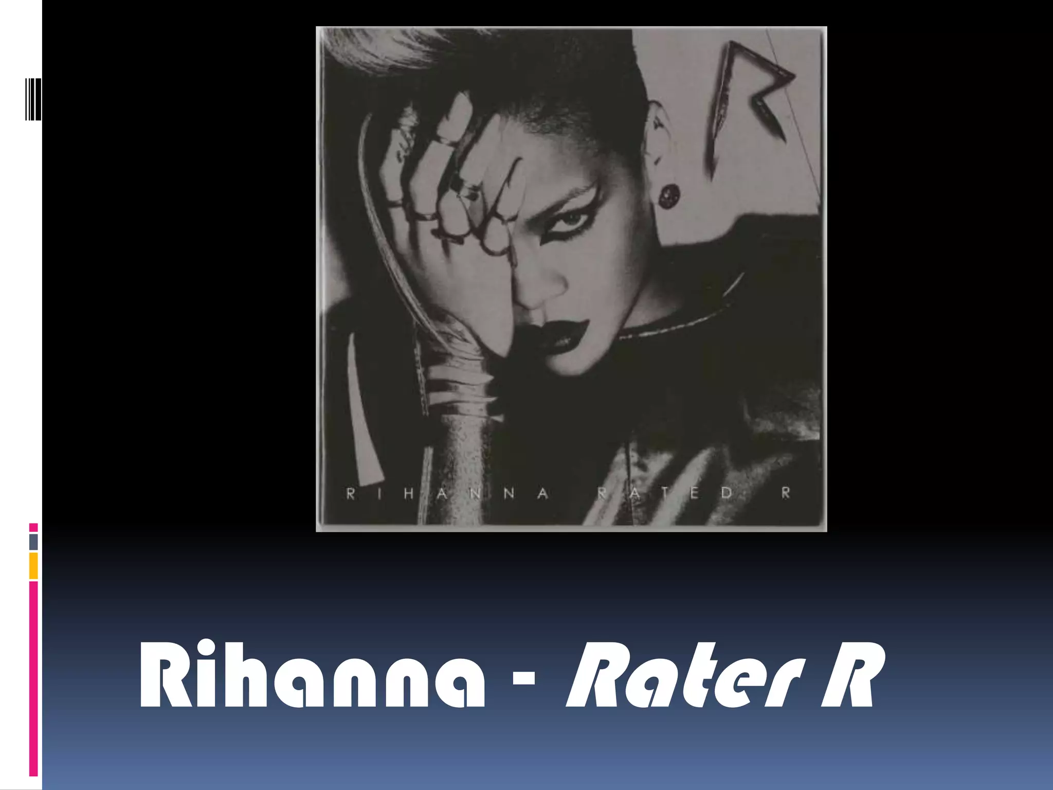
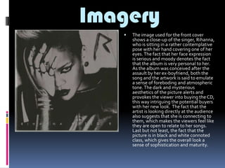
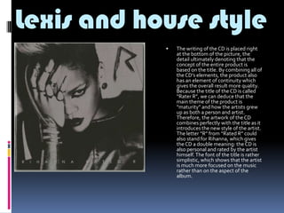
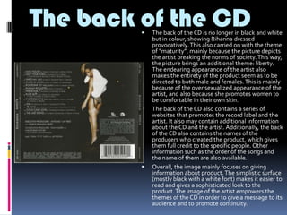
Rihanna - Rater R
Imagery


The image used for the front cover
shows a close-up of the singer, Rihanna,
who is sitting in a rather contemplative
pose with her hand covering one of her
eyes. The fact that her face expression
is serious and moody denotes the fact
that the album is very personal to her.
As the album was conceived after the
assault by her ex-boyfriend, both the
song and the artwork is said to emulate
a sense of foreboding and atmospheric
tone. The dark and mysterious
aesthetics of the picture alerts and
provokes the viewer into buying the CD,
this way intriguing the potential buyers
with her new look. The fact that the
artist is looking directly at the audience
also suggests that she is connecting to
them, which makes the viewers feel like
they are open to relate to her songs.
Last but not least, the fact that the
picture is in black and white connoted
class, which gives the overall look a
sense of sophistication and maturity.
Lexis and house style


The writing of the CD is placed right
at the bottom of the picture, the
detail ultimately denoting that the
concept of the entire product is
based on the title. By combining all of
the CD’s elements, the product also
has an element of continuity which
gives the overall result more quality.
Because the title of the CD is called
“Rater R”, we can deduce that the
main theme of the product is
“maturity” and how the artists grew
up as both a person and artist.
Therefore, the artwork of the CD
combines perfectly with the title as it
introduces the new style of the artist.
The letter “R” from “Rated R” could
also stand for Rihanna, which gives
the CD a double meaning: the CD is
also personal and rated by the artist
himself. The font of the title is rather
simplistic, which shows that the artist
is much more focused on the music
rather than on the aspect of the
album.
The back of the CD






The back of the CD is no longer in black and white
but in colour, showing Rihanna dressed
provocatively. This also carried on with the theme
of “maturity”, mainly because the picture depicts
the artist breaking the norms of society. This way,
the picture brings an additional theme: liberty.
The endearing appearance of the artist also
makes the entirety of the product seem as to be
directed to both male and females. This is mainly
because of the over sexualized appearance of the
artist, and also because she promotes women to
be comfortable in their own skin.
The back of the CD also contains a series of
websites that promotes the record label and the
artist. It also may contain additional information
about the CD and the artist. Additionally, the back
of the CD also contains the names of the
producers who created the product, which gives
them full credit to the specific people. Other
information such as the order of the songs and
the name of them are also available.
Overall, the image mainly focuses on giving
information about product. The simplistic surface
(mostly black with a white font) makes it easier to
read and gives a sophisticated look to the
product. The image of the artist empowers the
themes of the CD in order to give a message to its
audience and to promote continuity.
The inserts:


In terms of the inserts, the content of the booklet provided
with the CD is very much a collection of
artwork/photographs that reinforce the theme of maturity
and liberation. Each picture is extremely sexualized and
represents maturity through sexuality. The dark and
mysterious tone of the artwork presents the overall
product to have a dangerous atmosphere which can
intrigue the public. The side of each page represents a
specific song from the album and the names of the people
that were involved in the creation of it. Giving credit to the
entire team that built the product is therefore an important
aspect. The Inserts also include the CD that is also designed
in a rather simplistic fashion. The CD is black with the
emblem of the product represented by the letter “R”. The
design of the emblem makes it look like a dangerous tool
which also reinforces the theme of “maturity” and
“danger”. The R” also represents the title and the name of
the artist, which gives it double meaning. The fact that the
CD is designed in a simplistic way gives the product class as
implicitly says that the artist is very much focused on the
music and not on the appearance.

Case Study Media

  • 1.
  • 2.
    Imagery  The image usedfor the front cover shows a close-up of the singer, Rihanna, who is sitting in a rather contemplative pose with her hand covering one of her eyes. The fact that her face expression is serious and moody denotes the fact that the album is very personal to her. As the album was conceived after the assault by her ex-boyfriend, both the song and the artwork is said to emulate a sense of foreboding and atmospheric tone. The dark and mysterious aesthetics of the picture alerts and provokes the viewer into buying the CD, this way intriguing the potential buyers with her new look. The fact that the artist is looking directly at the audience also suggests that she is connecting to them, which makes the viewers feel like they are open to relate to her songs. Last but not least, the fact that the picture is in black and white connoted class, which gives the overall look a sense of sophistication and maturity.
  • 3.
    Lexis and housestyle  The writing of the CD is placed right at the bottom of the picture, the detail ultimately denoting that the concept of the entire product is based on the title. By combining all of the CD’s elements, the product also has an element of continuity which gives the overall result more quality. Because the title of the CD is called “Rater R”, we can deduce that the main theme of the product is “maturity” and how the artists grew up as both a person and artist. Therefore, the artwork of the CD combines perfectly with the title as it introduces the new style of the artist. The letter “R” from “Rated R” could also stand for Rihanna, which gives the CD a double meaning: the CD is also personal and rated by the artist himself. The font of the title is rather simplistic, which shows that the artist is much more focused on the music rather than on the aspect of the album.
  • 4.
    The back ofthe CD    The back of the CD is no longer in black and white but in colour, showing Rihanna dressed provocatively. This also carried on with the theme of “maturity”, mainly because the picture depicts the artist breaking the norms of society. This way, the picture brings an additional theme: liberty. The endearing appearance of the artist also makes the entirety of the product seem as to be directed to both male and females. This is mainly because of the over sexualized appearance of the artist, and also because she promotes women to be comfortable in their own skin. The back of the CD also contains a series of websites that promotes the record label and the artist. It also may contain additional information about the CD and the artist. Additionally, the back of the CD also contains the names of the producers who created the product, which gives them full credit to the specific people. Other information such as the order of the songs and the name of them are also available. Overall, the image mainly focuses on giving information about product. The simplistic surface (mostly black with a white font) makes it easier to read and gives a sophisticated look to the product. The image of the artist empowers the themes of the CD in order to give a message to its audience and to promote continuity.
  • 5.
    The inserts:  In termsof the inserts, the content of the booklet provided with the CD is very much a collection of artwork/photographs that reinforce the theme of maturity and liberation. Each picture is extremely sexualized and represents maturity through sexuality. The dark and mysterious tone of the artwork presents the overall product to have a dangerous atmosphere which can intrigue the public. The side of each page represents a specific song from the album and the names of the people that were involved in the creation of it. Giving credit to the entire team that built the product is therefore an important aspect. The Inserts also include the CD that is also designed in a rather simplistic fashion. The CD is black with the emblem of the product represented by the letter “R”. The design of the emblem makes it look like a dangerous tool which also reinforces the theme of “maturity” and “danger”. The R” also represents the title and the name of the artist, which gives it double meaning. The fact that the CD is designed in a simplistic way gives the product class as implicitly says that the artist is very much focused on the music and not on the appearance.