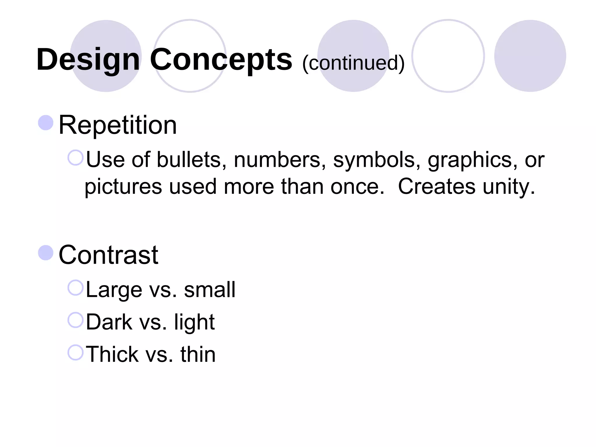
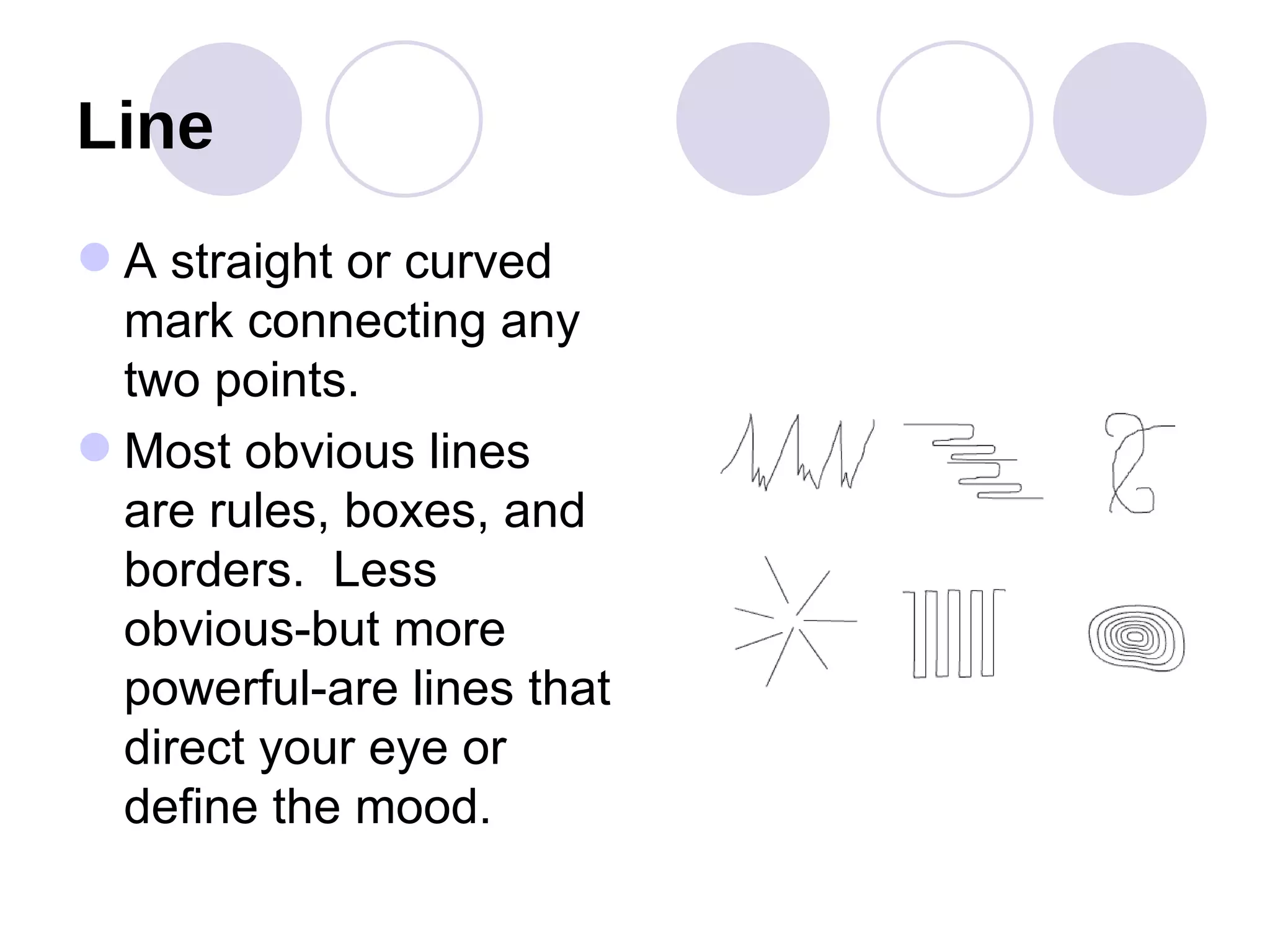
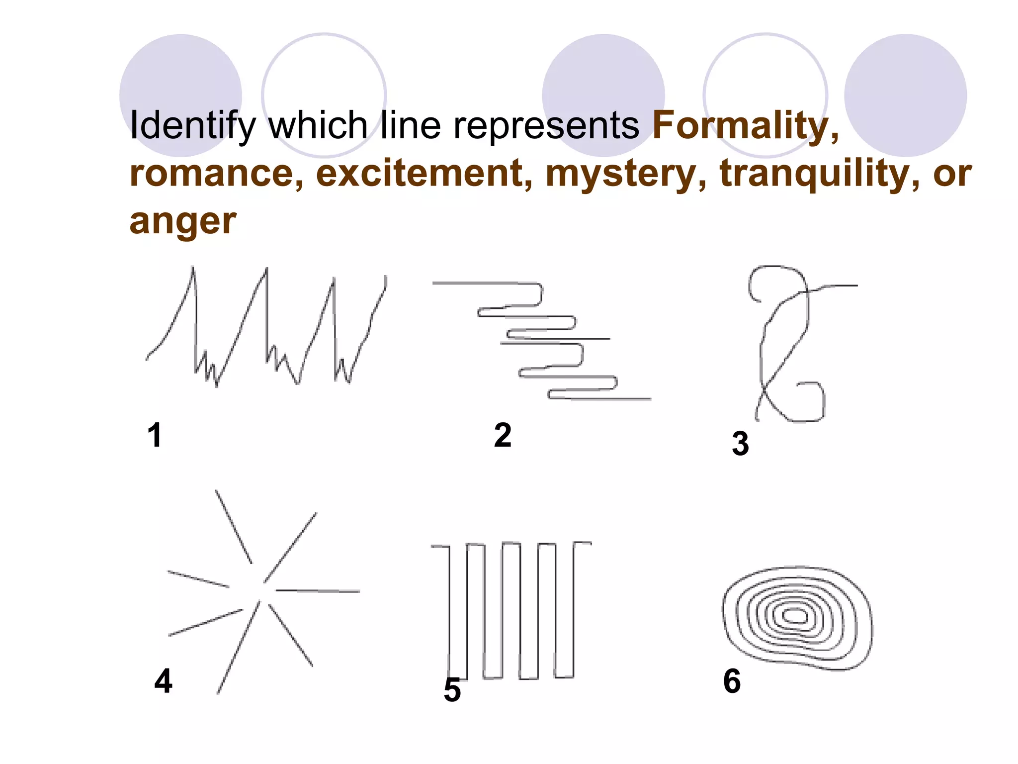
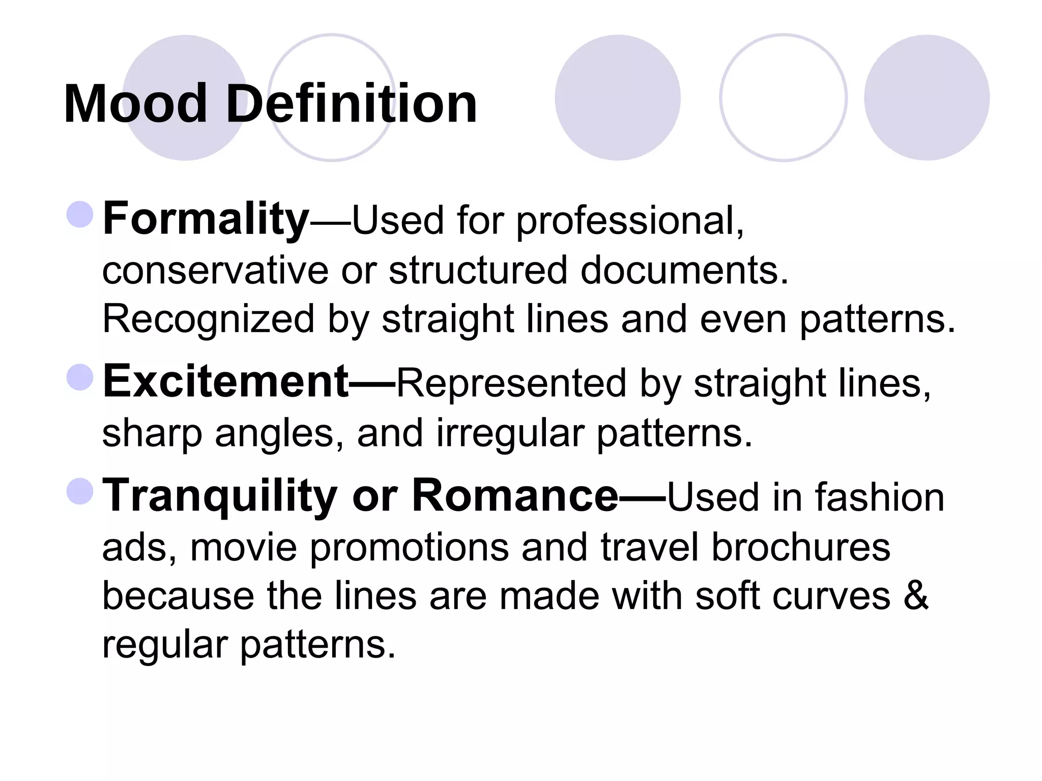
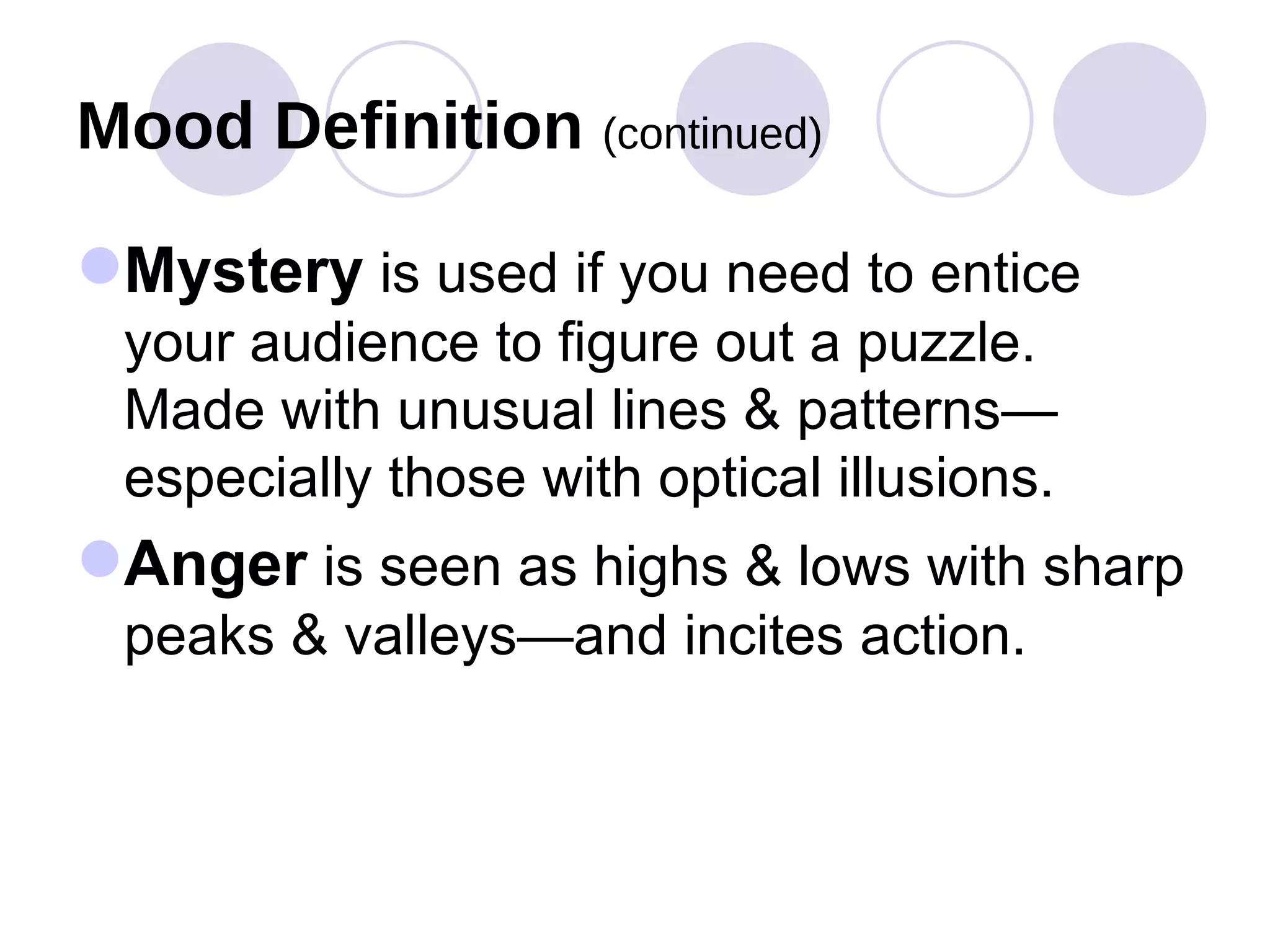
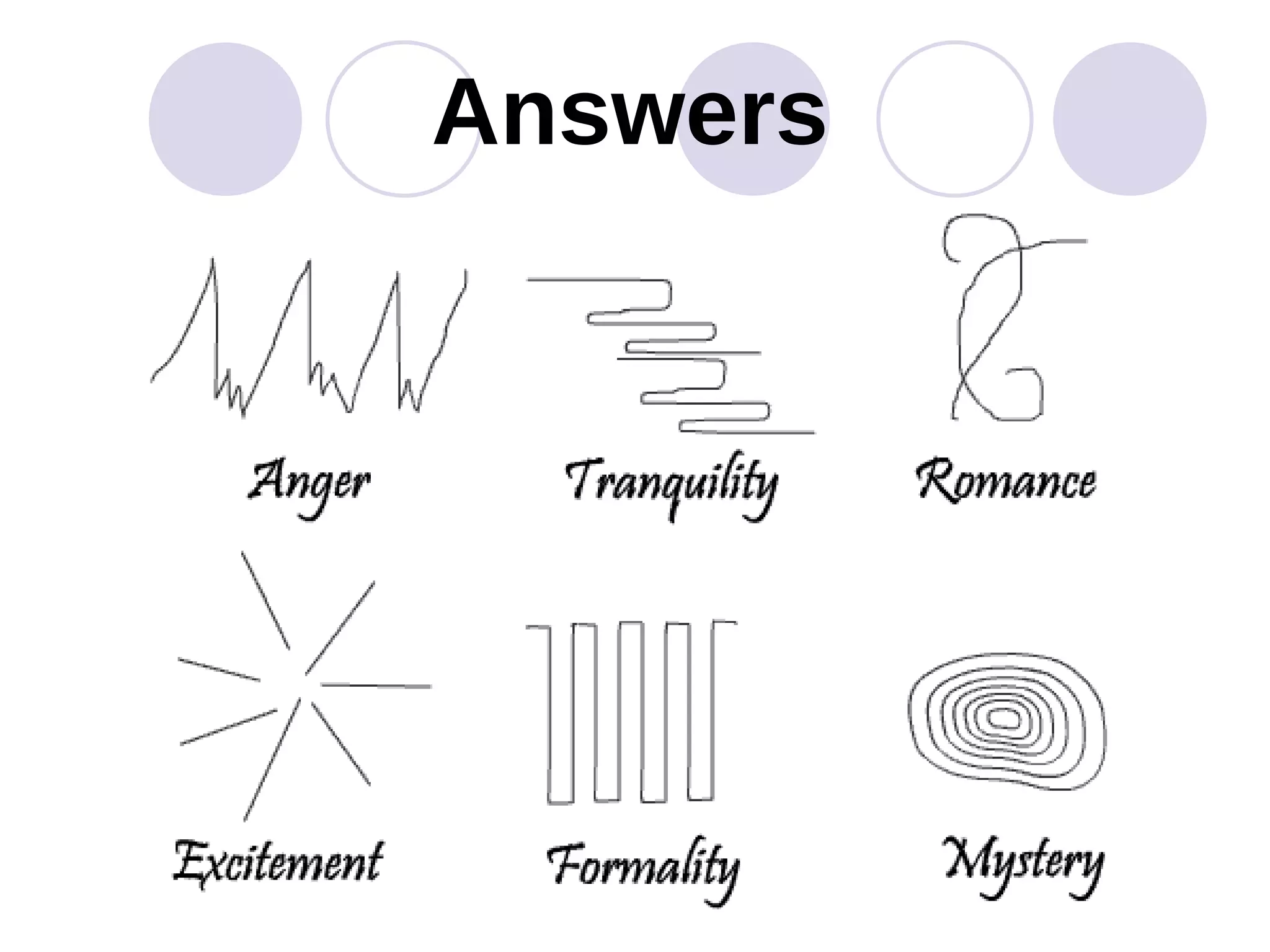
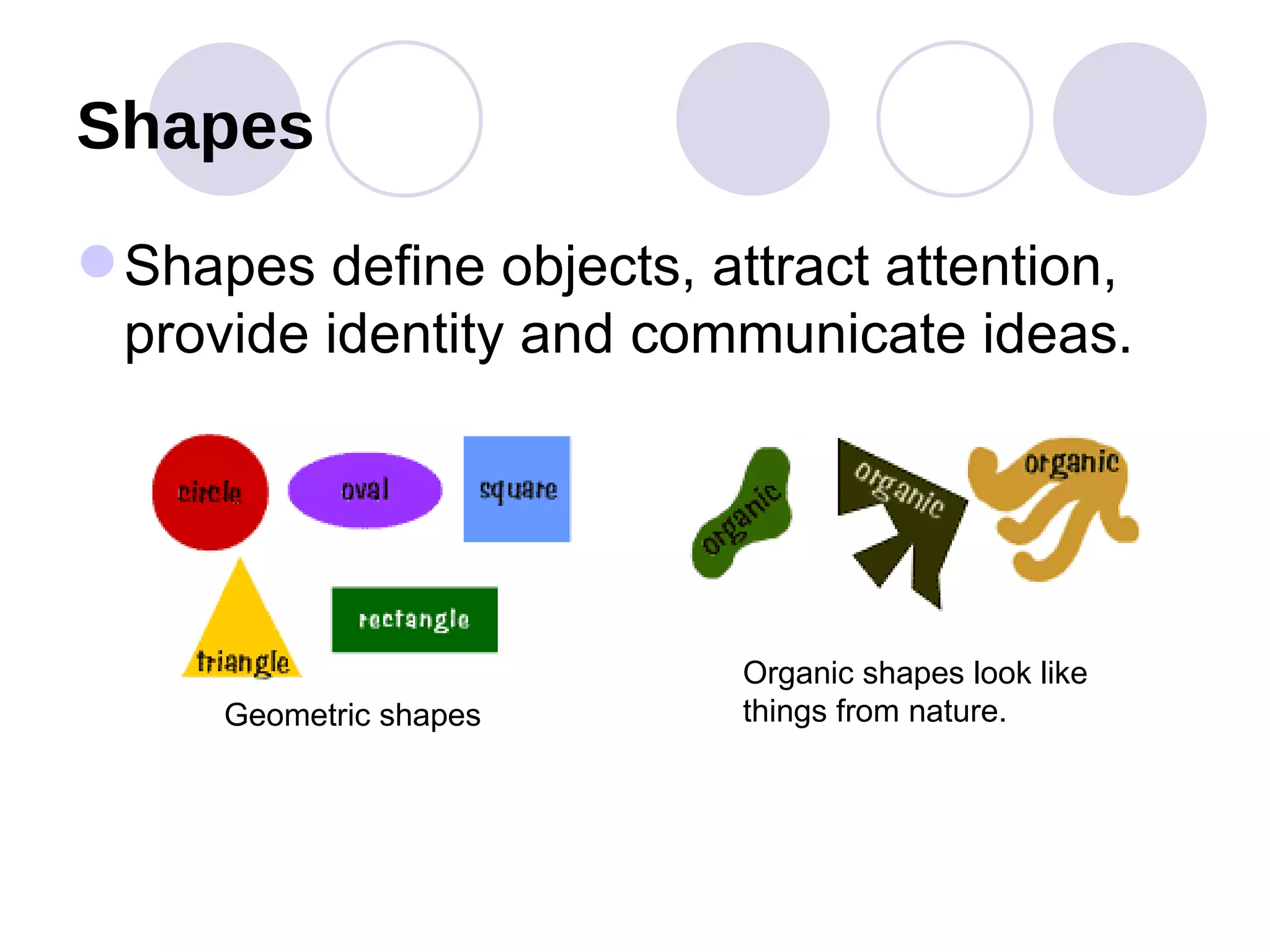
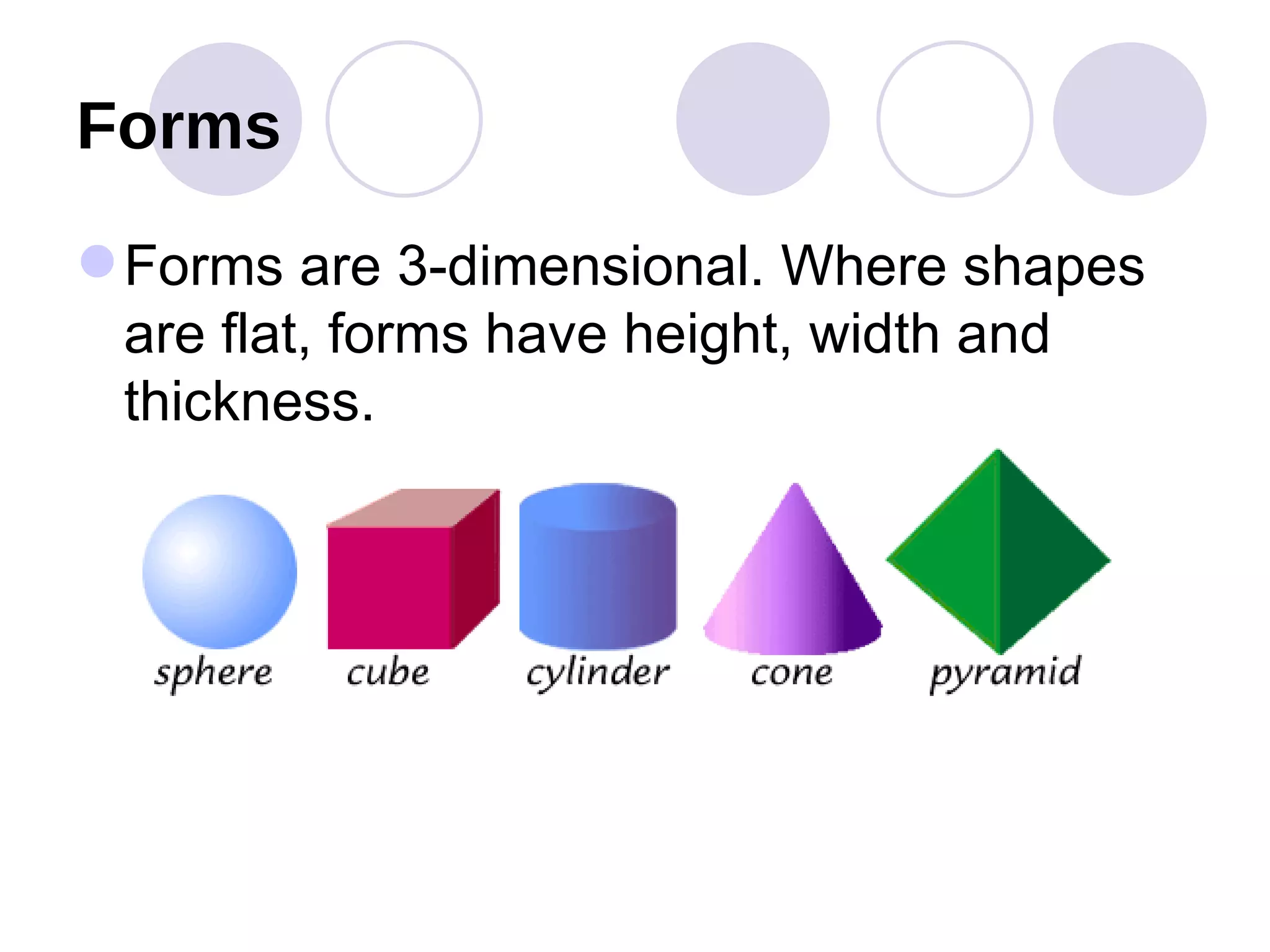
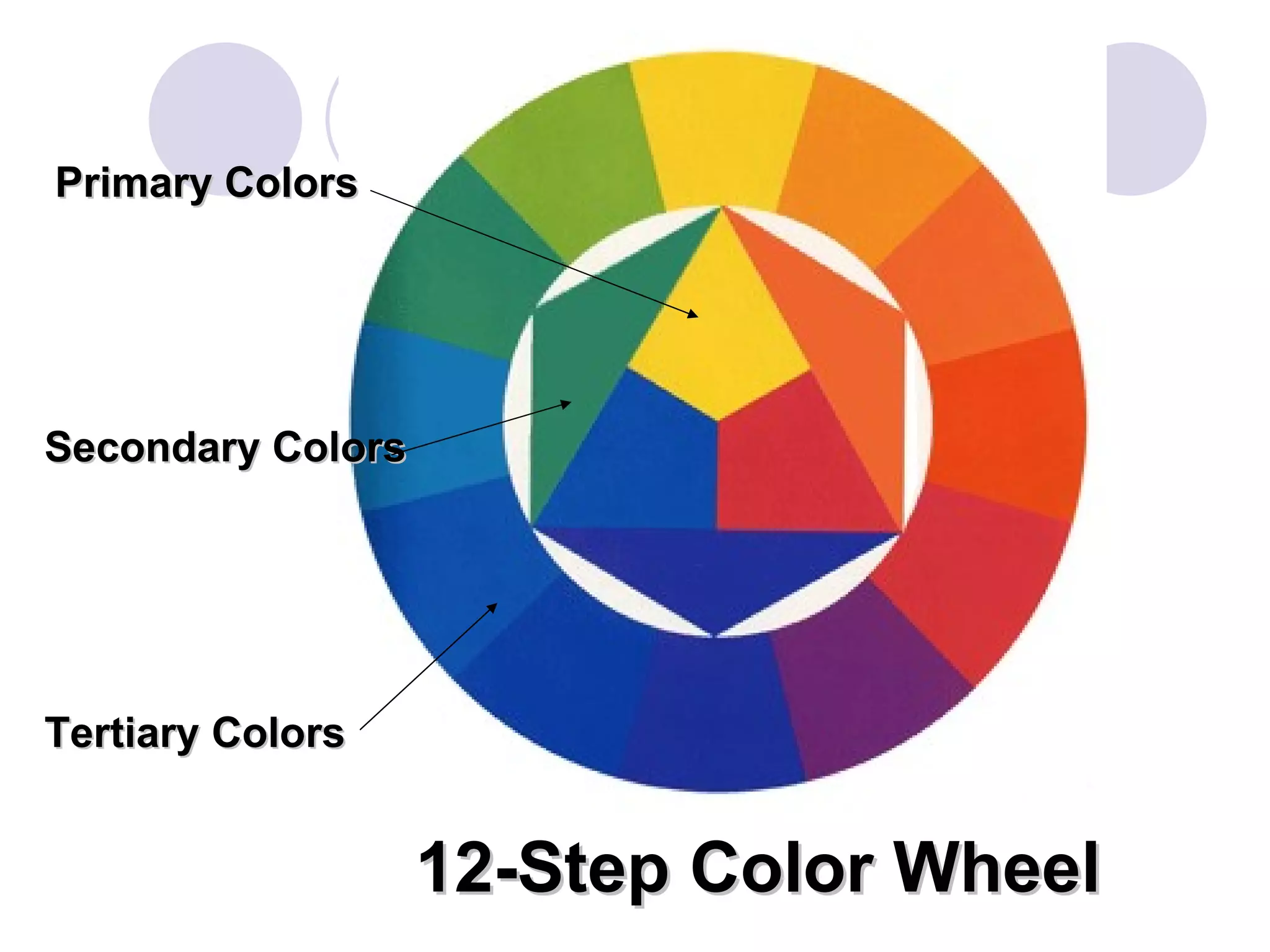
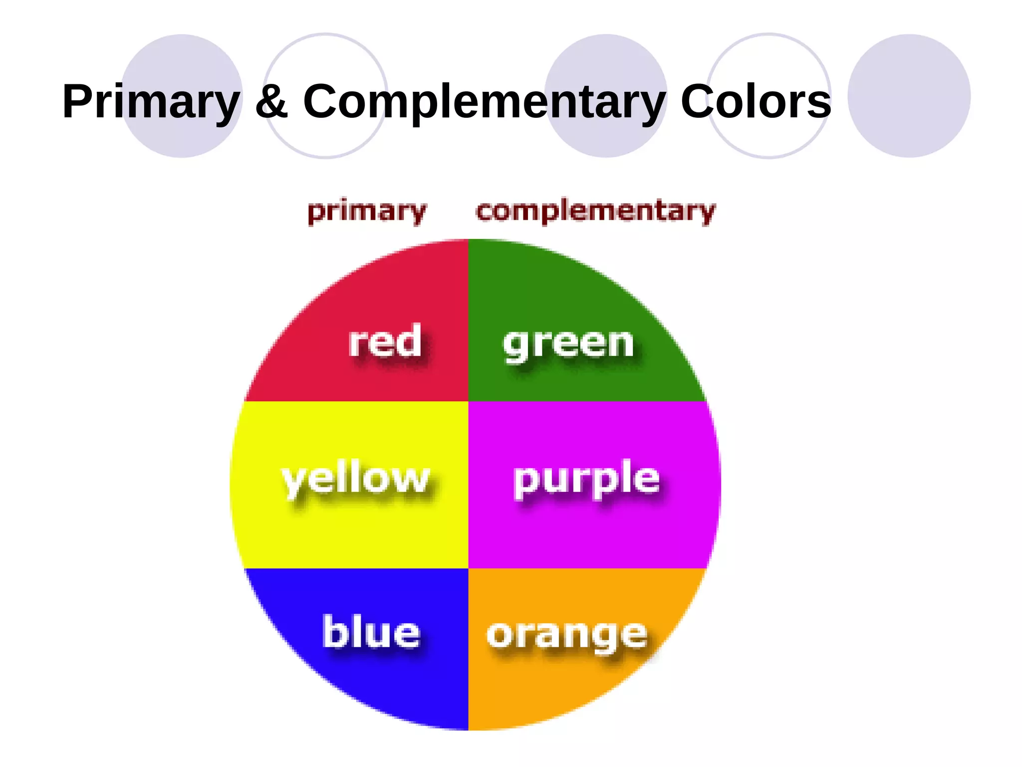
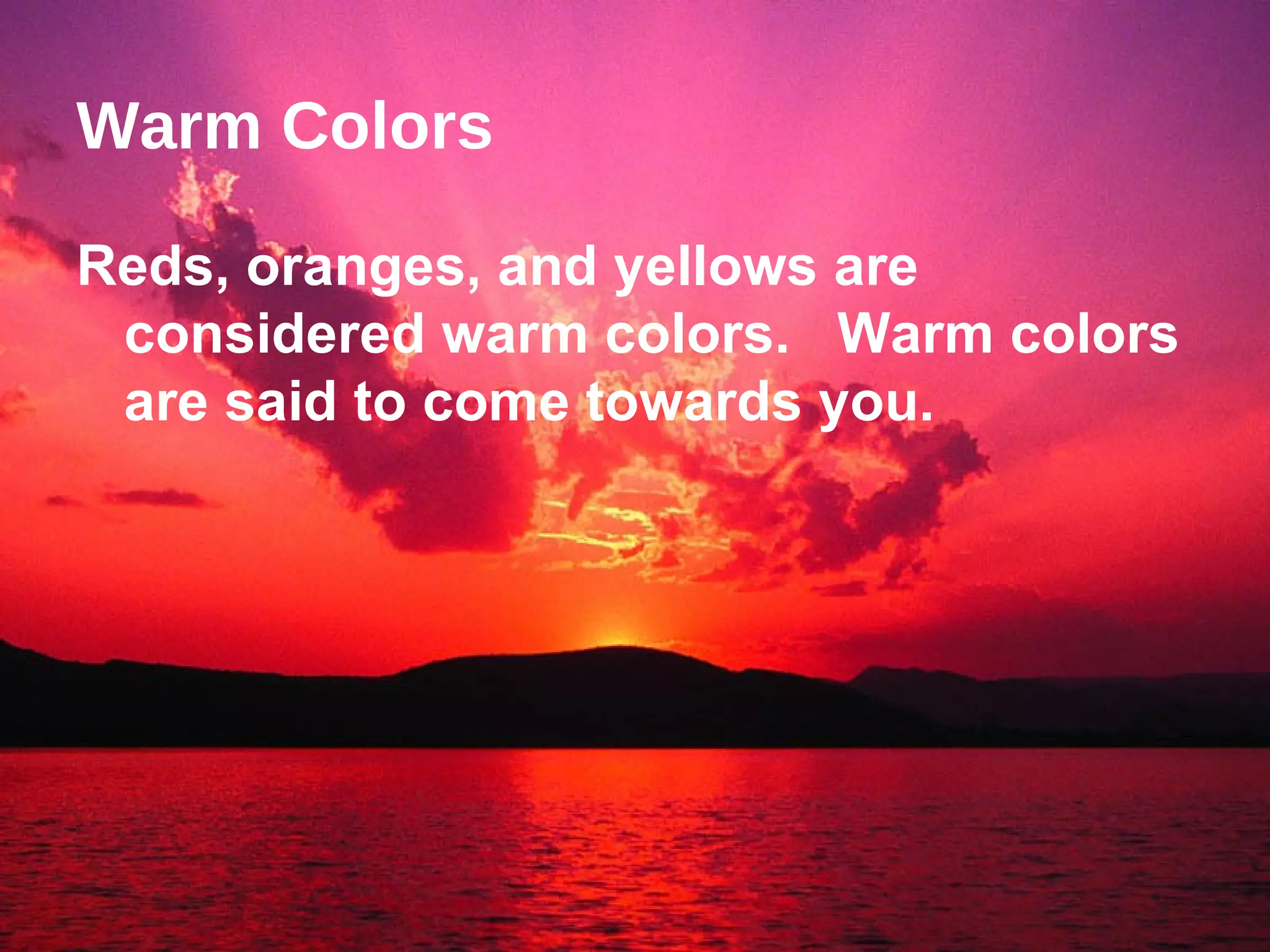
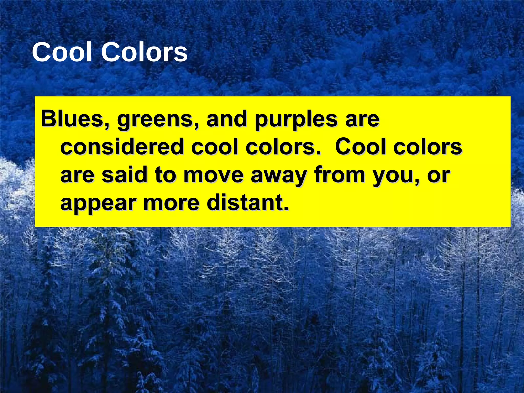
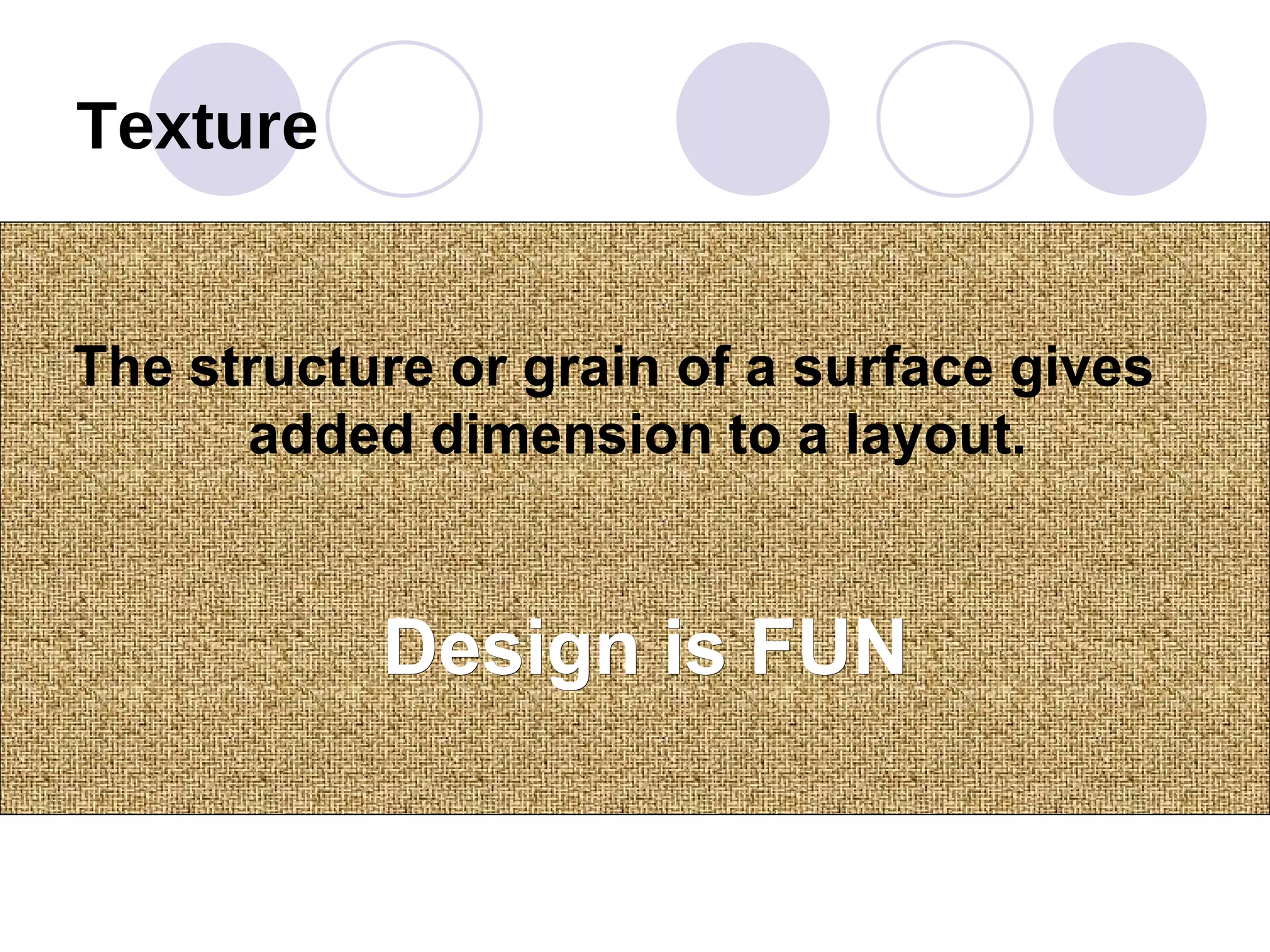
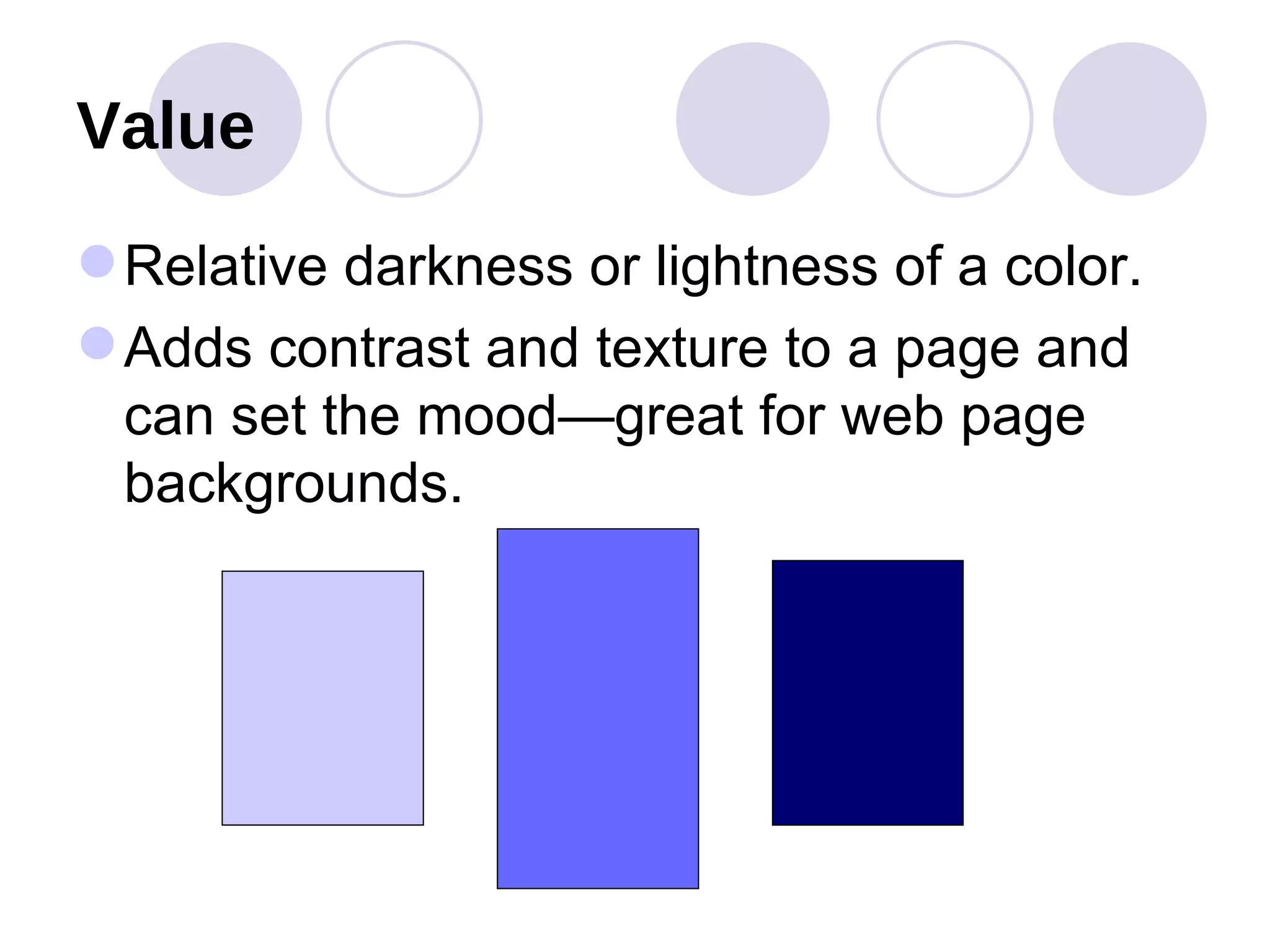
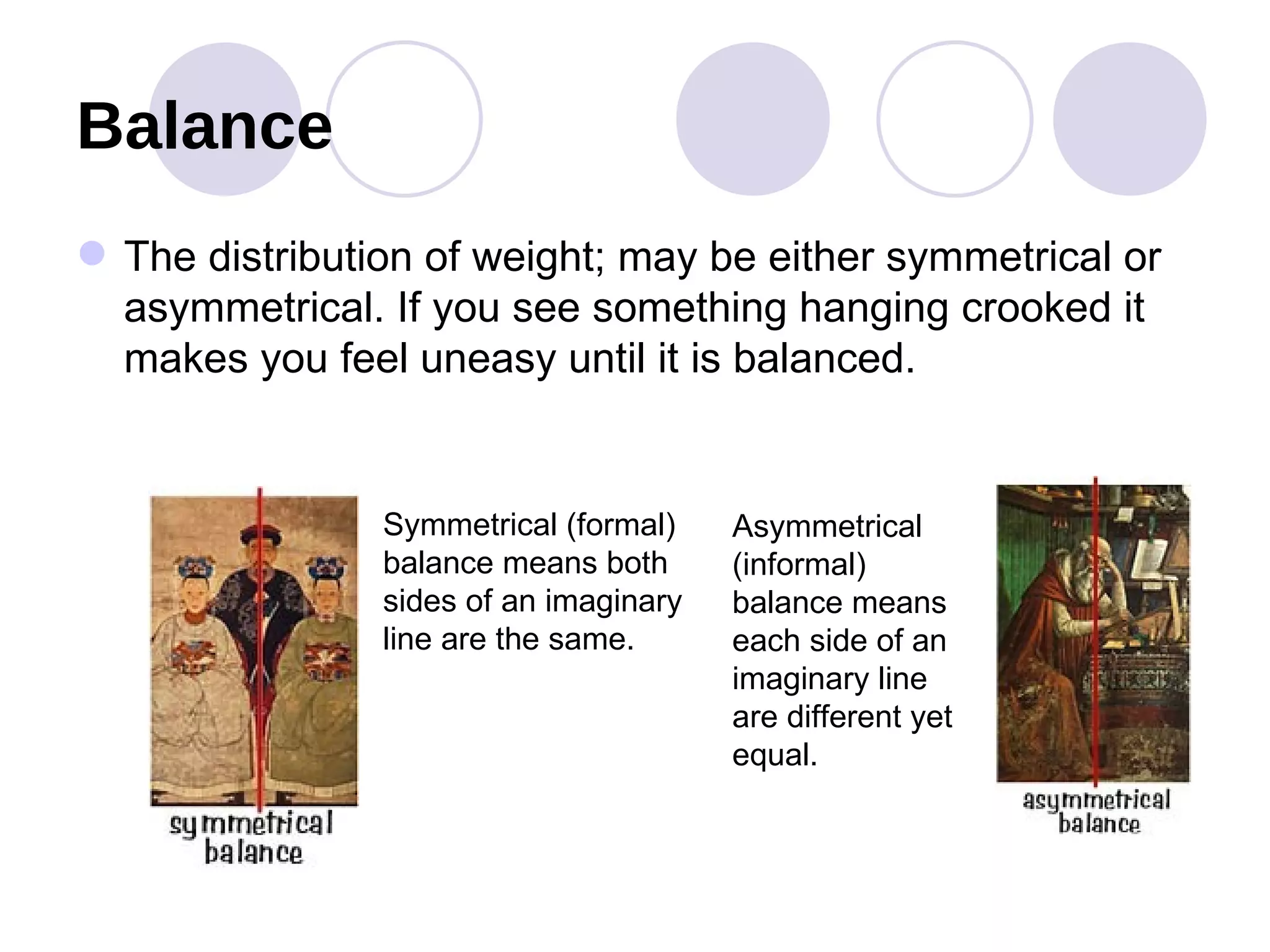
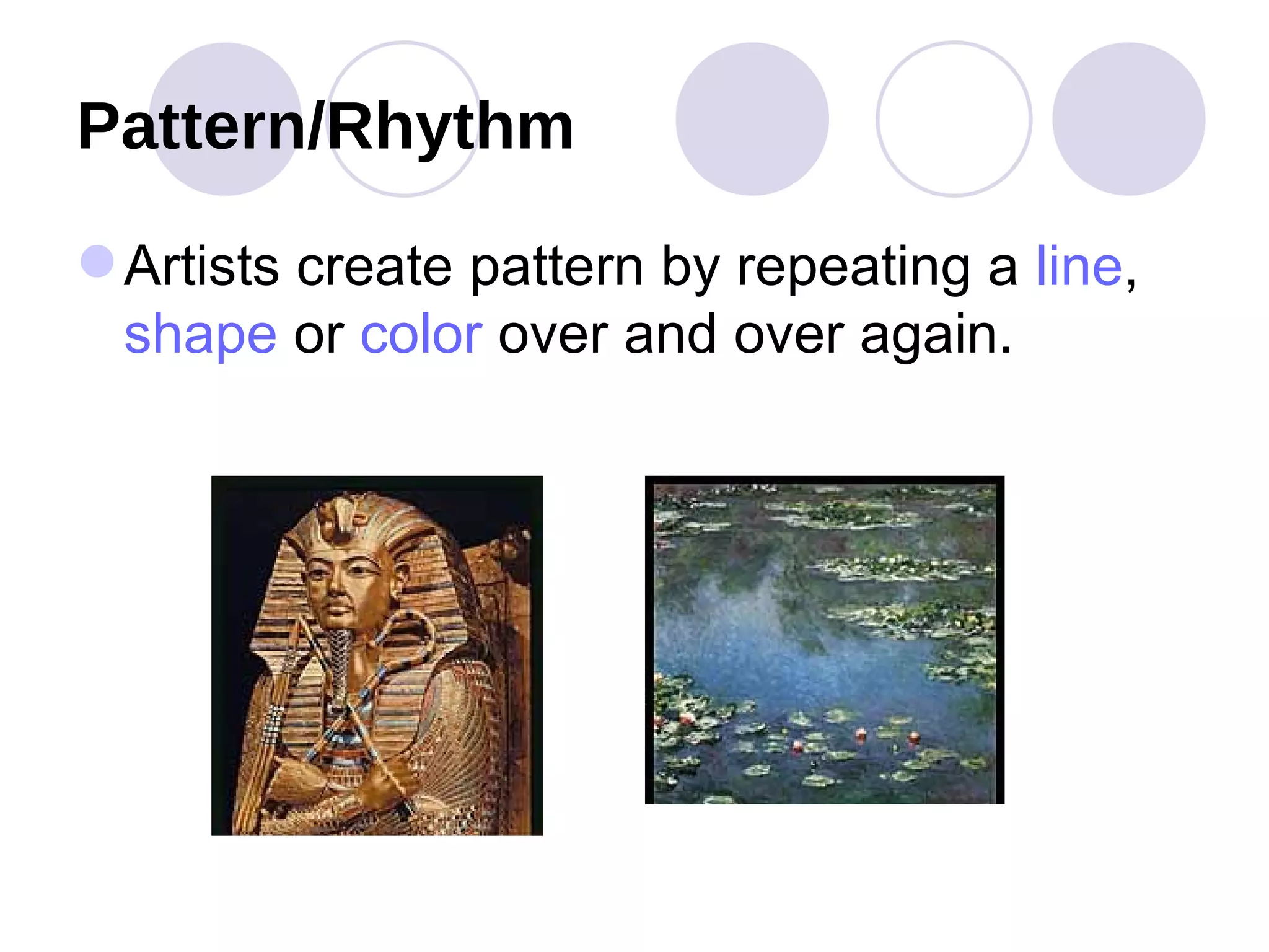
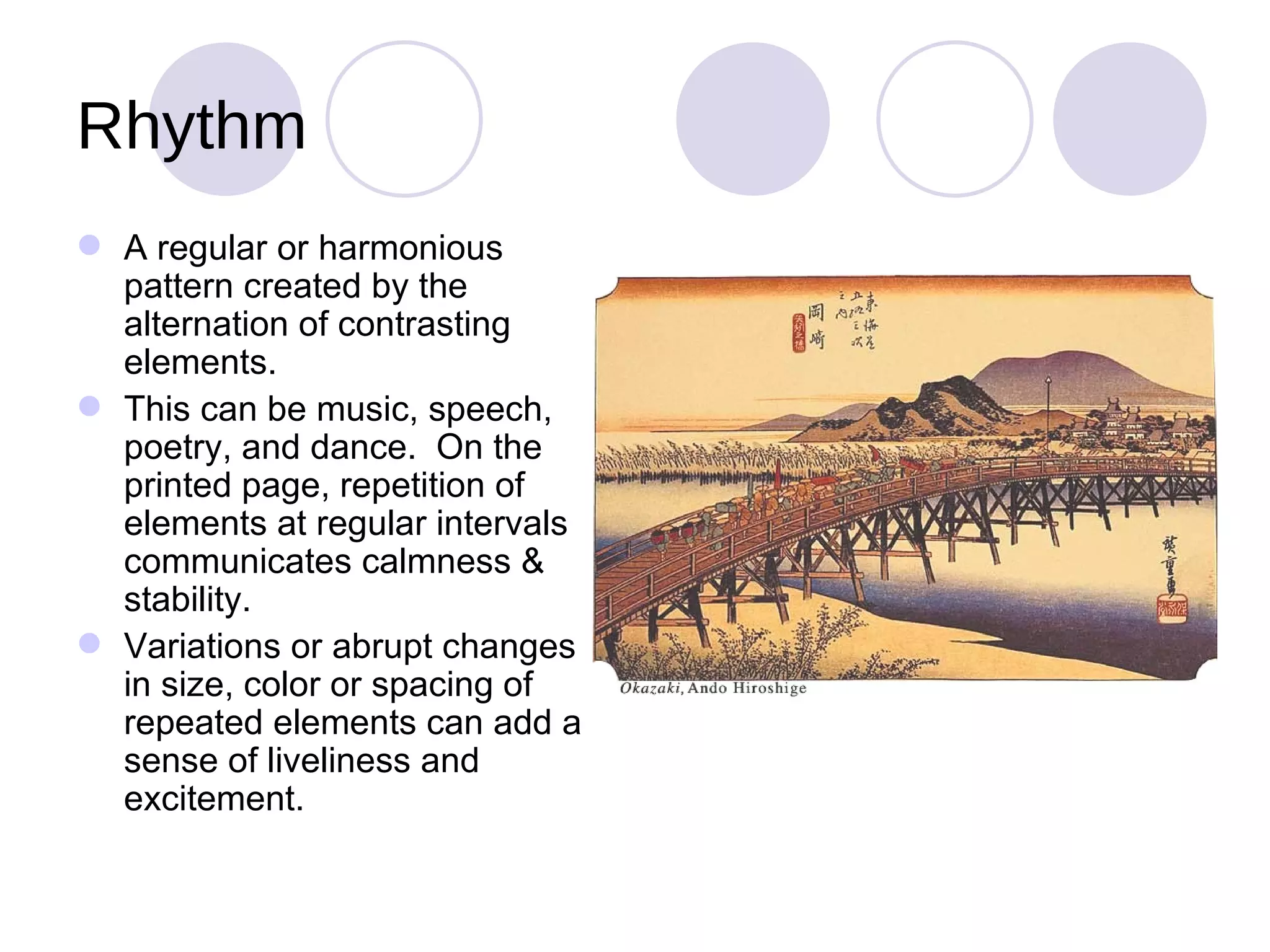
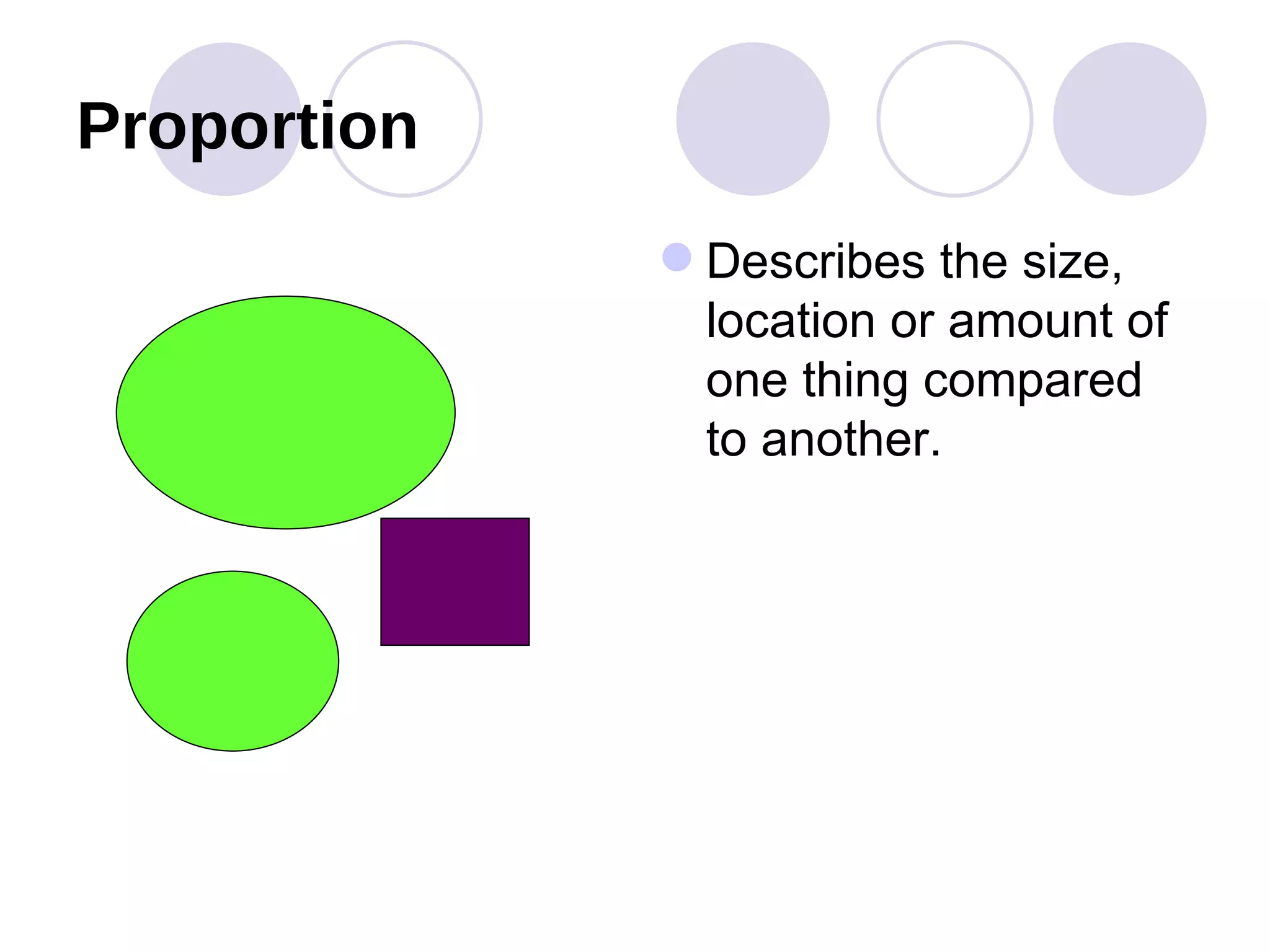
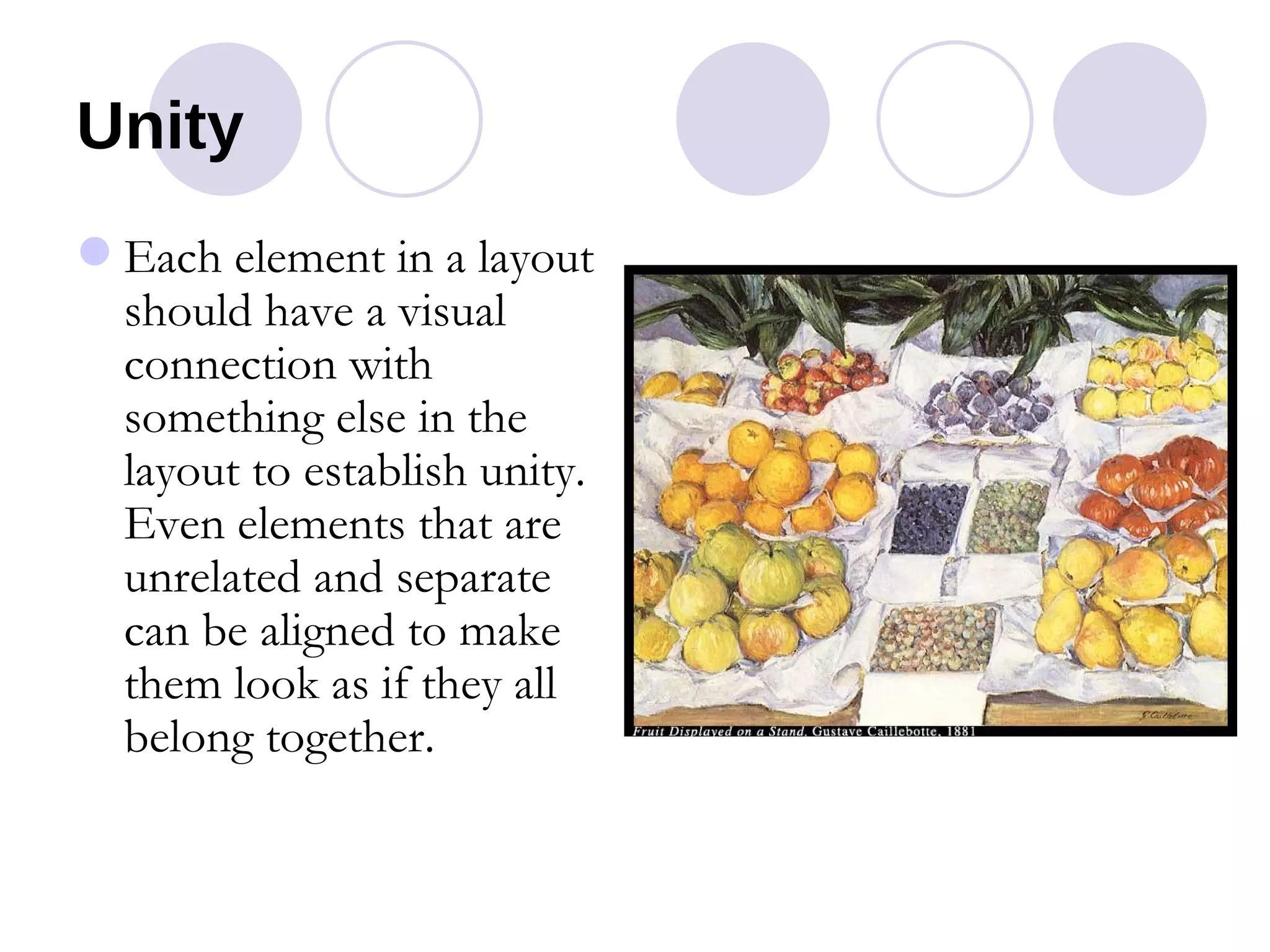
E lements   &  P rinciples   of  D esign C reated by  L aura  M cKee
Magazine Questions What attracts you to the cover? What do you think the message is?
Vocabulary As in just about any field of endeavor, it helps to have a common language to describe things. If I say 'dohickey' and you say 'doodad', we may not know we're talking about the same thing.  Vocabulary is vital for correct principles to be taught in any discipline.
Design Concepts Alignment Left, right, center, justified Proximity Placement of graphic/pictures to related text
Design Concepts  (continued) Repetition Use of bullets, numbers, symbols, graphics, or pictures used more than once.  Creates unity. Contrast Large vs. small Dark vs. light Thick vs. thin
Elements of Design Line Shape Form Space Color Texture Value
Line A straight or curved mark connecting any two points.  Most obvious lines are rules, boxes, and borders.  Less obvious-but more powerful-are lines that direct your eye or define the mood.
Identify which line represents   Formality, romance, excitement, mystery, tranquility, or anger 1 2 3 4 5 6
Mood Definition  Formality —Used for professional, conservative or structured documents.  Recognized by straight lines and even patterns. Excitement— Represented by straight lines, sharp angles, and irregular patterns. Tranquility or Romance— Used in fashion ads, movie promotions and travel brochures because the lines are made with soft curves & regular patterns.
Mood Definition  (continued) Mystery  is used if you need to entice your audience to figure out a puzzle.  Made with unusual lines & patterns—especially those with optical illusions. Anger  is seen as highs & lows with sharp peaks & valleys—and incites action.
Do you want to make any changes to your choices?
Answers
Shapes Shapes define objects, attract attention, provide identity and communicate ideas. Geometric shapes Organic shapes look like things from nature.
Forms Forms are 3-dimensional. Where shapes are flat, forms have height, width and thickness.
Space The absence of elements or the area between or around elements.  Space is used to rest the eye, to visually organize, and to make text more readable.
Color The most critical design element on the page. It is the most difficult to work with and the most effective in achieving the results you want.
Primary Colors Secondary Colors Tertiary Colors 12-Step Color Wheel
Primary & Complementary Colors
Warm Colors Reds, oranges, and yellows are considered warm colors.  Warm colors are said to come towards you.
Cool Colors Blues, greens, and purples are considered cool colors.  Cool colors are said to move away from you, or appear more distant.
Texture The structure or grain of a surface gives added dimension to a layout. Design is FUN
Value Relative darkness or lightness of a color.  Adds contrast and texture to a page and can set the mood—great for web page backgrounds.
Principles of Design Balance Unity Emphasis Rhythm Pattern Contrast Movement
Balance The distribution of weight; may be either symmetrical or asymmetrical. If you see something hanging crooked it makes you feel uneasy until it is balanced. Asymmetrical (informal) balance means each side of an imaginary line are different yet equal.  Symmetrical (formal) balance means both sides of an imaginary line are the same.
Pattern/Rhythm Artists create pattern by repeating a  line ,  shape  or  color  over and over again.
Rhythm A regular or harmonious pattern created by the alternation of contrasting elements.  This can be music, speech, poetry, and dance.  On the printed page, repetition of elements at regular intervals communicates calmness & stability. Variations or abrupt changes in size, color or spacing of repeated elements can add a sense of liveliness and excitement.
Proportion Describes the size, location or amount of one thing compared to another.
Emphasis Special weight or importance placed upon something.  In speech we talk louder or whisper.  In appearance we dress or style our hair differently from the norm.  With objects, we paint them bold colors, build them enormous or make them noisy.  We make them different! Use contrast Add texture Color headings & graphics or backgrounds Lead the reader to the most important thing on the page
Unity Each element in a layout should have a visual connection with something else in the layout to establish unity.  Even elements that are unrelated and separate can be aligned to make them look as if they all belong together.

Elements & Principles

  • 1.
    E lements & P rinciples of D esign C reated by L aura M cKee
  • 2.
    Magazine Questions Whatattracts you to the cover? What do you think the message is?
  • 3.
    Vocabulary As injust about any field of endeavor, it helps to have a common language to describe things. If I say 'dohickey' and you say 'doodad', we may not know we're talking about the same thing. Vocabulary is vital for correct principles to be taught in any discipline.
  • 4.
    Design Concepts AlignmentLeft, right, center, justified Proximity Placement of graphic/pictures to related text
  • 5.
    Design Concepts (continued) Repetition Use of bullets, numbers, symbols, graphics, or pictures used more than once. Creates unity. Contrast Large vs. small Dark vs. light Thick vs. thin
  • 6.
    Elements of DesignLine Shape Form Space Color Texture Value
  • 7.
    Line A straightor curved mark connecting any two points. Most obvious lines are rules, boxes, and borders. Less obvious-but more powerful-are lines that direct your eye or define the mood.
  • 8.
    Identify which linerepresents Formality, romance, excitement, mystery, tranquility, or anger 1 2 3 4 5 6
  • 9.
    Mood Definition Formality —Used for professional, conservative or structured documents. Recognized by straight lines and even patterns. Excitement— Represented by straight lines, sharp angles, and irregular patterns. Tranquility or Romance— Used in fashion ads, movie promotions and travel brochures because the lines are made with soft curves & regular patterns.
  • 10.
    Mood Definition (continued) Mystery is used if you need to entice your audience to figure out a puzzle. Made with unusual lines & patterns—especially those with optical illusions. Anger is seen as highs & lows with sharp peaks & valleys—and incites action.
  • 11.
    Do you wantto make any changes to your choices?
  • 12.
  • 13.
    Shapes Shapes defineobjects, attract attention, provide identity and communicate ideas. Geometric shapes Organic shapes look like things from nature.
  • 14.
    Forms Forms are3-dimensional. Where shapes are flat, forms have height, width and thickness.
  • 15.
    Space The absenceof elements or the area between or around elements. Space is used to rest the eye, to visually organize, and to make text more readable.
  • 16.
    Color The mostcritical design element on the page. It is the most difficult to work with and the most effective in achieving the results you want.
  • 17.
    Primary Colors SecondaryColors Tertiary Colors 12-Step Color Wheel
  • 18.
  • 19.
    Warm Colors Reds,oranges, and yellows are considered warm colors. Warm colors are said to come towards you.
  • 20.
    Cool Colors Blues,greens, and purples are considered cool colors. Cool colors are said to move away from you, or appear more distant.
  • 21.
    Texture The structureor grain of a surface gives added dimension to a layout. Design is FUN
  • 22.
    Value Relative darknessor lightness of a color. Adds contrast and texture to a page and can set the mood—great for web page backgrounds.
  • 23.
    Principles of DesignBalance Unity Emphasis Rhythm Pattern Contrast Movement
  • 24.
    Balance The distributionof weight; may be either symmetrical or asymmetrical. If you see something hanging crooked it makes you feel uneasy until it is balanced. Asymmetrical (informal) balance means each side of an imaginary line are different yet equal. Symmetrical (formal) balance means both sides of an imaginary line are the same.
  • 25.
    Pattern/Rhythm Artists createpattern by repeating a line , shape or color over and over again.
  • 26.
    Rhythm A regularor harmonious pattern created by the alternation of contrasting elements. This can be music, speech, poetry, and dance. On the printed page, repetition of elements at regular intervals communicates calmness & stability. Variations or abrupt changes in size, color or spacing of repeated elements can add a sense of liveliness and excitement.
  • 27.
    Proportion Describes thesize, location or amount of one thing compared to another.
  • 28.
    Emphasis Special weightor importance placed upon something. In speech we talk louder or whisper. In appearance we dress or style our hair differently from the norm. With objects, we paint them bold colors, build them enormous or make them noisy. We make them different! Use contrast Add texture Color headings & graphics or backgrounds Lead the reader to the most important thing on the page
  • 29.
    Unity Each elementin a layout should have a visual connection with something else in the layout to establish unity. Even elements that are unrelated and separate can be aligned to make them look as if they all belong together.

Editor's Notes

  • #3 Is there a large, bold typeface, an attractive graphic or photo, is there a repetitive element somewhere? Is the message inviting, calming, exciting, fun? Or, is the information placed haphazardly and gives you a nervous frustrating feeling?
  • #4 As in just about any field of endeavor, it helps to have a common language to describe things with. If I say 'dohickey' and you say 'doodad', we may not know we're talking about the same thing. Vocabulary is vital for correct principles to be taught in any discipline.
  • #5 Alignment ties items together on a page. Proximity gives meaning and purpose to clipart, graphics, and illustrations & photos.
  • #6 Repetition builds unity between multiple pages of a document. Contrast draws your interest and gives focus to the most important item on the page.
  • #18 Primary colors are made up of yellow, blue, and red. These colors cannot be made from mixing any other colors. Secondary colors are made from mixing any two primary colors. Yellow & blue will make green, blue and red will make purple, and red & yellow make orange. Secondary colors are orange, green and violet. They are also known as complementary. Tertiary colors are made by mixing one or two primary colors with a secondary color. For instance, Orange and yellow make an orange-yellow mix. Green and yellow make a lime green color.
  • #19 Complementary colors are opposite each other on the color wheel. Red and green, yellow and violet, blue and orange are the three simple pairs of complementary colors. These colors always go well with each other, hence the term complimentary.   One sees the use of complementary color schemes in every aspect of our lives. During Christmas, red and green become inseparable, proving the simplicity and ease of complementary color schemes. The use of gold on a rich blue background was a favorite of renaissance painters. Early evening or seasonal paintings utilizing the yellow and violet color scheme was common among impressionist painters like Monet and Serrat. Contrasting schemes use shades from opposite segments on the color wheel . Contrasting bold primary and secondary colors - red and green, yellow and violet, or blue and orange - will create a very dramatic look. Contrasting colors can also be created using pastel shades, also found as opposites on the color wheel.
  • #20 Warm colors invite excitement and fun.
  • #21 Cool colors are calming.
  • #30 Shape is used to create unity in this picture. All items seem to go together.