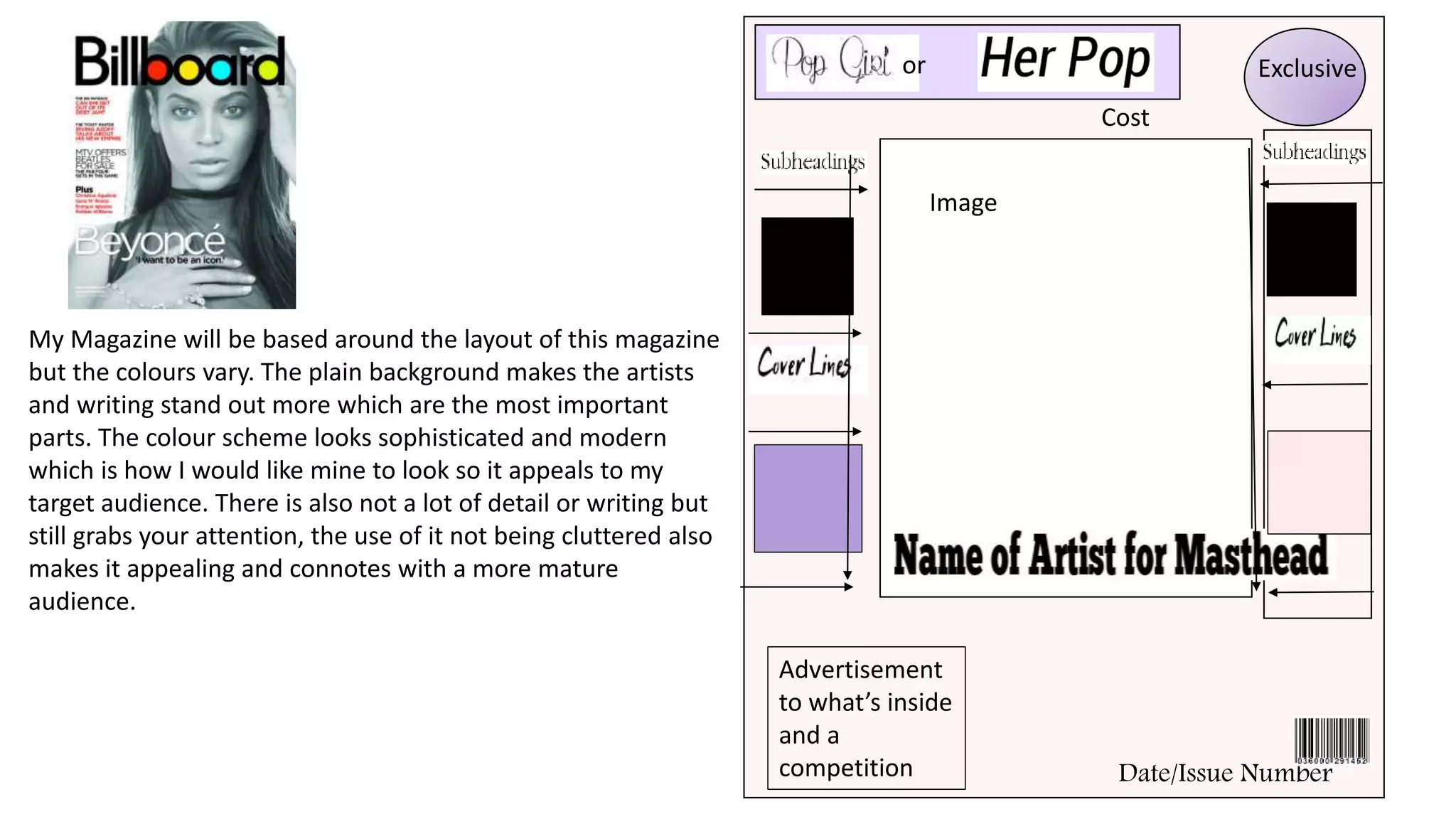
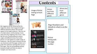
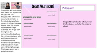
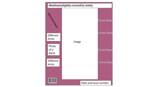
My Magazine will be based around the layout of this magazine
but the colours vary. The plain background makes the artists
and writing stand out more which are the most important
parts. The colour scheme looks sophisticated and modern
which is how I would like mine to look so it appeals to my
target audience. There is also not a lot of detail or writing but
still grabs your attention, the use of it not being cluttered also
makes it appealing and connotes with a more mature
audience.
Image
or
Date/Issue Number
Cost
Exclusive
Advertisement
to what’s inside
and a
competition
Image of Artist
linking to front
Page
Artists but
from
different
genre
Artists
but from
different
genre
Page Numbers and
details to what is on the
pages.
Picture
linking with
the page
number
My magazine will be influenced by the
magazines above. Each magazine brings a
different elements which I like and will
appeal to the target audience. I like the use
of simple colours, and by having a music
chart since the magazine if for music. I also
like the use of having different camera
angles and different artists from other
genres so It will appeal to a wider range of
audiences. I like the colour schemes and the
use of pictures with the page numbers so it
grabs their attention wanting them to turn
that page. They are eye grabbing without
being too bright and they are easy to
navigate your way around.
Image of the artists who is featured on
the front cover and who the article is
about
Pull quote
Answer (black)
Answer (black)
Answer (black)
Answer (black)
Answer (black)
Answer (black)
The writing will be in black
so it stands out against the
background. The
background is a feminine
colour and connotes to
femininity but also looks
mature. It is in an interview
format since this is what
appeals to my target
audience, the image is on
the right as it is
conventional to be placed
here, the artists name is in
a different colour so it
stands out and the
masthead is eye catching
and draws them in as it
uses intriguing language.
The images above are a
guideline as well.
Image
Masthead (slightly covered by Artist)
Cover lines
Cover lines
Different
Artist
Cover lines
Cover lines
Date and Issue number
Different
Artist
Photo
of a
Band
What’s inside this week?
Photo of
Artists and
page
number
Photo of a
Band in the
New Singles
Special
Features
New Singles
Date and Website
Page Numbers and
details
Photo of
Artists
Image of Artist
looking secretive or
shocked
Detailed Interview Detailed Interview

Draft layout

  • 1.
    My Magazine willbe based around the layout of this magazine but the colours vary. The plain background makes the artists and writing stand out more which are the most important parts. The colour scheme looks sophisticated and modern which is how I would like mine to look so it appeals to my target audience. There is also not a lot of detail or writing but still grabs your attention, the use of it not being cluttered also makes it appealing and connotes with a more mature audience. Image or Date/Issue Number Cost Exclusive Advertisement to what’s inside and a competition
  • 2.
    Image of Artist linkingto front Page Artists but from different genre Artists but from different genre Page Numbers and details to what is on the pages. Picture linking with the page number My magazine will be influenced by the magazines above. Each magazine brings a different elements which I like and will appeal to the target audience. I like the use of simple colours, and by having a music chart since the magazine if for music. I also like the use of having different camera angles and different artists from other genres so It will appeal to a wider range of audiences. I like the colour schemes and the use of pictures with the page numbers so it grabs their attention wanting them to turn that page. They are eye grabbing without being too bright and they are easy to navigate your way around.
  • 3.
    Image of theartists who is featured on the front cover and who the article is about Pull quote Answer (black) Answer (black) Answer (black) Answer (black) Answer (black) Answer (black) The writing will be in black so it stands out against the background. The background is a feminine colour and connotes to femininity but also looks mature. It is in an interview format since this is what appeals to my target audience, the image is on the right as it is conventional to be placed here, the artists name is in a different colour so it stands out and the masthead is eye catching and draws them in as it uses intriguing language. The images above are a guideline as well.
  • 4.
    Image Masthead (slightly coveredby Artist) Cover lines Cover lines Different Artist Cover lines Cover lines Date and Issue number Different Artist Photo of a Band
  • 5.
    What’s inside thisweek? Photo of Artists and page number Photo of a Band in the New Singles Special Features New Singles Date and Website Page Numbers and details Photo of Artists
  • 6.
    Image of Artist lookingsecretive or shocked Detailed Interview Detailed Interview