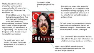
1. The big ‘Q’ as the masthead
shows how well known the
magazine is. Also it is covered by
the main image that shows how
established it is.
Mise-en-scene is very plain, especially
the background, it is to emphasise how
much the main image is popping out of
the cover. It is one block colour so all of
the colourful bits such as the splashes
and cover lines.
The main image is popping out the cover to
make him stand out because the article is
about him saving rock for the second time,
which shows him as some kind of god.
Main cover line is the bands name that this
artist is from, this gives more information on
who the main image is and why he is there.
Its very central which is something that
rock magazines use to clearly outline that
the main image is above it.
All of the writing is different colours
which shows that the magazine is
unpredictable just like the music it
is representing… also it shows that
the genre can be diverse, because
its not all the same colour.
Splash with a free
giveaway so people buy
it
The font is quite blocky and
modern this shows that it goes
with the type of music which is
also modern.
Direct address used to show he is
talking to you specifically. This
also fits in with the front cover
codes and conventions
2. Again, the magazine is so well
established that it doesn’t have to
have all of the ‘VIBE’ on show, it
can be covered by the main image
The font and style of the
masthead and other bits
of writing are very
modern and bold. The
gradient of colours shows
this.
The main image is quite
outstanding on a plain, simple
background this is because it
has to be very uniform and
serious because it goes with an
article about drug abuse
Quotes used to entice people in
to reading the article. Also there
are a lot of names, so if you see
one you like you may want to
buy it and read it.
This image is direct address to
show seriousness. Also it fits in
with the codes and
conventions of the front cover
main iamge.
3. The dark colours used in the
main image shows the fact that
the person in the picture is
dead- shown by the main cover
line.
The colour choice of the
writing is used because it will
stand out on the black and
white background. It is also
used because to outline the
important information on the
front page
The yellow splash is there to
make the writing inside stand
out as something you need
to see- extra or fun stuff-
incentives.
Also the main image is
direct address which also
shows seriousness which
goes with the idea of the
picture (that he’s dead)
Also it fits in with
codes and
conventions.