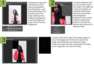
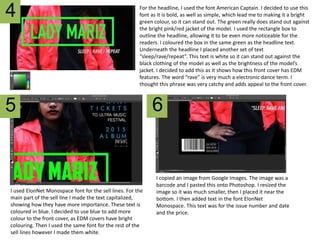
1
3
2I selected the image that
I wanted for my front
cover and uploaded it
onto Photoshop. I used
the Quick Selection Tool
to select parts of the
image, allowing me to
change the background.
I used the Background
Eraser Tool to erase the
background.
I used the brightness tool
so I can the colouring of
the model. The image that
I used was too light, so I
made the model’s face,
neck and hands darker. I
also changed the
brightness of the model’s
clothing, making them
darker, so the pink will
become red and grey shirt
becomes black.
I copied a plain black image from Google Images, to
use as the background for this draft. I pasted the
image onto Photoshop and resized the image. I
made sure to place the layer underneath the model,
so the image does not cover the model.
4
5 6
For the headline, I used the font American Captain. I decided to use this
font as it is bold, as well as simple, which lead me to making it a bright
green colour, so it can stand out. The green really does stand out against
the bright pink/red jacket of the model. I used the rectangle box to
outline the headline, allowing it to be even more noticeable for the
readers. I coloured the box in the same green as the headline text.
Underneath the headline I placed another set of text
“sleep/rave/repeat”. This text is white so it can stand out against the
black clothing of the model as well as the brightness of the model’s
jacket. I decided to add this as it shows how this front cover has EDM
features. The word “rave” is very much a electronic dance term. I
thought this phrase was very catchy and adds appeal to the front cover.
I used ElonNet Monospace font for the sell lines. For the
main part of the sell line I made the text capitalized,
showing how they have more importance. These text is
coloured in blue. I decided to use blue to add more
colour to the front cover, as EDM covers have bright
colouring. Then I used the same font for the rest of the
sell lines however I made them white.
I copied an image from Google Images. The image was a
barcode and I pasted this onto Photoshop. I resized the
image so it was much smaller, then I placed it near the
bottom. I then added text in the font ElonNet
Monospace. This text was for the issue number and date
and the price.

Draft #3 - step by step

  • 1.
    1 3 2I selected theimage that I wanted for my front cover and uploaded it onto Photoshop. I used the Quick Selection Tool to select parts of the image, allowing me to change the background. I used the Background Eraser Tool to erase the background. I used the brightness tool so I can the colouring of the model. The image that I used was too light, so I made the model’s face, neck and hands darker. I also changed the brightness of the model’s clothing, making them darker, so the pink will become red and grey shirt becomes black. I copied a plain black image from Google Images, to use as the background for this draft. I pasted the image onto Photoshop and resized the image. I made sure to place the layer underneath the model, so the image does not cover the model.
  • 2.
    4 5 6 For theheadline, I used the font American Captain. I decided to use this font as it is bold, as well as simple, which lead me to making it a bright green colour, so it can stand out. The green really does stand out against the bright pink/red jacket of the model. I used the rectangle box to outline the headline, allowing it to be even more noticeable for the readers. I coloured the box in the same green as the headline text. Underneath the headline I placed another set of text “sleep/rave/repeat”. This text is white so it can stand out against the black clothing of the model as well as the brightness of the model’s jacket. I decided to add this as it shows how this front cover has EDM features. The word “rave” is very much a electronic dance term. I thought this phrase was very catchy and adds appeal to the front cover. I used ElonNet Monospace font for the sell lines. For the main part of the sell line I made the text capitalized, showing how they have more importance. These text is coloured in blue. I decided to use blue to add more colour to the front cover, as EDM covers have bright colouring. Then I used the same font for the rest of the sell lines however I made them white. I copied an image from Google Images. The image was a barcode and I pasted this onto Photoshop. I resized the image so it was much smaller, then I placed it near the bottom. I then added text in the font ElonNet Monospace. This text was for the issue number and date and the price.