1. The word “contents” is written at the top, informing the
reader what this page is. It is layered over a grey line, added
a design to the page.
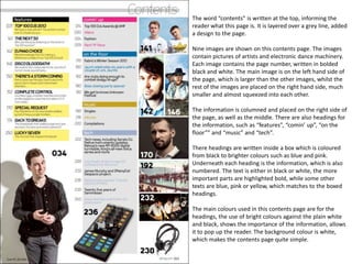
Nine images are shown on this contents page. The images
contain pictures of artists and electronic dance machinery.
Each image contains the page number, written in bolded
black and white. The main image is on the left hand side of
the page, which is larger than the other images, whilst the
rest of the images are placed on the right hand side, much
smaller and almost squeezed into each other.
The information is columned and placed on the right side of
the page, as well as the middle. There are also headings for
the information, such as “features”, “comin’ up”, “on the
floor”” and “music” and “tech”.
There headings are written inside a box which is coloured
from black to brighter colours such as blue and pink.
Underneath each heading is the information, which is also
numbered. The text is either in black or white, the more
important parts are highlighted bold, while some other
texts are blue, pink or yellow, which matches to the boxed
headings.
The main colours used in this contents page are for the
headings, the use of bright colours against the plain white
and black, shows the importance of the information, allows
it to pop up the reader. The background colour is white,
which makes the contents page quite simple.