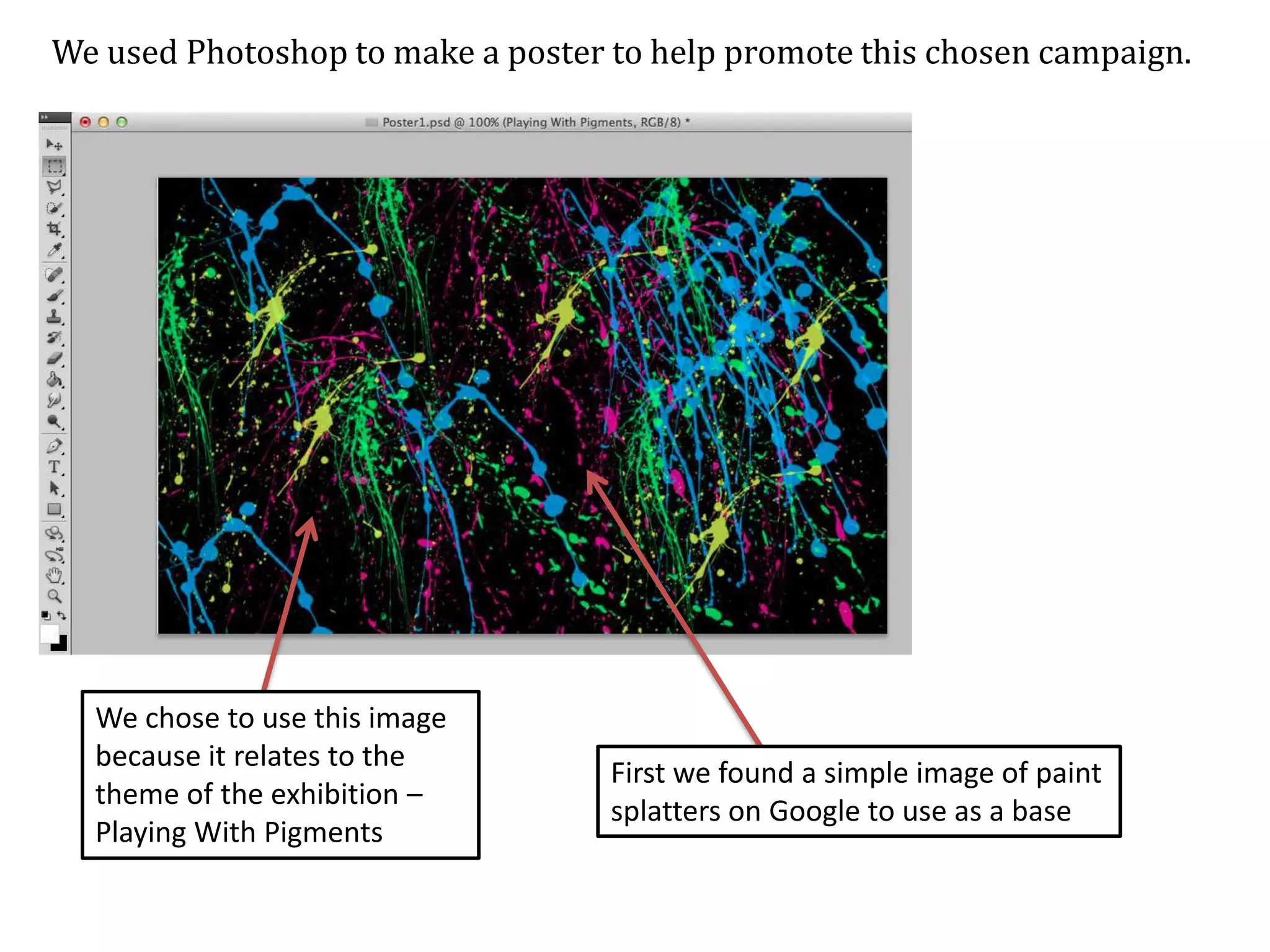
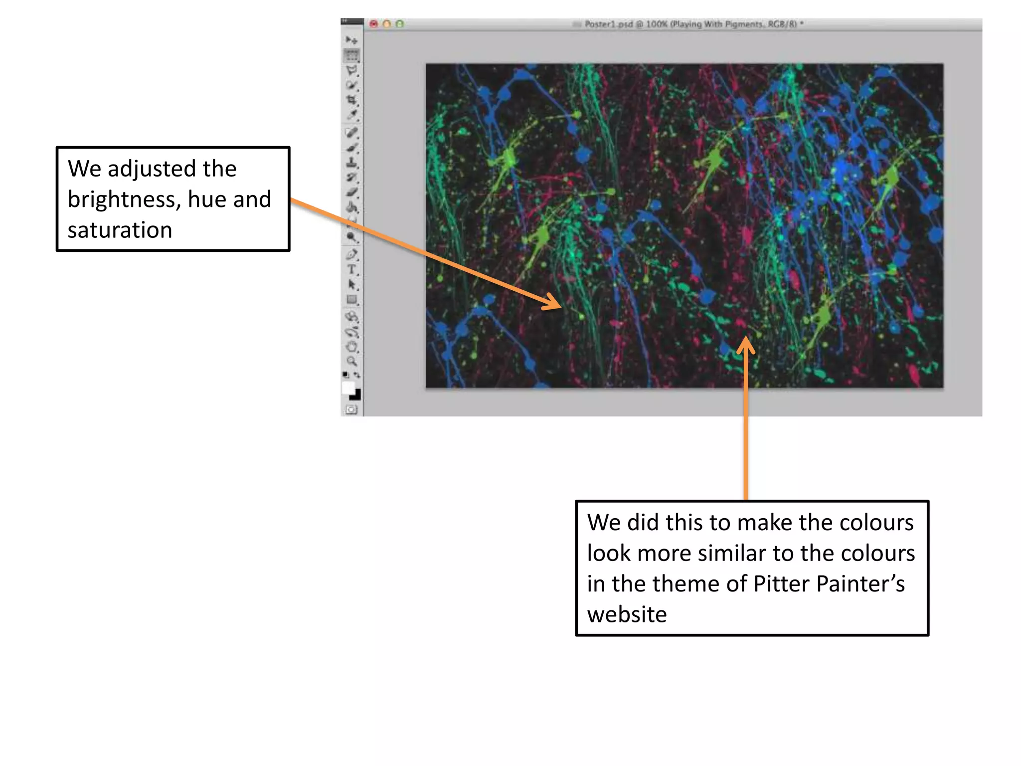
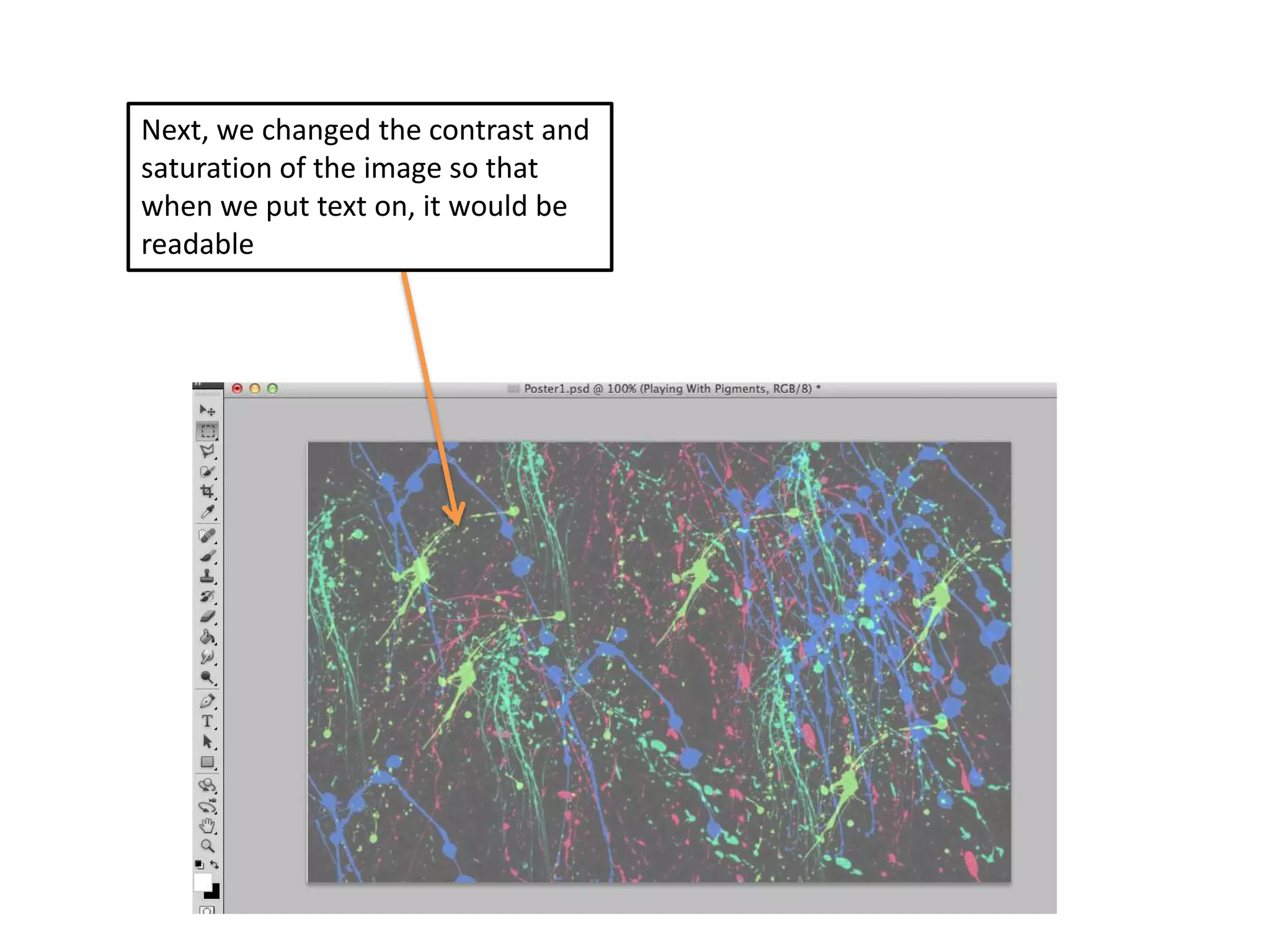
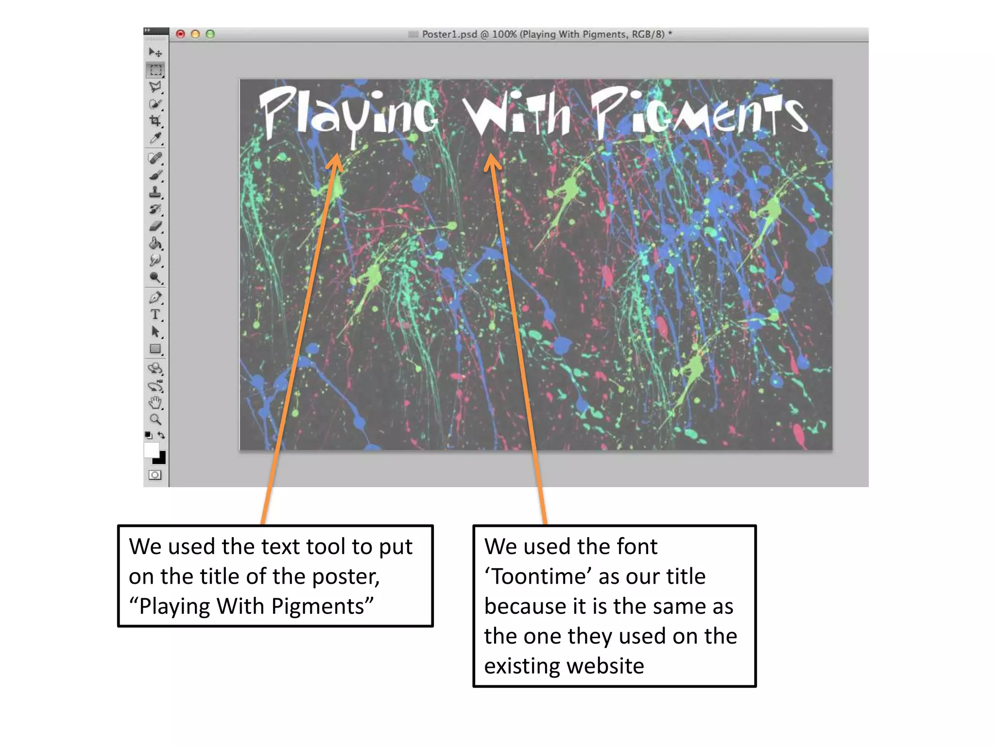
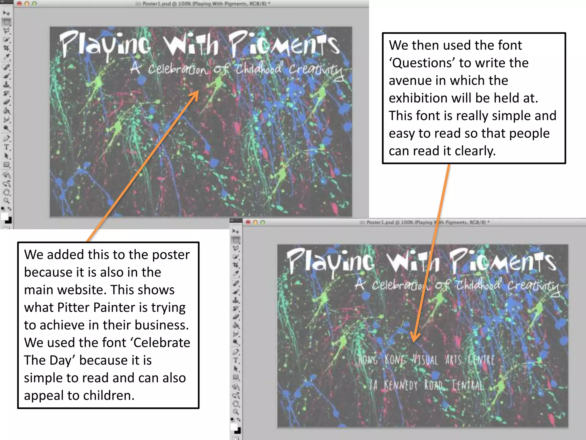
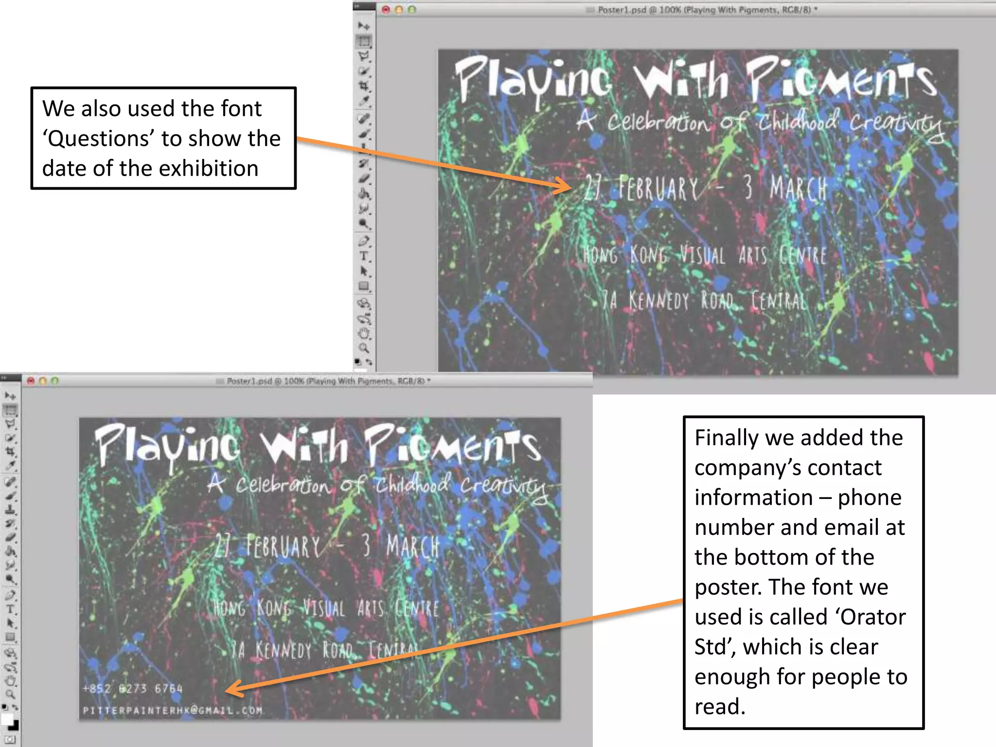
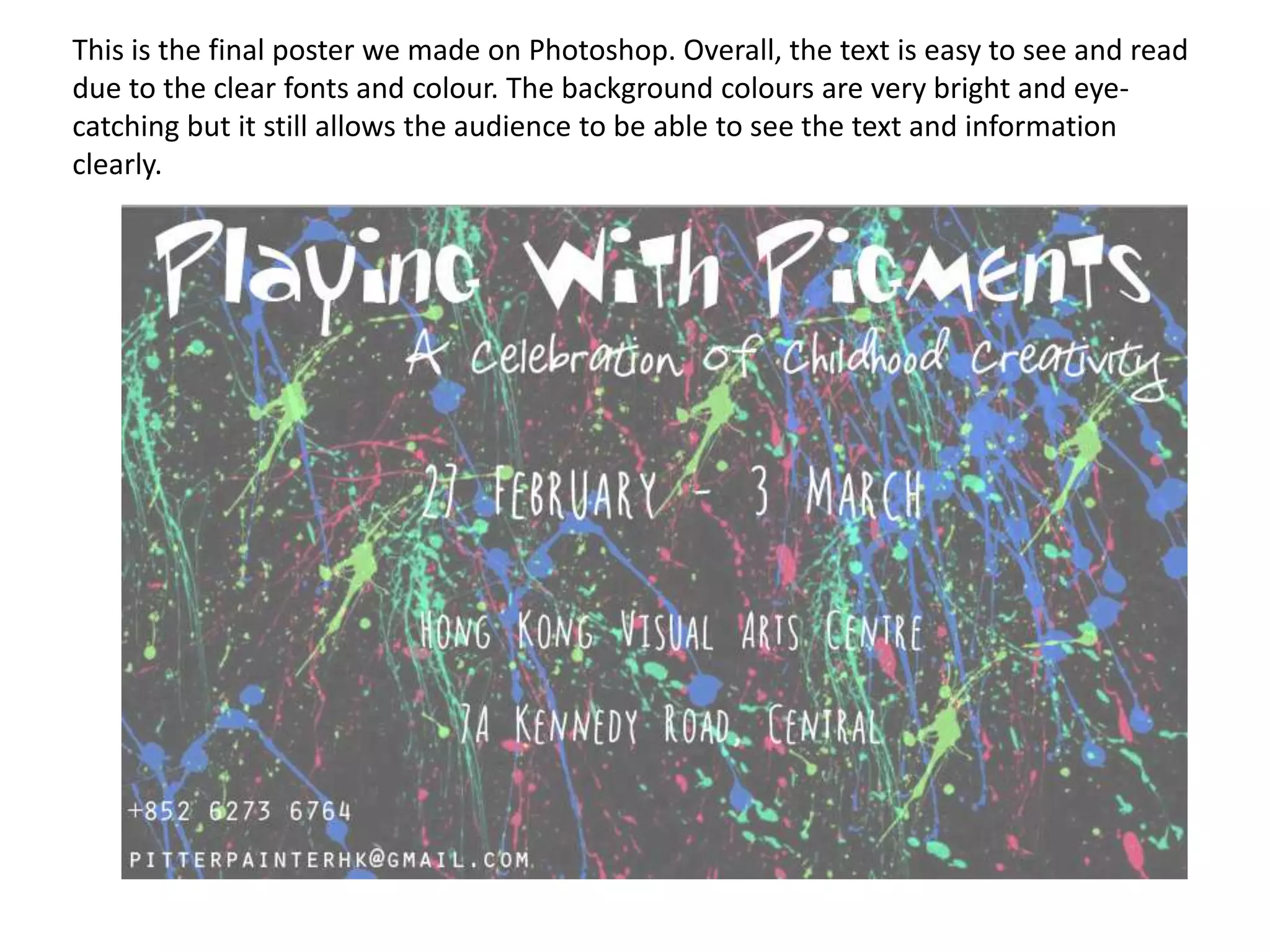
Poster
Technical Skills and Creativity
We used Photoshop to make a poster to help promote this chosen campaign.

We chose to use this image
because it relates to the
theme of the exhibition –
Playing With Pigments

First we found a simple image of paint
splatters on Google to use as a base
We adjusted the
brightness, hue and
saturation

We did this to make the colours
look more similar to the colours
in the theme of Pitter Painter’s
website
Next, we changed the contrast and
saturation of the image so that
when we put text on, it would be
readable
We used the text tool to put
on the title of the poster,
“Playing With Pigments”

We used the font
‘Toontime’ as our title
because it is the same as
the one they used on the
existing website
We then used the font
‘Questions’ to write the
avenue in which the
exhibition will be held at.
This font is really simple and
easy to read so that people
can read it clearly.

We added this to the poster
because it is also in the
main website. This shows
what Pitter Painter is trying
to achieve in their business.
We used the font ‘Celebrate
The Day’ because it is
simple to read and can also
appeal to children.
We also used the font
‘Questions’ to show the
date of the exhibition

Finally we added the
company’s contact
information – phone
number and email at
the bottom of the
poster. The font we
used is called ‘Orator
Std’, which is clear
enough for people to
read.
This is the final poster we made on Photoshop. Overall, the text is easy to see and read
due to the clear fonts and colour. The background colours are very bright and eyecatching but it still allows the audience to be able to see the text and information
clearly.

Poster technical skills

  • 1.
  • 2.
    We used Photoshopto make a poster to help promote this chosen campaign. We chose to use this image because it relates to the theme of the exhibition – Playing With Pigments First we found a simple image of paint splatters on Google to use as a base
  • 3.
    We adjusted the brightness,hue and saturation We did this to make the colours look more similar to the colours in the theme of Pitter Painter’s website
  • 4.
    Next, we changedthe contrast and saturation of the image so that when we put text on, it would be readable
  • 5.
    We used thetext tool to put on the title of the poster, “Playing With Pigments” We used the font ‘Toontime’ as our title because it is the same as the one they used on the existing website
  • 6.
    We then usedthe font ‘Questions’ to write the avenue in which the exhibition will be held at. This font is really simple and easy to read so that people can read it clearly. We added this to the poster because it is also in the main website. This shows what Pitter Painter is trying to achieve in their business. We used the font ‘Celebrate The Day’ because it is simple to read and can also appeal to children.
  • 7.
    We also usedthe font ‘Questions’ to show the date of the exhibition Finally we added the company’s contact information – phone number and email at the bottom of the poster. The font we used is called ‘Orator Std’, which is clear enough for people to read.
  • 8.
    This is thefinal poster we made on Photoshop. Overall, the text is easy to see and read due to the clear fonts and colour. The background colours are very bright and eyecatching but it still allows the audience to be able to see the text and information clearly.