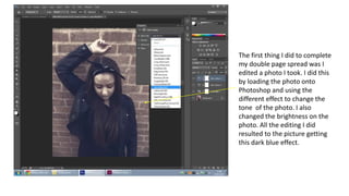
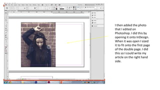
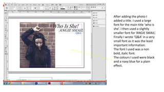
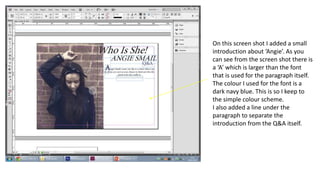
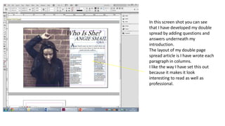
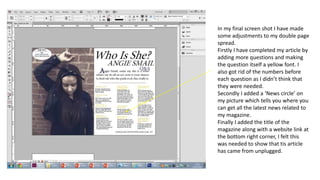
DPS screen shots
By Caitlin O’Mara
The first thing I did to complete
my double page spread was I
edited a photo I took. I did this
by loading the photo onto
Photoshop and using the
different effect to change the
tone of the photo. I also
changed the brightness on the
photo. All the editing I did
resulted to the picture getting
this dark blue effect.
I then added the photo
that I edited on
Photoshop. I did this by
opening it onto InDesign.
When it was open I sized
it to fit onto the first page
of the double page. I did
this so I could write my
article on the right hand
side.
After adding the photo I
added a title. I used a large
font for the main title ‘who is
she’. I then used a slightly
smaller font for ‘ANGIE SMAIL’.
Finally I wrote ‘Q&A’ in a very
small font as it was the least
important information.
The font I used was a non
bold, italic font.
The colours I used were black
and a navy blue for a plain
effect.
On this screen shot I added a small
introduction about ‘Angie’. As you
can see from the screen shot there is
a ‘A’ which is larger than the font
that is used for the paragraph itself.
The colour I used for the font is a
dark navy blue. This is so I keep to
the simple colour scheme.
I also added a line under the
paragraph to separate the
introduction from the Q&A itself.
In this screen shot you can see
that I have developed my double
spread by adding questions and
answers underneath my
introduction.
The layout of my double page
spread article is I have wrote each
paragraph in columns.
I like the way I have set this out
because it makes it look
interesting to read as well as
professional.
In my final screen shot I have made
some adjustments to my double page
spread.
Firstly I have completed my article by
adding more questions and making
the question itself a yellow font. I
also got rid of the numbers before
each question as I didn’t think that
they were needed.
Secondly I added a ‘News circle’ on
my picture which tells you where you
can get all the latest news related to
my magazine.
Finally I added the title of the
magazine along with a website link at
the bottom right corner, I felt this
was needed to show that tis article
has came from unplugged.

Dps screen shots

  • 1.
    DPS screen shots ByCaitlin O’Mara
  • 2.
    The first thingI did to complete my double page spread was I edited a photo I took. I did this by loading the photo onto Photoshop and using the different effect to change the tone of the photo. I also changed the brightness on the photo. All the editing I did resulted to the picture getting this dark blue effect.
  • 3.
    I then addedthe photo that I edited on Photoshop. I did this by opening it onto InDesign. When it was open I sized it to fit onto the first page of the double page. I did this so I could write my article on the right hand side.
  • 4.
    After adding thephoto I added a title. I used a large font for the main title ‘who is she’. I then used a slightly smaller font for ‘ANGIE SMAIL’. Finally I wrote ‘Q&A’ in a very small font as it was the least important information. The font I used was a non bold, italic font. The colours I used were black and a navy blue for a plain effect.
  • 5.
    On this screenshot I added a small introduction about ‘Angie’. As you can see from the screen shot there is a ‘A’ which is larger than the font that is used for the paragraph itself. The colour I used for the font is a dark navy blue. This is so I keep to the simple colour scheme. I also added a line under the paragraph to separate the introduction from the Q&A itself.
  • 6.
    In this screenshot you can see that I have developed my double spread by adding questions and answers underneath my introduction. The layout of my double page spread article is I have wrote each paragraph in columns. I like the way I have set this out because it makes it look interesting to read as well as professional.
  • 7.
    In my finalscreen shot I have made some adjustments to my double page spread. Firstly I have completed my article by adding more questions and making the question itself a yellow font. I also got rid of the numbers before each question as I didn’t think that they were needed. Secondly I added a ‘News circle’ on my picture which tells you where you can get all the latest news related to my magazine. Finally I added the title of the magazine along with a website link at the bottom right corner, I felt this was needed to show that tis article has came from unplugged.