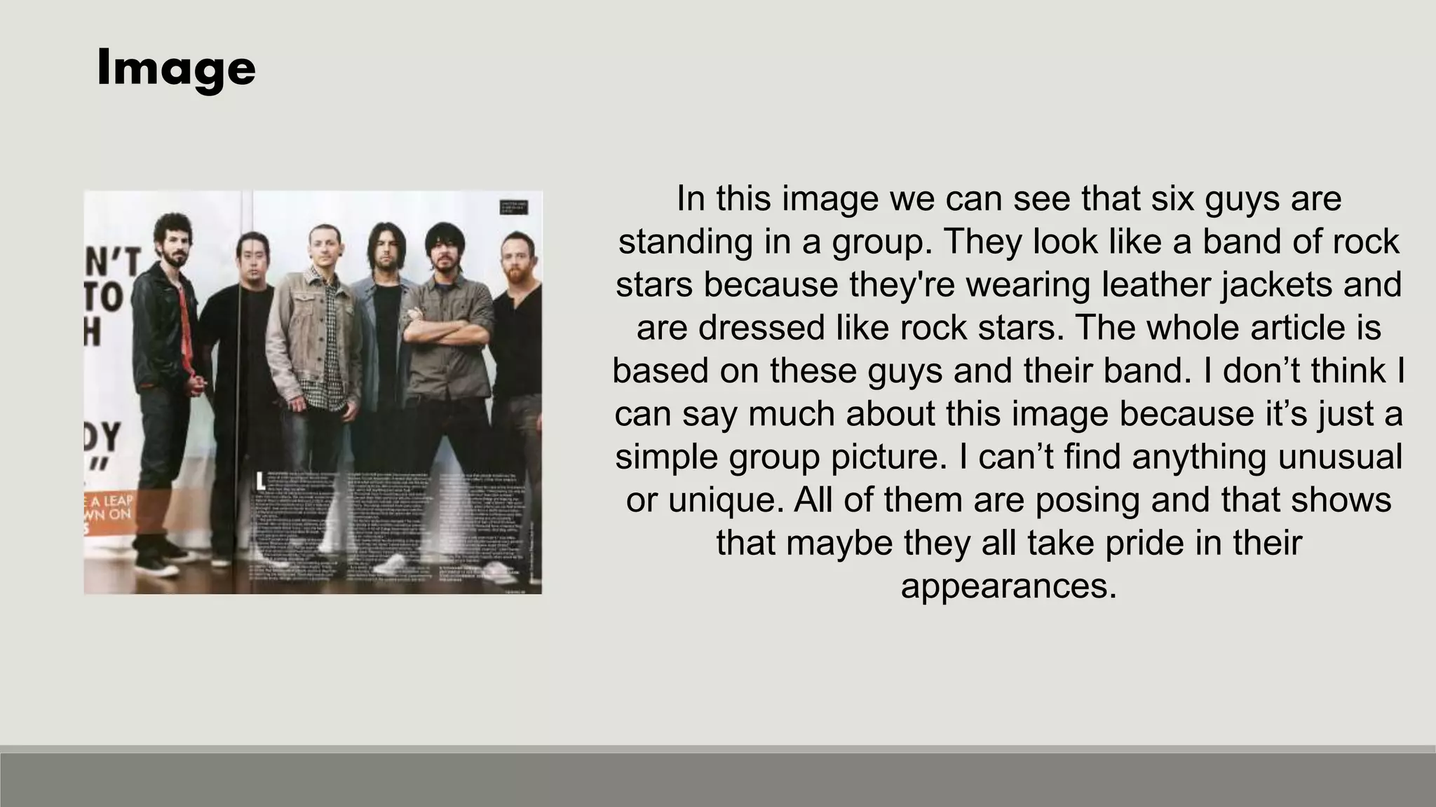
Double Spread Analysis
Double Spread#1
Title
Header
Standfirst
The title firstly includes a pull quote
from the interview on the side.
They've highlighted the important
information in pink o catch the readers
attention and intrigue them to read the
interview. The title is written in two
lines and the font is very bold which
stands out. The colour palette is very
pleasing to the eyes ad in my opinion
in looks very presentable. There’s
also a subtitle (also known as
standfirst) in the form of a strip
beneath the title which makes the
double spread look more creative.
Image
Footer
Just from looking at the image you can denote that the
artist is a teenager of the new generation with his pink
skinny jeans and sleeveless tank top. He has dyed his
hair in two colours (black and brown) which used to
considered very trendy a few years back when this
magazine was released. He also has a tattoo on his arm
and is wearing a chain and bracelets, from this we can
connate that he’s just another teenager who wants to look
cool for the paparazzi and his fans.
He’s standing in a very difficult position in this image, like
he’s trying to drive a car. We don’t usually see these type
of poses in magazines, we can connate that he’s very
different and wants to standout in a crowd. The
background is plain white which is a good contrast
against his black tank top. Key lighting has been used
because half of his face is darker than the other half.
Interview
Anchoring Image
Credit line/Footer
Content Box
Mostly interviews start with a drop cop but that common
convention has not been used here. I think that they
should’ve started the interview with drop cop because
then it would’ve been easier for the readers to see where
the interview starts from. There's an anchoring image
present in the center of the page which shows that this
interview is mainly about the artist’s relationship with his
girlfriend. They’ve also separated the answers from the
questions by highlighting the questions in pink and leaving
the answers in black, this helps the readers differentiate
between the two. To give credits there's a black
highlighted strip placed in the footer area which fills up the
empty space. A content box is also present highlighted in
pink to make the double spread look more creative.
Double Spread#2
Title
By Line
Standfirst
The title looks very unusual and unique
because some letters are big in size and
some are small, maybe to catch attention.
Words have been highlighted in black boxes
which makes it look outstanding on the light
grey background. It’s a pull quote used from
the article present below, to show the readers
that the article is very interesting. Name of
the writer is mentioned in a very small font in
red which is known as by line, maybe they
just wanted to fit it in and to give credits to
the writer. They’ve give a short explanation of
the article known as stand first or subtitle, to
intrigue the readers and make them want to
read the article.
Image
Just by looking at the image we can see
that the artist is a gothic teenager with her
black smudged eyeliner and short hair.
From this we can say that she seems very
carefree and lives in her own world. From
the way she's posing we can connate that
she tries to fit in the society but she simply
isn’t supposed to fit it, she's supposed to
standout. The overall colour palette goes
with the colours of the title which makes it
look very eye pleasing.
Article
Graphic
Footer
There’s a graphic (black box) placed after
which the article starts. Graphics are used to
enhance the overall look of the magazine.
The article is in columns and looks very
typical. It doesn’t look very interesting so I
don’t think many people would want to read
it. It’s written in a very small font because
maybe they wanted it all to fit in. A footer is
placed right below the article with the page
number to make the double spread look more
creative.
Double Spread #3
Title Category
Standfirst/Strip
The title is written in black which looks very
simple but it creates a good contrast against the
white background. They’ve ended it with ‘’…’’
because it’s a pull quote from the article below
and they basically want the readers to know that
they can read the rest of it in the article. This
creates suspense and mystery which makes the
readers want to read the whole article. There’s a
box on the top which shows the category, you
can skip it if you don’t like it but it’s just there to
fill up the empty spaces. A standfirst is also
present in a semi permanent red coloured strip
which mentions the name of the artist so his
fans can know that it’s about him.
Image
In this image we can see that six guys are
standing in a group. They look like a band of rock
stars because they're wearing leather jackets and
are dressed like rock stars. The whole article is
based on these guys and their band. I don’t think I
can say much about this image because it’s just a
simple group picture. I can’t find anything unusual
or unique. All of them are posing and that shows
that maybe they all take pride in their
appearances.
Article
A very interesting thing about this article is
that it’s starting with drop cop. ‘’L’’ is larger
in size and is very bold. Drop cops are
used to show the readers where the article
is starting from. Article is written in white
which stands out on the background. The
background is their picture which makes it
look unique. In my opinion the article
seems boring because it’s simple and in
the form of columns but the overall look is
intriguing because of the image.

Double spread analysis

  • 1.
  • 2.
  • 3.
    Title Header Standfirst The title firstlyincludes a pull quote from the interview on the side. They've highlighted the important information in pink o catch the readers attention and intrigue them to read the interview. The title is written in two lines and the font is very bold which stands out. The colour palette is very pleasing to the eyes ad in my opinion in looks very presentable. There’s also a subtitle (also known as standfirst) in the form of a strip beneath the title which makes the double spread look more creative.
  • 4.
    Image Footer Just from lookingat the image you can denote that the artist is a teenager of the new generation with his pink skinny jeans and sleeveless tank top. He has dyed his hair in two colours (black and brown) which used to considered very trendy a few years back when this magazine was released. He also has a tattoo on his arm and is wearing a chain and bracelets, from this we can connate that he’s just another teenager who wants to look cool for the paparazzi and his fans. He’s standing in a very difficult position in this image, like he’s trying to drive a car. We don’t usually see these type of poses in magazines, we can connate that he’s very different and wants to standout in a crowd. The background is plain white which is a good contrast against his black tank top. Key lighting has been used because half of his face is darker than the other half.
  • 5.
    Interview Anchoring Image Credit line/Footer ContentBox Mostly interviews start with a drop cop but that common convention has not been used here. I think that they should’ve started the interview with drop cop because then it would’ve been easier for the readers to see where the interview starts from. There's an anchoring image present in the center of the page which shows that this interview is mainly about the artist’s relationship with his girlfriend. They’ve also separated the answers from the questions by highlighting the questions in pink and leaving the answers in black, this helps the readers differentiate between the two. To give credits there's a black highlighted strip placed in the footer area which fills up the empty space. A content box is also present highlighted in pink to make the double spread look more creative.
  • 6.
  • 7.
    Title By Line Standfirst The titlelooks very unusual and unique because some letters are big in size and some are small, maybe to catch attention. Words have been highlighted in black boxes which makes it look outstanding on the light grey background. It’s a pull quote used from the article present below, to show the readers that the article is very interesting. Name of the writer is mentioned in a very small font in red which is known as by line, maybe they just wanted to fit it in and to give credits to the writer. They’ve give a short explanation of the article known as stand first or subtitle, to intrigue the readers and make them want to read the article.
  • 8.
    Image Just by lookingat the image we can see that the artist is a gothic teenager with her black smudged eyeliner and short hair. From this we can say that she seems very carefree and lives in her own world. From the way she's posing we can connate that she tries to fit in the society but she simply isn’t supposed to fit it, she's supposed to standout. The overall colour palette goes with the colours of the title which makes it look very eye pleasing.
  • 9.
    Article Graphic Footer There’s a graphic(black box) placed after which the article starts. Graphics are used to enhance the overall look of the magazine. The article is in columns and looks very typical. It doesn’t look very interesting so I don’t think many people would want to read it. It’s written in a very small font because maybe they wanted it all to fit in. A footer is placed right below the article with the page number to make the double spread look more creative.
  • 10.
  • 11.
    Title Category Standfirst/Strip The titleis written in black which looks very simple but it creates a good contrast against the white background. They’ve ended it with ‘’…’’ because it’s a pull quote from the article below and they basically want the readers to know that they can read the rest of it in the article. This creates suspense and mystery which makes the readers want to read the whole article. There’s a box on the top which shows the category, you can skip it if you don’t like it but it’s just there to fill up the empty spaces. A standfirst is also present in a semi permanent red coloured strip which mentions the name of the artist so his fans can know that it’s about him.
  • 12.
    Image In this imagewe can see that six guys are standing in a group. They look like a band of rock stars because they're wearing leather jackets and are dressed like rock stars. The whole article is based on these guys and their band. I don’t think I can say much about this image because it’s just a simple group picture. I can’t find anything unusual or unique. All of them are posing and that shows that maybe they all take pride in their appearances.
  • 13.
    Article A very interestingthing about this article is that it’s starting with drop cop. ‘’L’’ is larger in size and is very bold. Drop cops are used to show the readers where the article is starting from. Article is written in white which stands out on the background. The background is their picture which makes it look unique. In my opinion the article seems boring because it’s simple and in the form of columns but the overall look is intriguing because of the image.