
Recommended
More Related Content
What's hot
What's hot (15)
Similar to Analysing Double Page Spread
Similar to Analysing Double Page Spread (20)
Recently uploaded
Recently uploaded (13)
Analysing Double Page Spread
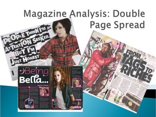
- 2. Mise en scene created by graffiti wall background is still reflecting the urban music genre and a sense of hip hop music. Main Image - the main image again is Dizzie Rascal which shows that this page is who article about him. The title and date are again followed through. To again show the reader that this is an article part of this week’s edition. Byline (credit for author and photographer Sub heading Main heading/headline which is something relating to the text and what the article is about. 4 columns –notice text wraps around the image of the radio which makes the text easier to read and follow. Caption saying Dizzee which informs the readers who this image is of if they were unsure and didn’t know who this music artist is. The use of the radio and beer bottles again suggests that Dizzie is rebellious which is in conjunction with the graffiti background and the radio suggests the theme of hip hop. Copy (text) begins with A large letter Y using Drops Cap. The use of this is to show to the reader that this is where the article starts.
- 4. Large medium shot of Lily Allen to show that this article is about her. Main headline is bold and enlarged to hook the reader in and to give a slight insight to what this article is about. The title and date are again followed through. To again show the reader that this is an article part of this week’s edition. Byline (credit for author and photographer Copy is written in four columns to make the text easier to read and follow. Subheading Exciting use of font to suggest that Lily Allen’s music is exciting and that is reflected in the font. Plain background to make the image of Lily Allen stand out which suggests that she doesn’t need a backing to her as she is already outstanding and exciting and standing out from the crowd. Copy (text) begins with A large letter Y using Drops Cap. The use of this is to show to the reader that this is where the article starts.
- 6. Main headline is very bold and colourful to introduce to the reader what this article is about. Copy is written in separated columns to make the text easier to read and follow. Sub-headings gives the reader a little bit more extra information about this article without giving away too much information. Separate images relating to text to make the graphology interesting. Main image is large and centred to the right. This shows the reader whom this article is about. Quotations placed around the main image to add a touch to the graphology which attracts this magazine’s target audience. Font. The font is very feminine with it having a design of starts which also portrays that the actress Kristen Steward is a “star” Colour: the colour used is again feminine with the use of the pink, white and black which defines this magazine's target audience.