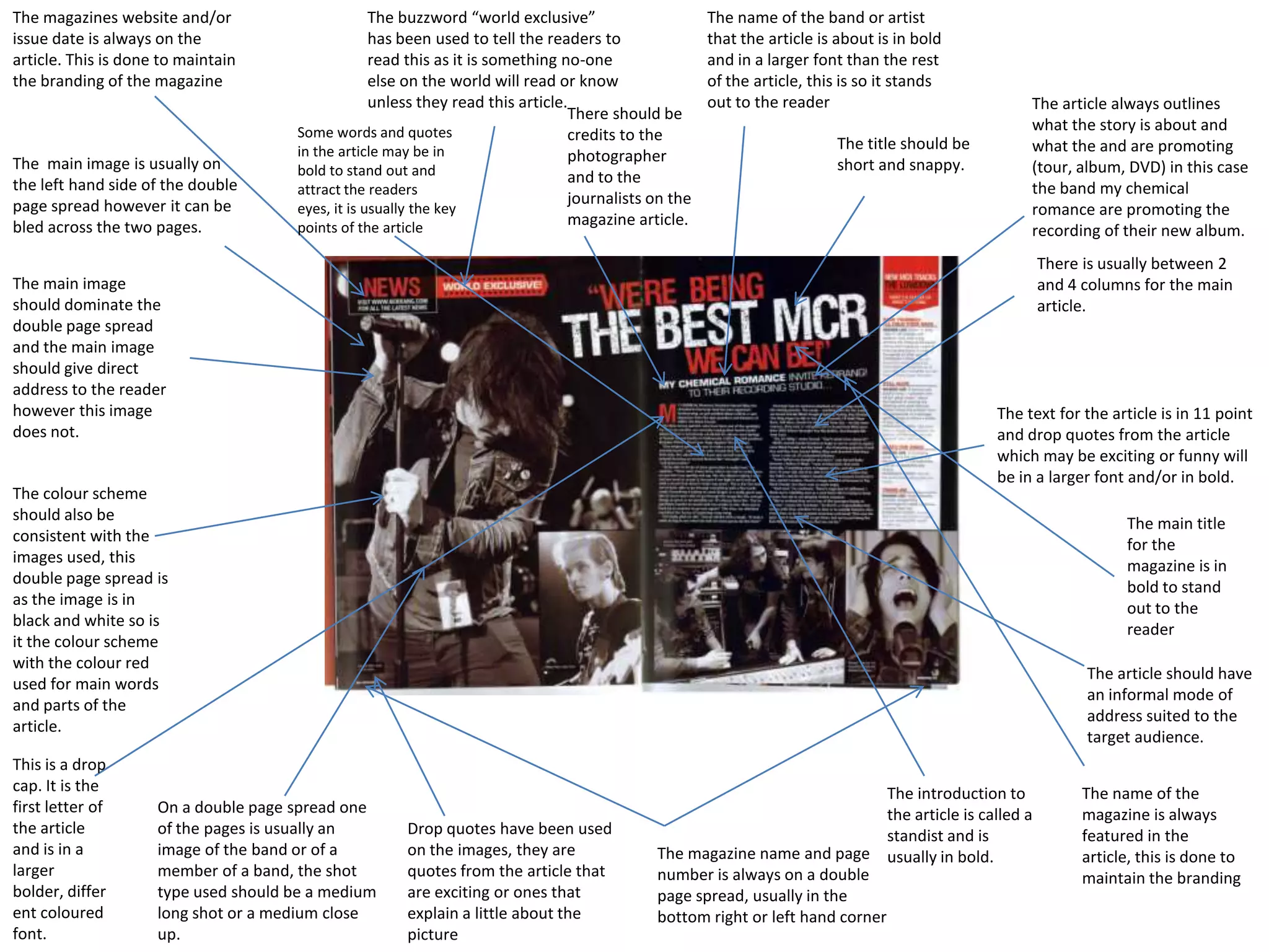
The name of the band or artist that the article is about is in bold and in a larger font than the rest of the article, this is so it stands out to the readerThe buzzword “world exclusive” has been used to tell the readers to read this as it is something no-one else on the world will read or know unless they read this article.The magazines website and/or issue date is always on the article. This is done to maintain the branding of the magazineThe article always outlines what the story is about and what the and are promoting (tour, album, DVD) in this case the band my chemical romance are promoting the recording of their new album.There should be credits to the photographer and to the journalists on the magazine article.Some words and quotes in the article may be in bold to stand out and attract the readers eyes, it is usually the key points of the articleThe title should be short and snappy.The  main image is usually on the left hand side of the double page spread however it can be bled across the two pages.There is usually between 2 and 4 columns for the main article.The main image should dominate the double page spread and the main image should give direct address to the reader however this image does not.The text for the article is in 11 point and drop quotes from the article which may be exciting or funny will be in a larger font and/or in bold.The colour scheme should also be consistent with the images used, this double page spread is as the image is in black and white so is it the colour scheme with the colour red used for main words and parts of the article.The main title for the magazine is in bold to stand out to the readerThe article should have an informal mode of address suited to the target audience.This is a drop cap. It is the first letter of the article and is in a larger bolder, different coloured font.The name of the magazine is always featured in the article, this is done to maintain the brandingThe introduction to the article is called a standist and is usually in bold.On a double page spread one of the pages is usually an image of the band or of a member of a band, the shot type used should be a medium long shot or a medium close up.Drop quotes have been used on the images, they are quotes from the article that are exciting or ones that explain a little about the pictureThe magazine name and page number is always on a double page spread, usually in the bottom right or left hand corner

Double page spread

  • 1.
    The name ofthe band or artist that the article is about is in bold and in a larger font than the rest of the article, this is so it stands out to the readerThe buzzword “world exclusive” has been used to tell the readers to read this as it is something no-one else on the world will read or know unless they read this article.The magazines website and/or issue date is always on the article. This is done to maintain the branding of the magazineThe article always outlines what the story is about and what the and are promoting (tour, album, DVD) in this case the band my chemical romance are promoting the recording of their new album.There should be credits to the photographer and to the journalists on the magazine article.Some words and quotes in the article may be in bold to stand out and attract the readers eyes, it is usually the key points of the articleThe title should be short and snappy.The main image is usually on the left hand side of the double page spread however it can be bled across the two pages.There is usually between 2 and 4 columns for the main article.The main image should dominate the double page spread and the main image should give direct address to the reader however this image does not.The text for the article is in 11 point and drop quotes from the article which may be exciting or funny will be in a larger font and/or in bold.The colour scheme should also be consistent with the images used, this double page spread is as the image is in black and white so is it the colour scheme with the colour red used for main words and parts of the article.The main title for the magazine is in bold to stand out to the readerThe article should have an informal mode of address suited to the target audience.This is a drop cap. It is the first letter of the article and is in a larger bolder, different coloured font.The name of the magazine is always featured in the article, this is done to maintain the brandingThe introduction to the article is called a standist and is usually in bold.On a double page spread one of the pages is usually an image of the band or of a member of a band, the shot type used should be a medium long shot or a medium close up.Drop quotes have been used on the images, they are quotes from the article that are exciting or ones that explain a little about the pictureThe magazine name and page number is always on a double page spread, usually in the bottom right or left hand corner