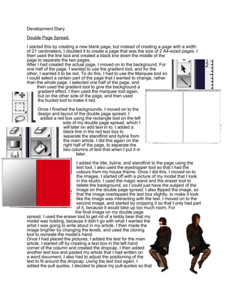
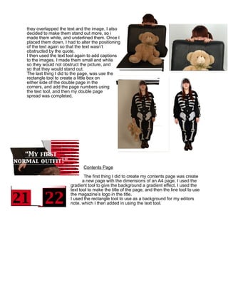
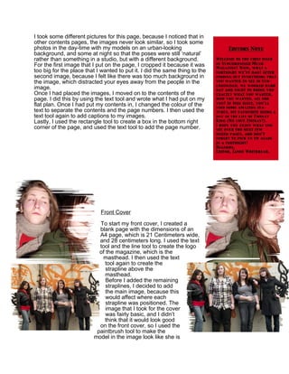
SlideShare a Scribd company logo
Development Diary

Double Page Spread.

I started this by creating a new blank page, but instead of creating a page with a width
of 21 centimeters, I doubled it to create a page that was the size of 2 A4-sized pages. I
then used the line tool and created a black line down the middle of the
page to separate the two pages.
After I had created the actual page, I moved on to the background. For
one half of the page, I wanted to use the gradient tool, and for the
other, I wanted it to be red. To do this, I had to use the Marquee tool so
I could select a certain part of the page that I wanted to change, rather
than the whole page. I selected one half of the page, and
      then used the gradient tool to give the background a
       gradient effect. I then used the marquee tool again,
       but on the other side of the page, and then used
       the bucket tool to make it red.

     Once I finished the backgrounds, I moved on to the
     design and layout of the double page spread. I
      added a red box using the rectangle tool on the left
                  side of my double page spread, which I
                  will later on add text in to. I added a
                  black line in the red text box to
                  separate the standfirst and byline from
                  the main article. I did this again on the
                  right half of the page, to separate the
                  two columns of text that when I put it in
                          later.

                             I added the title, byline, and standfirst to the page using the
                             text tool. I also used the eyedropper tool so that I had the
                             colours from my house theme. Once I did this, I moved on to
                             the images. I started off with a picture of my model that I took
                             in the studio. I used the magic wand and the eraser tool to
                             delete the background, so I could just have the subject of the
                             image on the double page spread. I also flipped the image, so
                             that the image overlapped the text box slightly, to make it look
                             like the image was interacting with the text. I moved on to the
                             second image, and started by cropping it so that I only had part
                             of it, because it would take up too much room. For
                            the final image on my double page
spread, I used the eraser tool to get rid of a teddy bear that my
model was holding, because it didn’t go with what I wanted the
artist I was going to write about in my article. I then made the
image brighter by changing the levels, and used the cloning
tool to recreate the model’s hand.
Once I had placed the pictures, I added the text for the main
article. I started off by creating a text box in the left hand
corner of the column and created the dropcap. I then added
another text box and pasted my article that I had written on
a word document. I also had to adjust the positioning of the
text to fit around the dropcap. Using the text tool again, I
added the pull quotes. I decided to place my pull-quotes so that
they overlapped the text and the image. I also
decided to make them stand out more, so i
made them white, and underlined them. Once I
placed them down, I had to alter the positioning
of the text again so that the text wasn’t
obstructed by the quote.
I then used the text tool again to add captions
to the images. I made them small and white
so they would not obstruct the picture, and
so that they would stand out.
The last thing I did to the page, was use the
rectangle tool to create a little box on
either side of the double page in the
corners, and add the page numbers using
the text tool, and then my double page
spread was completed.


                             Contents Page

                              The first thing I did to create my contents page was create
                             a new page with the dimensions of an A4 page. I used the
                      gradient tool to give the background a gradient effect. I used the
                      text tool to make the title of the page, and then the line tool to use
                      the magazine’s logo in the title.
                      I used the rectangle tool to use as a background for my editors
                      note, which I then added in using the text tool.
I took some different pictures for this page, because I noticed that in
other contents pages, the images never look similar, so I took some
photos in the day-time with my models on an urban-looking
background, and some at night so that the poses were still ‘natural’
rather than something in a studio, but with a different background.
For the first image that I put on the page, I cropped it because it was
too big for the place that I wanted to put it. I did the same thing to the
second image, because I felt like there was too much background in
the image, which distracted your eyes away from the people in the
image.
Once I had placed the images, I moved on to the contents of the
page. I did this by using the text tool and wrote what I had put on my
flat plan. Once I had put my contents in, I changed the colour of the
text to separate the contents and the page numbers. I then used the
text tool again to add captions to my images.
Lastly, I used the rectangle tool to create a box in the bottom right
corner of the page, and used the text tool to add the page number.


                            Front Cover

                           To start my front cover, I created a
                           blank page with the dimensions of an
                           A4 page, which is 21 Centimeters wide,
                           and 28 centimeters long. I used the text
                           tool and the line tool to create the logo
                           of the magazine, which is the
                            masthead. I then used the text
                             tool again to create the
                              strapline above the
                              masthead.
                              Before I added the remaining
                              straplines, I decided to add
                              the main image, because this
                              would affect where each
                              strapline was positioned. The
                              image that I took for the cover
                              was fairly basic, and I didn’t
                             think that it would look good
                           on the front cover, so I used the
                          paintbrush tool to make the
                         model in the image look like she is
wearing strange make-up, like some modern pop-singers do. I also used the text tool,
because I had the model hold her hair up in the picture, so that I could write something
there, so I put the name of the artist that I am featuring in the magazine, and then used
the smudge tool to make it look different. Once I had finished that, I used the magic
wand tool to erase the background, and dragged it on to my front cover.
The next thing I had to do to complete my Front Cover was add the straplines. I did this
by using the
text tool to write the strapline, and then use the rectangle tool to make certain parts of
the strapline stand out. I also changed the colour of certain
words to make them stand out first, and to make them seem
important.
When I finished the straplines, I added the bar code that I used
on               the mock-up of my magazine, and then used the
                           text tool to add a price to my magazine,
                              which I placed above the barcode,
                              because this is where the price is usually
                              on other magazines.

More Related Content

What's hot

Editing process of my music magazine
Editing process of my music magazineEditing process of my music magazine
Editing process of my music magazineCharleyMartin95
 
Augustine’s preliminary task
Augustine’s preliminary taskAugustine’s preliminary task
Augustine’s preliminary taskAugustine_Adeosun
 
Bhangra Music Magazine Evaluation
Bhangra Music Magazine EvaluationBhangra Music Magazine Evaluation
Bhangra Music Magazine Evaluationkomalvekaria
 
Evaluation
EvaluationEvaluation
Evaluation
mahamednor
 
Question 6
Question 6Question 6
Question 6
ts05069521
 
Media as evaluation
Media as evaluationMedia as evaluation
Media as evaluationyahong24
 
Media as evaluation
Media as evaluationMedia as evaluation
Media as evaluationyahong24
 
Media as evaluation
Media as evaluationMedia as evaluation
Media as evaluationyahong24
 
Contents Page Progression
Contents Page ProgressionContents Page Progression
Contents Page Progression
iramd
 
Contents page progression
Contents page progressionContents page progression
Contents page progression
iramd
 
Magazine process
Magazine   process Magazine   process
Magazine process
Sophie Smith
 
Media Coursework Schedule
Media Coursework ScheduleMedia Coursework Schedule
Media Coursework Schedule
leezaahwan
 
production log continued
production log continued production log continued
production log continued
Janet Lunkusé
 
Contents page progression
Contents page progressionContents page progression
Contents page progression
iramd
 

What's hot (19)

Fzsddgasg3333
Fzsddgasg3333Fzsddgasg3333
Fzsddgasg3333
 
Editing process of my music magazine
Editing process of my music magazineEditing process of my music magazine
Editing process of my music magazine
 
Augustine’s preliminary task
Augustine’s preliminary taskAugustine’s preliminary task
Augustine’s preliminary task
 
Bhangra Music Magazine Evaluation
Bhangra Music Magazine EvaluationBhangra Music Magazine Evaluation
Bhangra Music Magazine Evaluation
 
Question six
Question sixQuestion six
Question six
 
Evaluation
EvaluationEvaluation
Evaluation
 
Question 6
Question 6Question 6
Question 6
 
Media as evaluation
Media as evaluationMedia as evaluation
Media as evaluation
 
Media as evaluation
Media as evaluationMedia as evaluation
Media as evaluation
 
Media as evaluation
Media as evaluationMedia as evaluation
Media as evaluation
 
Contents Page Progression
Contents Page ProgressionContents Page Progression
Contents Page Progression
 
Contents page progression
Contents page progressionContents page progression
Contents page progression
 
Magazine process
Magazine   process Magazine   process
Magazine process
 
Media Coursework Schedule
Media Coursework ScheduleMedia Coursework Schedule
Media Coursework Schedule
 
production log continued
production log continued production log continued
production log continued
 
Skills dev'
Skills dev'Skills dev'
Skills dev'
 
Skills dev'
Skills dev'Skills dev'
Skills dev'
 
Development diary
Development diaryDevelopment diary
Development diary
 
Contents page progression
Contents page progressionContents page progression
Contents page progression
 

Similar to Development diary-word

Development diary (double page spread)
Development diary (double page spread)Development diary (double page spread)
Development diary (double page spread)Kate-Anna Smith
 
Screenshots dps
Screenshots dps Screenshots dps
Screenshots dps
eleanornatalie
 
Editing process of my magazine
Editing process of my magazineEditing process of my magazine
Editing process of my magazinestelloyd386
 
Editing process of my magazine
Editing process of my magazineEditing process of my magazine
Editing process of my magazinestelloyd386
 
Front page Production Log
Front page Production LogFront page Production Log
Front page Production Loglilflickmania
 
Making my magazine
Making my magazineMaking my magazine
Making my magazinetk04851811
 
6. production reflection
6. production reflection6. production reflection
6. production reflection
rachel haw
 
Screen shots
Screen shotsScreen shots
Screen shots
zahrasm
 
Designing my dps
Designing my dpsDesigning my dps
Designing my dps
AS Media Column D
 
Contents page printscreens
Contents page printscreens Contents page printscreens
Contents page printscreens
rubyasmedia
 
Contents page production log
Contents page production logContents page production log
Contents page production loglilflickmania
 
Evidence of manipulation of images
Evidence of manipulation of imagesEvidence of manipulation of images
Evidence of manipulation of images
AS Media Column E
 
3. Production Experiments (visual)
3. Production Experiments (visual)3. Production Experiments (visual)
3. Production Experiments (visual)
TamzinTwose
 
Step by step guide for my dps
Step by step guide for my dpsStep by step guide for my dps
Step by step guide for my dpsasmediaf12
 
Construction of contents page
Construction of contents pageConstruction of contents page
Construction of contents page
AS Media Column D
 
Skills journal 97 03
Skills journal 97 03Skills journal 97 03
Skills journal 97 03kieranlhyde
 
Production of my magazine
Production of my magazineProduction of my magazine
Production of my magazineasmediae12
 

Similar to Development diary-word (20)

Development diary (double page spread)
Development diary (double page spread)Development diary (double page spread)
Development diary (double page spread)
 
Screenshots dps
Screenshots dps Screenshots dps
Screenshots dps
 
Editing process of my magazine
Editing process of my magazineEditing process of my magazine
Editing process of my magazine
 
Editing process of my magazine
Editing process of my magazineEditing process of my magazine
Editing process of my magazine
 
Front page Production Log
Front page Production LogFront page Production Log
Front page Production Log
 
Making my magazine
Making my magazineMaking my magazine
Making my magazine
 
Magazine progress
Magazine progressMagazine progress
Magazine progress
 
6. production reflection
6. production reflection6. production reflection
6. production reflection
 
Screen shots
Screen shotsScreen shots
Screen shots
 
Front cover editing process
Front cover editing processFront cover editing process
Front cover editing process
 
Designing my dps
Designing my dpsDesigning my dps
Designing my dps
 
Evidence of Front Cover
Evidence of Front CoverEvidence of Front Cover
Evidence of Front Cover
 
Contents page printscreens
Contents page printscreens Contents page printscreens
Contents page printscreens
 
Contents page production log
Contents page production logContents page production log
Contents page production log
 
Evidence of manipulation of images
Evidence of manipulation of imagesEvidence of manipulation of images
Evidence of manipulation of images
 
3. Production Experiments (visual)
3. Production Experiments (visual)3. Production Experiments (visual)
3. Production Experiments (visual)
 
Step by step guide for my dps
Step by step guide for my dpsStep by step guide for my dps
Step by step guide for my dps
 
Construction of contents page
Construction of contents pageConstruction of contents page
Construction of contents page
 
Skills journal 97 03
Skills journal 97 03Skills journal 97 03
Skills journal 97 03
 
Production of my magazine
Production of my magazineProduction of my magazine
Production of my magazine
 

More from Jwbread

Presentation1
Presentation1Presentation1
Presentation1Jwbread
 
Questionnaire results-presentation-1
Questionnaire results-presentation-1Questionnaire results-presentation-1
Questionnaire results-presentation-1Jwbread
 
Paranormal activity
Paranormal activityParanormal activity
Paranormal activityJwbread
 
Woman in-black
Woman in-blackWoman in-black
Woman in-blackJwbread
 
Focus group-questionnaire
Focus group-questionnaireFocus group-questionnaire
Focus group-questionnaireJwbread
 
Questionnaire
QuestionnaireQuestionnaire
QuestionnaireJwbread
 
Production schedule-template
Production schedule-templateProduction schedule-template
Production schedule-templateJwbread
 
Edit decision list
Edit decision listEdit decision list
Edit decision listJwbread
 
Magazine Textual Analysis
Magazine Textual AnalysisMagazine Textual Analysis
Magazine Textual AnalysisJwbread
 
Textual analysis
Textual analysisTextual analysis
Textual analysisJwbread
 
Production schedule-template
Production schedule-templateProduction schedule-template
Production schedule-templateJwbread
 
Location scouting sheet
Location scouting sheetLocation scouting sheet
Location scouting sheetJwbread
 
Risk assessment-template
Risk assessment-templateRisk assessment-template
Risk assessment-templateJwbread
 
Production schedule-template
Production schedule-templateProduction schedule-template
Production schedule-templateJwbread
 
Favourite Thirty Pictures
Favourite Thirty PicturesFavourite Thirty Pictures
Favourite Thirty PicturesJwbread
 
Secondary Research
Secondary ResearchSecondary Research
Secondary ResearchJwbread
 
Favourite work so far
Favourite work so farFavourite work so far
Favourite work so farJwbread
 
Pictures
PicturesPictures
PicturesJwbread
 

More from Jwbread (18)

Presentation1
Presentation1Presentation1
Presentation1
 
Questionnaire results-presentation-1
Questionnaire results-presentation-1Questionnaire results-presentation-1
Questionnaire results-presentation-1
 
Paranormal activity
Paranormal activityParanormal activity
Paranormal activity
 
Woman in-black
Woman in-blackWoman in-black
Woman in-black
 
Focus group-questionnaire
Focus group-questionnaireFocus group-questionnaire
Focus group-questionnaire
 
Questionnaire
QuestionnaireQuestionnaire
Questionnaire
 
Production schedule-template
Production schedule-templateProduction schedule-template
Production schedule-template
 
Edit decision list
Edit decision listEdit decision list
Edit decision list
 
Magazine Textual Analysis
Magazine Textual AnalysisMagazine Textual Analysis
Magazine Textual Analysis
 
Textual analysis
Textual analysisTextual analysis
Textual analysis
 
Production schedule-template
Production schedule-templateProduction schedule-template
Production schedule-template
 
Location scouting sheet
Location scouting sheetLocation scouting sheet
Location scouting sheet
 
Risk assessment-template
Risk assessment-templateRisk assessment-template
Risk assessment-template
 
Production schedule-template
Production schedule-templateProduction schedule-template
Production schedule-template
 
Favourite Thirty Pictures
Favourite Thirty PicturesFavourite Thirty Pictures
Favourite Thirty Pictures
 
Secondary Research
Secondary ResearchSecondary Research
Secondary Research
 
Favourite work so far
Favourite work so farFavourite work so far
Favourite work so far
 
Pictures
PicturesPictures
Pictures
 

Development diary-word

  • 1. Development Diary Double Page Spread. I started this by creating a new blank page, but instead of creating a page with a width of 21 centimeters, I doubled it to create a page that was the size of 2 A4-sized pages. I then used the line tool and created a black line down the middle of the page to separate the two pages. After I had created the actual page, I moved on to the background. For one half of the page, I wanted to use the gradient tool, and for the other, I wanted it to be red. To do this, I had to use the Marquee tool so I could select a certain part of the page that I wanted to change, rather than the whole page. I selected one half of the page, and then used the gradient tool to give the background a gradient effect. I then used the marquee tool again, but on the other side of the page, and then used the bucket tool to make it red. Once I finished the backgrounds, I moved on to the design and layout of the double page spread. I added a red box using the rectangle tool on the left side of my double page spread, which I will later on add text in to. I added a black line in the red text box to separate the standfirst and byline from the main article. I did this again on the right half of the page, to separate the two columns of text that when I put it in later. I added the title, byline, and standfirst to the page using the text tool. I also used the eyedropper tool so that I had the colours from my house theme. Once I did this, I moved on to the images. I started off with a picture of my model that I took in the studio. I used the magic wand and the eraser tool to delete the background, so I could just have the subject of the image on the double page spread. I also flipped the image, so that the image overlapped the text box slightly, to make it look like the image was interacting with the text. I moved on to the second image, and started by cropping it so that I only had part of it, because it would take up too much room. For the final image on my double page spread, I used the eraser tool to get rid of a teddy bear that my model was holding, because it didn’t go with what I wanted the artist I was going to write about in my article. I then made the image brighter by changing the levels, and used the cloning tool to recreate the model’s hand. Once I had placed the pictures, I added the text for the main article. I started off by creating a text box in the left hand corner of the column and created the dropcap. I then added another text box and pasted my article that I had written on a word document. I also had to adjust the positioning of the text to fit around the dropcap. Using the text tool again, I added the pull quotes. I decided to place my pull-quotes so that
  • 2. they overlapped the text and the image. I also decided to make them stand out more, so i made them white, and underlined them. Once I placed them down, I had to alter the positioning of the text again so that the text wasn’t obstructed by the quote. I then used the text tool again to add captions to the images. I made them small and white so they would not obstruct the picture, and so that they would stand out. The last thing I did to the page, was use the rectangle tool to create a little box on either side of the double page in the corners, and add the page numbers using the text tool, and then my double page spread was completed. Contents Page The first thing I did to create my contents page was create a new page with the dimensions of an A4 page. I used the gradient tool to give the background a gradient effect. I used the text tool to make the title of the page, and then the line tool to use the magazine’s logo in the title. I used the rectangle tool to use as a background for my editors note, which I then added in using the text tool.
  • 3. I took some different pictures for this page, because I noticed that in other contents pages, the images never look similar, so I took some photos in the day-time with my models on an urban-looking background, and some at night so that the poses were still ‘natural’ rather than something in a studio, but with a different background. For the first image that I put on the page, I cropped it because it was too big for the place that I wanted to put it. I did the same thing to the second image, because I felt like there was too much background in the image, which distracted your eyes away from the people in the image. Once I had placed the images, I moved on to the contents of the page. I did this by using the text tool and wrote what I had put on my flat plan. Once I had put my contents in, I changed the colour of the text to separate the contents and the page numbers. I then used the text tool again to add captions to my images. Lastly, I used the rectangle tool to create a box in the bottom right corner of the page, and used the text tool to add the page number. Front Cover To start my front cover, I created a blank page with the dimensions of an A4 page, which is 21 Centimeters wide, and 28 centimeters long. I used the text tool and the line tool to create the logo of the magazine, which is the masthead. I then used the text tool again to create the strapline above the masthead. Before I added the remaining straplines, I decided to add the main image, because this would affect where each strapline was positioned. The image that I took for the cover was fairly basic, and I didn’t think that it would look good on the front cover, so I used the paintbrush tool to make the model in the image look like she is
  • 4. wearing strange make-up, like some modern pop-singers do. I also used the text tool, because I had the model hold her hair up in the picture, so that I could write something there, so I put the name of the artist that I am featuring in the magazine, and then used the smudge tool to make it look different. Once I had finished that, I used the magic wand tool to erase the background, and dragged it on to my front cover. The next thing I had to do to complete my Front Cover was add the straplines. I did this by using the text tool to write the strapline, and then use the rectangle tool to make certain parts of the strapline stand out. I also changed the colour of certain words to make them stand out first, and to make them seem important. When I finished the straplines, I added the bar code that I used on the mock-up of my magazine, and then used the text tool to add a price to my magazine, which I placed above the barcode, because this is where the price is usually on other magazines.
  • 5. wearing strange make-up, like some modern pop-singers do. I also used the text tool, because I had the model hold her hair up in the picture, so that I could write something there, so I put the name of the artist that I am featuring in the magazine, and then used the smudge tool to make it look different. Once I had finished that, I used the magic wand tool to erase the background, and dragged it on to my front cover. The next thing I had to do to complete my Front Cover was add the straplines. I did this by using the text tool to write the strapline, and then use the rectangle tool to make certain parts of the strapline stand out. I also changed the colour of certain words to make them stand out first, and to make them seem important. When I finished the straplines, I added the bar code that I used on the mock-up of my magazine, and then used the text tool to add a price to my magazine, which I placed above the barcode, because this is where the price is usually on other magazines.
  • 6. wearing strange make-up, like some modern pop-singers do. I also used the text tool, because I had the model hold her hair up in the picture, so that I could write something there, so I put the name of the artist that I am featuring in the magazine, and then used the smudge tool to make it look different. Once I had finished that, I used the magic wand tool to erase the background, and dragged it on to my front cover. The next thing I had to do to complete my Front Cover was add the straplines. I did this by using the text tool to write the strapline, and then use the rectangle tool to make certain parts of the strapline stand out. I also changed the colour of certain words to make them stand out first, and to make them seem important. When I finished the straplines, I added the bar code that I used on the mock-up of my magazine, and then used the text tool to add a price to my magazine, which I placed above the barcode, because this is where the price is usually on other magazines.
  • 7. wearing strange make-up, like some modern pop-singers do. I also used the text tool, because I had the model hold her hair up in the picture, so that I could write something there, so I put the name of the artist that I am featuring in the magazine, and then used the smudge tool to make it look different. Once I had finished that, I used the magic wand tool to erase the background, and dragged it on to my front cover. The next thing I had to do to complete my Front Cover was add the straplines. I did this by using the text tool to write the strapline, and then use the rectangle tool to make certain parts of the strapline stand out. I also changed the colour of certain words to make them stand out first, and to make them seem important. When I finished the straplines, I added the bar code that I used on the mock-up of my magazine, and then used the text tool to add a price to my magazine, which I placed above the barcode, because this is where the price is usually on other magazines.